Part One:

Part Two:
Partners Map-
Portrait-


Project Description:
Part One- Map
For this two part project I decided to first make a map reflecting the fast fashion industry vs thrift in NYC. I did this by making a side by side comparison of two maps of same area, on one marking the 19 fast fashion stores I could find while on the other marking the 3 affordable vintage/thrift stores. The goal was to illustrate the vast difference in quantity of stores which is a reflection of the impacts that fast fashion is creating on both consumers, people producing the clothes, and the environment. It is also representative of my personal self and daily life because I am constantly on the hunt trying to find new affordable used clothing stores in NYC and in my short two months here these are the only three I have so far found.
Part Two- Portrait
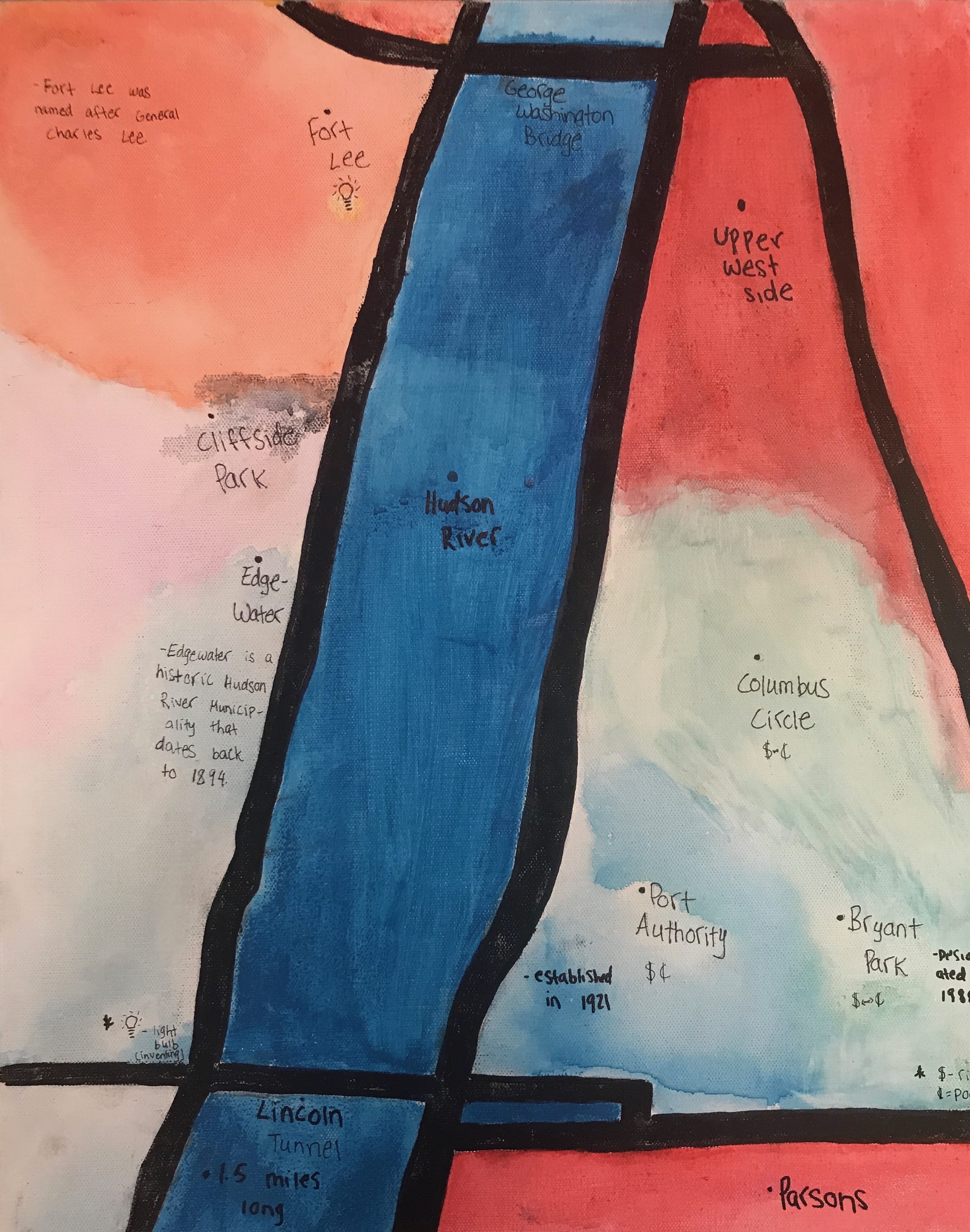
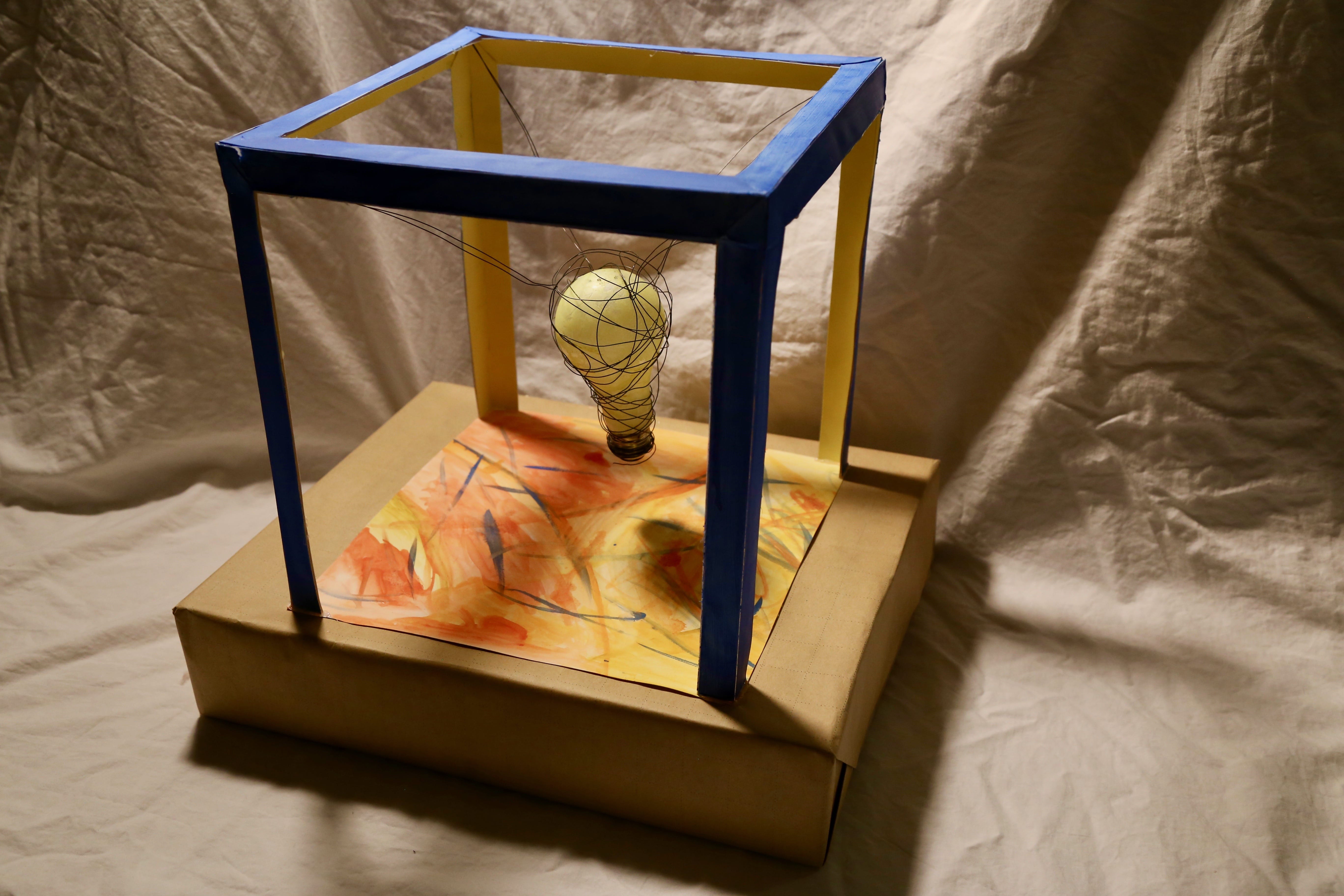
The second part of this project was a sculptural piece that I made as a portrait of my partner, Margaret Chen. It is a paper cube surrounding a wire covered lightbulb which represents Margaret’s inventive mind. It was influenced in color by her map but most of the idea came from the knowledge I have of her through our interview in seminar. The map does point out one place with a lightbulb symbol which is the place she does most of her inventing, a theme I wanted to incorporate into the portrait. Margaret also makes many of her invention prototypes as paper models which is the reasoning behind the chosen medium of my piece. I painted the inside of the box yellow to show the illumination from the bulb lighting up the inside of the box. The outside is blue to represent technology and innovation, as blue is a clean and refreshing color. The bottom panel is a combination of yellow, blue, and orange to represent the passion that Margaret possesses for her passion of inventing and creating new ideas for technological innovation. I also made an effort to incorporate the black lines and points of her map through the wire which is holding up the lightbulb. Margaret often gets inspiration from traveling and seeing new places, which appears evident in her map. Therefore, the wires represent her daily paths of travel and hold up the lightbulbs, being her ideas, which she wouldn’t be able to have/come up with if it wasn’t for her constant desire to see new places.
Materials for Portrait:
Watercolor on card stock, hot glue, wire, lightbulb, wrapping paper, cardboard box.
Rough Draft and Process Photos:


Reflection:
The critiques I received in class showed that this piece did read as inventive, in the way I intended it to. One said the wires made it appear like the ideas were being pulled from the fiery (koi) pond below and being transported into the lightbulb via the wires. Another said the box the sculpture is stood on top of appears as an envelope to encompass all the ideas being created from the light bulb. The blue color wasn’t immediately interpreted to represent technology but was related to the color of the glow from a computer screen. Overall, I think the piece went well and communicated what I had intended it to, being that Margaret is an inventive person while also representing her personal style using medium and color choice. It relates back to the map also through color choices and certain points which point out where she likes to go to invent. As far as my personal style goes, I am not pleased with this piece and it is not something I would have made otherwise for the purpose of this project. However, it was a good opportunity to experience with a new medium and work within a color palette that I usually would not.