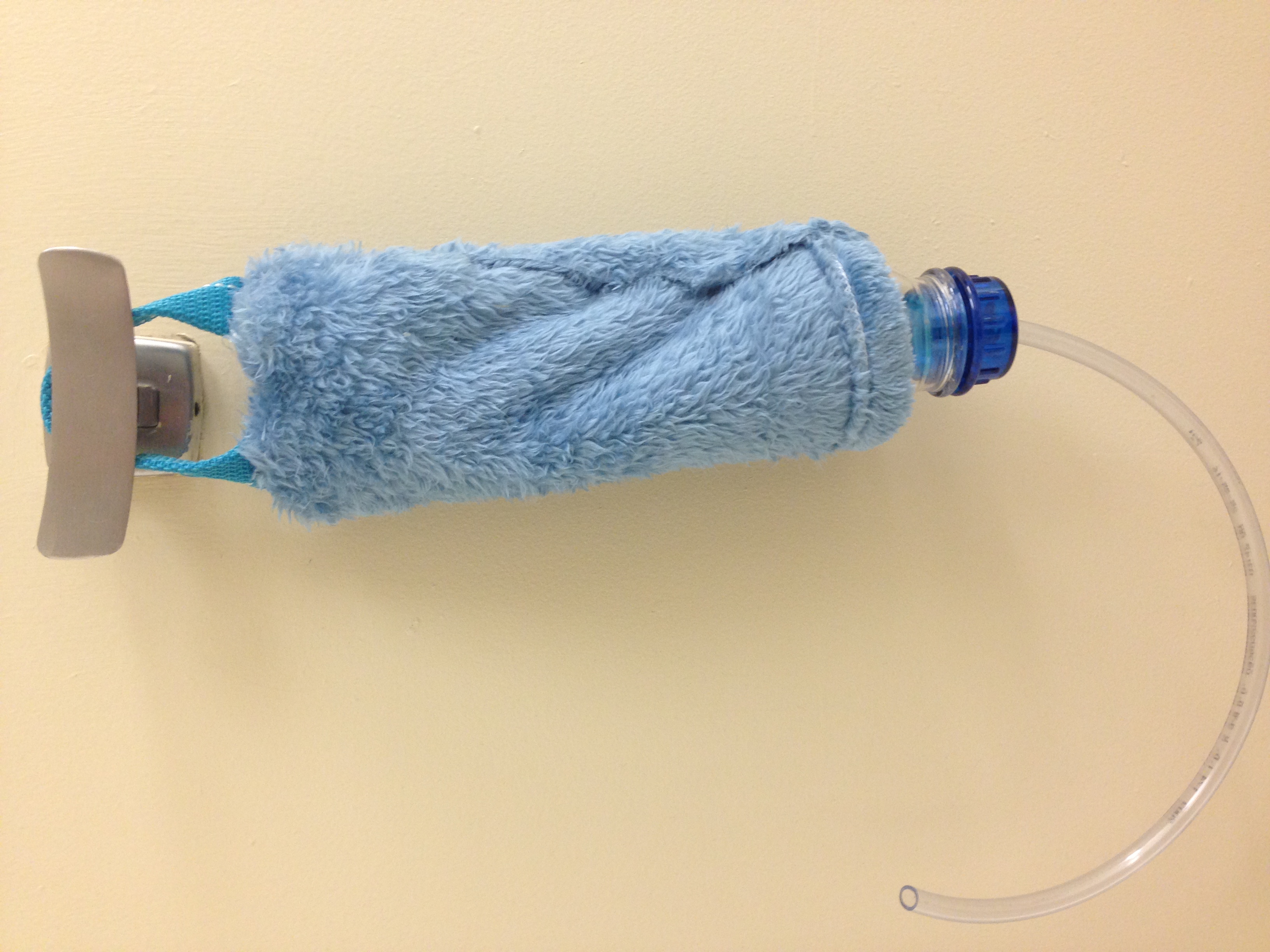
Chindogu- Finished Product
Image
Reply

In order to build my cup, I gathered materials consisting of a plastic water bottle, a picnic cooler bag, a fluffy blue blanket, and a small, bendable, rubber tube. I deconstructed the cooler bag and removed the lining. This lining I would use as the inside of my cup and reshape into a smaller bag form for the liquid to go into. I would cut up the blanket into the same I wanted the cup to be and attach it to the lining. I the strap off of the cooler and attached it to the bottom of the lining/blanket.
I found a water bottle that had a detachable upper half. I disconnected the top half from the lower half and used a saw to make it a bit smaller. The top of the water bottle had a screw-on cap. I took off the cap and drilled a hole in it to insert the tube so that it would be part of the cap, and the tube would be the straw. Lastly, I attached the blanket/lining layer to the upper half of the bottle.

For the second project I worked on in Design Studio was the Chindogu. I immediately thought of some sort of sideways cup that someone could drink from while laying down. In my original sketches, my cup was a rectangular box with a bent straw coming out of the side. I also wanted to somehow attach a clip so that the consumer would be able to connect the cup to their bedpost. When I shared my idea in the classroom, I decided to alter my design after hearing several good ideas. I decided to make the cup more like a pillow or an IV bag. It would be a bag covered in some kind of material to make it comfortable. It would have a bendable straw coming out of a screw on cap, and a handle on the end to hang on a hook or bedpost. A more in-depth description of my product and inspiration behind it is below:

In the original drawing of my garment, I designed a hoop skirt. I decided to make it out of thick wire and wrap it in something to disguise the metal. After I built it, the metal looked really cool by itself and gave the outfit a new edge, so I decided to keep it rather than ruin it by wrapping it in something like colored scotch tape. However, when I was close to being finished with my garment, I put on the final plastic layer of the skirt, and the hoop skirt became unnoticeable. At the same time, I was playing with some canvas to try and tie the plastic layer together. I came up with the idea to wrap the wire loosely in strips of canvas. I made it look purposefully twisted and messy. It made the wire lines bigger and it fit well with the overall feel of my dress, since it wasn’t meant to be edgy. Below are before and after pictures of the hoop skirt:

Before
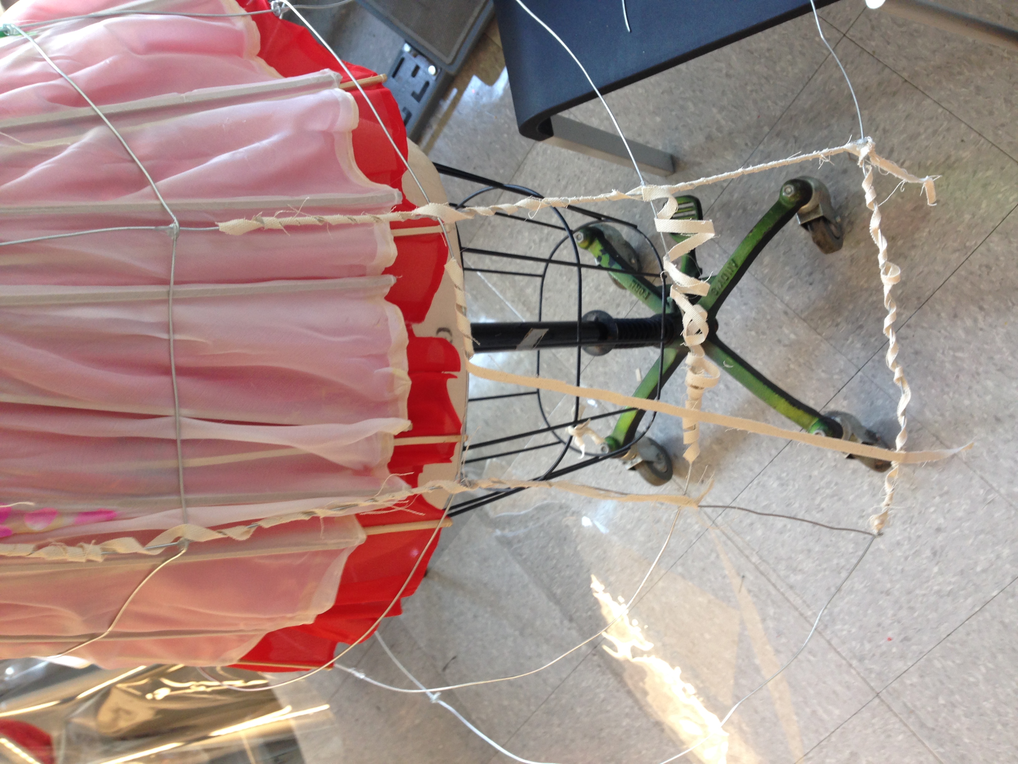
After
I started to actually build my garment. I already knew that I wanted to make a skirt out of umbrellas. I had one white and one red umbrella, both of which I had already deconstructed in order to separate the patterned fabric from the handle. Originally, I had planned to use the red umbrella as the top of the skirt, and the white umbrella as the bottom. The material of the umbrellas was thin, so I would have had to make shorts or another skirt to go under it. However, while I was making the skirt, I arranged the umbrellas how I envisioned, and I did not like them together. The skirt was too long, and I thought that the red drew too much attention. Therefore, I came up with the solution to layer the white umbrella over the red umbrella. This made the skirt shorter, the white umbrella looked better on top, and with two layers of material the skirt was no longer see-through, so it solved the problem of me having to come up with shorts to go underneath.

I had to design a garment concerning one specific area of urban adaptation. The area I had to focus on included shelter and protection against the elements. I visited Chinatown with my class and drew inspiration form the surrounding architecture. The inspiration behind my design and my croque is shown below:

My first project in Parsons Design Studio involved creating my own typeface using 3-D objects. Each student was given one word to inspire his/her alphabet. I received the word, “Symmetry.” I immediately thought of mirrors and reflections. I wanted the overall design to be very clean and linear. We were given about 30 minutes to grab the supplies we needed to build the alphabet. I grabbed flat wooden sticks and a roll of thin, reflective metal. I decided my design would be to split the symmetrical letters in half and put an axis of symmetry down the middle using the metal. I made the letters out of the sticks. As I was creating my alphabet, I began thinking. about positive and negative space, and I decided to use three wooden sticks to signify one line in a letter. This way, the letter would take up more space on the page as the main object. One of my finished letters is shown below:

Welcome to your brand new blog at The New School Sites.
To get started, simply log in, edit or delete this post and check out all the other options available to you.
For assistance, visit our comprehensive support site, check out our Edublogs User Guide guide or stop by The Edublogs Forums to chat with other edubloggers.
You can also subscribe to our brilliant free publication, The Edublogger, which is jammed with helpful tips, ideas and more.