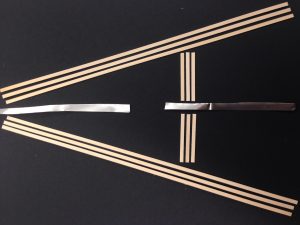
My first project in Parsons Design Studio involved creating my own typeface using 3-D objects. Each student was given one word to inspire his/her alphabet. I received the word, “Symmetry.” I immediately thought of mirrors and reflections. I wanted the overall design to be very clean and linear. We were given about 30 minutes to grab the supplies we needed to build the alphabet. I grabbed flat wooden sticks and a roll of thin, reflective metal. I decided my design would be to split the symmetrical letters in half and put an axis of symmetry down the middle using the metal. I made the letters out of the sticks. As I was creating my alphabet, I began thinking. about positive and negative space, and I decided to use three wooden sticks to signify one line in a letter. This way, the letter would take up more space on the page as the main object. One of my finished letters is shown below:

