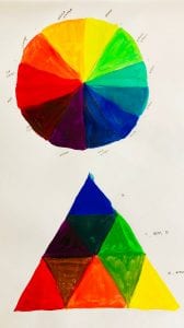
Color Wheel
Color Walk
yellow spray paint art on the mailbox
golden yellow rooftops
cigarette stub
yellow light red light walk
girl in the red baseball cap smiled back at me
red brick red cheeks red nose red lips
one tail light out on a green kia
third avenue and fifteen street
tiny old man in neon green pants
shades of green, irish pub, looks warm inside
green backpack, hoodie, sneakers
green leash black dog
smells like pine trees, looks like Wall Street
black iron railing, grey stone
grey sky, grey earth, grey everything
too much grey
two brown dogs
five brunettes all in a row
brown boots orange socks
M14A crosstown abington square
orange hand, don’t cross
white poodle with a better haircut than me
white marble
erected by the people of the city of new york
white fleece jacket, he looks very warm
i am very cold
white lamps, it’s too early to light them yet
model posing with a white pomeranian
it isn’t cooperating with the photographer
salt in the grey stone
light in the grey clouds
fluorescent light reflecting on stainless steel
yellow light-up buttons in the elevator
room number, pastel yellow paint
home
300 Hundred Word Explanation
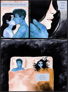
The idea of color being directly attached to emotion is completely fascinating to me. Different color combinations can change the emotional aspect and meaning of a work of art, and because of this color is something I want to be more conscious of in my work. For this bridge project I created three 14 x 17 short comics that use different color combinations to describe varied complex emotional states. All of my pieces are centered around different shades of blue combined with black, and how the different types of blue can represent different emotional states.
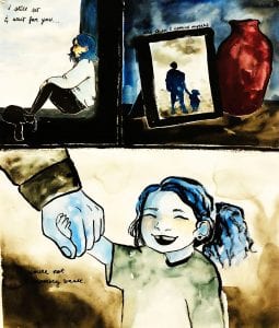
For the first comic “page” I created, I focused around loss and abandonment. Using a
very dark green blue, coupled with black I sketched and colored three panels. In the first panel, a girl sits by herself by a window. Then the visual becomes a blurry photograph showing two figures, one big and one little, next to a vase of some kind. The final panel shows a close up of the image in the photo of the girl when she was younger. She is smiling and holding hands with a much older man, presumably her father. This comic is mainly painted in watercolor and looks almost washed out, in order to represent memory and the kind of unclear, murkiness of someone who is starting to forget.
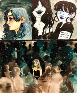
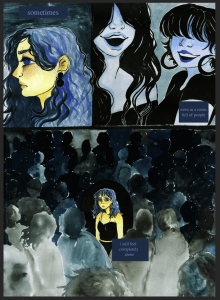
In the second comic, I chose teal and black to represent isolation. The first panel shows the profile of a girl standing by herself and looking fairly upset by something, followed by two faceless figures that are laughing and smiling. The girl in the first panel is draw in a lot of detail, while the two girls in the second panel do not have very clear features. In the final panel, the girl from the first panel stands in the middle of an incredibly crowded room, but there is a black circle separating her from the many faceless figures standing around her. The text featured in this comic reads, “ Sometimes, even in a room full of people, I still feel completely alone.” Each sentence used in these short comics is supposed to help bring the meaning of the emotive aspects into a clearer light.
In the final comic, the first panel shows a couple embracing. They are drawn in full color with inked detail. The second panel is a close up of one of the people, smiling, while the other holds her cheek. However, this differs from the first panel because she is suddenly blue instead of flesh toned. The background is much darker and more foreboding as well. In the final panel, the couple seem to be far apart and the girl is contemplating, the sentence for this comic reads, “I know I have to let you go, even if it hurts, because that’s what’s best for me.”
Edited Comic Pages (Adjusted Hue and Saturation)

