Bridge Five

Process:

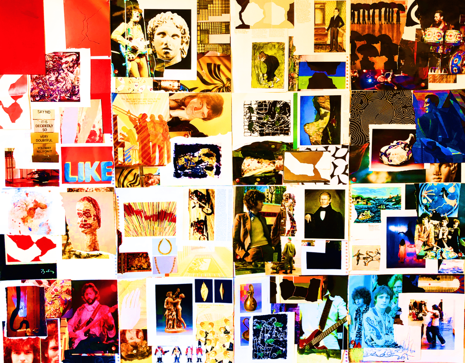
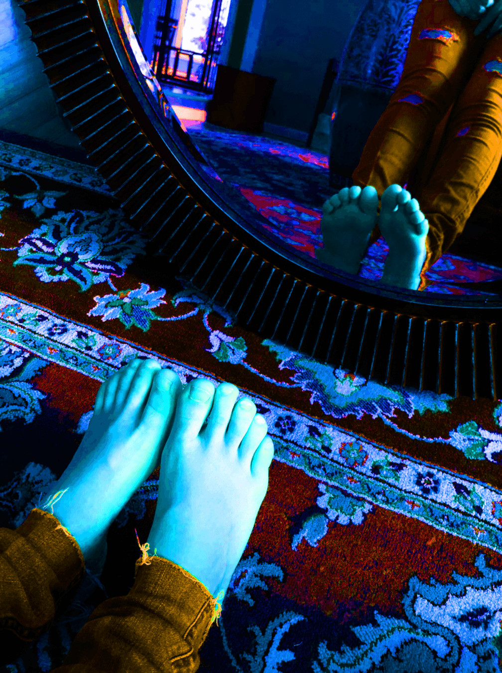
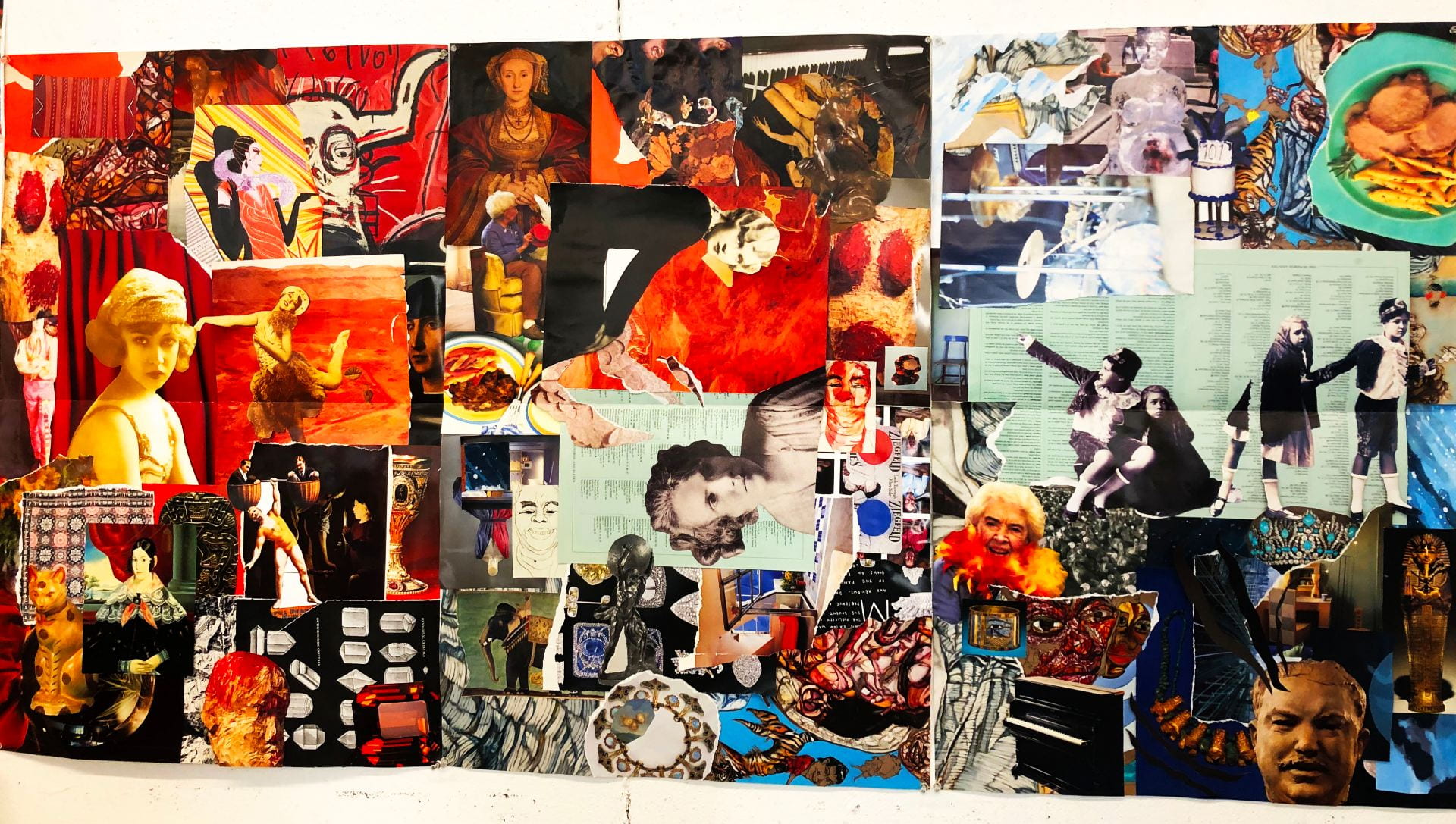
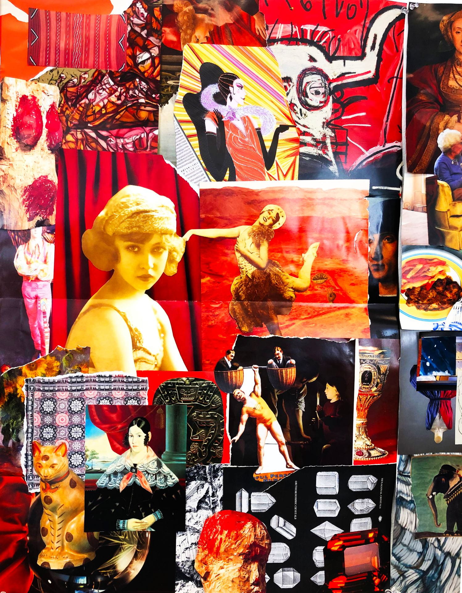
This is a picture of my five foot by six foot mind map collage made for inspiration for this project.

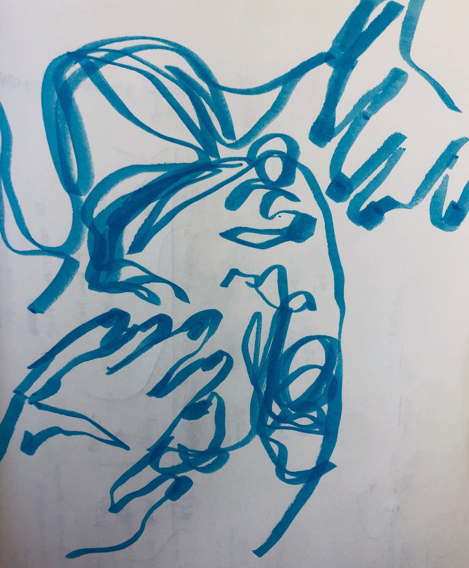
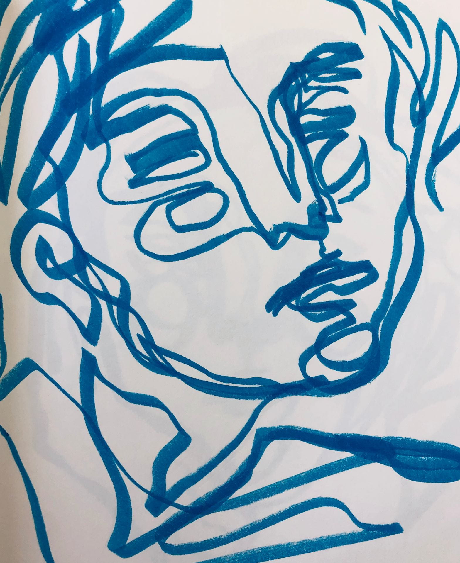
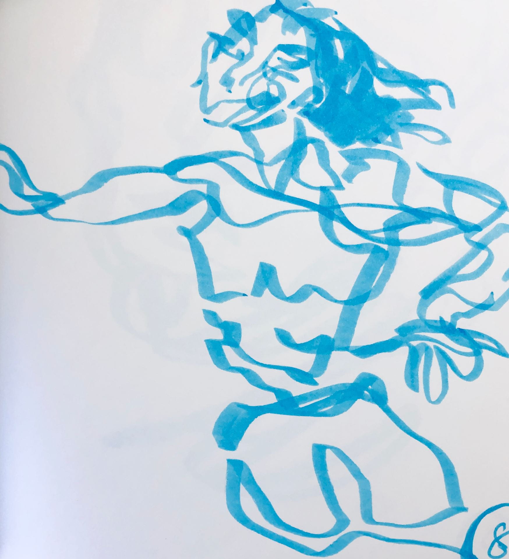
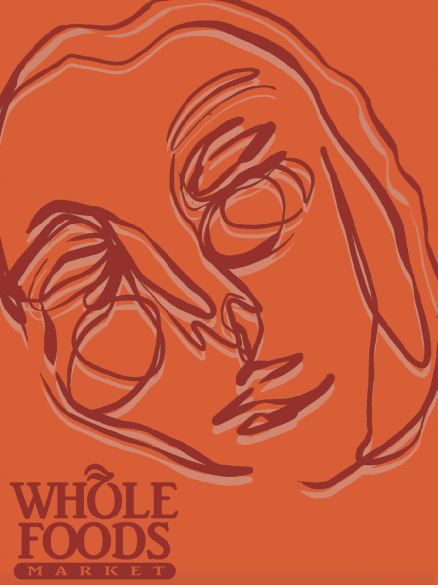
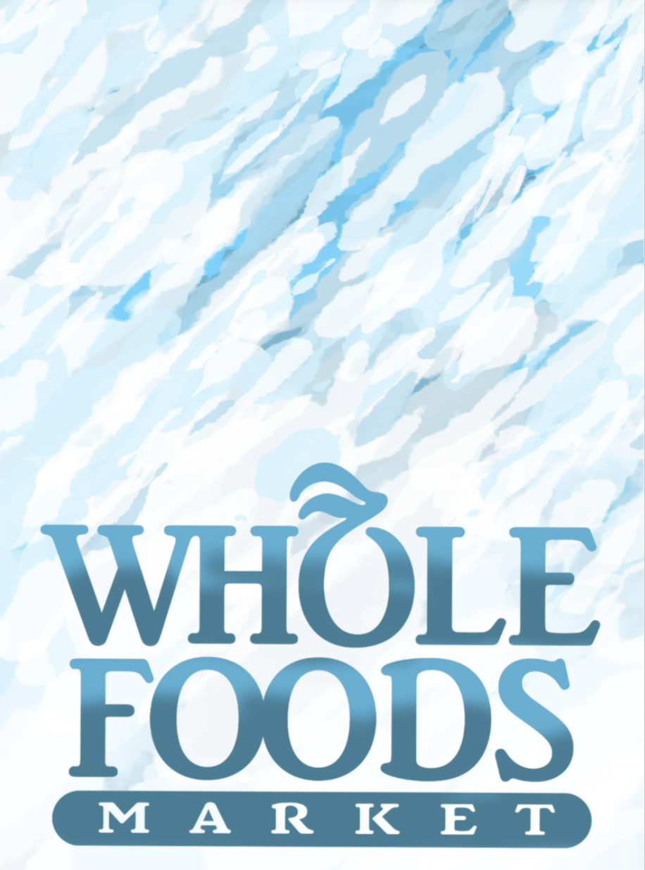
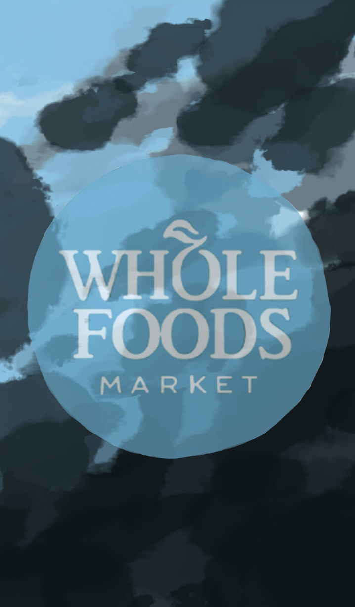
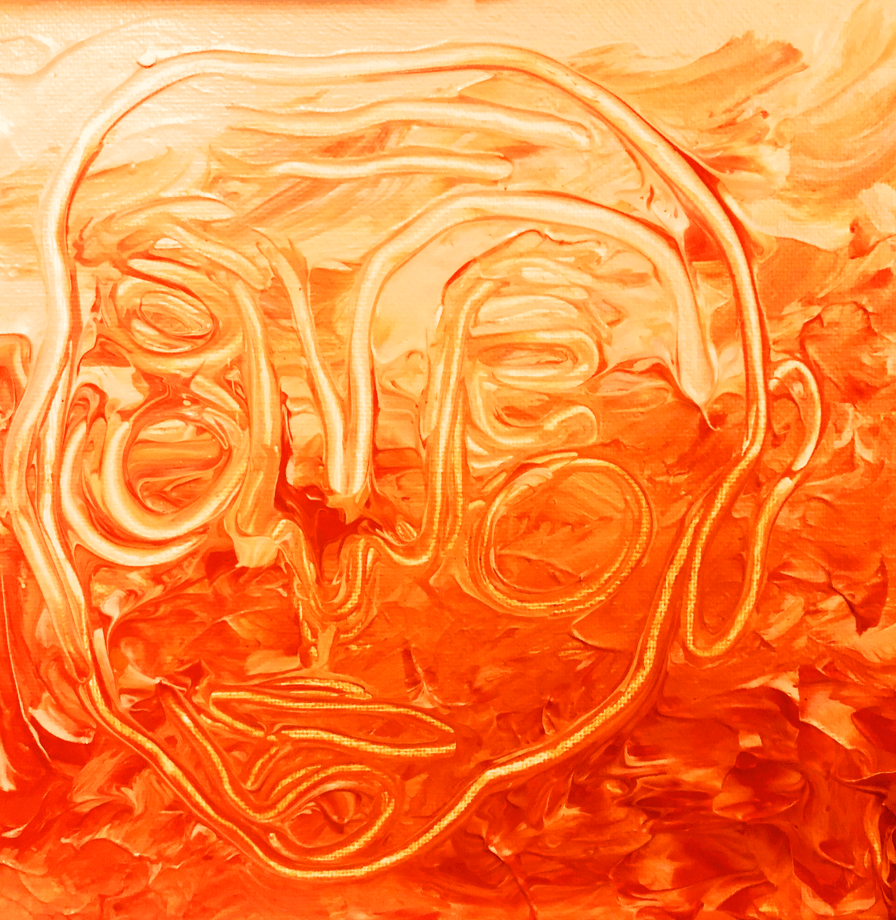
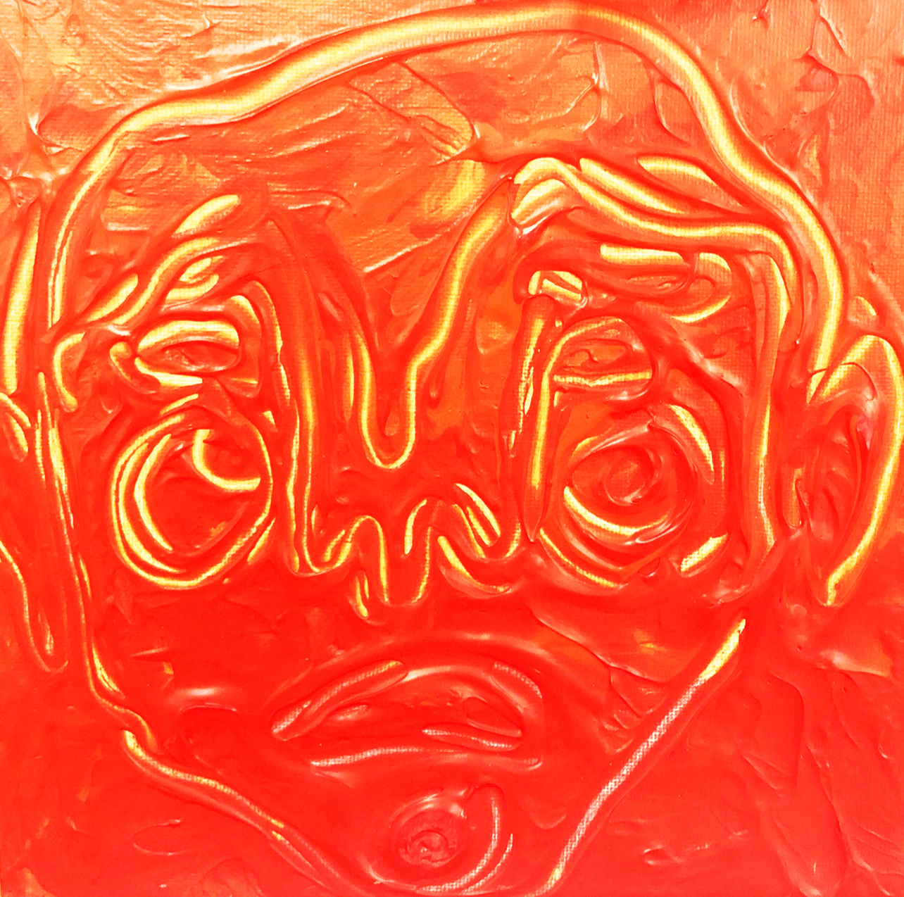
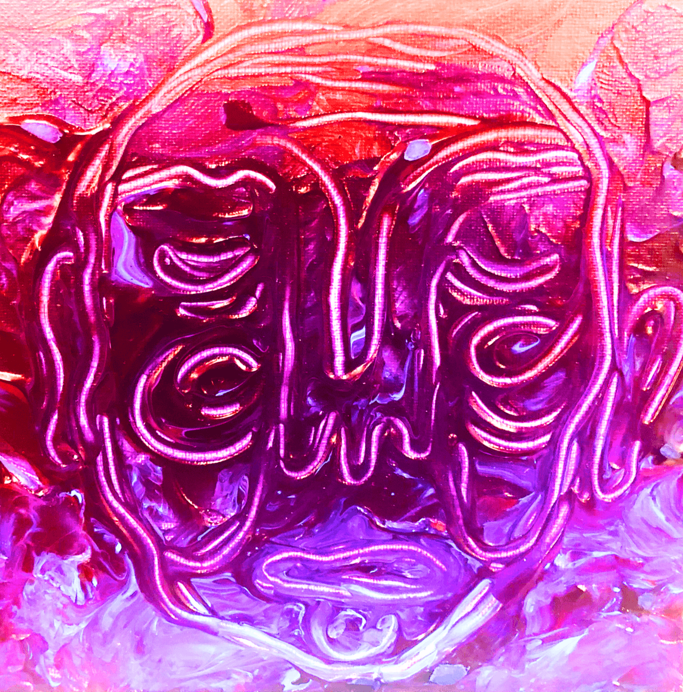
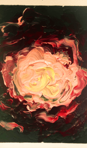
The photos pictures above are rough sketches of potential portraits I could create in monochrome with acrylic paint. This was my original idea for bridge five but it ended up falling through.

Final:

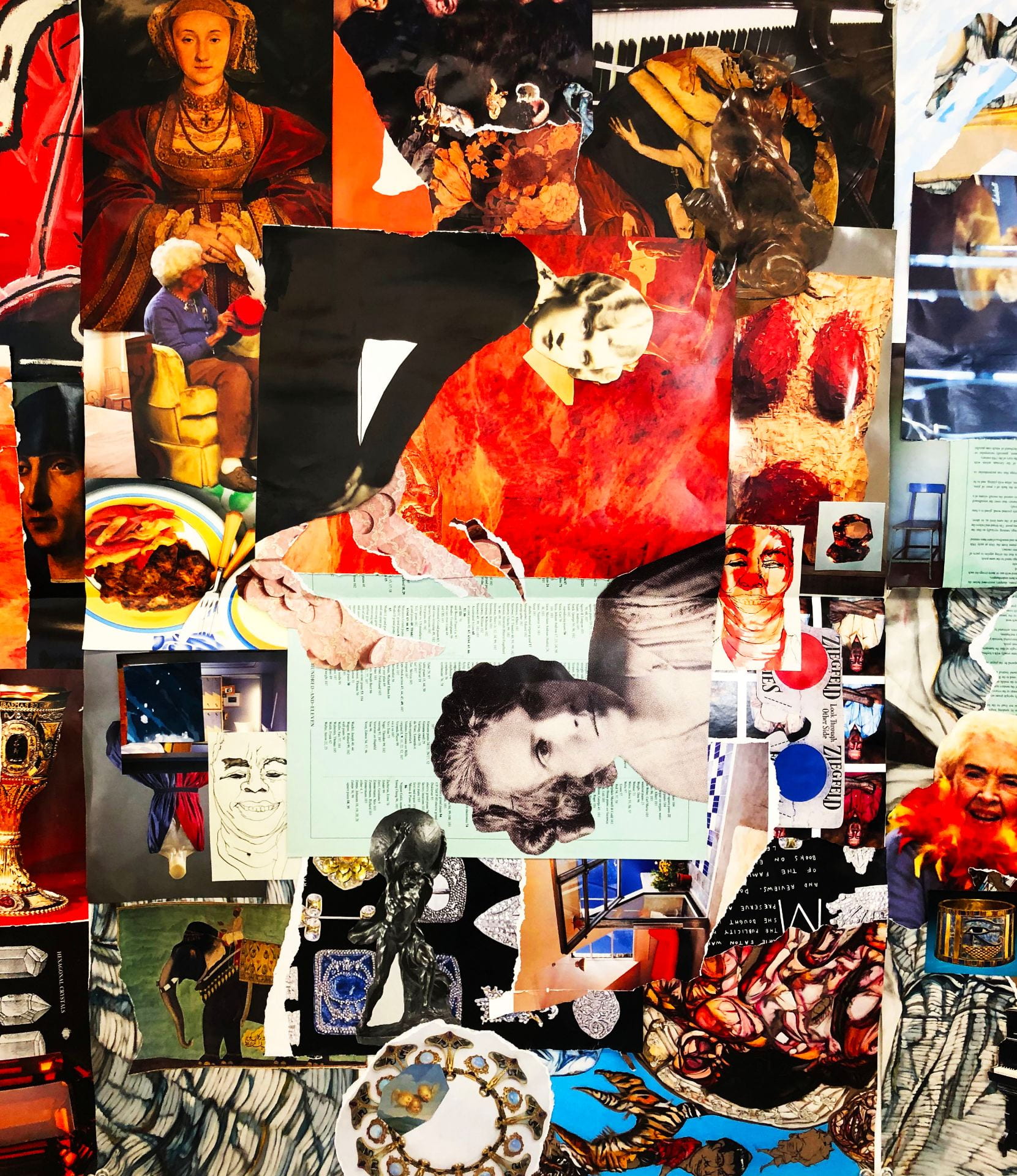
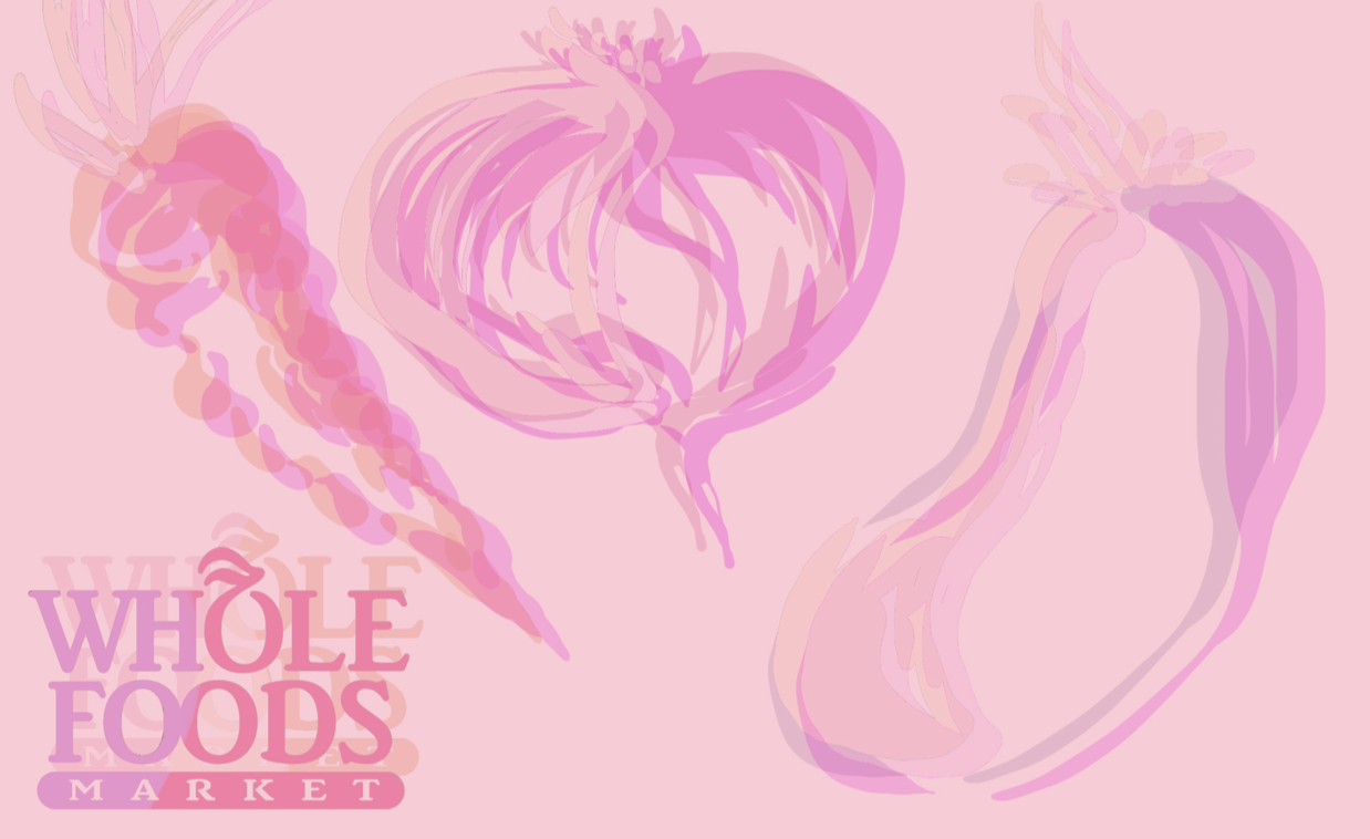
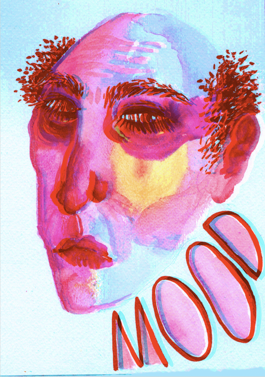
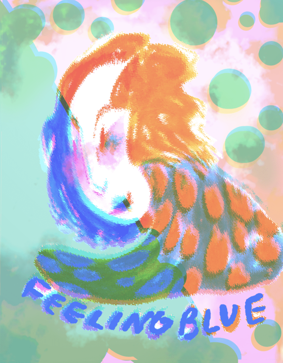
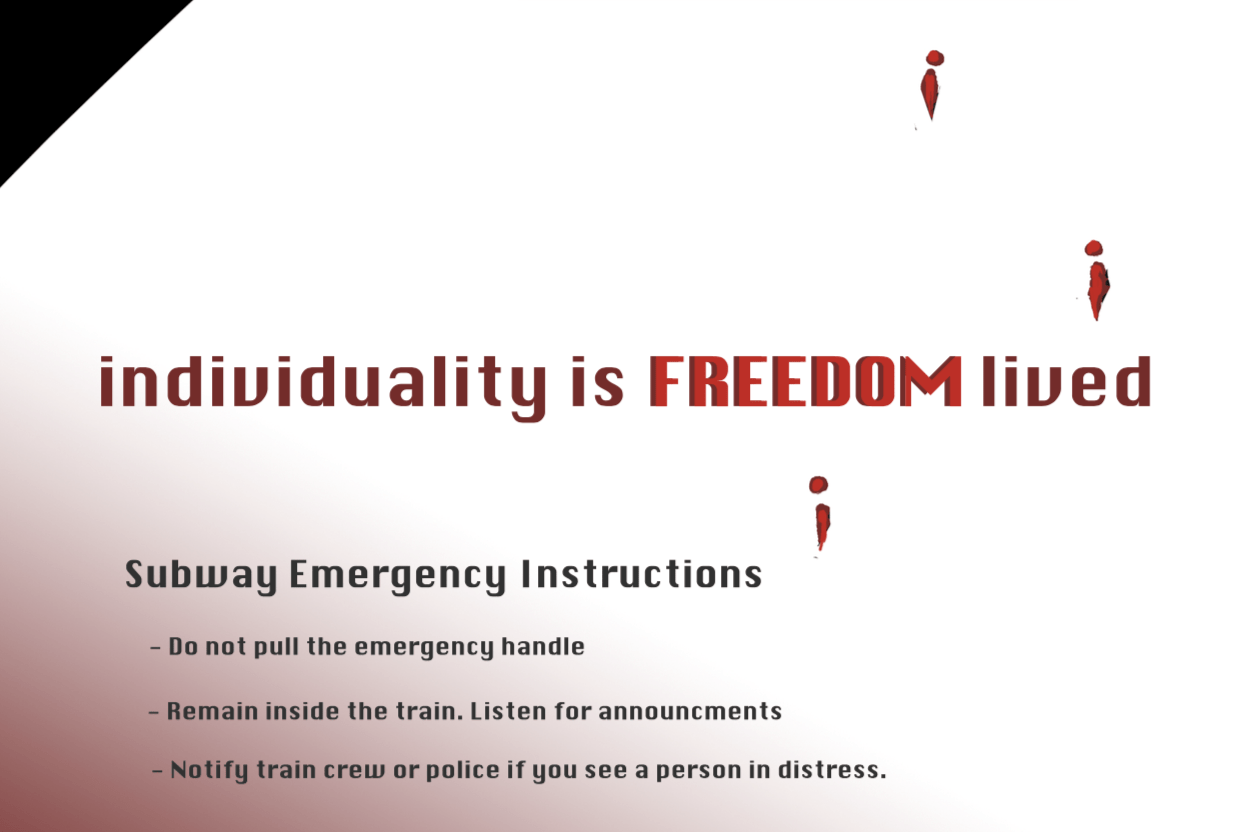
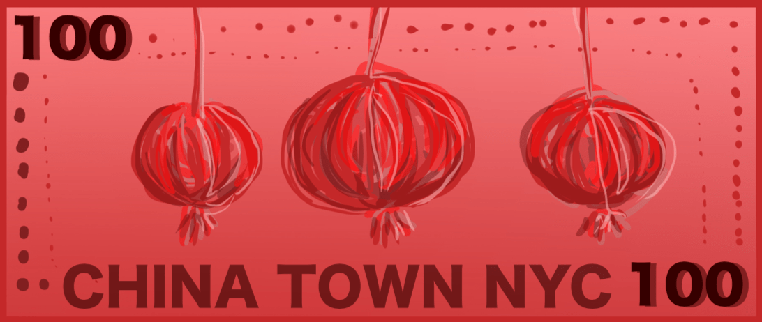
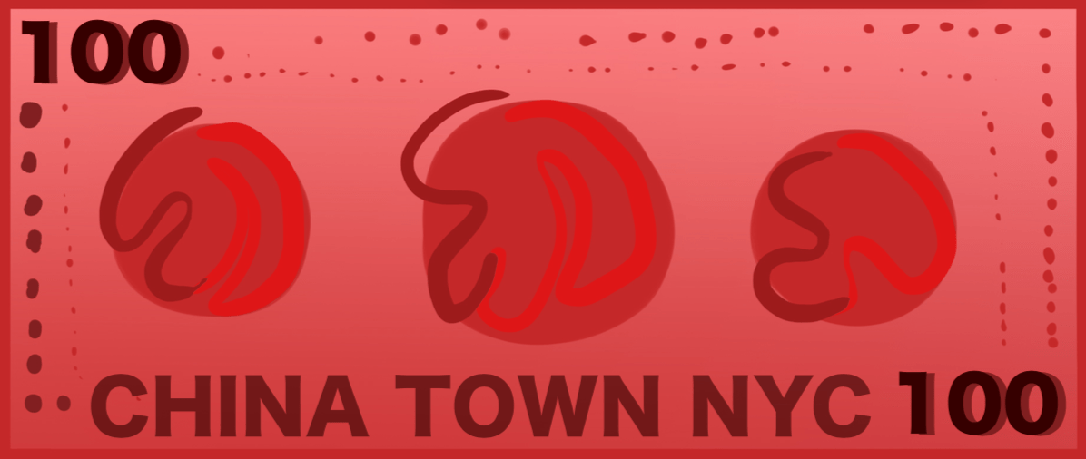
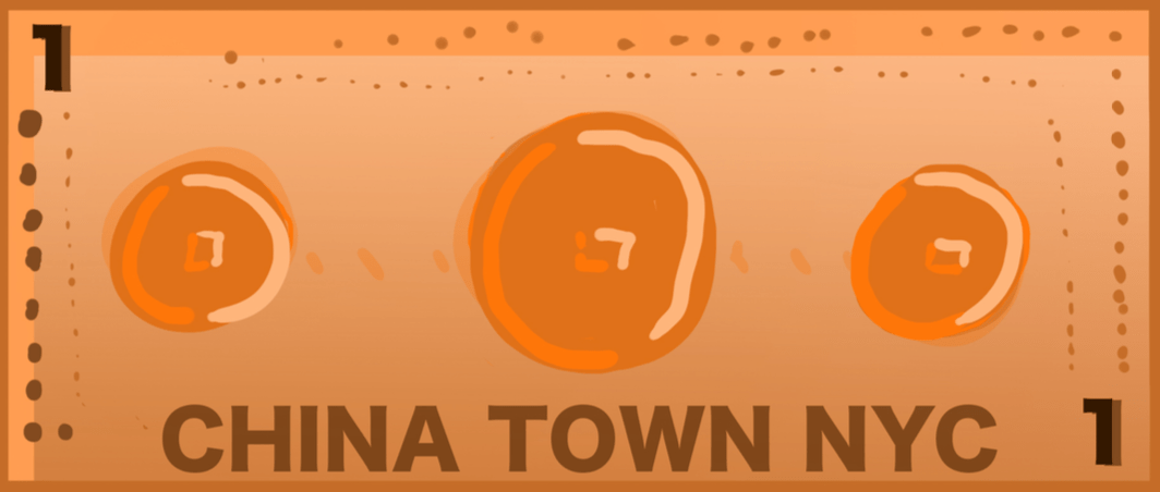
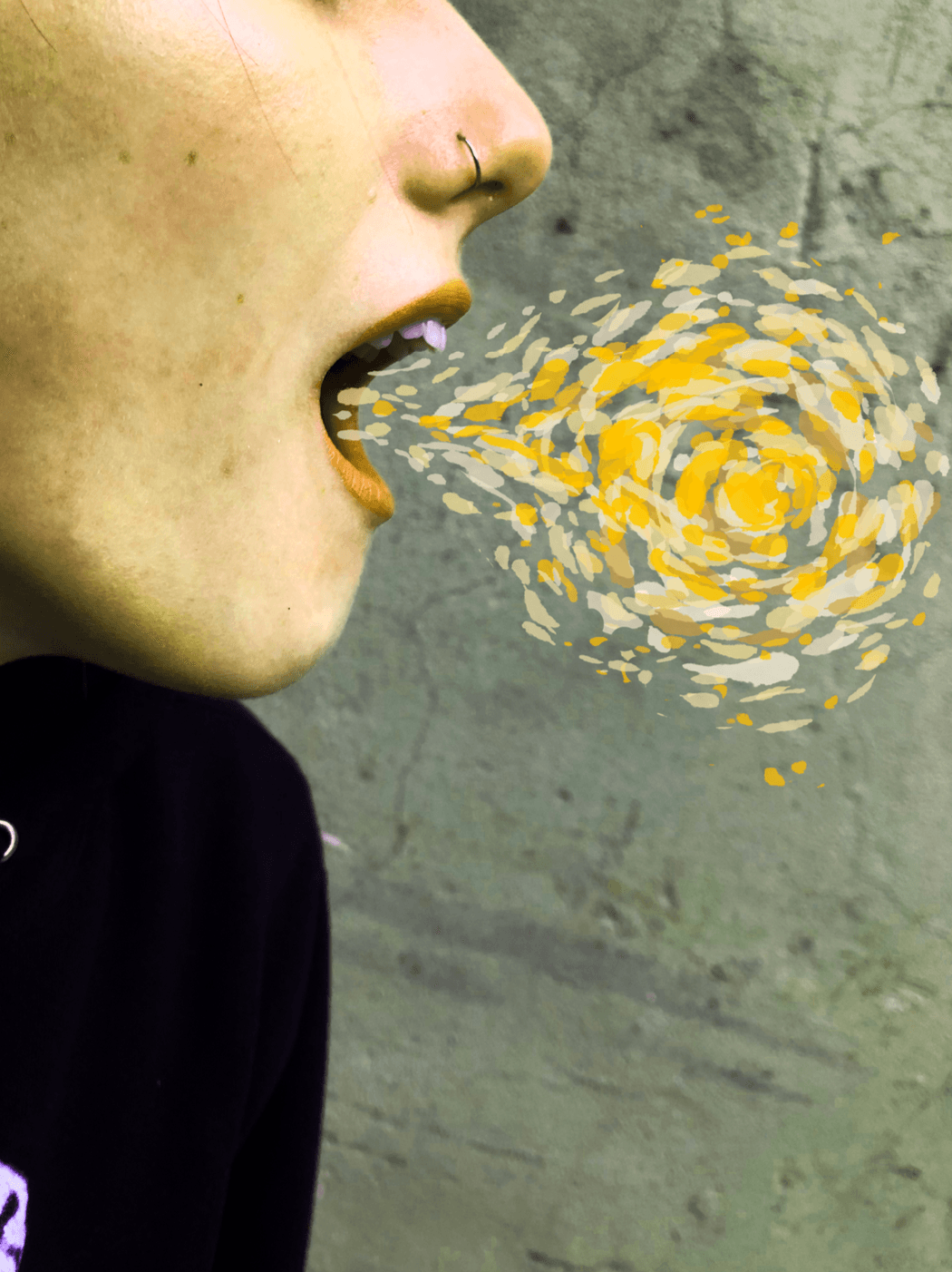
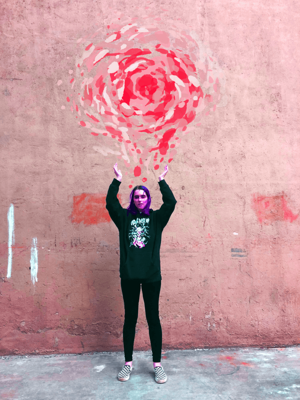
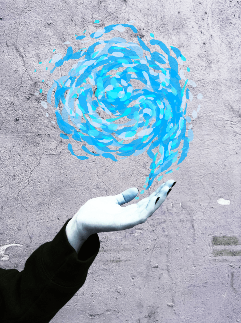
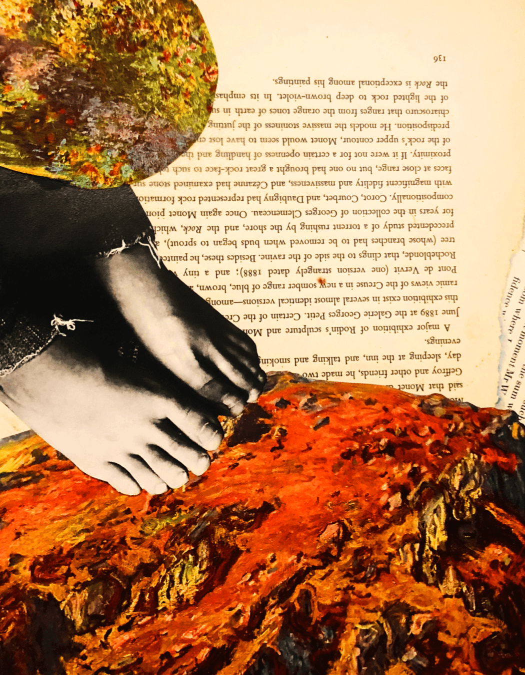
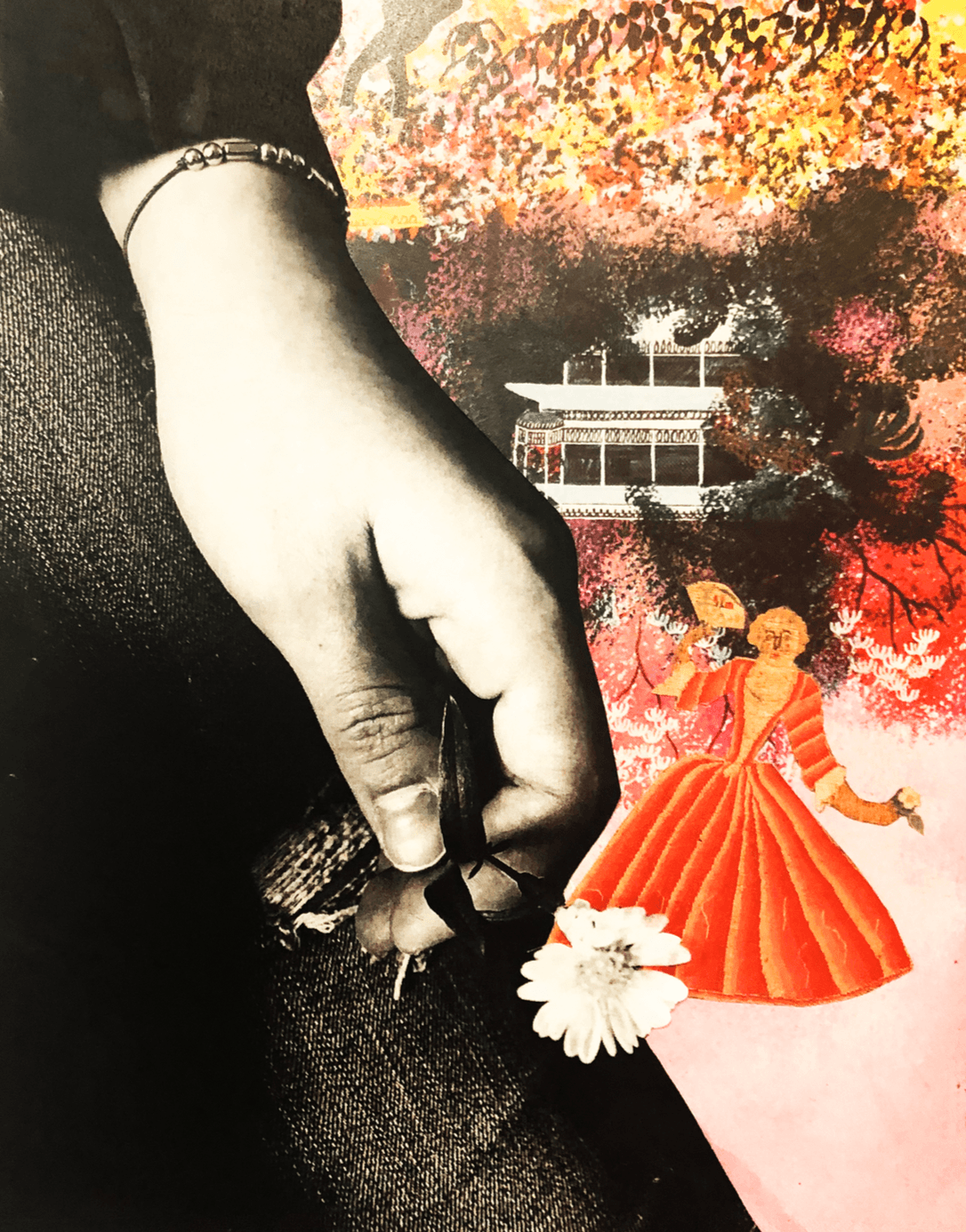
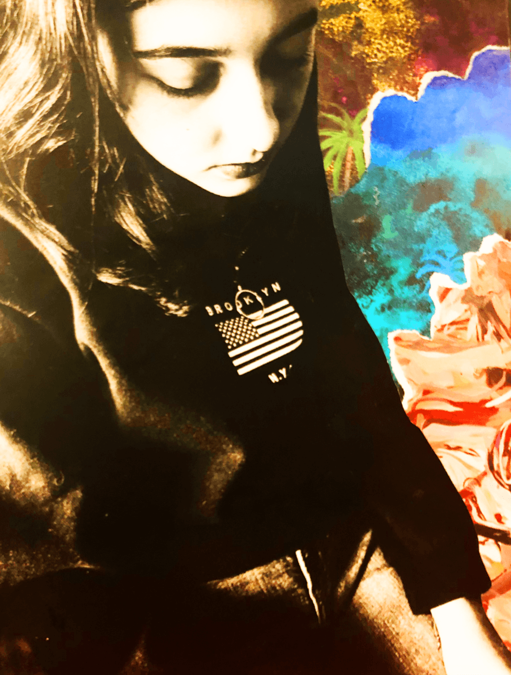
For this project I was very focused on the idea of color. I began leaning towards this subject before the project had even been assigned. Ever since our first seminar assignment of the semester, the color essay, I have steadily become more and more fascinated with the idea of color. In my final essay, I write that “the concept of color, which is easily old enough to predate all of our written histories, has always been utterly revolutionary. Color is an ever-changing constant, the epitome of a definite oxymoron. We have been surrounded by the same colors for tens of thousands of years, and yet we are constantly finding ways to repurpose them and shape them into something entirely bold and new.” A lot of my fascination stems from color association and how that was utilized by impressionist painters to create works that deeply connected to viewers. I think my final collage piece relates to my work over the course of the semester because it was definitely a new experience for me. I have been continuously challenging myself in this class to try new things and push myself out of my comfort zone, and I think with this project I really succeeded. I created a piece that was entirely collaged from found images and I had never collaged or worked large scale prior to this class. I think I am definitely more aware of the effect larger visual pieces can have on a viewer, and I loved getting the chance to fully explore a new medium. I would love to go on to create more pieces based around the idea of color and what it means to specific people, whether that be through paintings or sculpture. I think if I had more time to complete this project I would have created it at a larger scale, even if it would’ve been very difficult to move. Overall I think this is one of my favoirte projects of the year.

NYC Lecture: New York Comics & Picture-Story Symposium: Featuring Guy Lawley


New York Comics & Picture-Story Symposium: Featuring Guy Lawley

Guy Lawley on Comics, color and “Ben Day dots.”


  • Ben Day dots are colored dots commonly found in older comic books
    • INvented by 1879 by Benjamin Day
  • 1890’s-1980’s
    • Four color letterpress printing on newspaper
    • Rotary web perfecting press (1871)
  • Comics shift from newspaper to Comic Books
    • Originally printed on newspaper instead of better quality paper
    • Even the glossy papered comics of today are printed with dots
  • Roy Lichtenstein
    • NYU based artist uses ben day dots to create large scale comic paintings
    • Controversial artist due to the fact that he appears to steal content
    • Many artists go about trying to take the dots back from Lichtenstein for the comics
  • Four color printing
    • Cyan
    • Magenta
    • Yellow
    • Key
  • Color Separation
    • Creating images for the different color plates
    • There are two ways to separate color   
      • Photographic color separation
        • A full color image broken down into separate colors for printing
        • Used through the 1980’s for US comic color
      • Mechanical Color Separation
        • Extremely hands on method
        • Always begins with a color guide  
      • Three different color separation techniques
        • Ben Day Tints – “Platinum Age” Sundays
          • Ben Day Screen: Wooden Frame with clear celluloid and patterned with dots or lines as to avoid hand drawing each dot
          • This allowed for precisely controlled multiple applications of Ben Day dots

“They could never have created the industry that we have today if they kept Benday men only. They had to find faster ways of making the [colour] separations.”  – Sol Harrison

        • Craftint Multicolor – in comic book s from 1934
          • Takes color separation away from the metal plate and onto the drawing board
          • This method didn’t have as many options
            • “64 colors”
        • Acetate – Marvel 1954 DC 1956
          • Made through acetate sheets that were painted over to show where each color should be and then those are turned into printing plates and combined into one for mass printing.
          • 25% dots are colored dots on white paper
          • 50% dots are white dots on colored paper
  • Real Ben Day dots had phased out starting in the mid 1930’s
    • It became a generalized brand name like band-aid or kleenex

Studio Two – Bridge Two


inspiration: Starry Nigh by Van Gogh

For this bridge project, I chose to draw inspiration from and investigate Van Gogh’s Starry Night painting, currently exhibited at the Museum of Modern Art here in NYC. Painted in 1889, this incredibly popular masterpiece was done in oil on canvas and is approximately 29 x 36 inches. Starry Night was an attempt by Van Gogh to capture the early morning sunrise, and the colors and brushstrokes he used to do provided me with a surplus amount of motivation for my bridge project.

I think a very interesting part of this bridge assignment was the initial encouragement to step away from materials that were comfortable or easy to use. I tried to take this advice to the best of my ability, and I relied heavily on photography and digital painting for close to twenty of my pieces. I did get a bit carried away, but using new media was very excited and I felt that I wanted to continue my exploration. I think creating thirty works for this project allowed me to gradually get closer to revealing my message, both to my audience and to myself. I had wanted to explore color as a way to represent different realities, both internal and external, personal and universal. The large, loose brushstrokes utilized by Van Gogh made up swirls that represented his interpreted reality of stars. I want to further explore color association and artistic interpretation of the people and landscapes in the world around us.


Studio Two – Bridge One

Color Wheel

Color Walk

yellow spray paint art on the mailbox

golden yellow rooftops

cigarette stub

yellow light red light walk

girl in the red baseball cap smiled back at me

red brick red cheeks red nose red lips

one tail light out on a green kia

third avenue and fifteen street

tiny old man in neon green pants

shades of green, irish pub, looks warm inside

green backpack, hoodie, sneakers

green leash black dog

smells like pine trees, looks like Wall Street

black iron railing, grey stone

grey sky, grey earth, grey everything

too much grey

two brown dogs

five brunettes all in a row

brown boots orange socks

M14A crosstown abington square

orange hand, don’t cross

white poodle with a better haircut than me

white marble

erected by the people of the city of new york

white fleece jacket, he looks very warm

i am very cold

white lamps, it’s too early to light them yet

model posing with a white pomeranian

it isn’t cooperating with the photographer

salt in the grey stone

light in the grey clouds


fluorescent light reflecting on stainless steel


yellow light-up buttons in the elevator


room number, pastel yellow paint


home


300 Hundred Word Explanation 

The idea of color being directly attached to emotion is completely fascinating to me. Different color combinations can change the emotional aspect and meaning of a work of art, and because of this color is something I want to be more conscious of in my work. For this bridge project I created three 14 x 17 short comics that use different color combinations to describe varied complex emotional states. All of my pieces are centered around different shades of blue combined with black, and how the different types of blue can represent different emotional states.

For the first comic “page” I created, I focused around loss and abandonment. Using a

very dark green blue, coupled with black I sketched and colored three panels. In the first panel, a girl sits by herself by a window. Then the visual becomes a blurry photograph showing two figures, one big and one little, next to a vase of some kind. The final panel shows a close up of the image in the photo of the girl when she was younger. She is smiling and holding hands with a much older man, presumably her father. This comic is mainly painted in watercolor and looks almost washed out, in order to represent memory and the kind of unclear, murkiness of someone who is starting to forget.

In the second comic, I chose teal and black to represent isolation. The first panel shows the profile of a girl standing by herself and looking fairly upset by something, followed by two faceless figures that are laughing and smiling. The girl in the first panel is draw in a lot of detail, while the two girls in the second panel do not have very clear features. In the final panel, the girl from the first panel stands in the middle of an incredibly crowded room, but there is a black circle separating her from the many faceless figures standing around her. The text featured in this comic reads, “ Sometimes, even in a room full of people, I still feel completely alone.” Each sentence used in these short comics is supposed to help bring the meaning of the emotive aspects into a clearer light.

In the final comic, the first panel shows a couple embracing. They are drawn in full color with inked detail. The second panel is a close up of one of the people, smiling, while the other holds her cheek. However, this differs from the first panel because she is suddenly blue instead of flesh toned. The background is much darker and more foreboding as well. In the final panel, the couple seem to be far apart and the girl is contemplating, the sentence for this comic reads, “I know I have to let you go, even if it hurts, because that’s what’s best for me.”


Edited Comic Pages (Adjusted Hue and Saturation)

Plastics – Week Two

     I use this CeraVe lotion every morning. My skin is incredibly dry, especially during winter, so sometimes I’ll end up using it twice a day. This particular brand of lotion doesn’t irritate my skin or leave behind an oily or greasy sheen, and it completely moisturizes my skin. My need for facial lotion is on par with my need for chapstick, I hate the feeling of dry skin and do everything I can to avoid it. I alternate between brands of lotion often, depending on recommendations from my friends and family. Although this is the first time I’ve used a CeraVe product, the bottle seems to contain a lot of lotion and isn’t a quarter of the way empty yet. I have had this bottle for maybe three weeks at this point. After using the bottle I plan on recycling it due to it’s plastic components.
     When lifted, the bottle reveals a number four on its underside. Number four plastic is also called low-density polyethylene. This kind of plastic is used for the creation of  containers, dispensing bottles, wash bottles, tubing, plastic bags for computer components, and various molded laboratory equipment. Low-density polyethylene is most commonly found in plastic bags. Although I assumed this plastic is recyclable, further research revealed low-density polyethylene isn’t accepted in curbside or other recycling programs. As far as packaging goes, I think the most environmentally friendly alternative to number four plastic is glass. Glass containers prevent leakage and are very sturdy, while at the same time are environmentally friendly and easily recyclable.  During my research of environmentally friendly alternatives to lotion packaging, I found out that not all lotions are environmentally friendly themselves. It’s important to be conscious of the substances you are washing down the drain and into the sewer systems, and I have been neglecting that aspect of my purchase decisions. However, Cocokind is a brand of facial moisturizer with no more than five natural ingredients and mostly glass packaging. I will continue to investigate healthier lotion brands.

Plastics – Week One

     Chapstick is something that I use, a lot. I have a chapstick for pretty much every jacket pocket and every backpack compartment. My lips get chapped very easily and having something to keep them healthy and sooth that pain is important to me. I apply chapstick at least very hour, sometimes more frequently than that. Each tube lasts between two to four months, because I alternate between so many tubes it takes a while to get through each of them completely. I also tend to lose them due to how small they are. After I finish using a chapstick I’ll toss it into the recycling bin, even though I’m not sure if the type of plastic it’s made of can be recycled.
     Despite the lack of any numbers on the tubes of chapstick that could signify the kind of plastic they are made from, after some research online it became apparent that they are most likely made from polypropylene. Also known as plastic number five, it is often used in the creation of  yogurt cups, medicine bottles, ketchup bottles, and kitchenware. Polypropylene is a microwave-safe plastic because it is heat resistant and won’t warp in the microwave. This plastic is accepted by most curbside recycling programs. The most commonplace environmentally friendly alternative to plastic tubes is actually cardboard, however there are also chapstick container made out of wood. As someone who has always mainly focused on the cruelty-free aspect of my purchases, I never really noticed how much more there was to be aware of. After some research I came across Juniperseed Mercantile, a chapstick brand that is vegan, cruelty free, and environmentally friendly. The chapstick sold by Juniperseed Mercantile is three times the size of a normal tube and even the shipping materials are plastic free. I think once I finish and recycle my current chapsticks, I’ll be turning to greener alternatives.

George Nelson Reading & Bridge Three Project Review

I think the interaction between my studio and seminar classes has definitely aided me in understanding and enjoying the bridge three project. This assignment is something I can easily relate back to bridge two in the sense that the art being studied is fairly untraditional and relies on more than just the visual aspect of the work. The meditative process of creating a piece is what changes it from art to process art, and the end result is relatively unimportant. I love that the final project for the third bridge is so open to interpretation because I feel like I’ll be able to deeply enjoy whatever I create. Getting to pick an idea meaningful to me has inspired me to choose a process that is meaningful to me as well. I’m very excited to see the end result of my piece paired with the work of my entire group!

popcorn reflection


I think today’s class activity was incredibly interesting. I loved the idea of deconstructing an object and using it to make something entirely different, but I think my favorite part of the lesson was getting to see everyones different interpretations of the assignment hanging up on the wall. The visual representation of the stark contrast between all of our ideas was really cool. I knew everyone thought differently beforehand but actually getting to see all of the varied paths that led to such unique photos was stunning. I think this assignment will help me remember to look at things through a new angle and to  try to think of all the different possibilities for success.