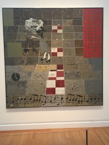
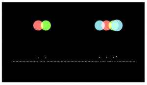
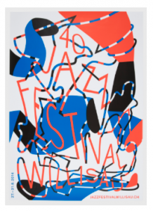
After a wonderful day at the Cooper Hewitt and the Met, I am inspired to make a print design for my final project. My inspiration was first ignited at the Cooper Hewitt at “The Senses: Design Beyond Vision”. There were beautiful poster and album cover art for Jazz. The mission behind the design was to put Jazz music- something so abstract and intangible- into color and design. Another piece was this electronic piano linked to a big screen. As you play each note, its coordinated color bounces on the screen. To see the colors of the notes you play is exciting and rewarding for the senses in a brand new way. I imagine that is part of the inspiration not only for the entire exhibit but also for the piano; to immerse yourself in the senses and unite them to create something even stronger, to see with your ears.
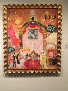
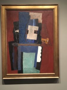
At the Met, I was drawn to paintings at the contemporary and modern art exhibit of the 20th century. The use oil paints, cubism, bright colors, and figures dancing with movement put into a more concrete sense of the marriage between music, color, and design. Pablo Picasso’s Guitar and Clarinet on a Mantelpiece (1915) visually excretes Spanish music from his tertiary oil colors and abstract shapes. Or Florine Stettheimer’s The Cathedrals of Broadway (1929) expounds theatrical songs and dance with bright colors, prints, and heavy movements.
For my Print Design I want to use the song ” Dont You Worry Bout a Thing” by Stevie Wonder to put into shapes and color to make a print(s) that communicates the song visually. Also to comfort me because I am freaking about finishing college!
From the Cooper Hewitt:
From the Met: