HER WORLD by Gertrude Von Gerhard [Nicholas V. Elbakidze, 2018] Video:
URL to video: https://youtu.be/EwmP2UFMUsU
“HER WORLD” by Gertrude Von Gerhard [My Alter Ego]:
When we were first assigned this project I wanted to create a work which would truly reflect my alter ego and her struggles. All of my work has been greatly influenced by that of both ready-made and conceptual artists such as Joseph Kosuth, Ai Weiwei, Ian Burn, and Eleanor Antian, to name a few. Therefore I knew that I wanted to create a project which would be heavily influenced by those who influenced me on my journey as a young artist and designer.
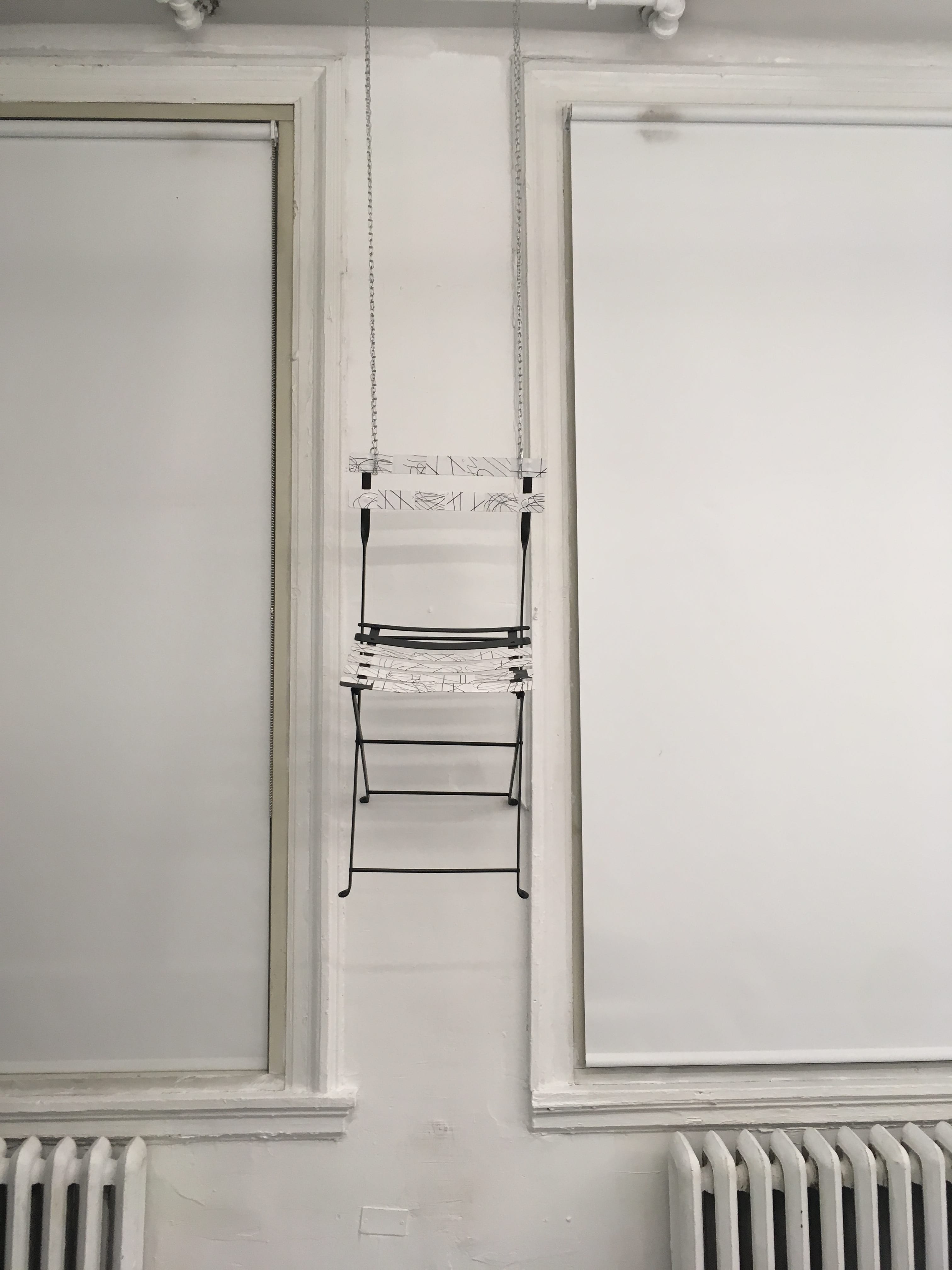
I immediately came into this assignment with the idea of having a chair serving as a sculptural object which would then be altered to represent my alter ego. I was inspired to use a chair after seeing a work by the Australian artist Trudy Moore, Chair 3, in which a chair is covered by a large sheet of drawing paper and is then robbed with charcoal to create an outline image of the chair; I was attracted to the final black and white form produced.
Trudy Moore Chair 3 (2011), charcoal on paper.
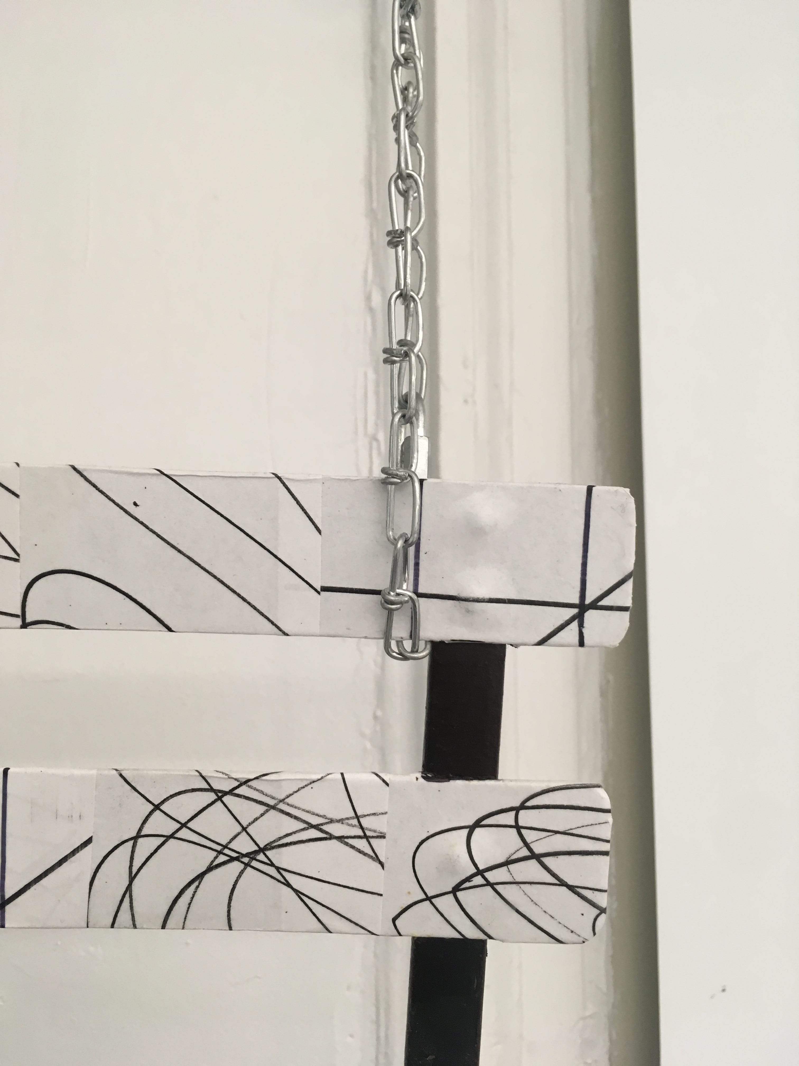
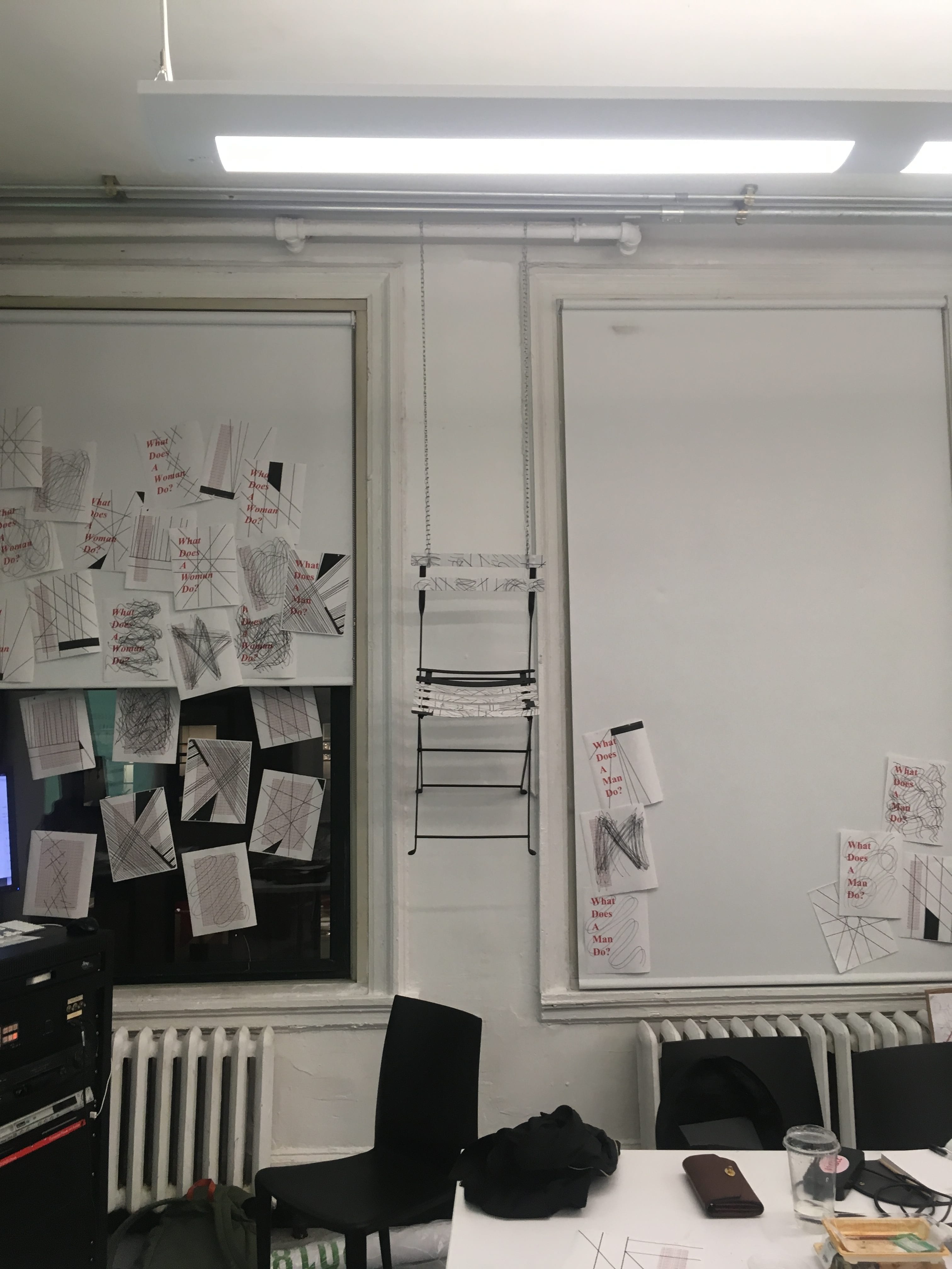
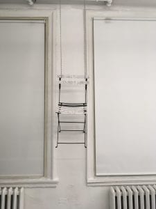
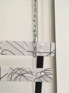
By having the 100 drawings decoupaged onto a chair the sculptural element would be revealed and expressed. I knew that I wanted the chair to be elevated above the viewing audience with a stainless steel chain as a way of giving depth to the work. I was inspired to hang the work after viewing both Lobster by Jeff Koons and In Advance of a Broken Arm by Marcel Duchamp, as both artists made the creative decision to hang everyday utilitarian objects in order to make the viewer question what society values. “The humble everyday chair, an object of pure utilitarian function has been elevated and rendered useless in the name of art and aesthetics. Personally, the chair signifies what I haven’t accomplished and never will; this chair once had a very real function, but now having been degraded it has none…” -Gertrude Von Gerhard.
Jeff Koons Lobster (2007), coated steel chain, polychromed aluminum, steel chain.
Marcel Duchamp In Advance of a Broken Arm (1915), wood and galvanized-iron snow shovel.
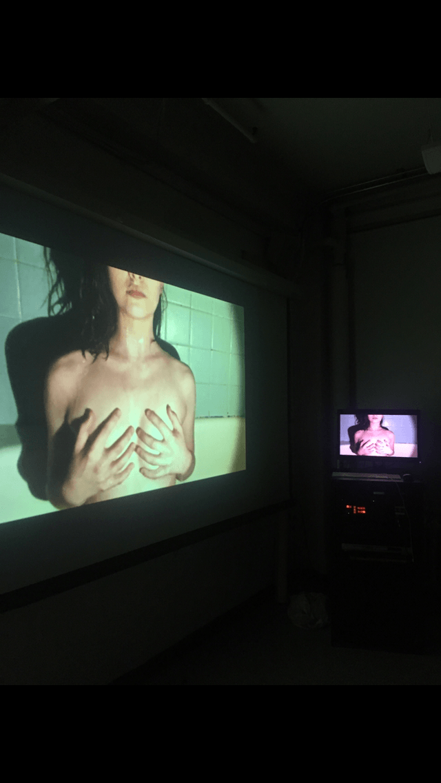
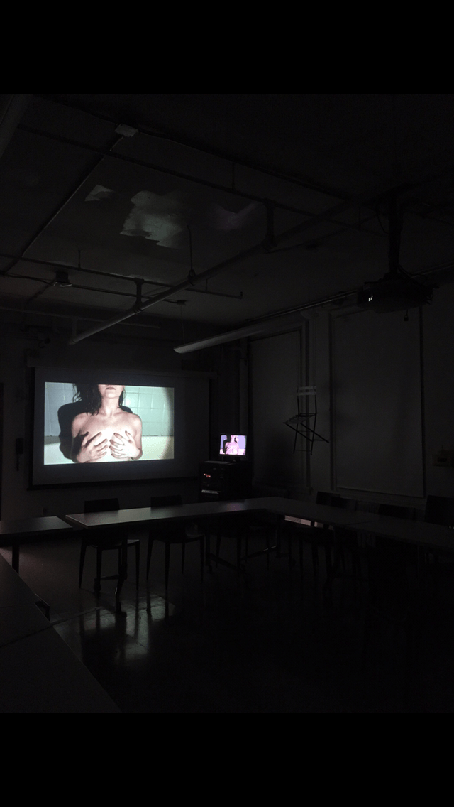
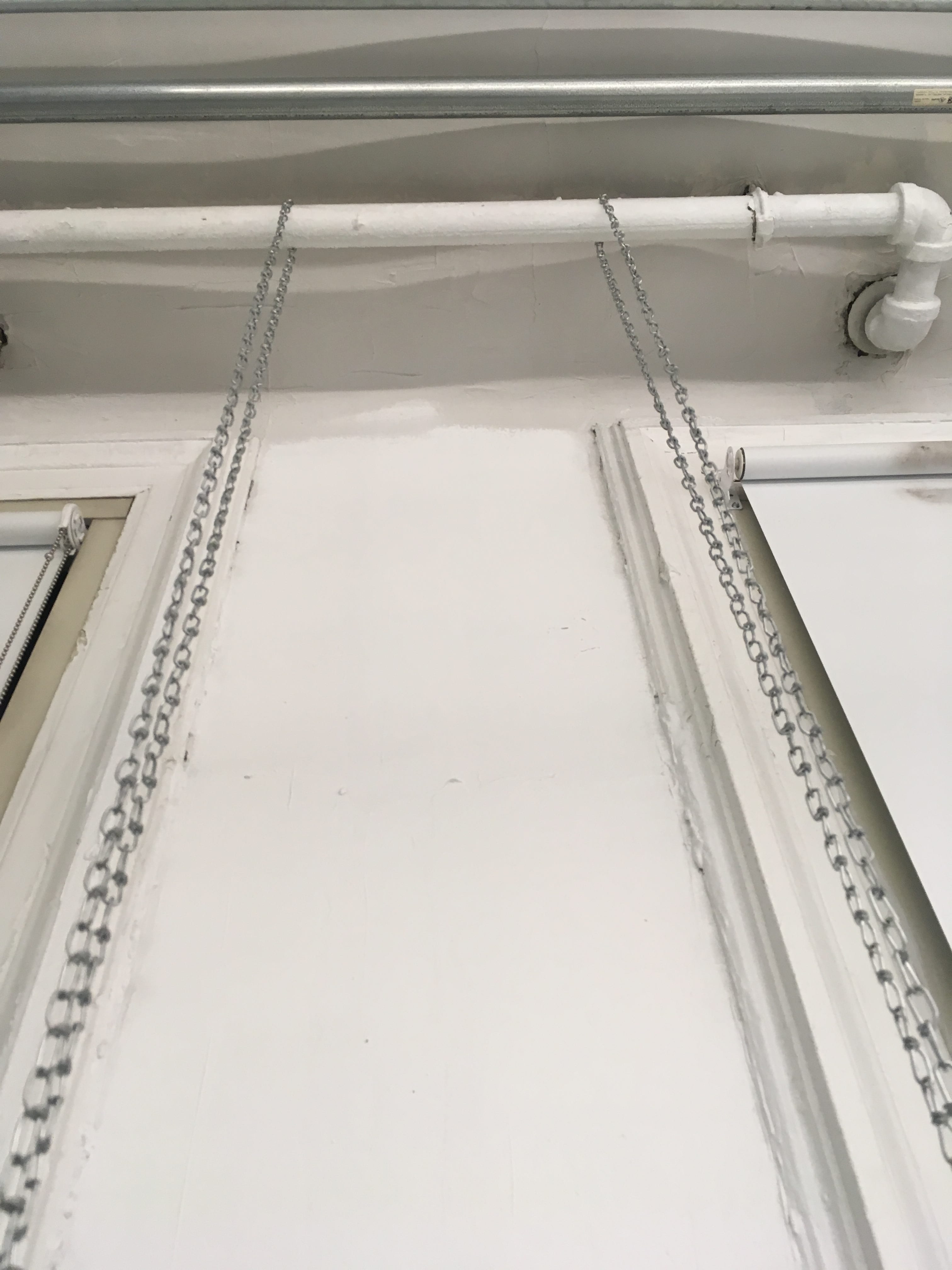
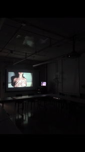
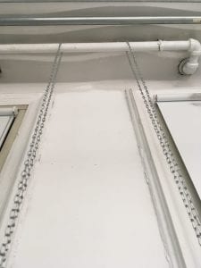
After looking at the interior architecture of our classroom I found that the most suitable area for a hanging work would be between the two windows right next to the computer and projector as this area has a medium sized pipe which could easily hold the chair above the ground. After determining what the chair would look like and where it would be displayed I set out to purchase a chair at a low cost. Having purchased the chair I immediately began to hand paint the chair black and the next day I was cutting, placing and decoupaging as soon as I entered the classroom. Once the chair was complete I went out and purchased a 14-foot long stainless steel chain which would be cut into two 7 foot halves and used to hang the chair from the pipe. I made the decision to use stainless steel chain as opposed to a plastic color wrapped steel chain because I wanted to keep a clean and contemporary. Having completed the chair and its chain I looked into ways which I could add one more element to this project so I set forth to create a projection video work which would be on view right next to the chair. Recently, I have been wanting to work with experimental dance choreography with video documentation. My video was greatly influenced by the choreographer Merce Cunningham and dance collective Collective Elite.
Merce Cunningham Rainforest (1968), decor by Andy Warhol.
Collective Elite RUIN (2016), a dance film.
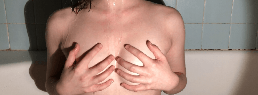
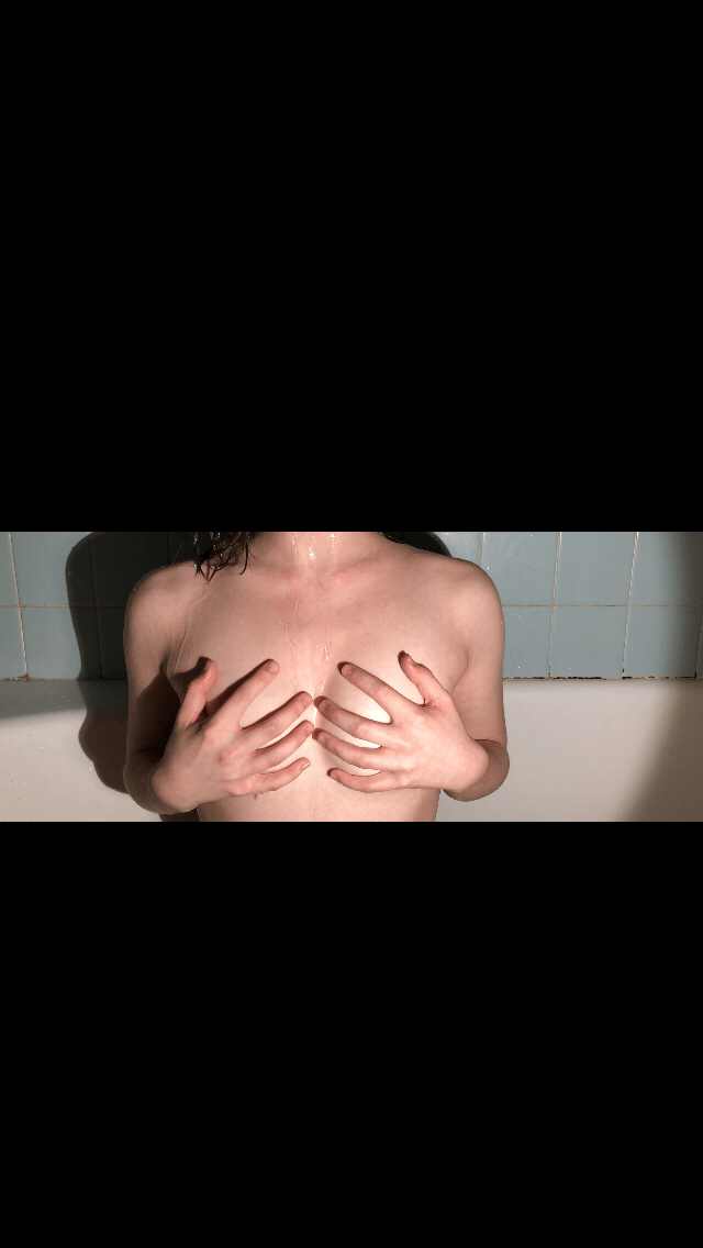
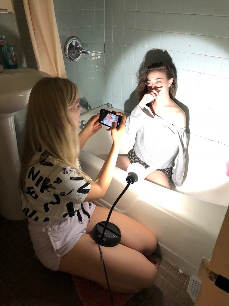
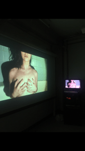
I wanted the video to be short around (20-30 seconds) and play on a constraint recreate, yet still, maintain a provocative atmosphere and nature. By having my model sit inside of a bathtub nude she is both visually and emotionally exposed to the viewer. She breathes heavily while being engulfed by water. Her actions give life to the chair while it watches over her. “My work symbolizes the lack of recognition I’ve experienced all my life. The woman in the bathtub is a physical and visual manifestation of myself depicted through a much younger female model. She sits waiting for the warm comfort and embrace of appreciation for all she has done, but she is welcomed by the bitter cold wetness of failure. She doesn’t fight this uninvited visitor, as I do now, she allows it to engulf her; taking over her self-worth and motivation to create” -Gertrude Von Gerhard.
HER WORLD an immersive experience by Gertrude Von Gerhard:
My self-made alter ego: Gertrude Von Gerhard
HER WORLD an immersive experience
by Gertrude Von Gerhard on view now.
The Media Colliding
Artist Gertrude Von Gerhard gives us a personal glimpse into HER WORLD.
What HER WORLD Can Teach Us About Our World
Gertrude Von Gerhard talks about motives and actions.
Gertrude Von Gerhard, daughter of Brock and Patricia Gerhard, was born and raised in east Brooklyn. Although her parents spent most of their life in Germany, Gertrude’s only knows America as her land. Her father was a woodworking carpenter and her mother hand embroidered pillowcases to gain a much needed extra income. The Gerhards always struggled financially but luckily Gertrude was able to attend The Pratt Institute on scholarship but dropped out in 1977 due to creative differences with her professors. After Gertrude left her education behind her, she began working at convenience stores while she worked vigorously at beginning her career as an installation artist. Since her artistic comeback in 2016, she has been working on this most recent and experimental show, HER WORLD.
HER WORLD by Gertrude Von Gerhard Final Photos:

HER WORLD by Gertrude Von Gerhard Curation Photos:
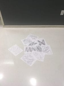
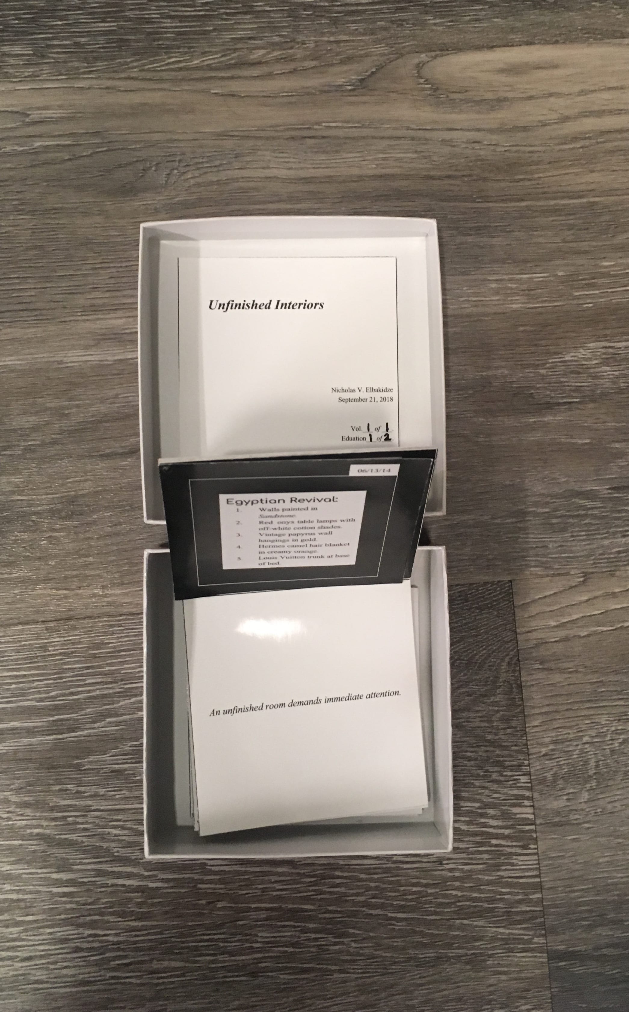
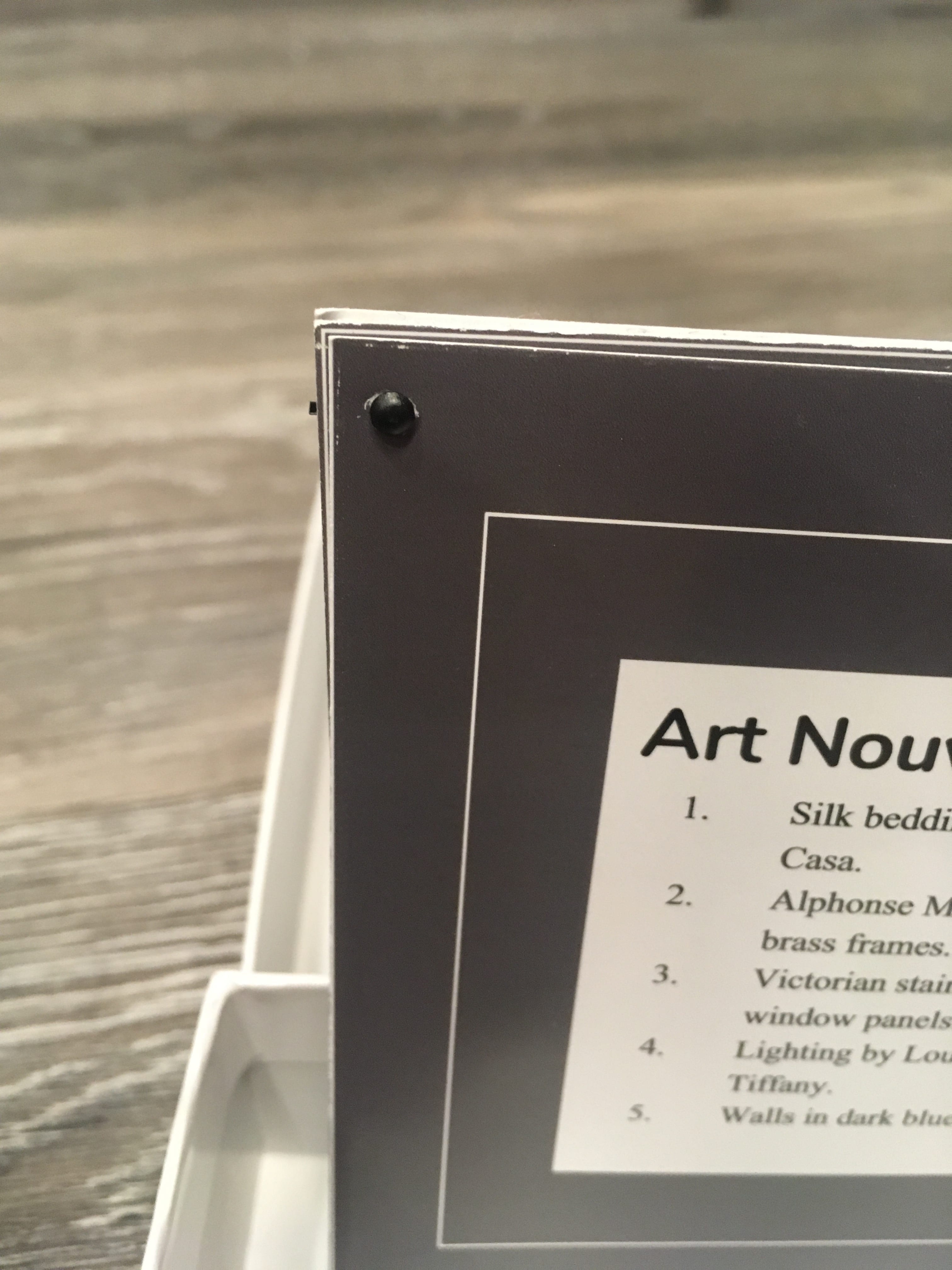
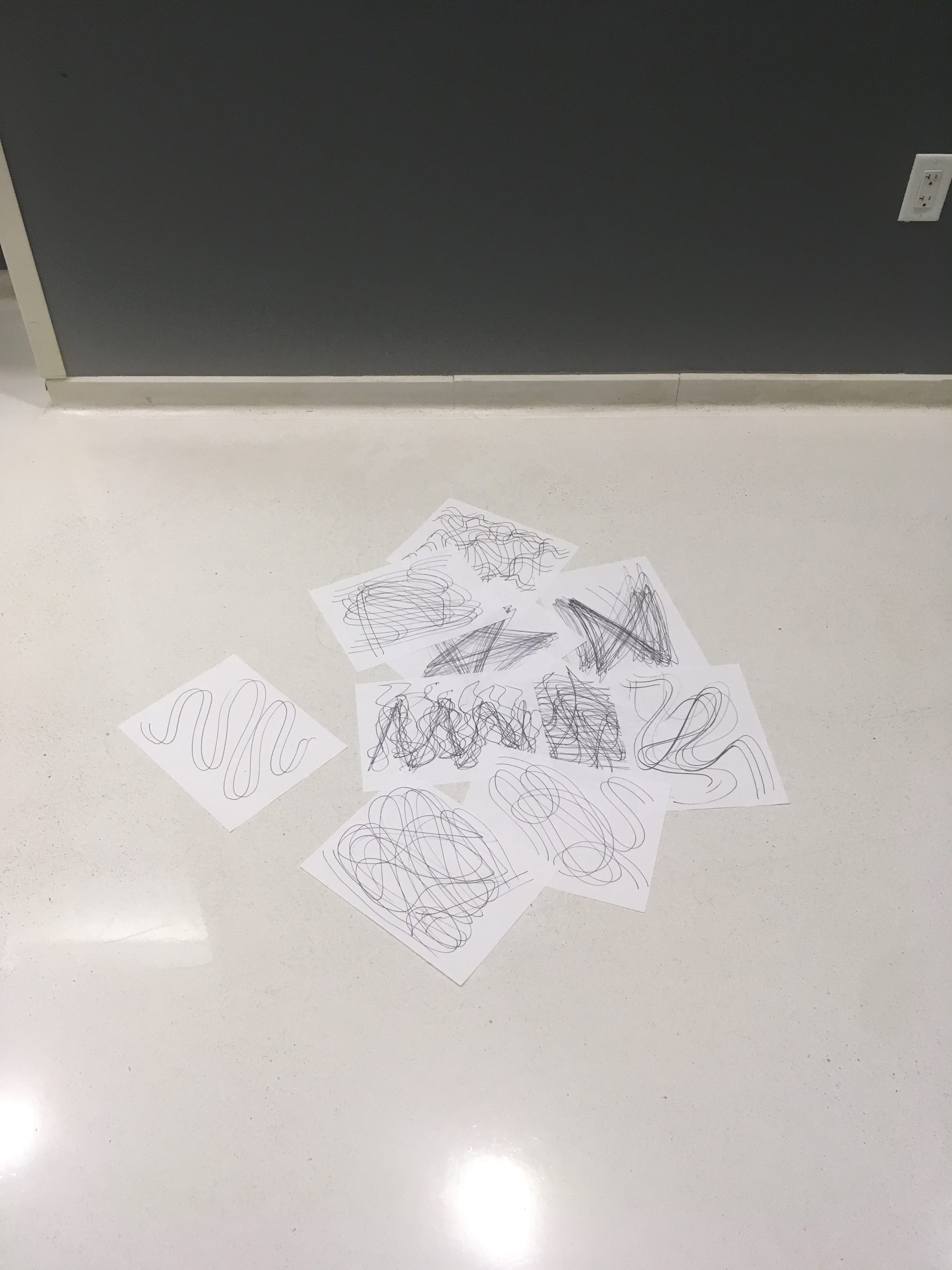
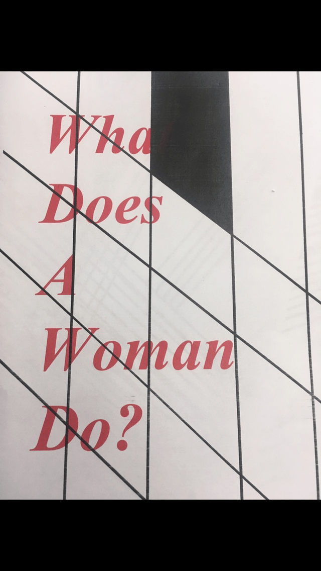
By curating my partner’s drawings I was given to opportunity to create a new design formation which I could not have done before with my drawings as mine had holes punched into them allowing them to be hung from a pipe on the ceiling. I found that my partner’s drawings looked childish in design (not application or skill) so I arranged them as if they were the remnants of a child’s drawing frenzy. By placing the drawings in a seemly random formation I created the look of randomness, just like how a child is random in his/ her uneducated piling of discarded papers. I was inspired by the work of Felix Gonzalez-Torres and his 1990 work “Untitled” (Death by Gun) at which he neatly placed a stack of papers in a room and allowed his audience to take a paper if they so chose from the stack. I wanted to create a kind of tension within my newly curated work, making the viewing audience want to intervene and organizing the disorganized mess of papers, like a parent of child cleaning home. I see this being created into a work of the same concept but rather of being made of fragile paper being redesigned of brass or bronze that the tension within the work could not be edited or changed and remained still.
HER WORLD by Gertrude Von Gerhard [Nicholas V. Elbakidze, 2018] Process Photos:

This is a behind the scenes look at the video (I had some trouble finding it). I was the one who took the photo so obviously I can not be seen. While the video was being recorded I was in the bathtub with a large pitcher of water slowly pouring it over the models head.
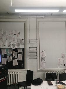

This photo shows our original idea of the two windows which the chair was elevated between as a kind of two-layer board to post messages on. This idea was realized while working on this project, however, it was not used in our final presentation as it did not quite fit the style of the work.
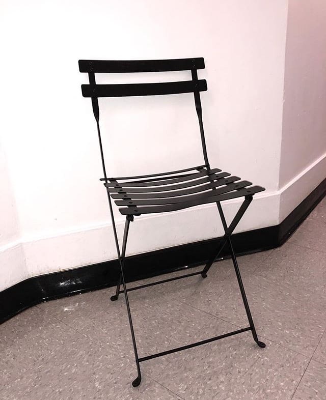
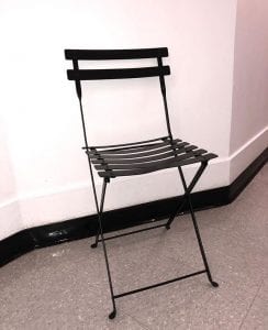
The chair before being painted black.
The chair being painted black.
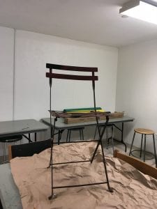
The chair before being decoupaged after being painted black.
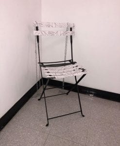
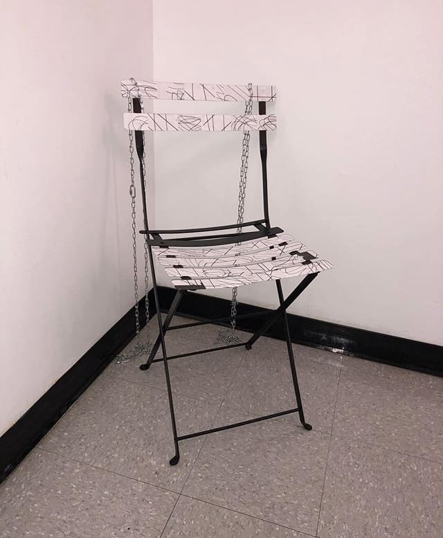
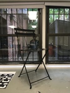
The chair after being decoupaged.