PART 1:
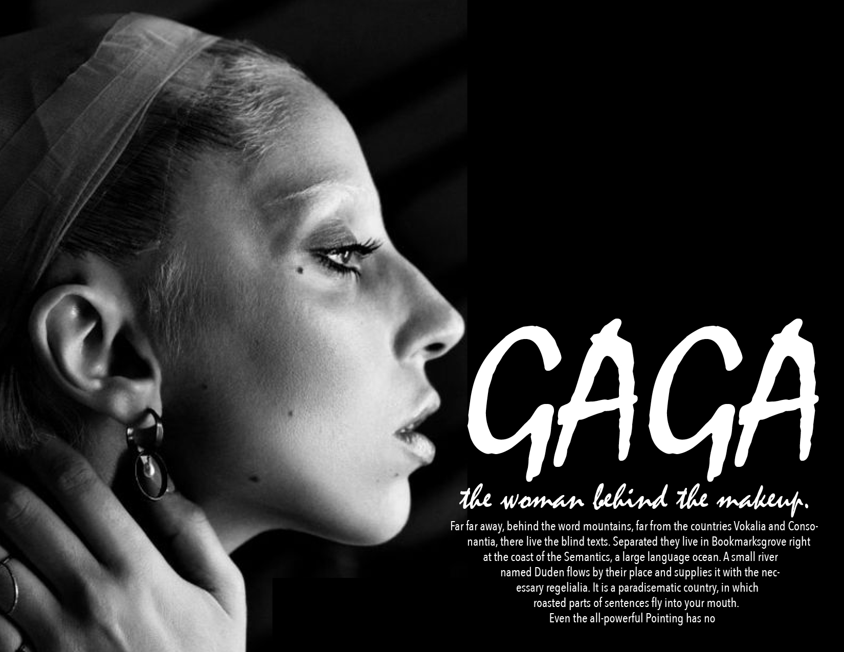
Thumbnail:
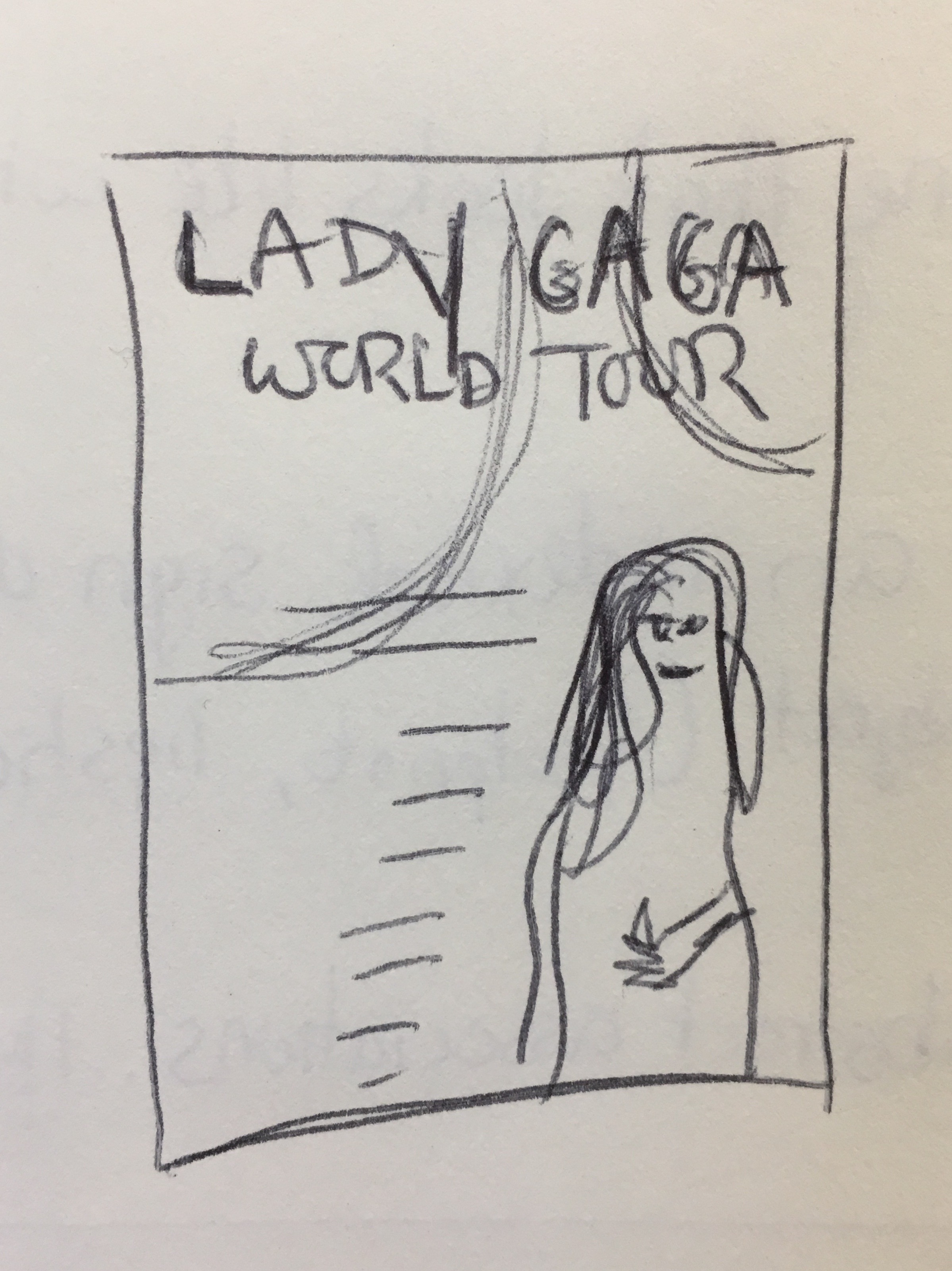
Final:

PART 2:
Symmetry
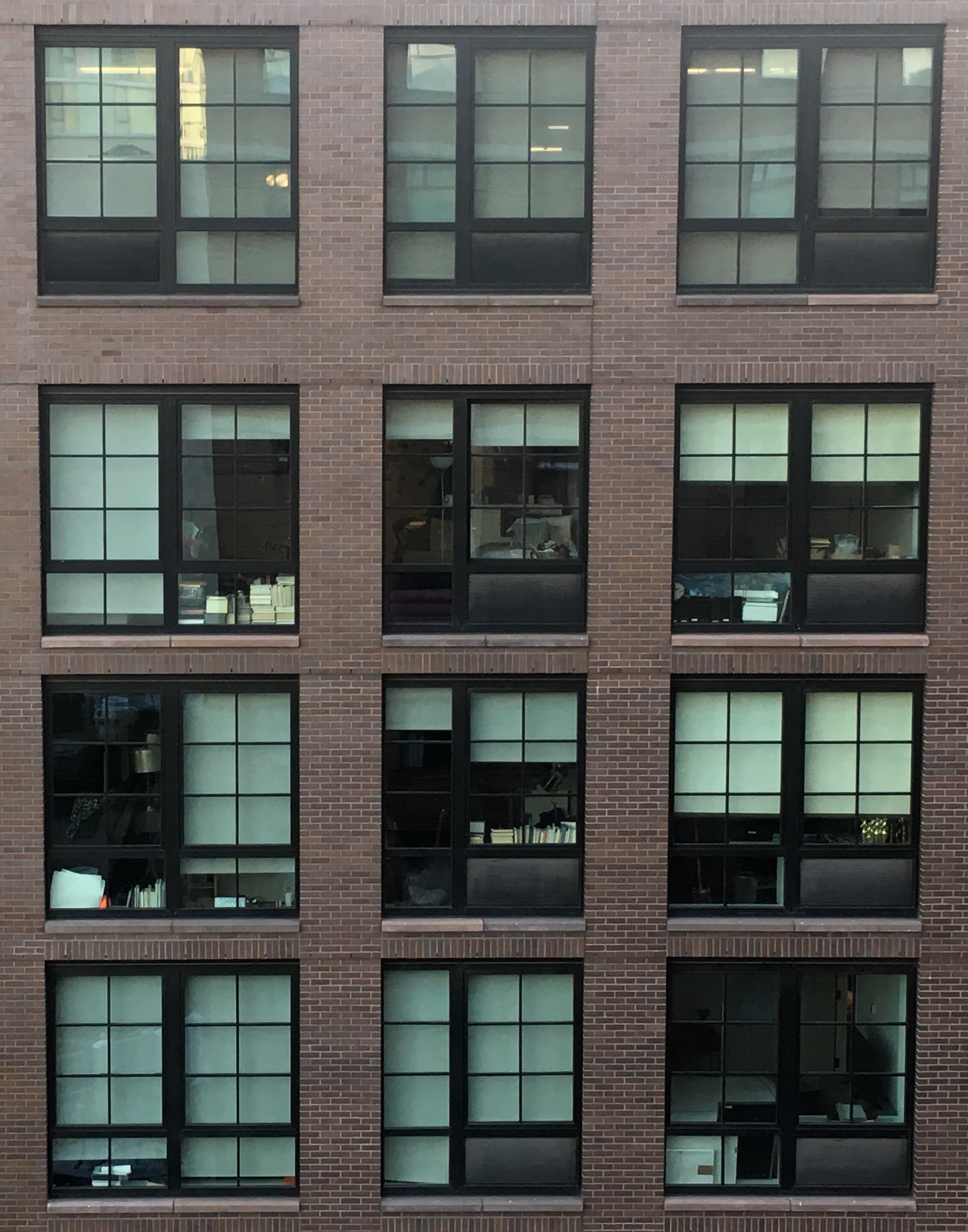
Each window is laid out to form a perfect grid. if you were to fold this image in half it would perfectly match up.
Asymmetry
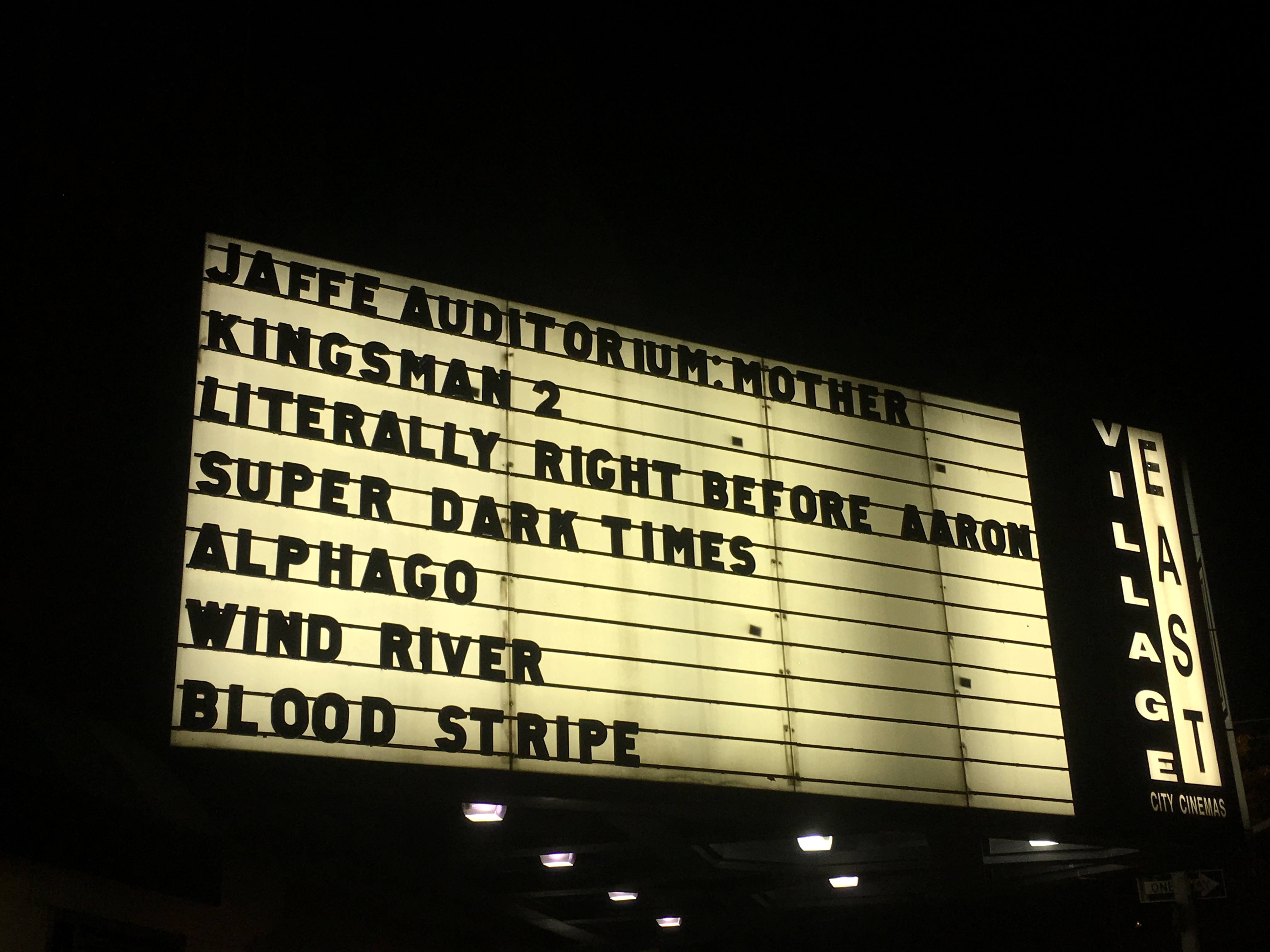
The text is not equally balanced on each line. The text is heavier on the left side of the sign, making it unbalanced and asymmetrical.
Grids
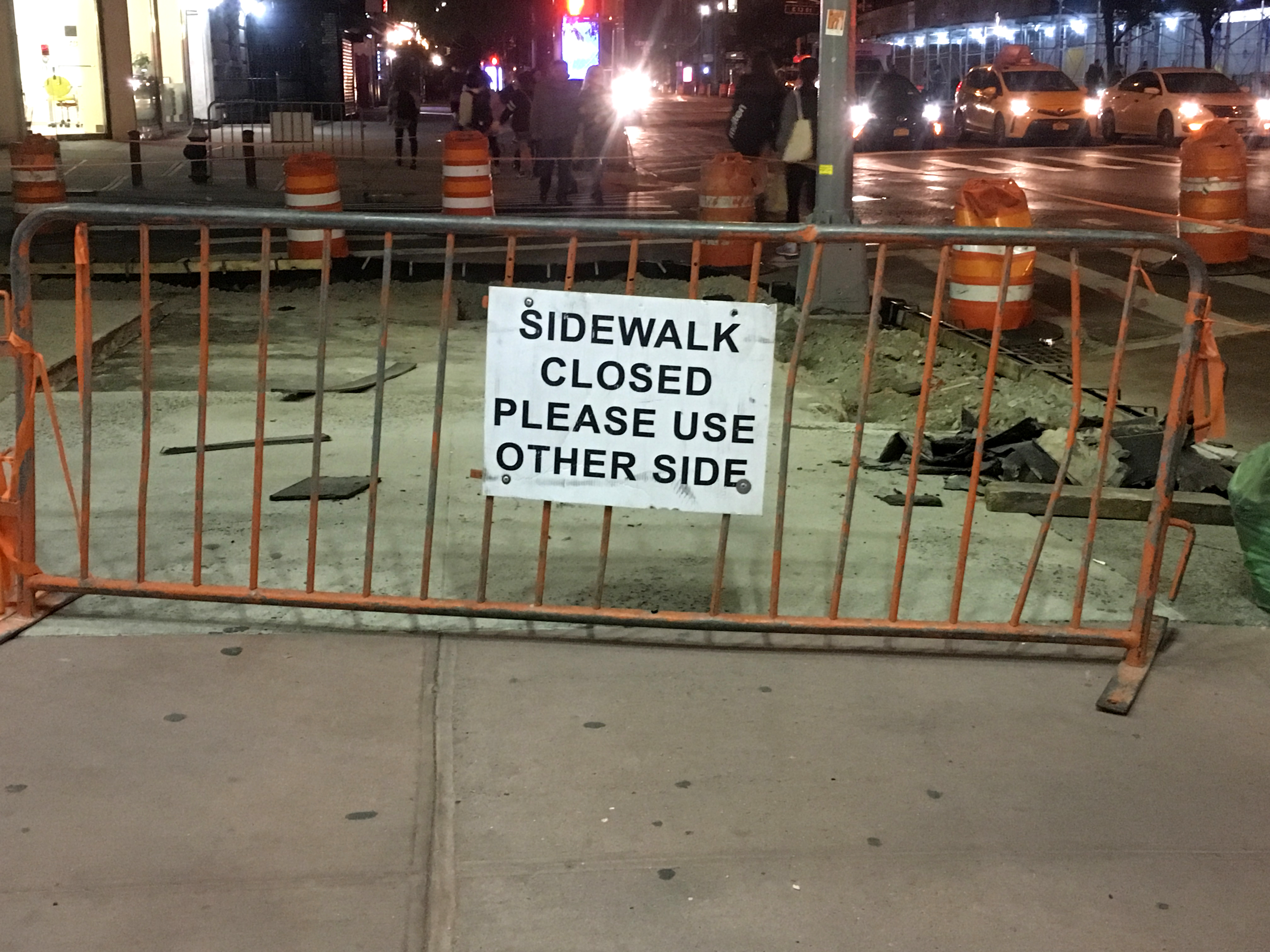
The vertical bars in this fence form perfect grid lines in this image.
PART 3:
Inspiration:
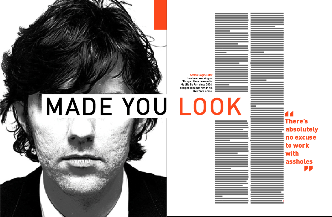
Mine:
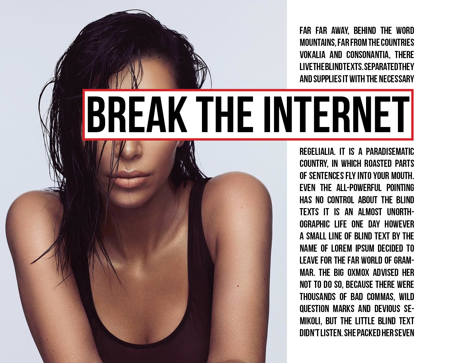
Inspiration:
Mine:
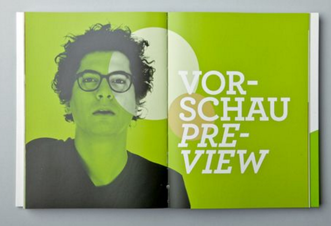
Inspiration:
Mine: