1.
Diptychs 1: (videos)
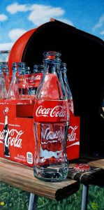
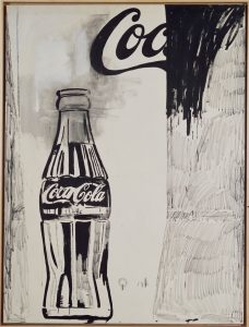
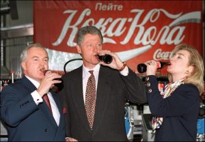
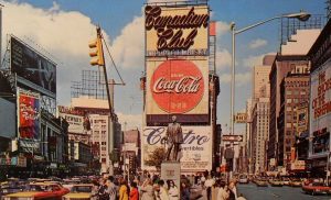
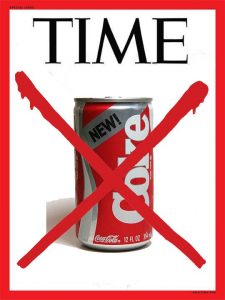
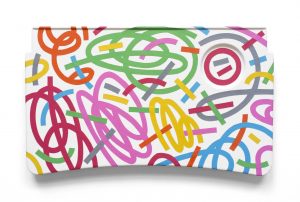
Photo gallery of the 2nd video:
-
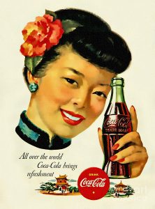
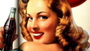
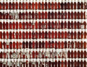
- Coca-Cola, 1961


-
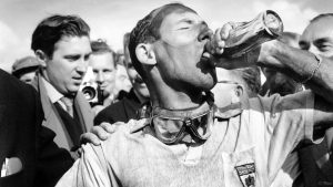
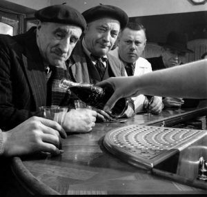
- Mandatory Credit: Photo by Photographic/REX_Shutterstock (3555458a) 1957 British Grand Prix. Aintree, Great Britain. 18-20 July 1957. Sir Stirling Moss (Vanwall), 1st position, takes a victory drink of Coca-Cola after he and Tony Brooks won the first World Championship grand prix by a British car. Motor Racing
-
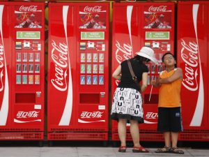
- A86FMA World of Coca Cola Atlanta Museum Georgia USA United States of America
-

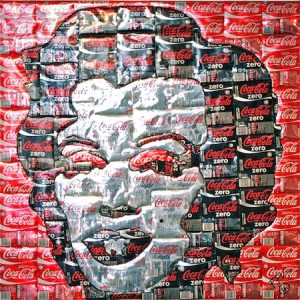
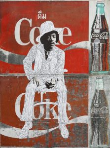
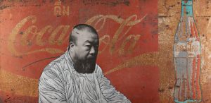
- Wang Guangyi (b. 1956) Great Criticism Series: Coca-Cola (2000)

Research process:
In the first video, I want to focus on the advertisements of Coca-cola. Because I think advertisements are the images a company wants to convey to its audiences. So I chose a wide range of topics of advertisements of Coca-cola covers from 1950-2018. And then I listed these topics/themes on my sketchbook in order to help me better transit the first video to the second.
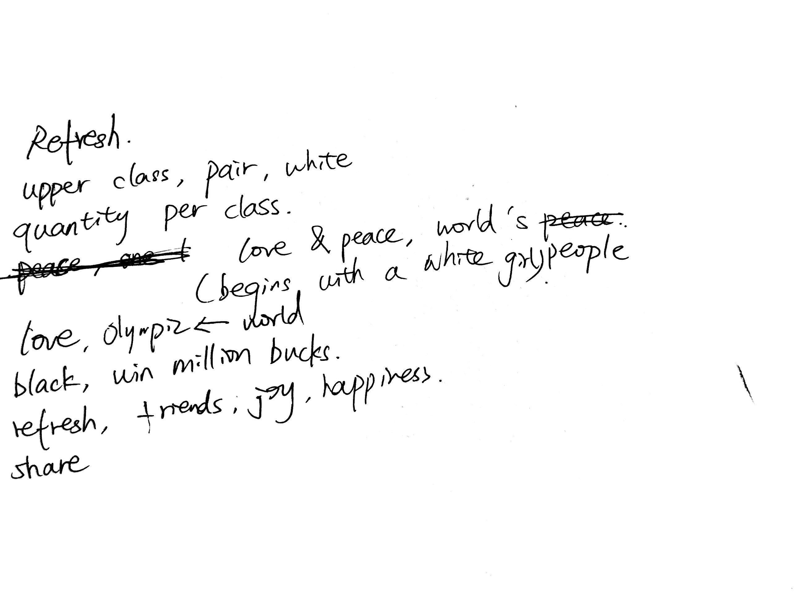
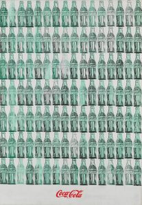
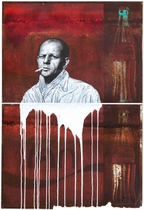
In the second video, I thought about the key words I extract from advertisements of Coca-cola, and then I thought about other than a company, Coca-cola represents a culture that exists a hundred year. So I wonder how artists would view it and how artists combine it with their artworks. So I looked up lots of artworks that relate to Coca-cola and select a some symbolic images to form the second video (this form is that I got inspired from Arthur Jafa’s Love is the massage, the massage is death). Also, in the audio part, I made google translate saying “Coca-cola” over and over again to make an emphasis.
Some links that I researched:
http://www.skiphursh.com/Delta-Coca-Cola-Tray-Art-Project
https://www.campaignlive.co.uk/article/asias-creative-partnerships-coca-cola-isobar-china/1399681
2.
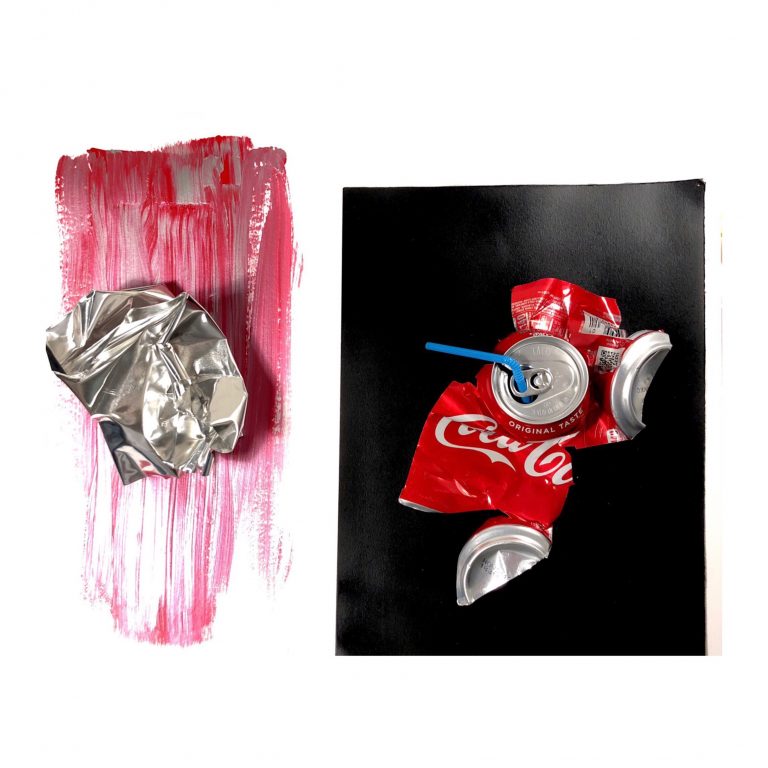
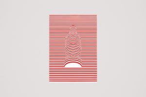
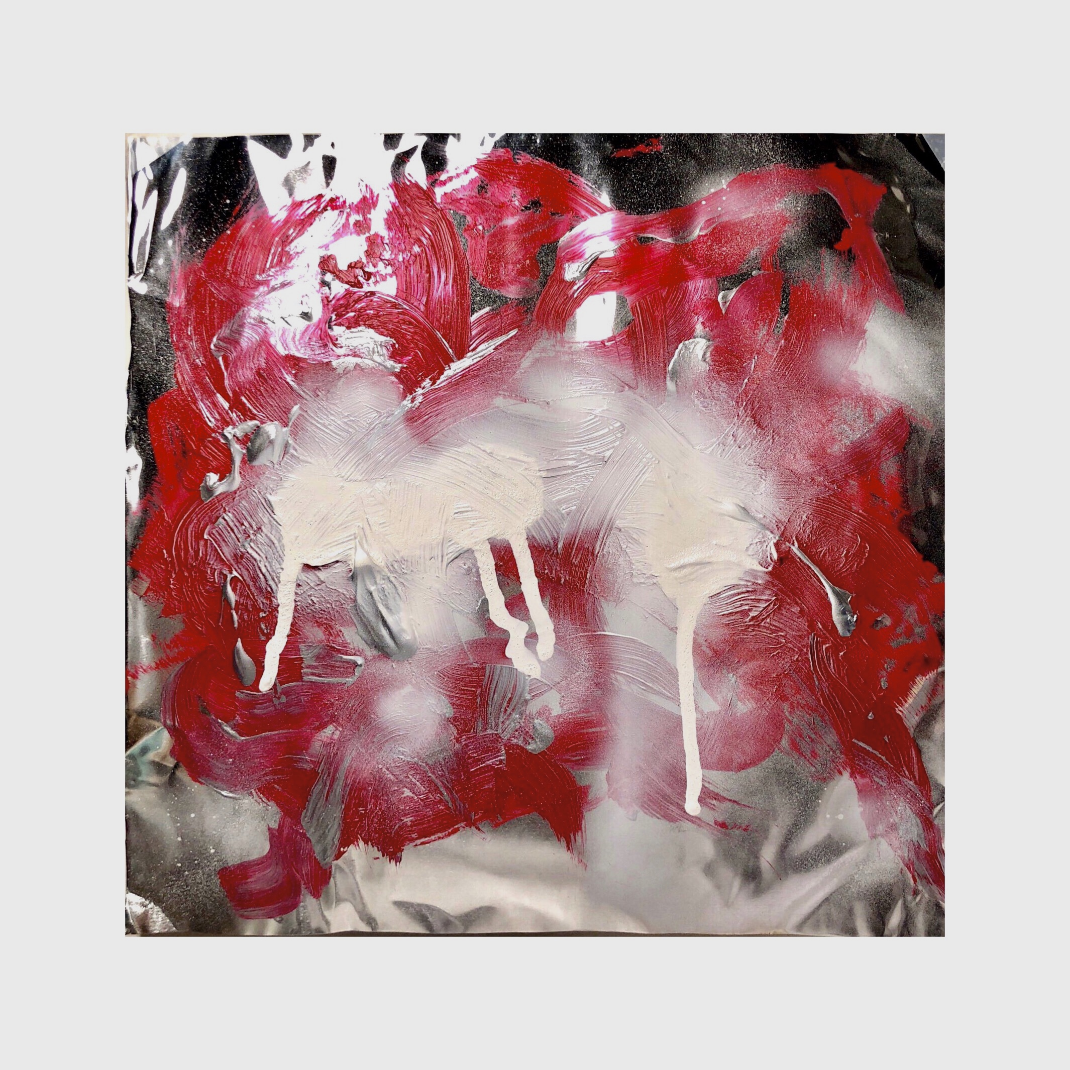
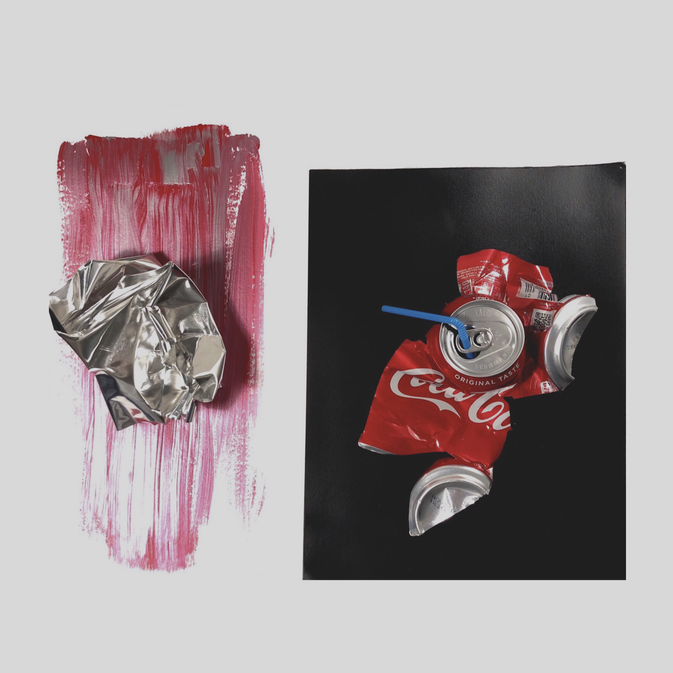
In this pair of diptychs, I want to do some analog pieces since I used digital way doing the last diptych. I painted Coca-cola red using acrylic In aluminum sheets which is the same material as Coca-cola can. And then I used spray paint adds some texture at the top. In this way, I want to extract the artistic elements of Coca-cola from all its other aspects. Because when I did the last assignment – 5 pair of diptychs, the last one (I asked my 5 friends to draw their thoughts about Coca-cola) inspired of how people would think when they heard of Coca-cola. They would think of calories, Pepsi, thirsty…. But in the essence, Coca-cola is just a kind of fountain drink, and all we see at the surface is red, white and silver. I also used the same idea at the second piece, I deconstructed a coke can and put it on a black cardboard, and at the other side of the paper, I drew a brush texture using mixed red and silver acrylic as the background, which mimics the pouring of beverage liquid, and bend a piece of aluminum sheet, which represents the essence of Coca-cola.
Reflection (Answers of the questions):
My topic is class and it evolved to focus on daily objects that reflects class issues. I found myself is easily attracted by trivial things that can show many different perspectives and theories. But in the nest project, I would like to try something else. I’m also have interests in the combination of class and gender. I especially want to focus on the relationship of class of female. I think the most successful material that I used in the diptychs is the combination of audio and video in my second video piece. The repeated “Coca-cola” off-screen narration matches with the 1 second 1 image of Coca-cola-related giving viewers a sense of brain-washing just like the company itself’s strategy of advertising. The acrylic that I used in the second diptychs failed to support my work, since I originally want it to represent the fluid movement of Coca-cola. But with the way of the brush, it looks more stringy.
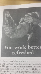
When I choose Coca-cola as the object of this project, I want to focus on the class and economics issue it represent. In the mind mapping process, I list several aspect it involves: mass production (In WWII, the producer of Coca-cola advertise it as the essentials in the troop since it contains sugar and is a refreshing drink for soldiers that can substitute alcohol. However, bottles occupy too much space in the transportation, only the syrup of Coca-cola was shipped. Since then, with the pace of WWII and American troop, factories of Coca-cola were built all around the world.), and internalization/localization is followed after mass production (After internalization, in order to add the connection between people from different culture background and Coca-cola, Coca-cola decides to localize the product – various language version of logo, advertisements etc. …), equality between classes (no matter what class are people from, they get the same Coca-cola), and the most important – its advertisements – how Coca-cola connect the product with feelings and spirits.
Transfer the vocabulary from the Critique Vocabulary Walk Around:
Content: different ads, colorful, brevity, including plenty of different elements, all different kind of ads(video & graphic), equality, Coca-cola ads from different time and countries, abstract painting, deconstruction (of Coca-cola can), texture (use of different materials), emotional brush stroke (like the foam that when you open a well-shaken coke).
Material: pink/red/white paint, broken Coca-cola can, metal sheet, aluminum, straw, spray can, video, ads, pop-art painting, animation, gif, video appropriator (edited video), google translate sounds, repetitive audio, vintage ads back to early years like 80’s/90’s .
Context: Pop culture, fast foods (nowadays’ society), deconstruction of what coke presented (American culture?), Health issue vs. The lack of Health care, duplication culture, Coca-cola brings people from different cultures and different classes together, How Coca-cola make their ads and how they want viewers t view them, speed out like “virus”, coke culture function as a “religion”, ads = pop culture = TV, emotion of happiness & what’s considered “real”.