Assignment 1: Draw an egg and seashell from multiple perspectives. Use lines to communicate its shape, volume, shadows/values, etc.
In-class drawing: 8/31/2015
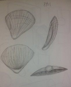
This first image is from my sketchbook. The class did a practice run of drawing the seashell. When I was drawing this, I was thinking of the different perspectives I could get from the seashell. These perspectives in the in-class sketch are largely different from each other. I wanted the views to be really different so the viewer could get the most out the one seashell.
Homework submission: 9/9/2015
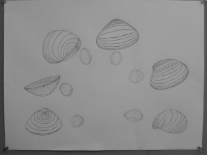
After seeing what other students had drawn for this assignment, I realized that I may have misunderstood the assignment. The other drawings showed the value and shadows of the objects. Mine’s looks more like the contour lines of the objects. My drawing of the seashell in class is closer to the other student’s final drawings. However, the instructor didn’t comment to me about my use of contour lines.
The instructor did state that I needed to improve my rendition of the eggs. Their positions weren’t that distinctive of one another. And their shape didn’t really read as an egg.
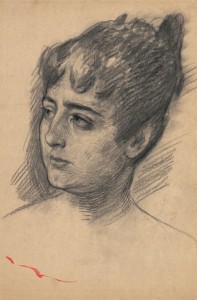
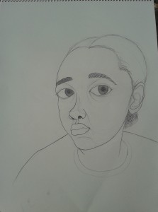
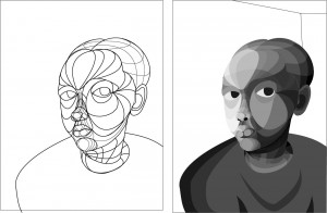
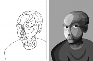
Assignment 2: Recreate a portrait by a master artists. Imitate the marks/mark making techniques. Match the medium used. Use techniques learned in class to create a proportionate drawing of the human head.
Here is the image I chose the base my drawing:
Portrait of Giulia Lucini
Colombani by Mose’ Bianchi
My final drawing: 9/16/2015

The drawing is did is similar to the master portrait, but it’s also very different. As far as facial features and other characteristics go, they are there, but somewhat exaggerated. It kind of looks like a caricature of the subject. What would have helped was to map out the features of the face. When I drew, just started with the eyes, and then I tried to draw the face around it. I didn’t plan the face before I drew it.
I felt as I drawing, I ignored the direction of the marks from the master portrait. I drew with the knowledge that I already know. There are certain shadows present at certain areas and features, like at the corner of the eye and under the nose.
Follow up inn class:
The instructor wanted to place a sheet of tracing paper of our drawings. We then drew the skull of the person in our drawings. This was to see how accurate our drawings were in comparison to a proper skull. We were looking at the proportions and shapes to determine accuracy.
Skull of my drawing: 9/16
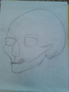
Skull over my drawing: 9/16
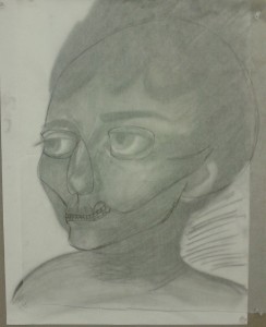
So, now that I see my skull, it’s quite inaccurate. I think this is due to my exaggeration of some features. My drawing was also really large on the paper, which created more room for mistakes.
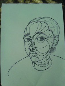
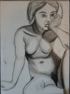
Assignment 3: Self-portrait using line.
Final Submission: 9/21/2015
Once again, I think I misunderstood some parts of the assignment. The other students had drawings similar to the first seashell assignment. I approached this drawing as outlining all of my features. Using line for creases and such. It isn’t that detailed, it’s quite simple.
I think my features are exaggerated or disproportionate. Going from the mouth to the forehead, the features start to get bigger and bigger. The nose is bigger in proportion to the mouth and the eyes are really big in proportion to everything else.
Follow up in class: We uploaded our drawings into illustrator to draw contour lines over our drawings. Then, our instructor asked us the take a picture of ourselves mimicking the pose in our drawing. We were going to use the photo as reference to color our contour lining of the drawing.
Contour lines over drawing: 9/28
Contour lines with color: 10/5
More color: 10/5 (at the end of class)
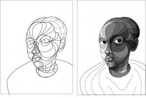
Final without lines and with background: 10/12
Reference photo:
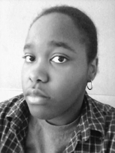
I think that my final gray scale color scheme looks chunky in some areas. It’s like there are vast color jumps in the sections next to each other. This maybe due to contour the lines I made for the face. I feel like they are too large. And some of them don’t truly contour to my face. I think my nose looks the best in the contour drawing. The shading is a little off to me.
Figure Drawing
Assignment 4: Copy a master’s figure drawing. Imitate the mark makings and shading. Capture the volumes and position of the body.
Reference photo:
Study for the Medieval War Scene (1865) by Edgar Degas
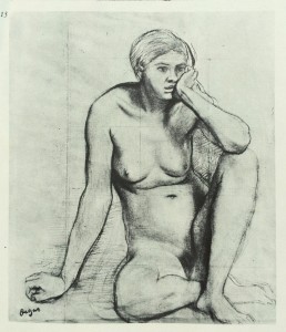
My drawing: 10/21/2015
This copy of a master drawing came out better than my last one. It looks more like the original. However, I suffer from the same disporpoionate features as before. I still didn’t plan out the body before fleshing everything out. This is common mistake of mine because I’m not use to planning the body/face. Sometime when I do, it still comes out disporportionate, but way better than other drawings that started without a plan. I also struggled with charcoal (It’s my least favorite medium). Some parts started too dark. In some parts my blending didn’t ease into the white of the paper so well, so the edges of some shadows look too shapr. I also feel like I ignored the shading of the master drawing and used what I thought would proper shading.
Project 1: Union Square Montage
The class went to Union Square Park and took multiple pictures of the crowds and scene. The goal was to imitate the scenes of some historical tapestries, paintings, etc.
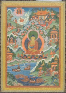
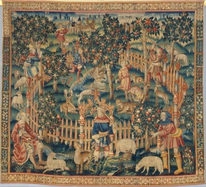
Here are some photos we were able to pick from for inspiration:
“Thanka with Buddha”, 19th Century, Tibet
Hunting of Birds with a Hawk and a Bow (from the Hunting Parks Tapestries), ca. 1515–35, South Netherlandish
Madonna and Child Enthroned with Saints and Angels, Artist: Francesco Botticini (Francesco di Giovanni) (Italian, Florentine, ca. 1446–1497)
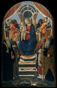
I’ve chosen “Thank With Bhudda” as my indspiration photo. My goal for my composition is to have a large central figure in front of a background of smaller people. The people in the inspiration image looked grouped in their activities. I want to have small groups in my composition as well. The areas that these groups are in a different from the other but they somehow meld together to create the entire landscape. I want the background of my composition the have little sections that blend into each other as well.
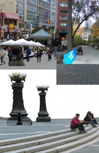
Here are some of the photos I took during my time at Union Square:

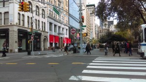
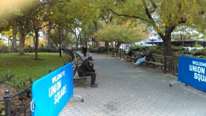
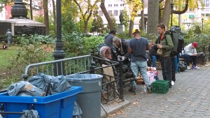
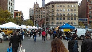
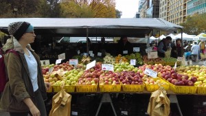
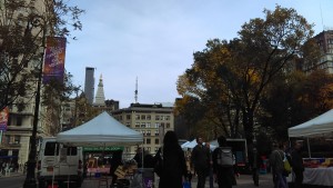
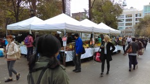
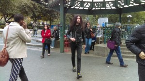
I have more images of with more people in it. The goal for me when aking these pictures was to get as much of the streets, groups, and buildings in their entirety as I could. It would be easier to cut people and buildings into the background if theuy are complete.
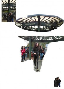
I started working on my montage by isolating the central figure, and it’s adornment. (The start of selecting some individuals for placement started as well.): 11/09/2015
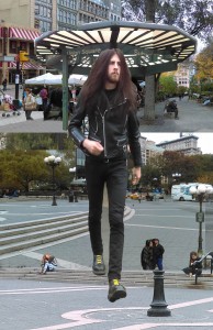
Then I started working on the background. I tried to put in the groups that I wanted: 11/12
After working on the background for some time, I added the central figure:
Another objective of the assignment was to implement pattern and color. The colors were spposed to balance each other out in the composition. Pattern could be used in any way we wanted, I used it as an embellishment of the background: 11/17
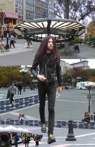
My last steps included a color layer for the background and the central figure. I wanted to make the background blue to cool it down. I feel as though the blue cover on the background is too thick. There are accents of warmer colors from the original colors of the background. I used the blue color cover to let these warmer colors show. They’re a little bit too accentuated because of the thick blue color cover, I wanted the accents to be subtler. The color layer over the central figure is made of warmer colors. However, that’s kind of difficult because of the original photo being dark colors. The warm color cover had to be highly saturated to show over the dark colors. This worked out in the end because it’s makes the central figure pop more than the background but ot too much since it’s already big.: 11/23
Project 2: Color and Pattern
There was a brief color and pattern exploration before and during the Union Square Montage project. This time we delved deeper into colors and making patterns.
We learned about using the Munsell color charts. These colors sections are essentially paired with their complementary colors oposite of each other. As the colors reach the center and meet eachother, the center line becomes grey/muted. The top is lighter/brighter in color, the bottome is darker. The very outsides are the most saturated.

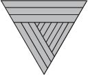
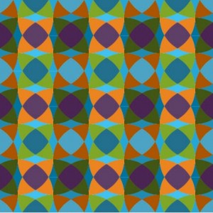
The colors on the Munsell charts were then used to crate patterns. But first we had to use one piece of the entire pattern. There were two pattern pieces available:
Circle pattern:

Hexagon pattern:
To create the full circle pattern, you would have to mirror one piece against another and make them touch. Then you would copy those two mirrored pieces and mirror that copy.
To create the full hexagon pattern, you would copy it and flip it horizontally. Then you’d rotate the copy so the top right corner becomes the bottom center corner. Then you’d attach the copy to the first piece. Then you’d do this two more times and rotate the new pieces so that they’ll attach as a hexagon.
Here are some of my final circle and hexagon patterns:
With my hexagon patterns, there’s a clear foreground, middle ground, and background. This is because I used one hue or two similar hue for the first two grounds and then the other for background. I also tried to make the middle and backgrounds muted or darker than the foreground.
The circle patterns don’t really communicate the shapes of circle because of the color. It looks more like bands from a weaved pattern.
Project 3 (Final Project): We were allowed to direct ourselves in the final project as long as it was based on the subjects that we cover this semester (which were colors, patterns, human figure, faces/portraits, montaging, and software use.)
My focus for this project was the human figure, face/portrait, and using Adobe Photoshop. The objective was to recreate the human body in an unnatural form, but to make it look natural and seamless.
I had started some sketches and Photoshop manipulations to see what I can do.
Sketch: 12/6/2015
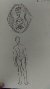
So my sketch includes an idea of rearranging the facial features. I then tried to see if changing the shape of the head would make a difference in how the new face if viewed. The other idea is switching the bottom half of the body so that the front is now the back and the inner line of the leg is switch with the outer line of the leg.
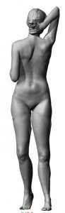
I wanted to try to create the changed body form in Photoshop. This is the file/image I decided to work with:
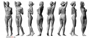
It has many perspectives and angles of the body, so that helps to create a new body shape.
Here is my final form: 12/11
I isolated the body parts from the original image and copy/pasted them onto my working file. Then I would blend/erase the body parts together. You can see the blending line on the legs of my final image. This was not the image I submitted for my project, but it is part of my developmental process.
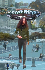
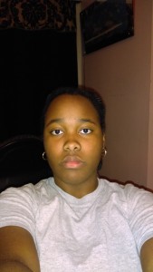
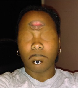
One of the final images I submitted was a self-portrait kind of image. I am the subject and my facial features are rearranged. This is the image I started with:
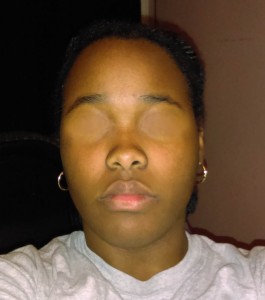
My first change was taking out the eyes because they would be placed elsewhere. Here are another version that I worked on after before filling in the eye holes:
When it took the eyes out, I couldn’t leave the eyeholes empty because that wouldn’t look natural. So I copied some of my skin from my cheek to fill in the eye holes:
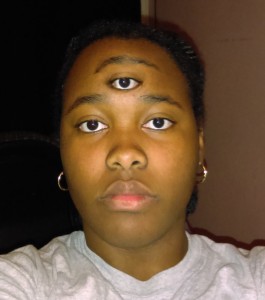
My next step was changing the eyes and mouth. I took my left eye and right eye and merged them together so the eye looks like it’s a center eye. You don’t see the tear duct that usually indicates which eye is which.
To complete the image, I added a faded patterned layer and color effects. This was to make the image more compelling:
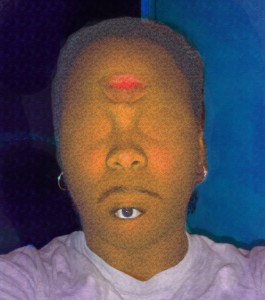
I think my final portrait image isn’t super compelling, even after the color manipulation and pattern layer. This could mean that I’ve created a believable creature with human features, so it’s not striking. But I also felt limited in creating this image. Now that I think about, I may have taken a generic approach to it. I moved the eyes and lips, but not the nose. And they face is in a front direction. I could have made it a profile view, or ¾ view (which may have been very difficult). It’s strange trying to create a new face because anything thing outside of normal looks weird. I moved features to spaces that already exist on the face, and those spaces are typically used when placing things on the face. I could have made one area of the face super dense in features. That may have been more dynamic.
My next image was another manipulation of the body. I took pictures of myself again in different poses to put them together. Here are the original images:
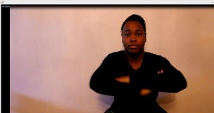
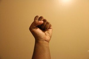
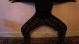
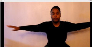
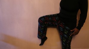
I had trouble working the camera, I couldn’t set up a timer to take photos. So I ended up taking a video of my self. Then I took screenshots from the video and used those as my images. That’s why I my clothes are quite dark in the photo.
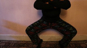
What I did was place my bent leg on my torso where the arms are. Then I placed my crossed arms at the bottom of my torso, where my legs usually are. I replaced my face with my fist. The body parts were all blended/erased together.
Here is the final image:
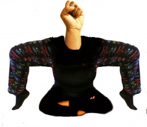
I’m unhappy with how dark my torso and middle part is. It would be nice and more effective to see the form of the body. However, I think leaving the background white makes it’s a little more striking because of the great contrast with the subject.
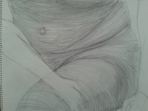
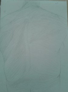
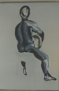
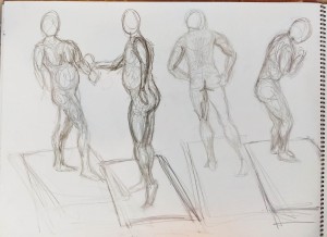
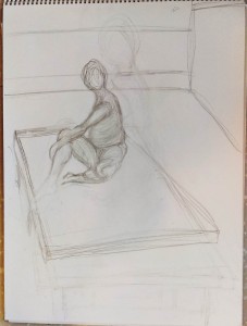
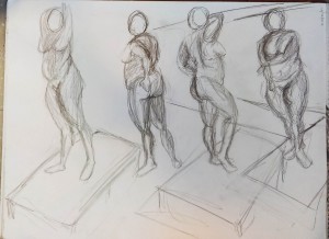
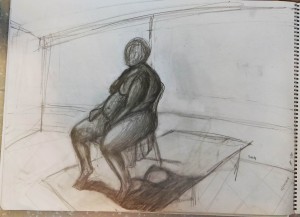
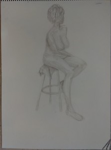
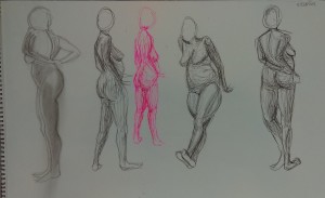
Classwork: Figure studies
My instructor said that he wanted us to stray away from drawing a figure with an outline. The outline makes the body look flat on the paper and minimizes the voluminous forms. To do this, he instructed us to draw the shadows of the figure. That way, the outline is ignored and the white of the paper is used as highlighting and changing the range of value.
There were also some images that we were asked to improve or change. We were asked to do this near the end of the semester, before our final project was started.
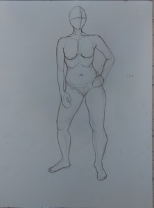
Here are all of my figure drawings:
10/19/2015 (done in class)
Male
Later:
Male
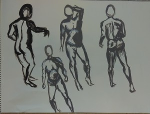
Male
Female
Female
Before: After:
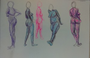
Before:
Female
After: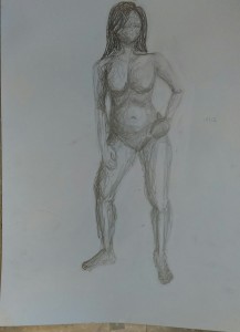
Learning to draw figures using shadows was really helpful for me. I depend heavily on outlines and it does make the figure drawing look flat. My last photo of the female figure, I used scribbles to create shading. Scribbles have worked really well for me most of the time because of how erratic it is and how much space it can cover. I struggle with making shadows using line marks because it seems too precise to me. It’s hard for me to control lines because they need a lot of control in my opinion.