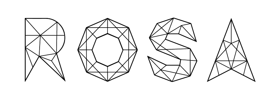
Originally, my blog had no identity and looked flat. I wanted to design four letters of my name “ROSA”, and use the final work as the logo of my blog. I used the crystal shape to design these four letters, which I think is match to my delicate design style. Besides, I thought crystal formation represented the accumulation of design works.
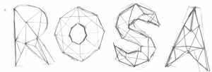
sketch
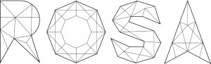
I use illustrator to make these four letter
I also used After Effect to make a little animation based on the typography.


Reflection
I think designing typography needs lots of patient and you must have good sense of font’s proportion. How to design a font that looks balanced and harmonious is a branch of knowledge.
Leave a Reply