Tag: drawing/imaging: language
“Expansion into Space” Project Process
Step 1: Mood board
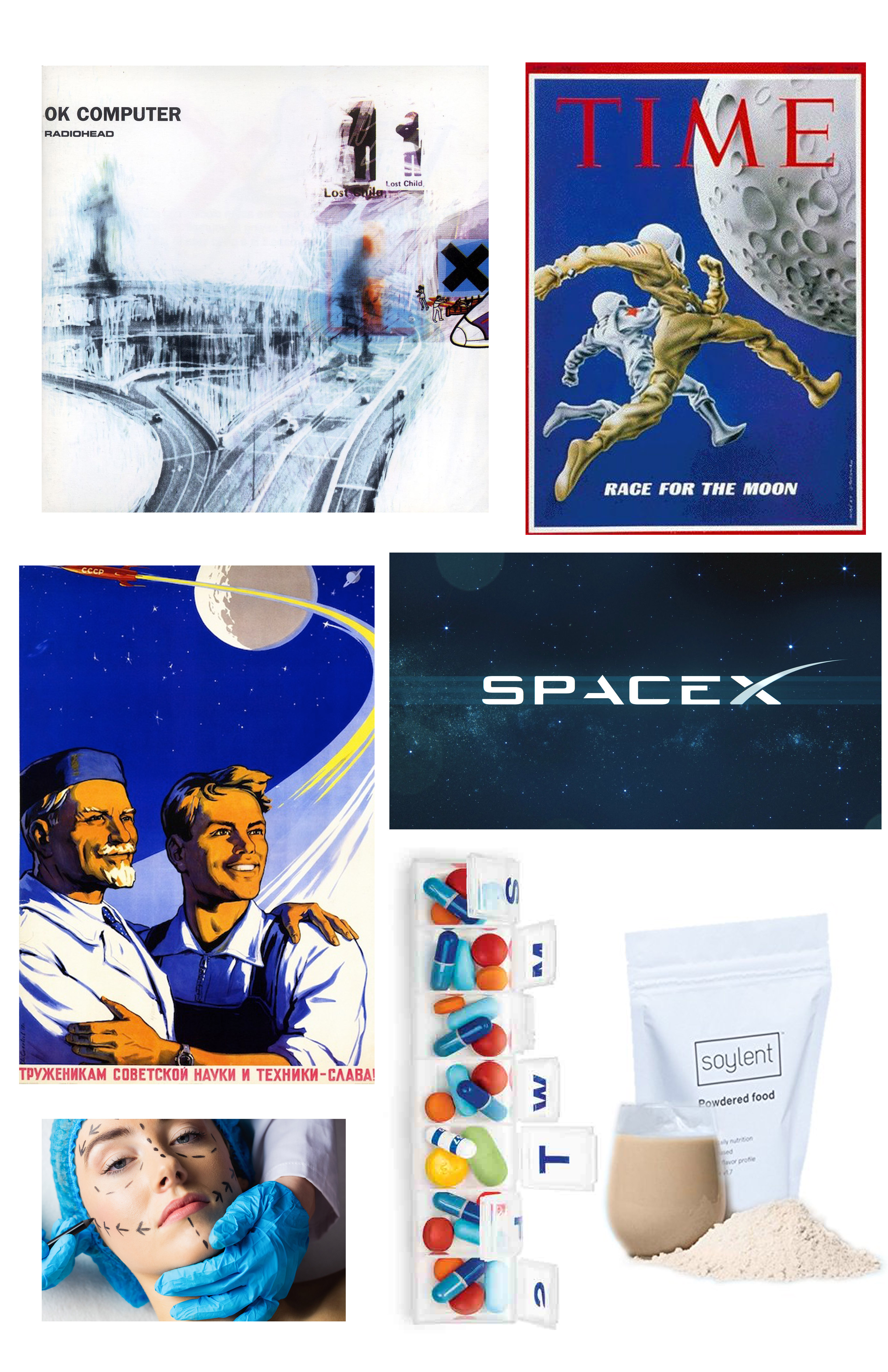
Upon hearing the prompt of “expansion into space” I immediately thought of the future and where humans are headed, both literally and figuratively. Initially I wanted my project to be (visually) gloomy and dystopian, with a colour palette of greys and blues.
Step 2: Inspiration material
Many of the inspirations for this idea came from Radiohead songs, the HBO show Westworld, and a Haruki Murakami short story about a doomed plastic surgeon. All of these sources of inspiration dance around the idea of society becoming an increasingly boring, unhappy place in which (wealthy) people may indulge in many luxuries yet continue to live emotionally/spiritually unfulfilling lives. When I think of the future of “accessible” space travel, I can only see this being enjoyed by the 1% population.
Step 3: Sketches + colour palettes
I looked at old Space Race propaganda from the 60s for further development of this idea, and started trying out content and layout concepts in my sketchbook. On Illustrator I arranged a few potential piece palettes from these pictures.
As I started working towards the actual piece, however, I deviated pretty far from these initial plans. Instead, I looked up “space fashion trend” on Google Images and eventually stumbled upon Gucci’s 2017/18 Star Trek-inspired photoshoot, and decided to go for a more editorial look of the piece.
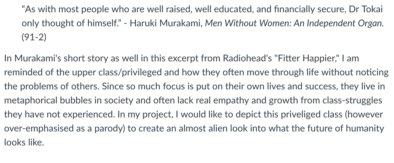
The Final Product

My concept is that these are what (fashion) magazines will be in the future, when space travel/interplanetary colonisation has taken place. On Photoshop Elements, I’ve created three beta-magazine spreads that would perhaps place an emphasis on the “new age of exploration,” physical luxury and perfection. In a futuristic beauty/fashion industry, I also see an emphasis being placed on plastic surgery, dieting, and more thorough health precautions due to advance in technology. Specifically, for the plastic surgery ad, I chose to use the tragic character “Dr. Tokai,” a plastic surgeon, from Murakami’s short story.
“Other Life” Project Process
The Process:

The first step of this project was to select an image of a (preferably) lean figure. This image would then be blown up to an 18×24″ size and printed out to be traced.

Once the general figure was traced, we were to draw stripes which would replace the need for contour lines, giving a three dimensional gestalt effect. After this initial drawing was completed, I traced the stripes from the drafting paper onto a sheet of mylar and inked the drawing with micron pens. After the inking process was completed, I scanned the mylar and fixed up any smudges or inconsistencies in Photoshop Elements. The drawing was then sized down and printed out onto a 11×17″ sheet of semi-gloss paper.
The Finished Piece:
Reflection:
At first, I was intimidated by the fact that no outer contour lines would be in this drawing, but taking the project step by step made it a bit easier and clearer for me to understand where the direction of it would be going. Finding an image online, printing it out, and tracing it made for a precise indicator of form – thus an easier way to visualise the internal contour stripes. This was an interesting process as I had never done a stripe contour drawing before, and I am pleased with the result of the figure’s implied form. It was also personally enjoyable for me since I enjoy contrasting/bold lines and colours, and I feel that final product is a powerful image overall.
Tracing Artifacts Project
The process:
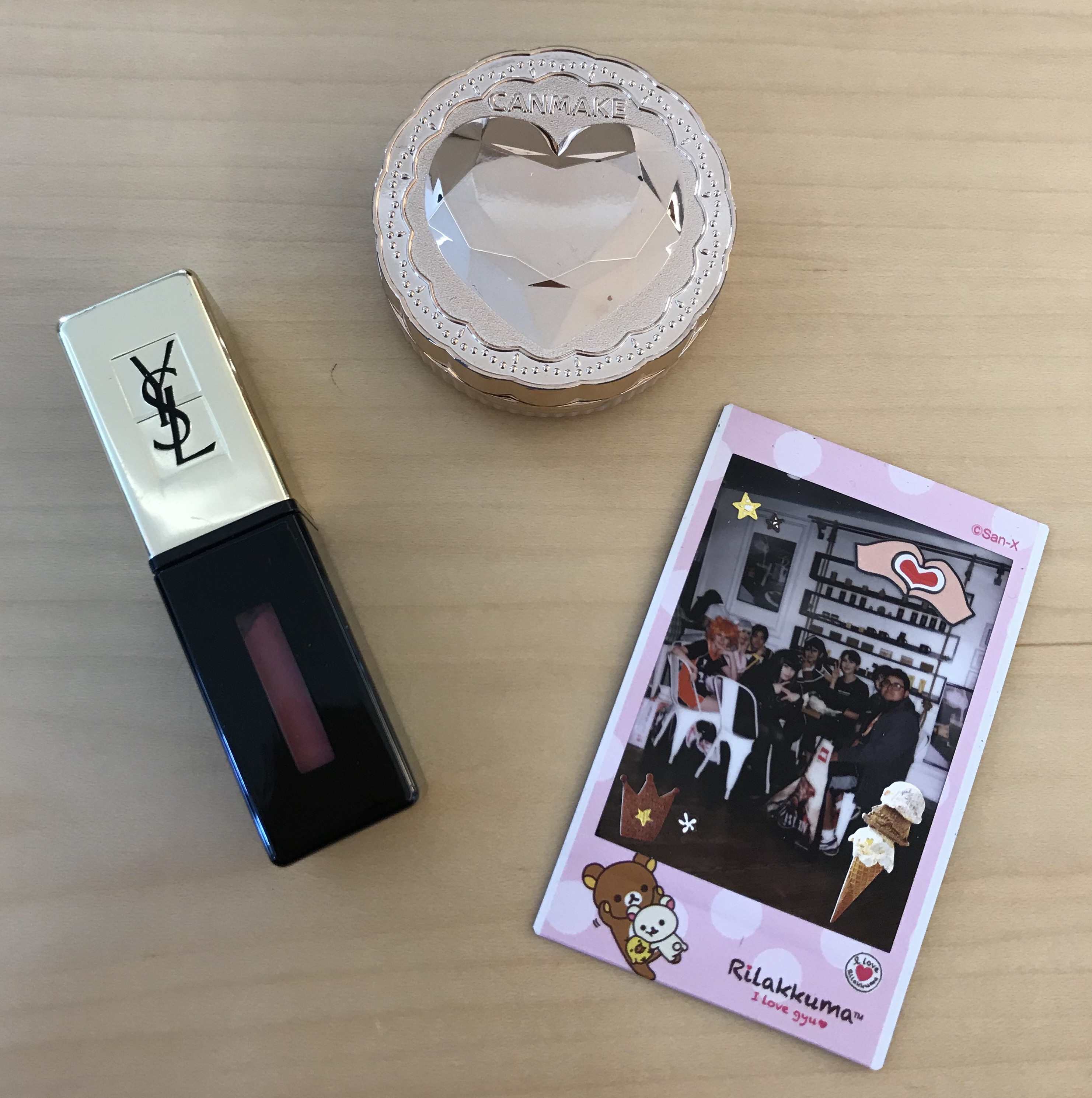
The project required us to bring in three personal/sentimental objects, so I brought a powder compact, a vile of lipstick, and a polaroid of me and my friends from back home.
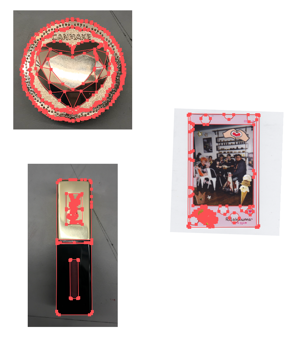
After scanning or photographing my objects, I vectored the outer outlines as well as inner details of them.
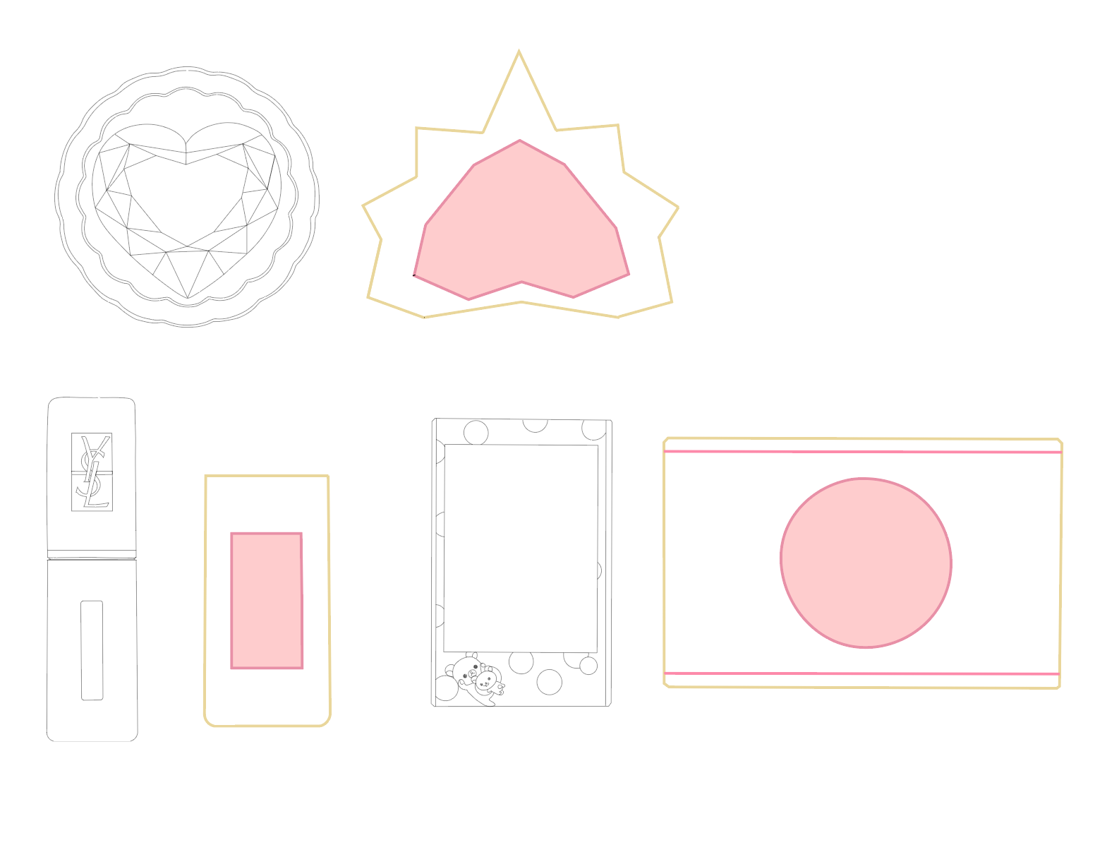
The symbols I derived from each object next to each respective vector. Whereas the vectors are quite detailed, I wanted to take a minimalistic approach to each symbol and derived the predominant colours (pink, gold) and shapes from the original objects.
Reflection:
Starting this project, I had never vectored an object in Adobe Illustrator beforehand so getting used to the pen and curve tools were difficult at first. After I got the hang of them, I quite enjoyed the process of tracing the scans and got caught up in mimicking the interior details of the original objects. After the vectors were completed, I wanted to take a minimalistic approach to the symbols, focusing only on the shapes and main colours of the objects and ended up making logo-esque derivations. After the peer critique in class, however, I wish that I had integrated more variation in the shapes and perhaps an element of collage in the finished symbols.
The finished piece:
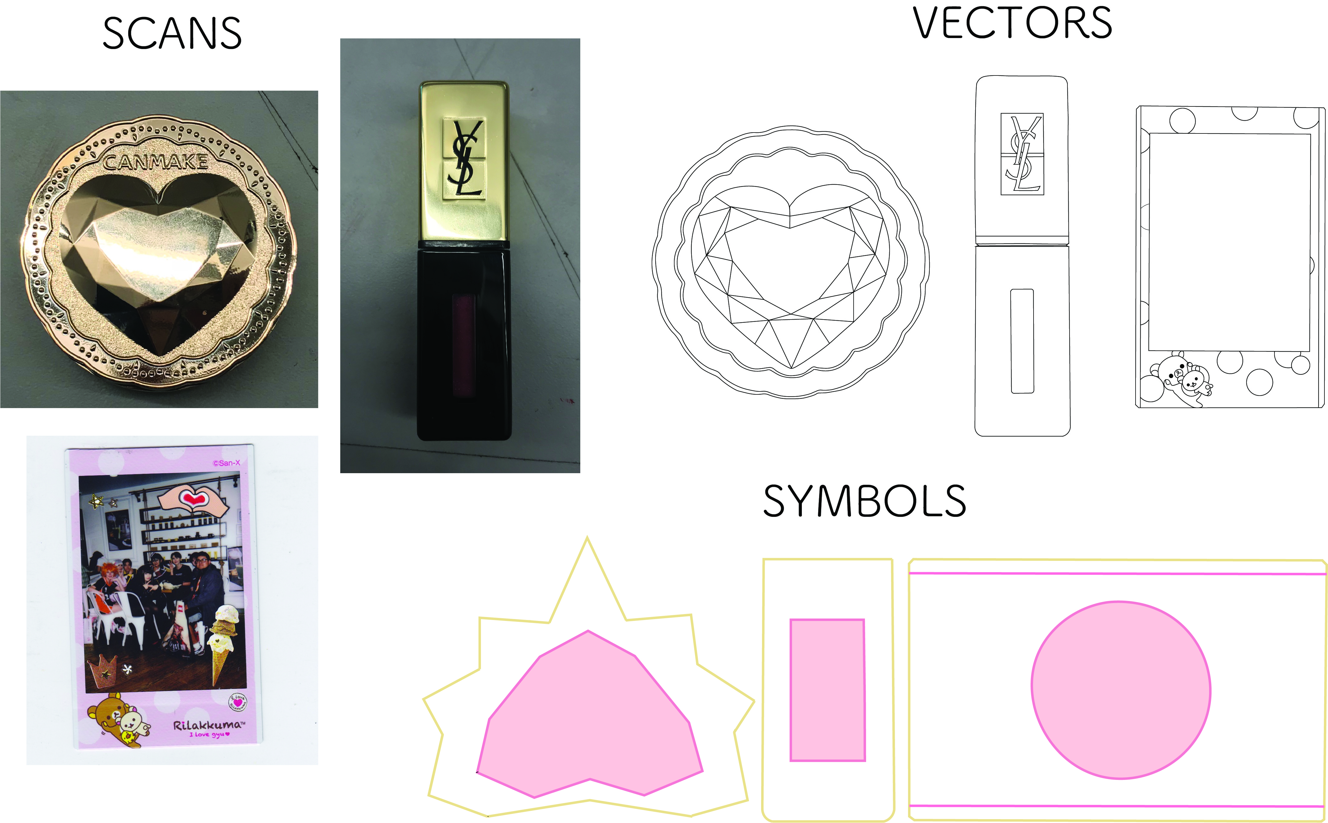
Simple layout of the original object scans, vectors, and symbols.