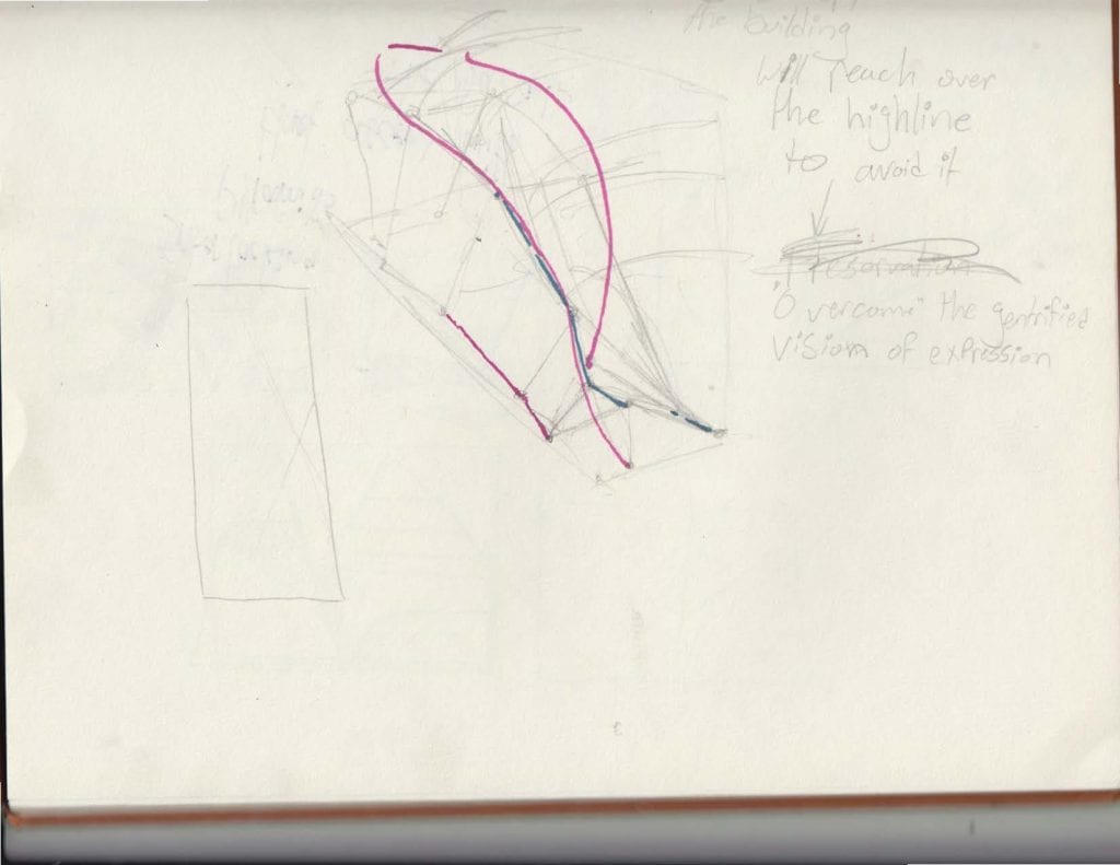
promptly after the conclusion of the midterm, we were tasked with designing a dance studio/academy in a lot that was 25 feet by 100 feet by 60 feet. In addition to this, the location of this lot would be directly next to the Highline, an area within NYC that attracts much attention. This aspect added another layer of complexity to this assignment as the building would be often be seen by individuals passing by on the Highline, which allows for an opportunity for interaction or intent to engage with these individuals.
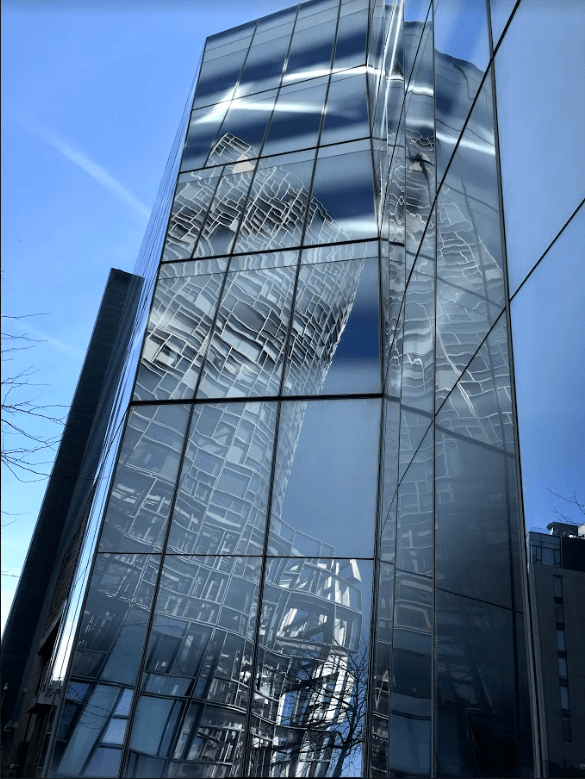
Since this was going to be a dance studio, I knew from the start that I wanted it to have a modern angle to it. The Highline, and the area surrounding it, is no stranger to modern architecture. For example Zaha Hadid’s apartment complex resides next to the highline, near the end of the Highline is the Hudson Yard site hosting projects such as Thomas Heatherwick’s “Vessel”. With this in mind I wanted to model the structure around modern dance, and to have it in some way exhibit the movement or core experience of modern dance. When I think of experiential dance, the first thing that comes to mind is contortionist dancing.
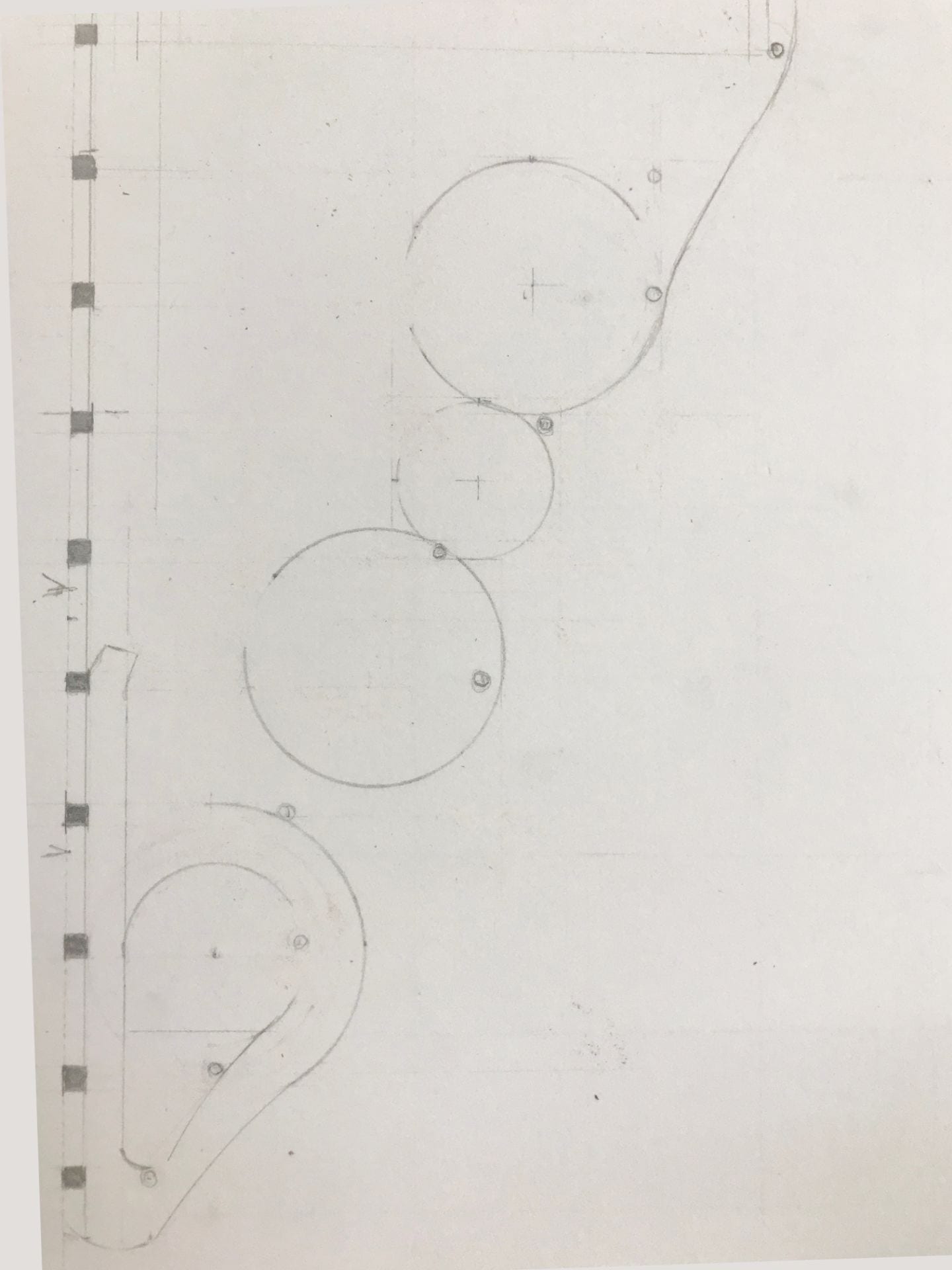
So I decided the first step would be to identify the form I would take influence from. To establish this I took still frames from a contortionist performance and drew them from observation.

Within this movement I looked for something I could translate into a structure. This proved to be difficult as I had to establish a language that would exhibit this motion without following this form too literally.
-
-
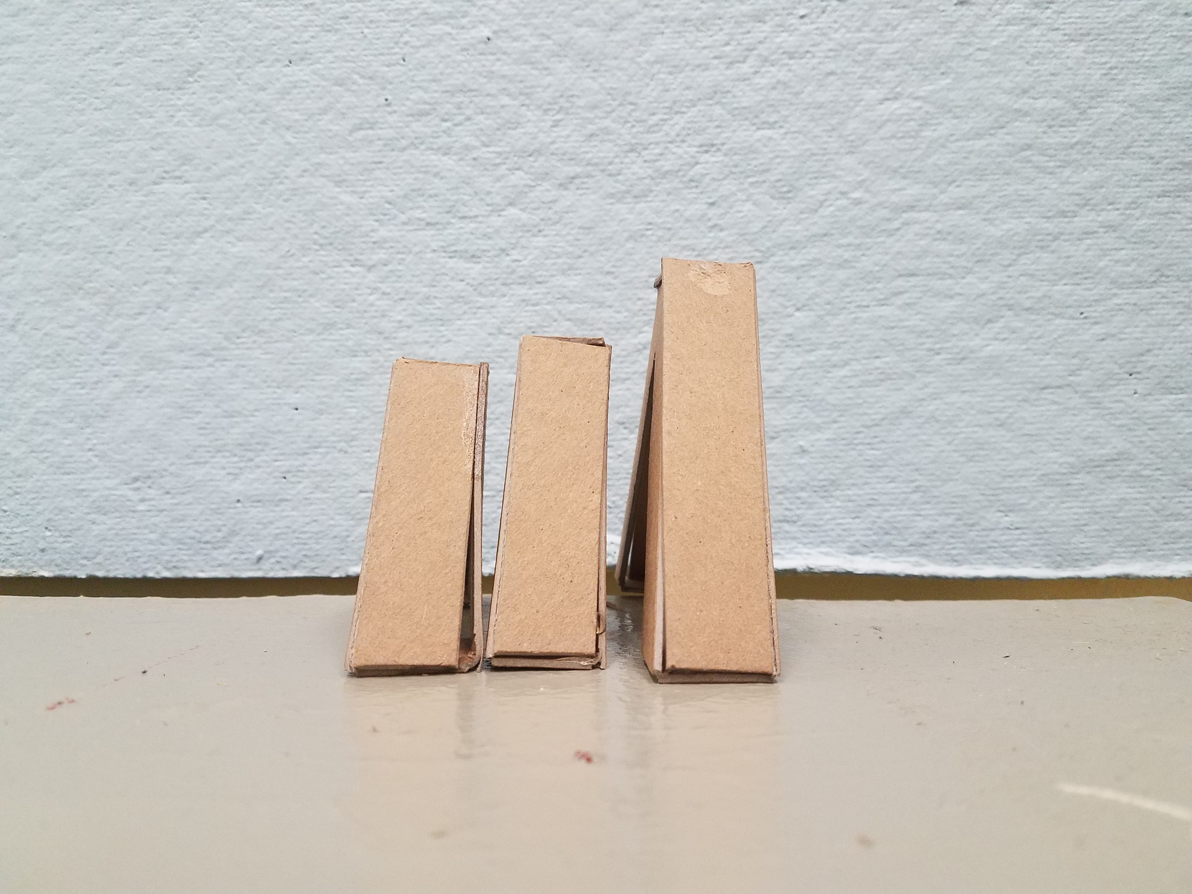
the first attempt
-
With this sketch model I figured out that I wanted to represent the dancer’s movements in a sequence:

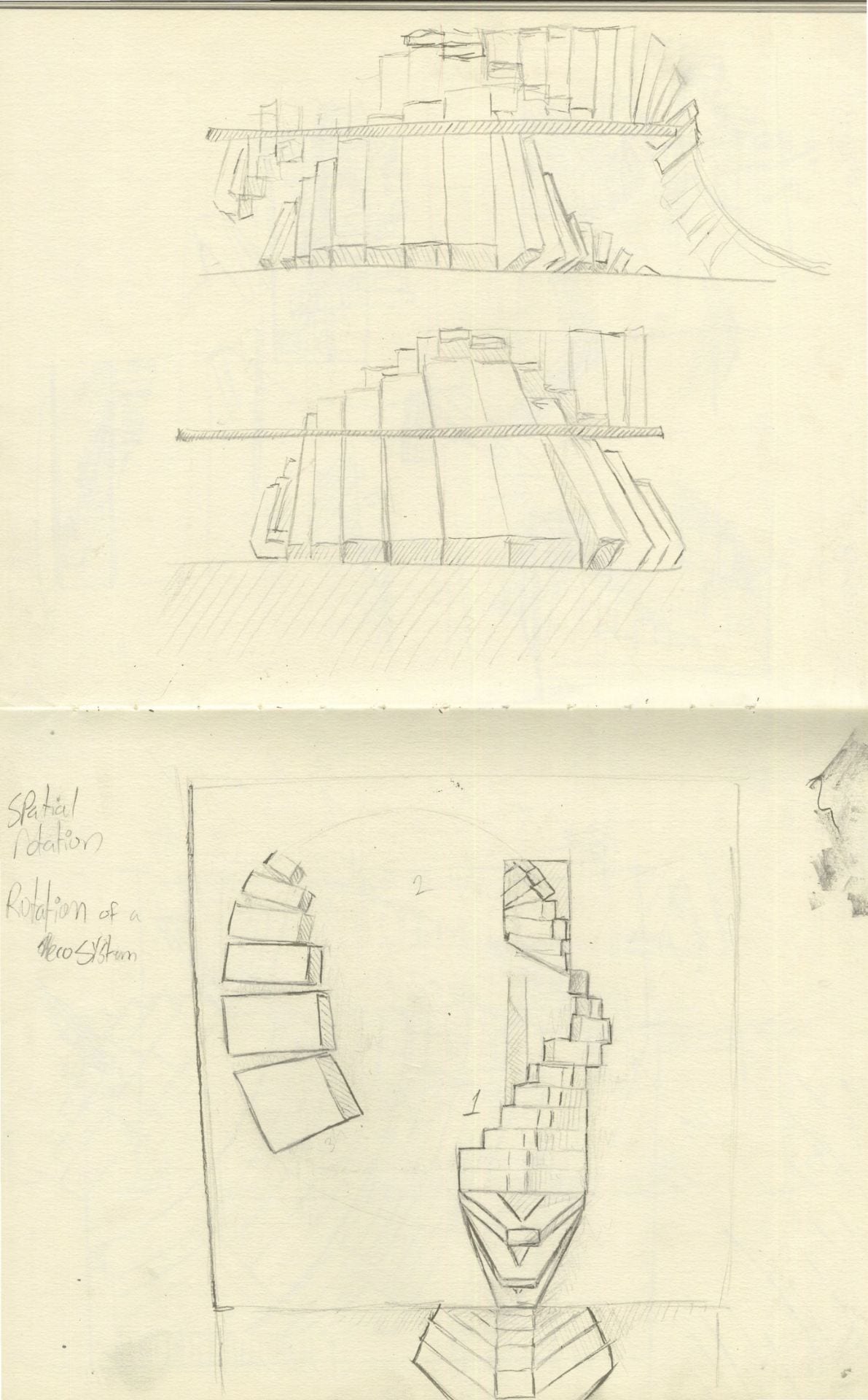
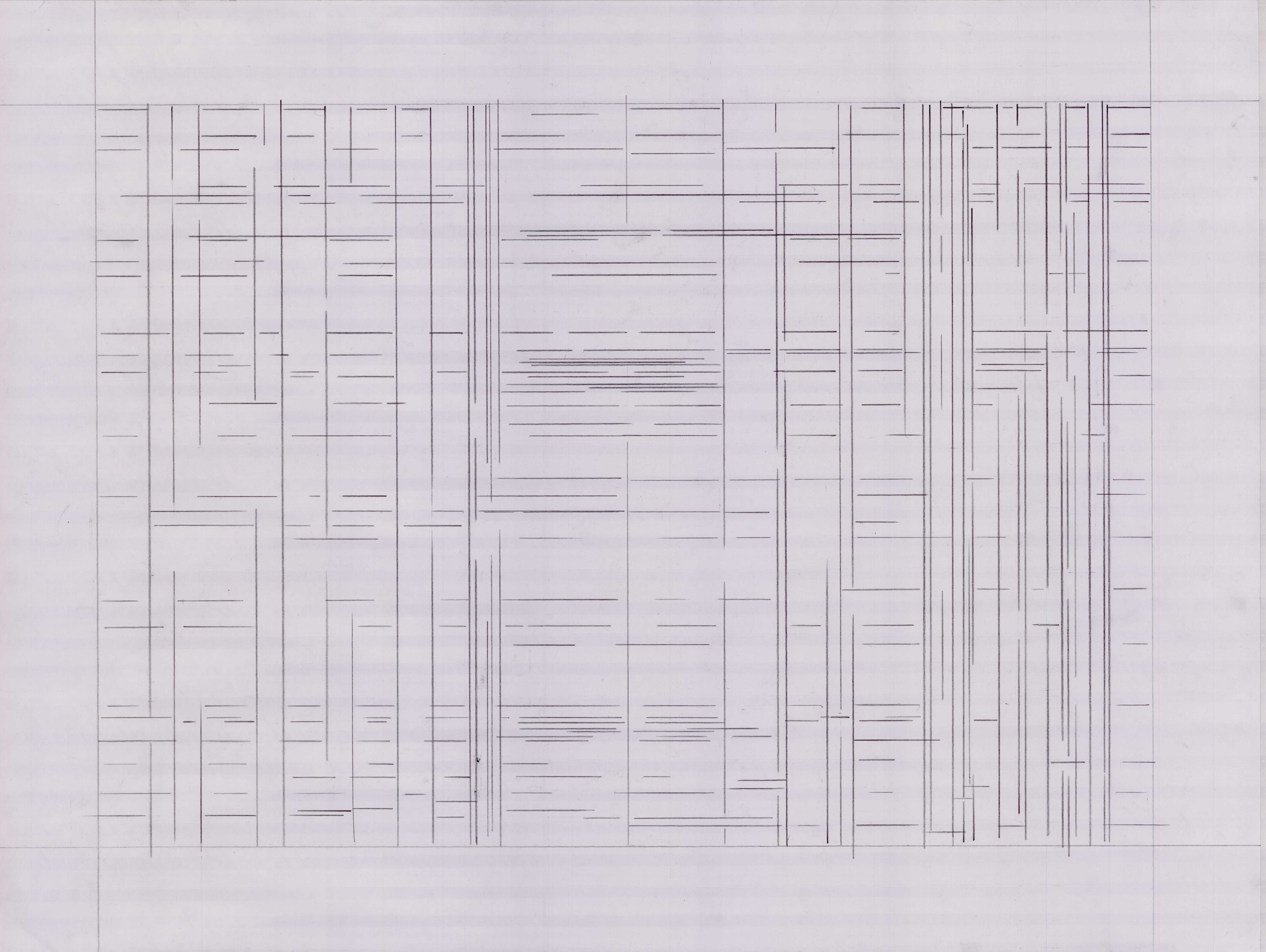
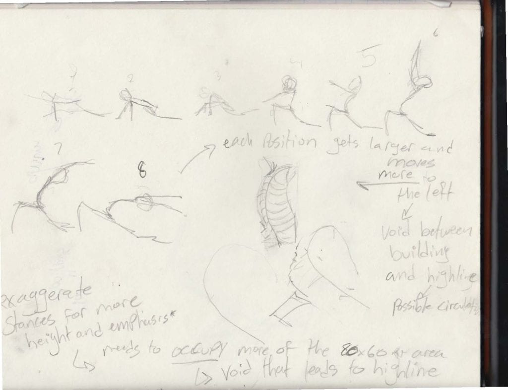
With this I began diagram this movement.

I originally had something organic in mind, I however was not entirely married to this idea.
-
-
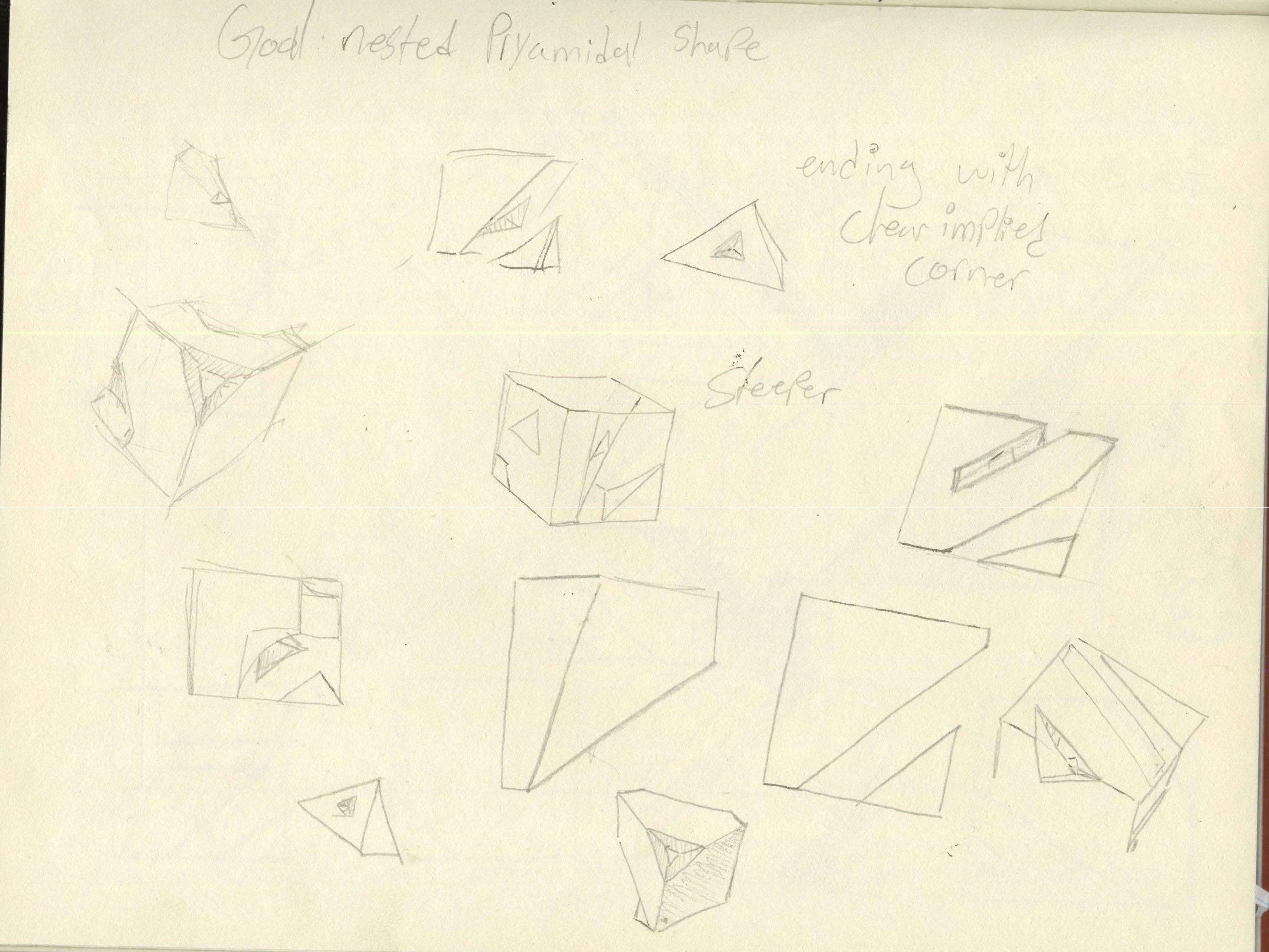
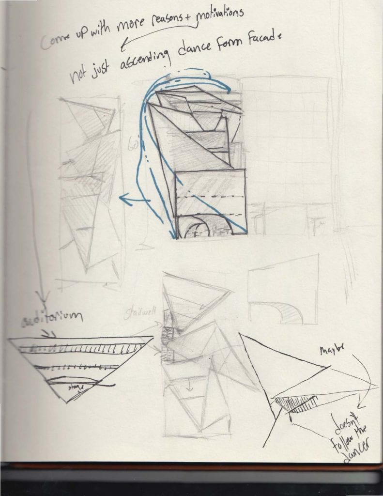
It was within these diagrams that I decided to focus more on the motion of the dancer rather than the form
-
-

-
-
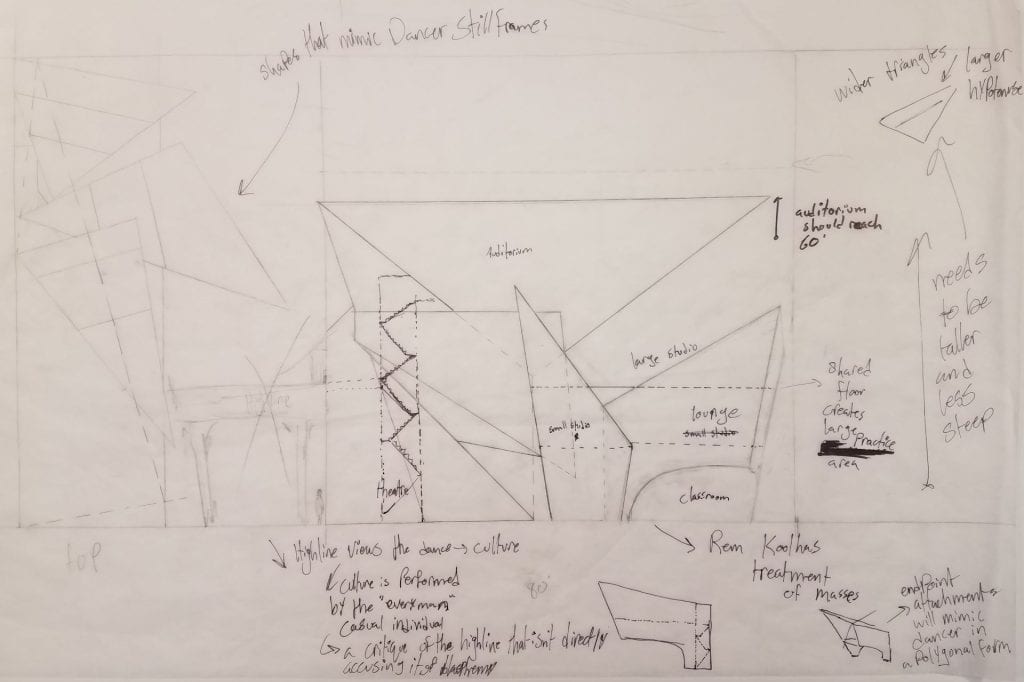
which could be narrowed down to a sweeping motion that geometrical shapes could follow
-
-
essentially embodying a mass underneath a line of motion
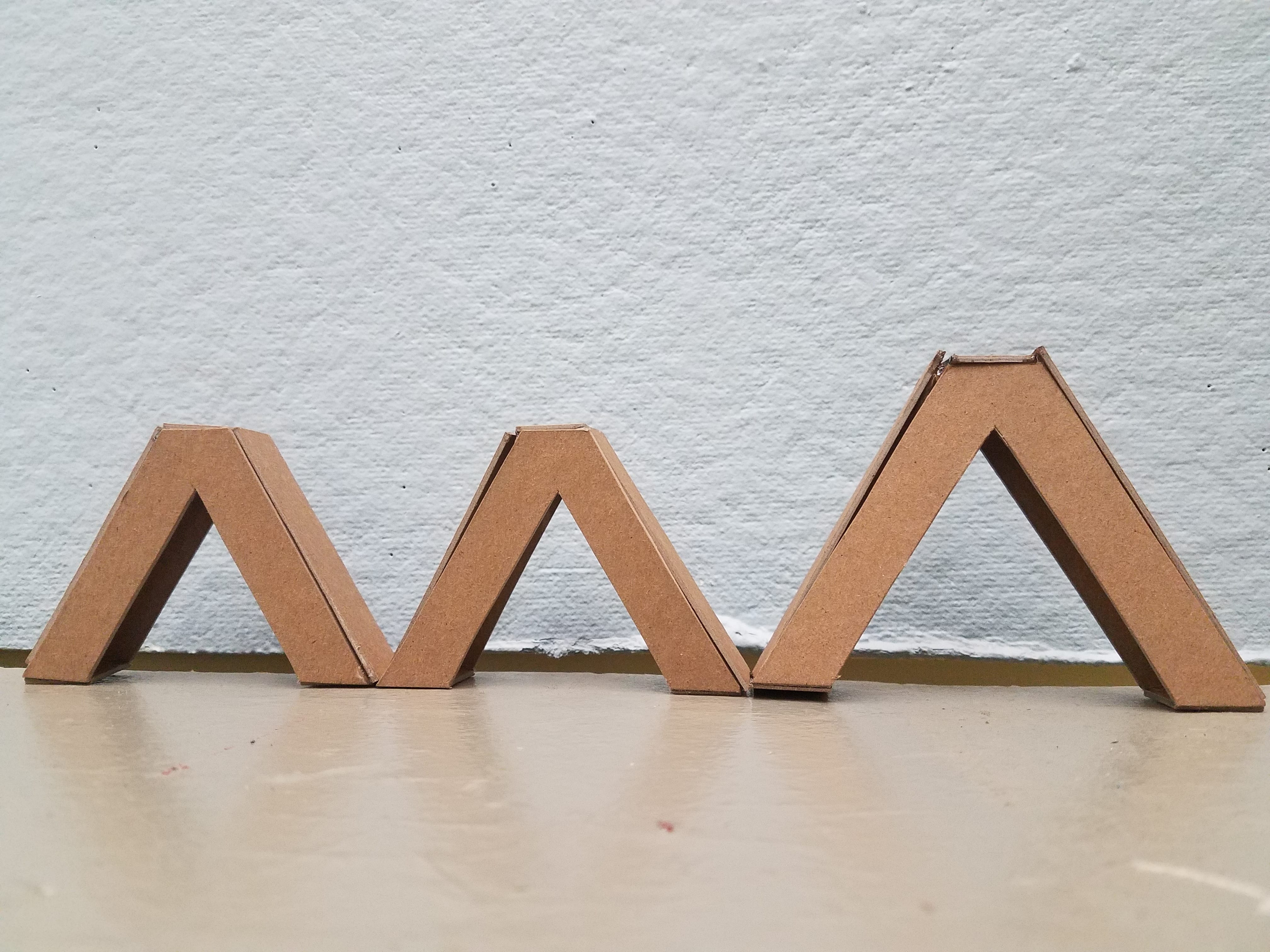
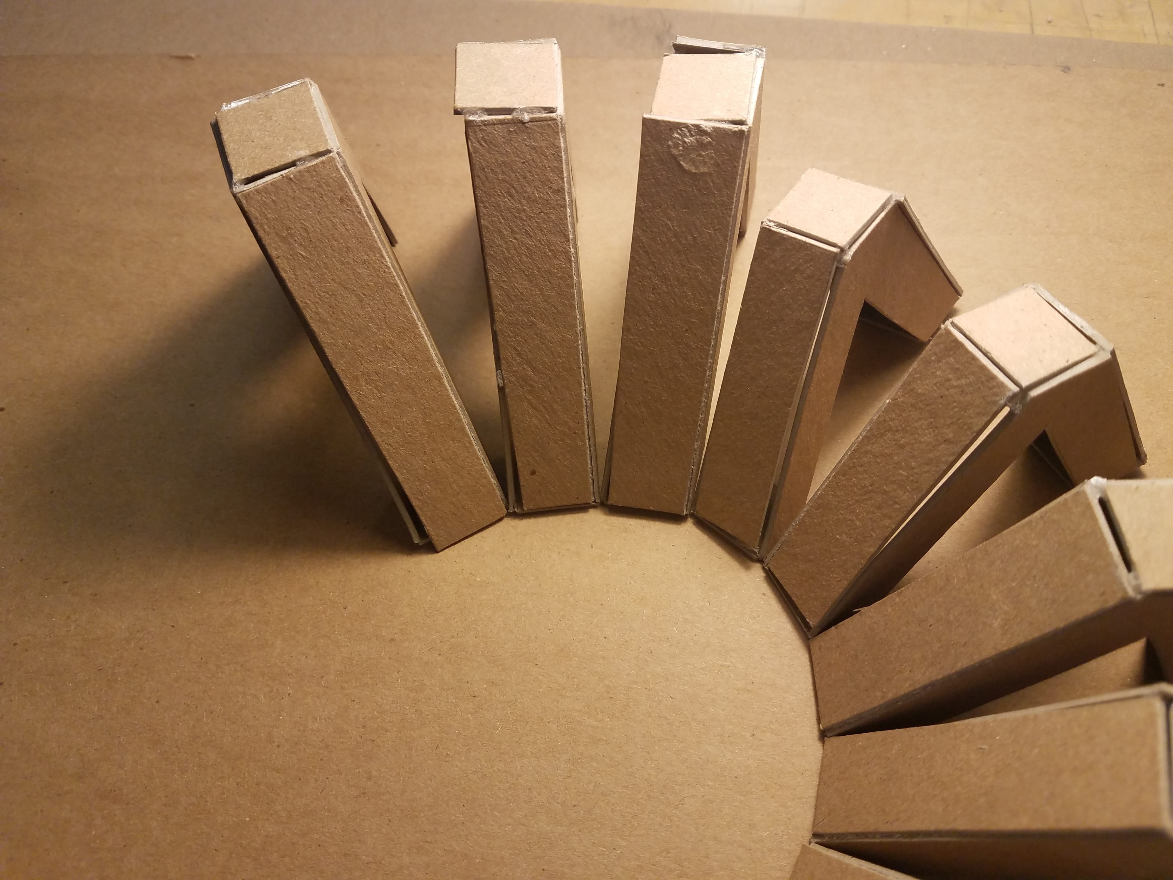
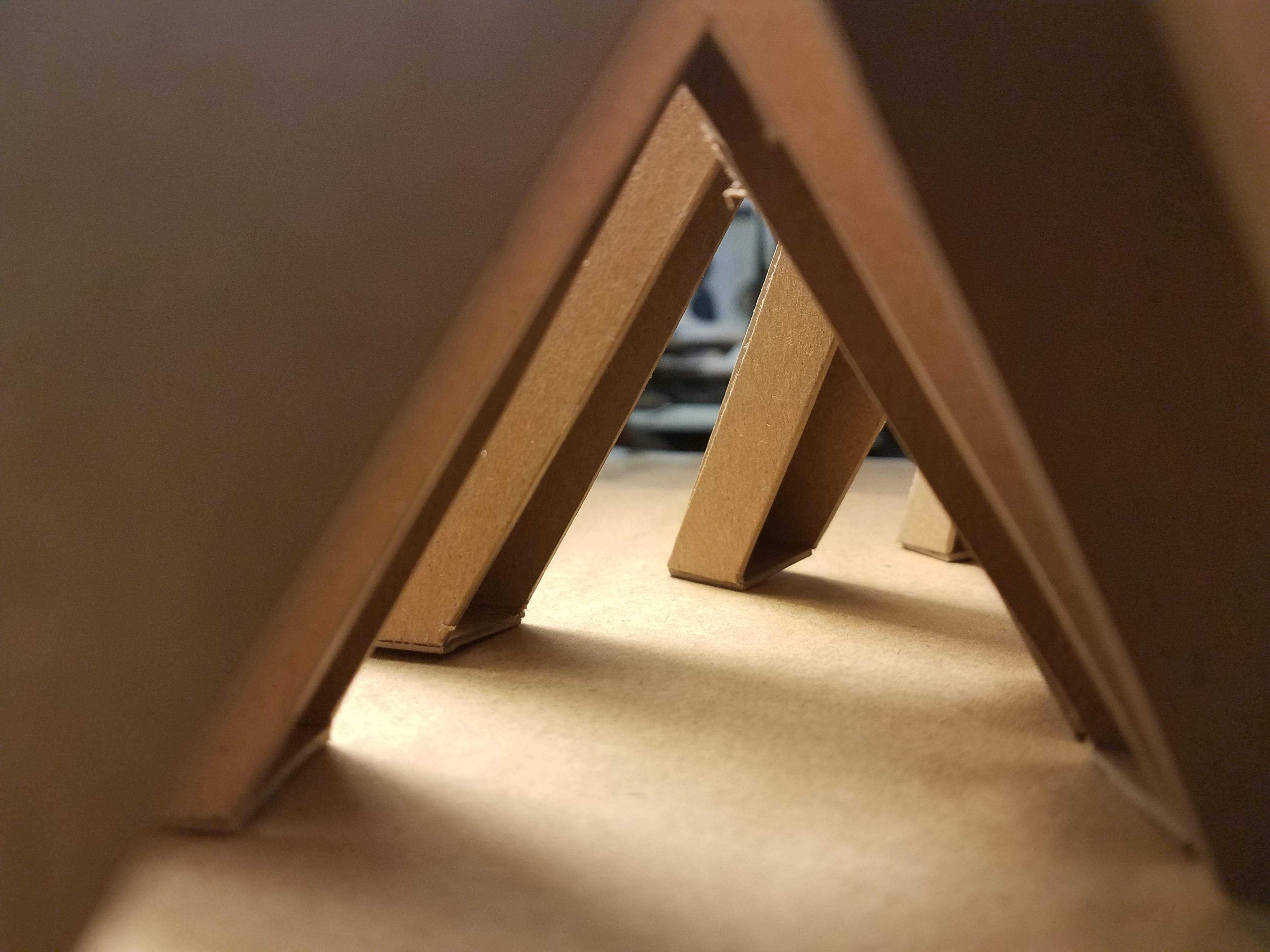
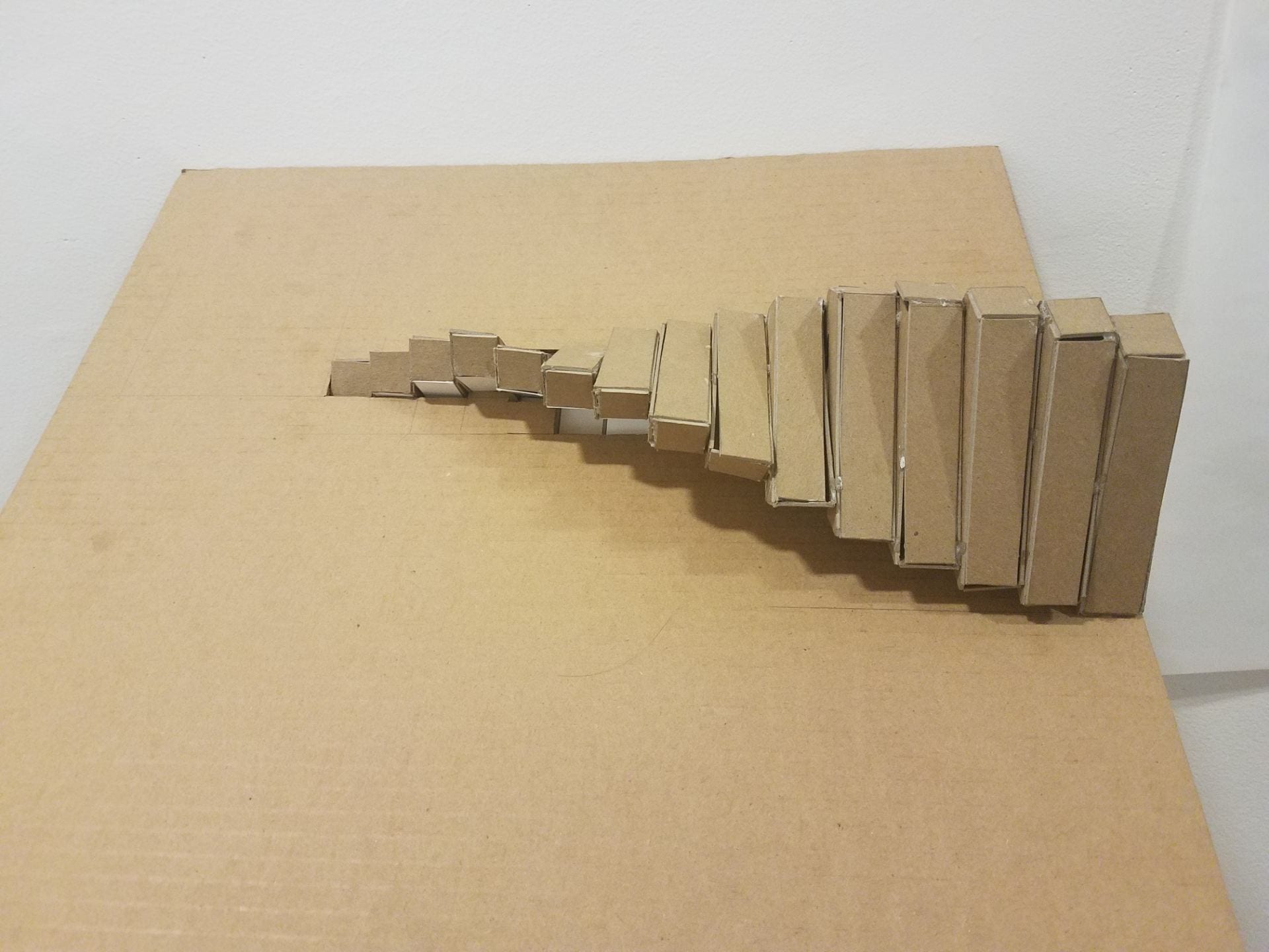
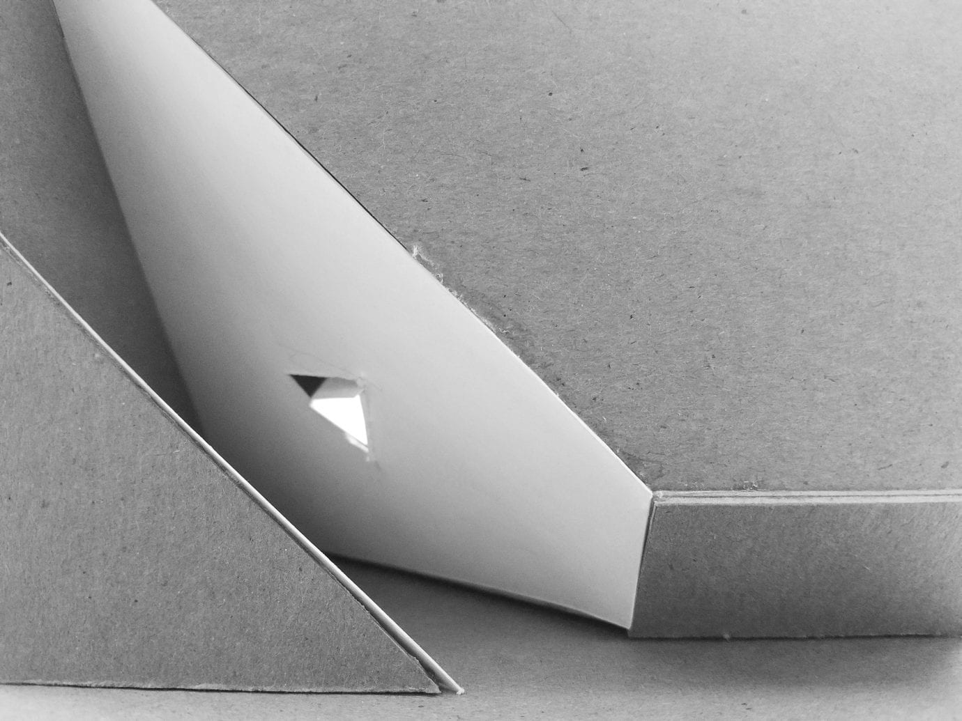
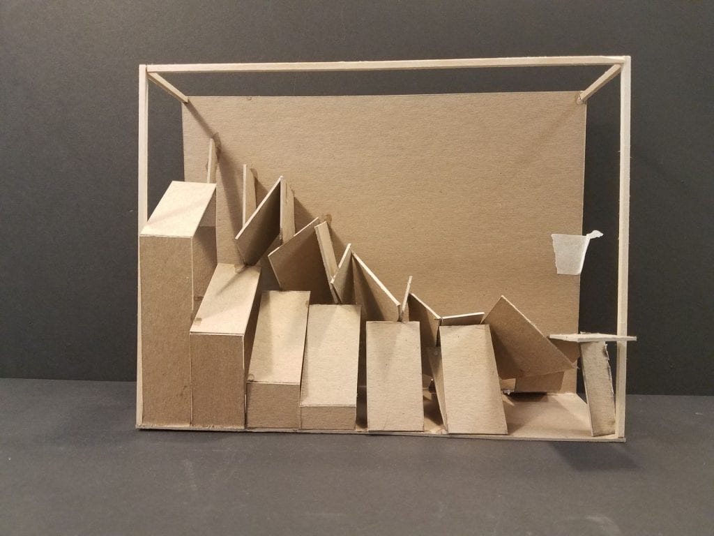
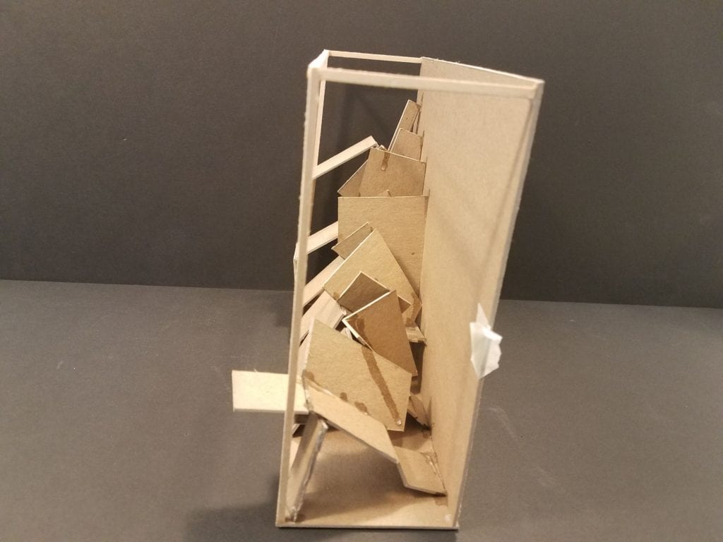
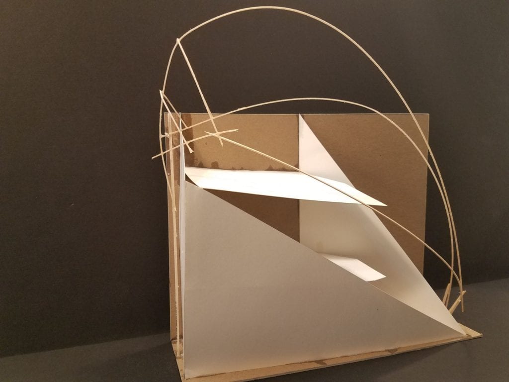
This geometrical form then generated this sketch model:
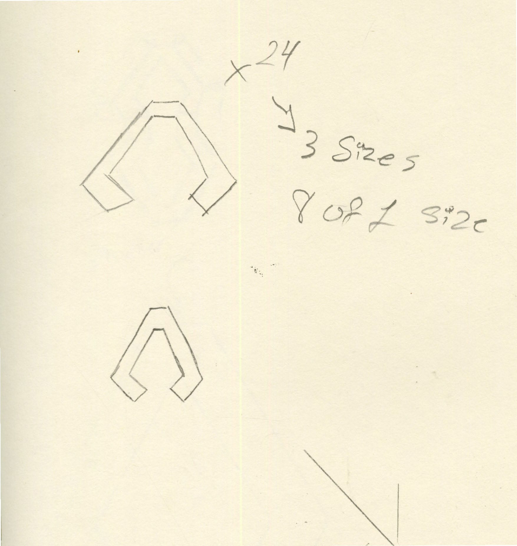
With these forms in mind, I began diagramming again:
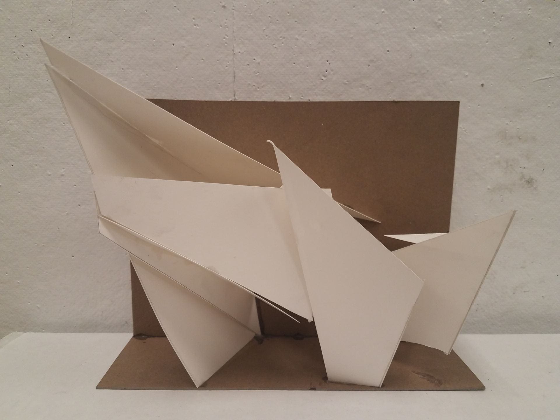
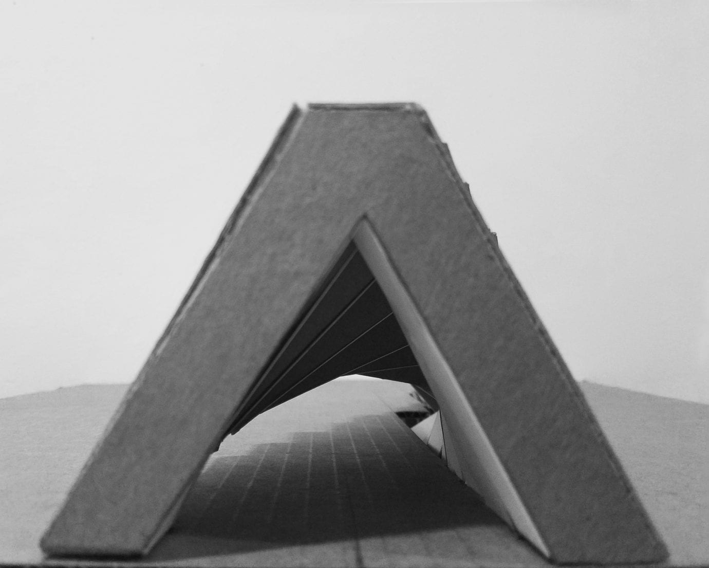
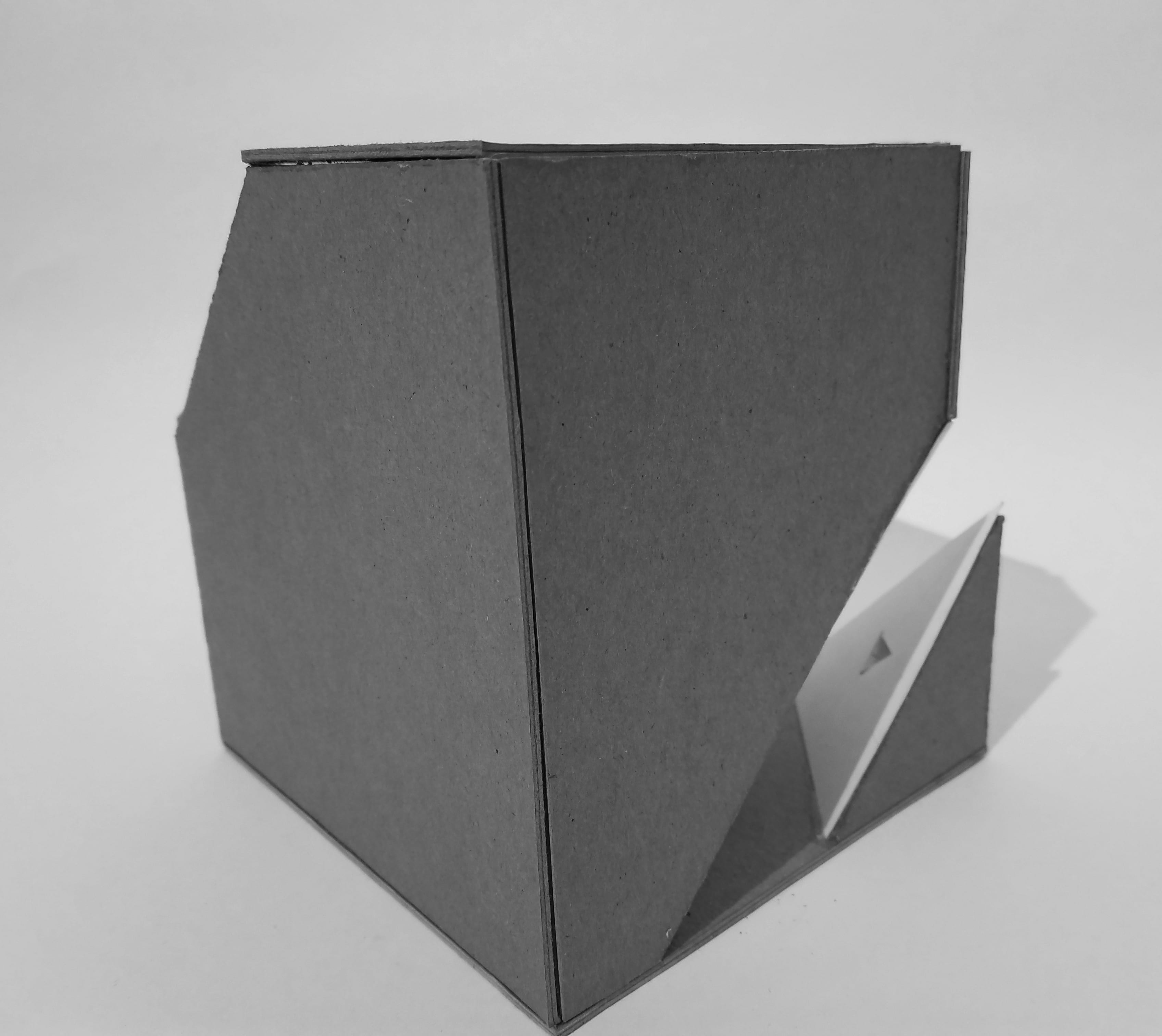
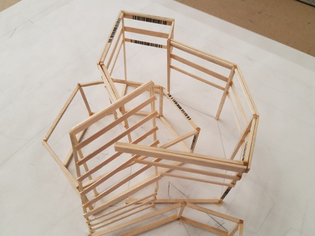
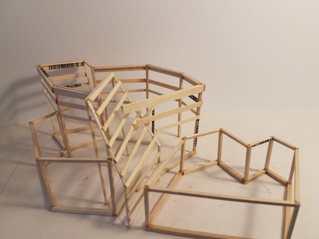
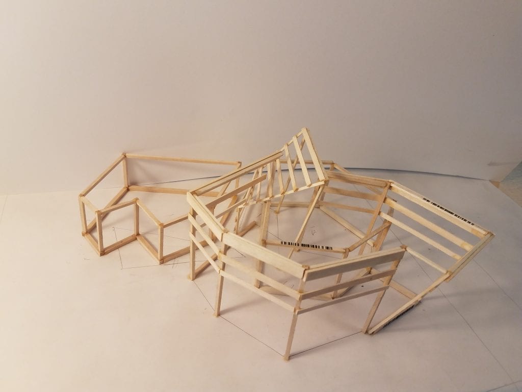
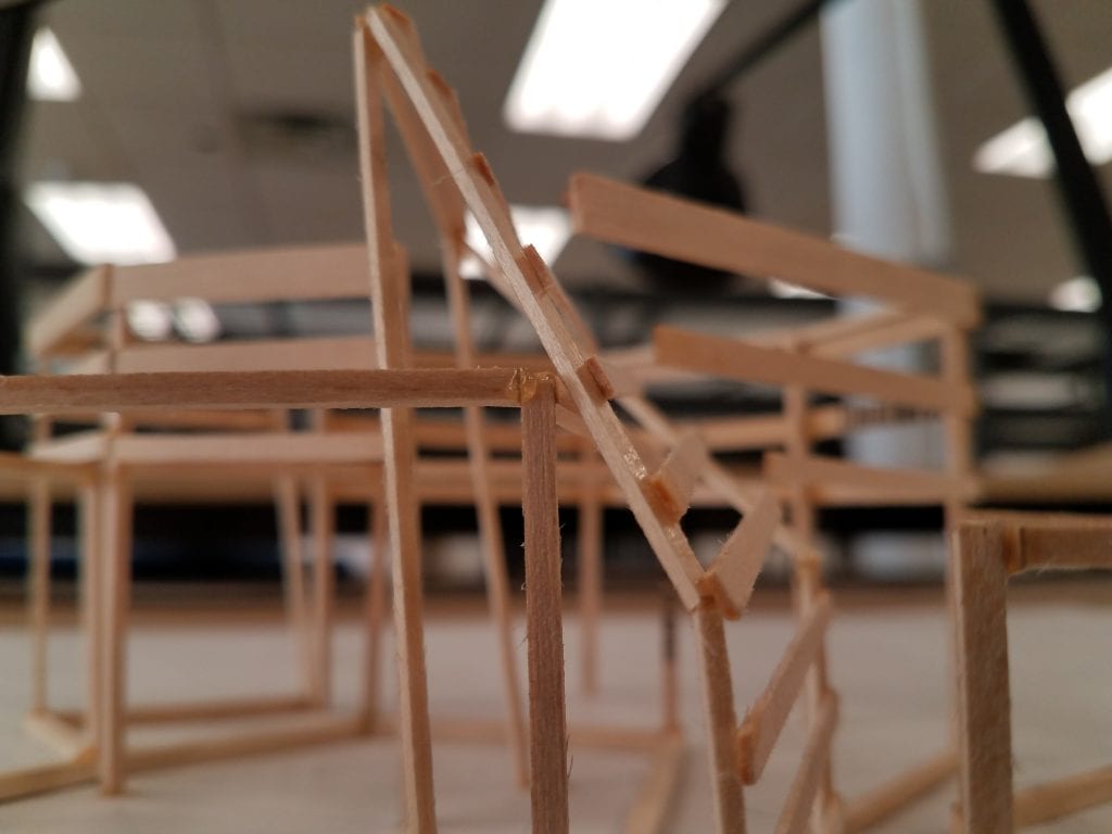
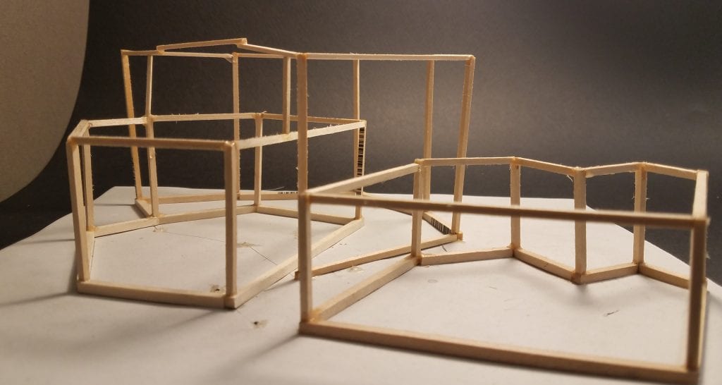
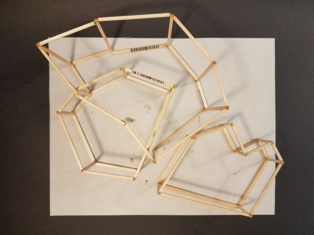
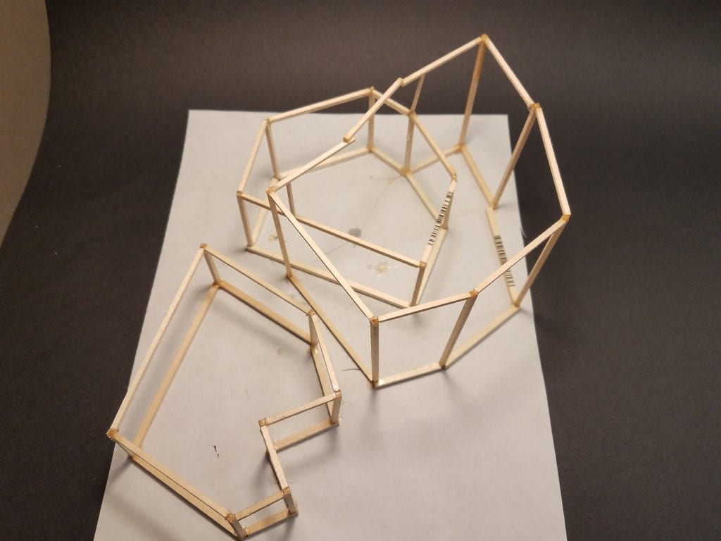
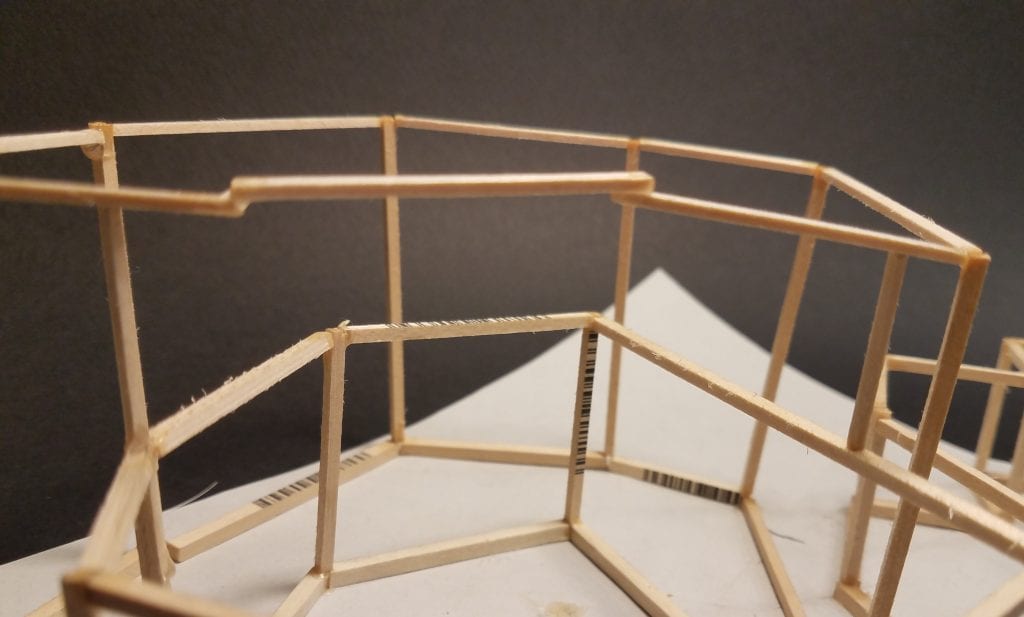
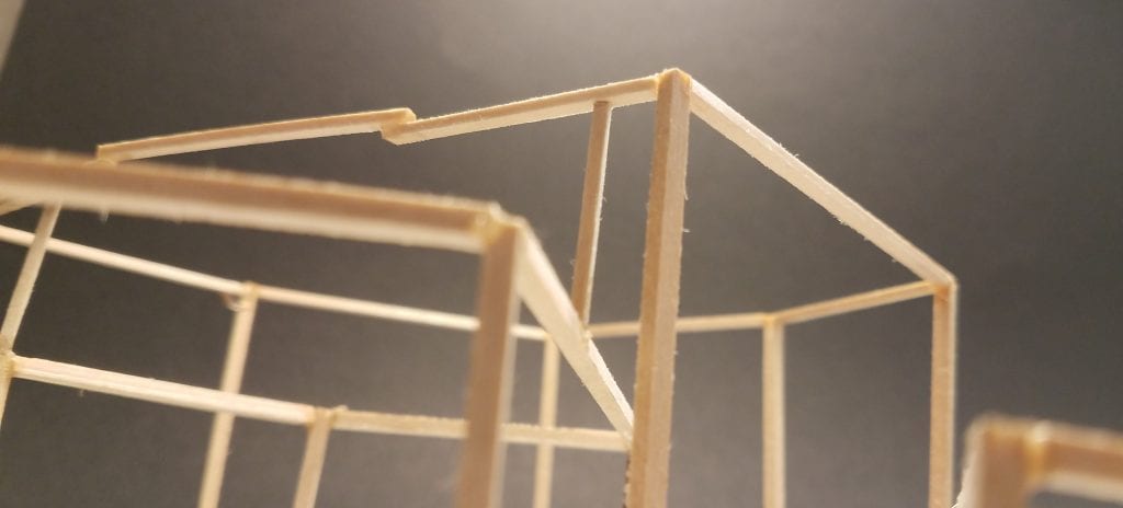
I wanted to figure out how I would enclose this structure, through a sketch model I decided to attach each endpoint with a line in a sort of Rem Koolhaas fashion:

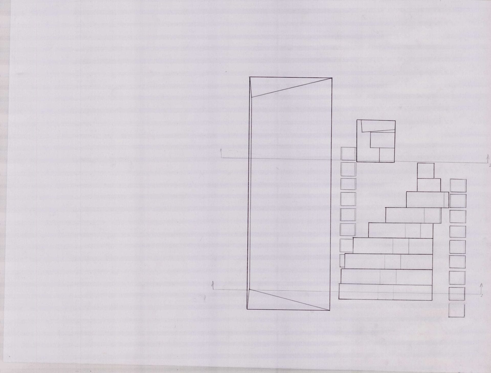
This would be the form I decide to continue this design process with. Now it was a matter of defining floor plates and where program would be situated.
-
-
These were meant to establish the relation between the Highline and the spaces inside
-
-
-
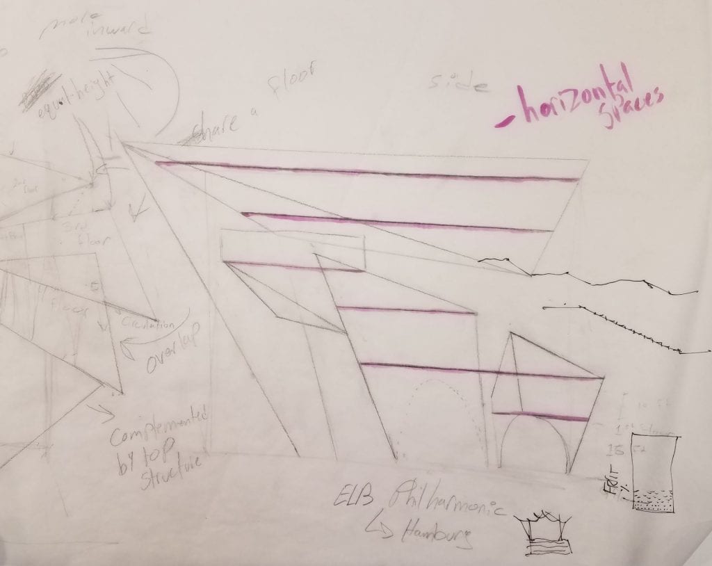
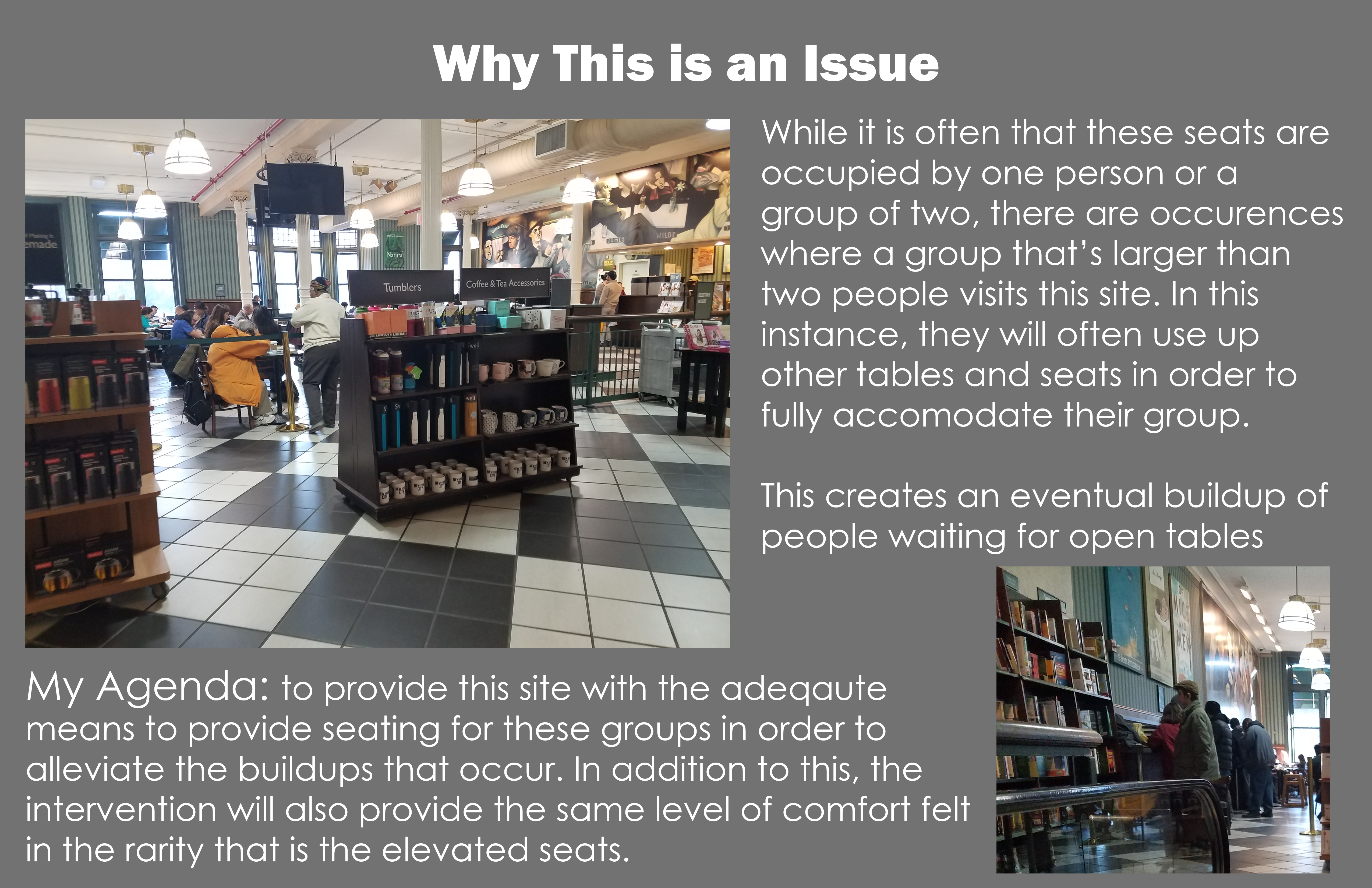
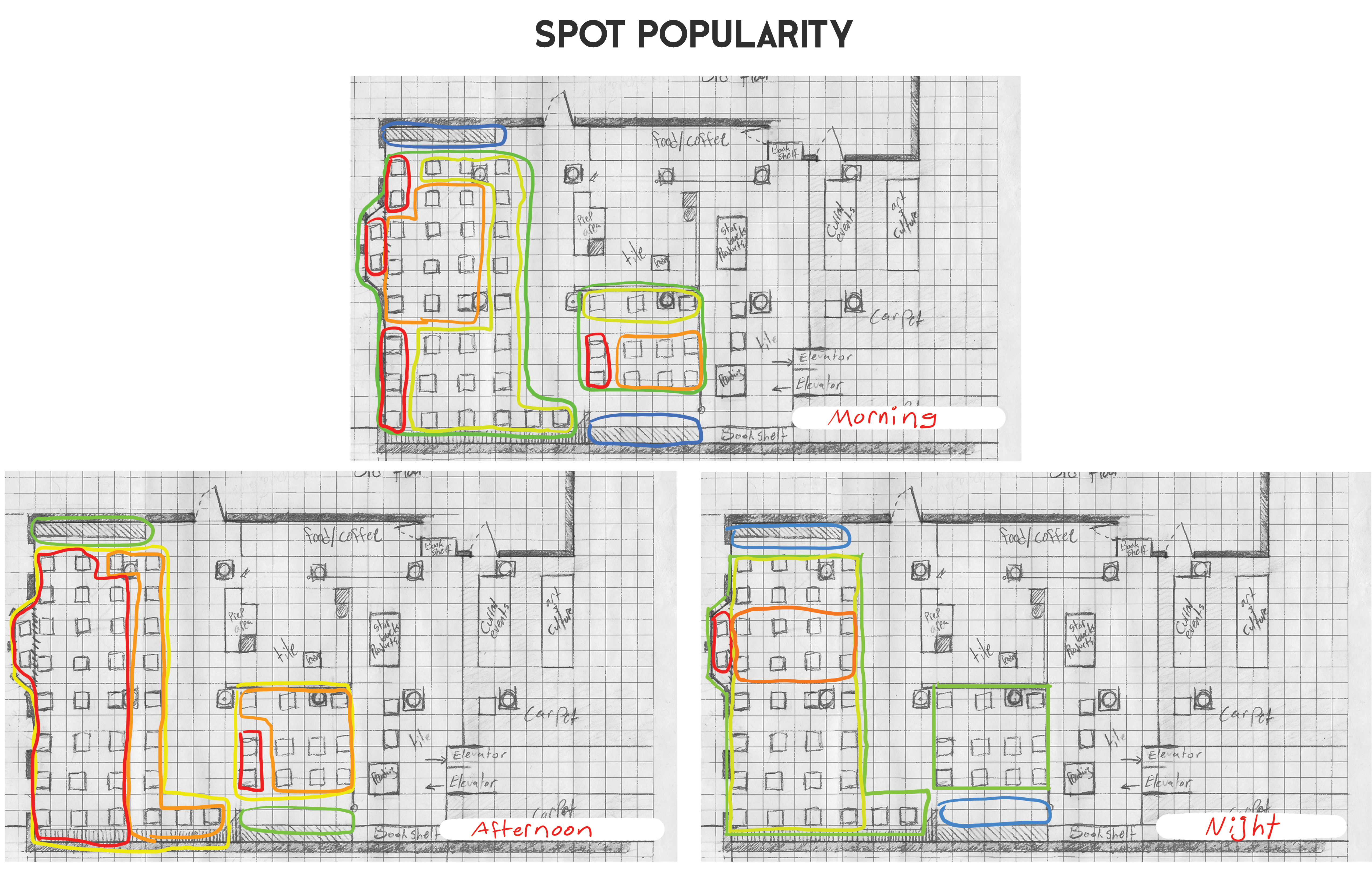
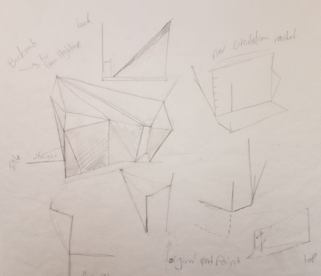
the issue with these floorplates was that they were too similar to one another, causing for the experience within the structure to be uninteresting
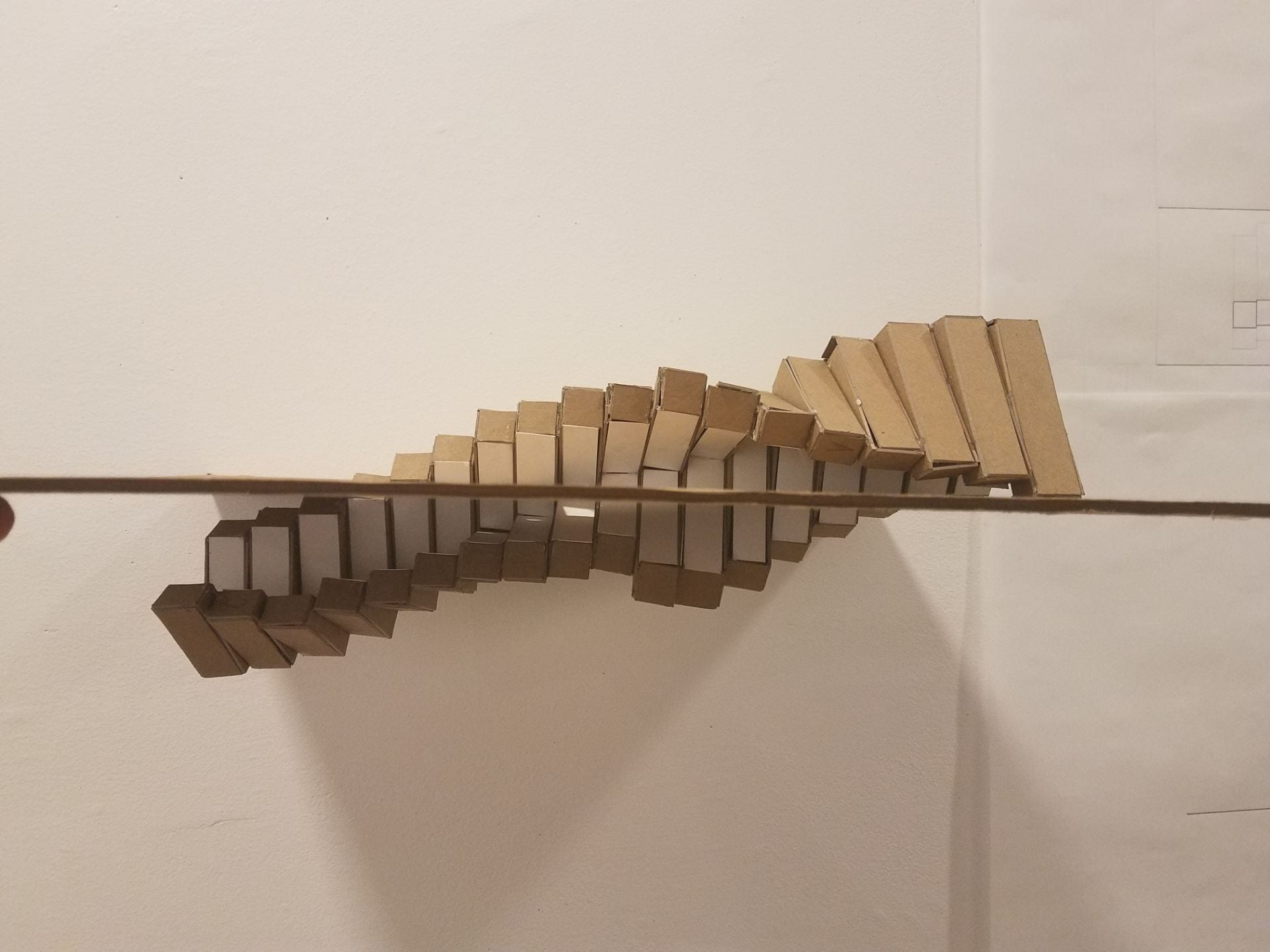
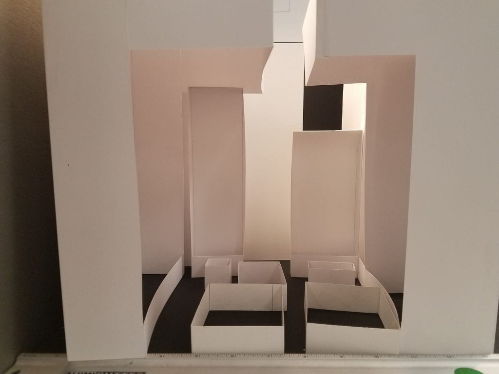
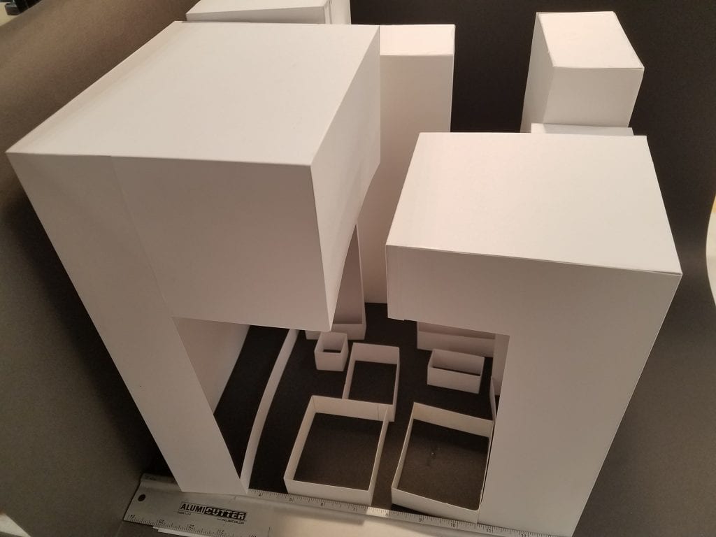
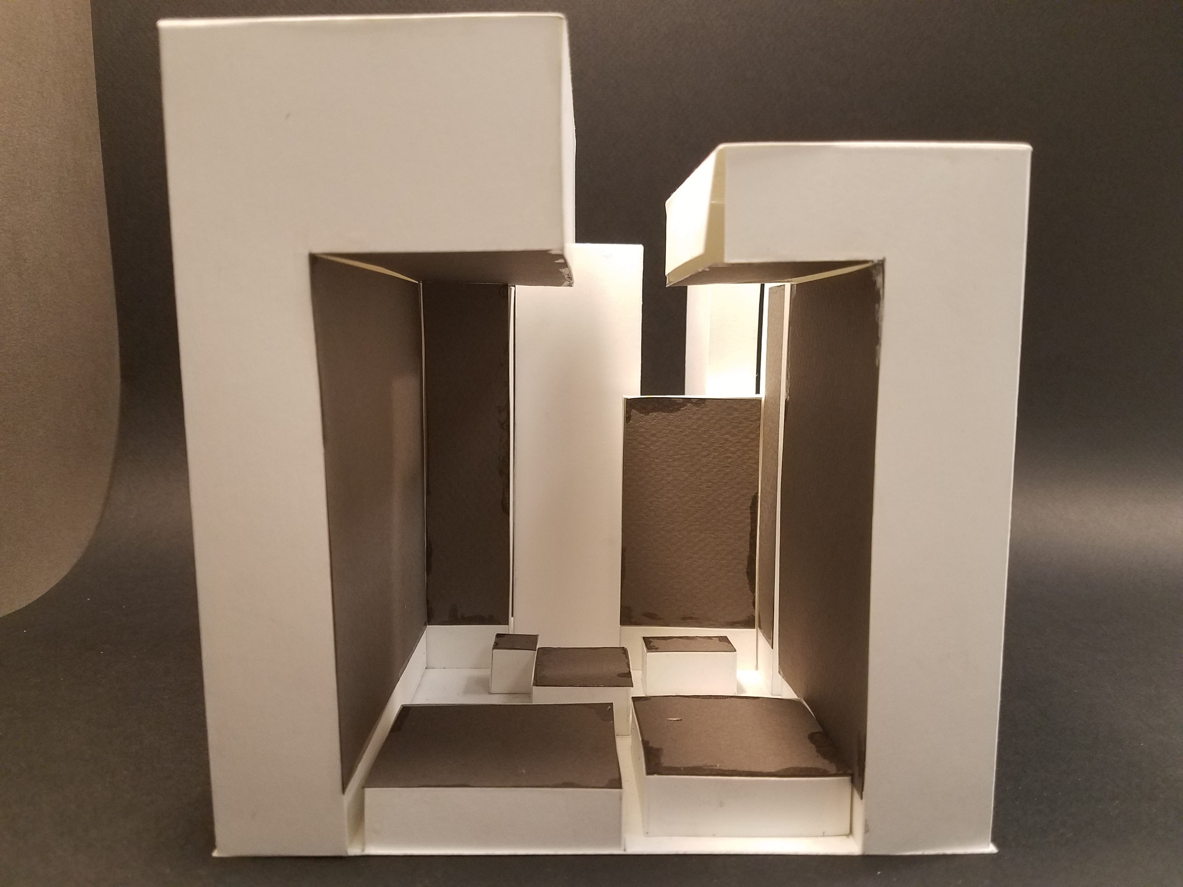
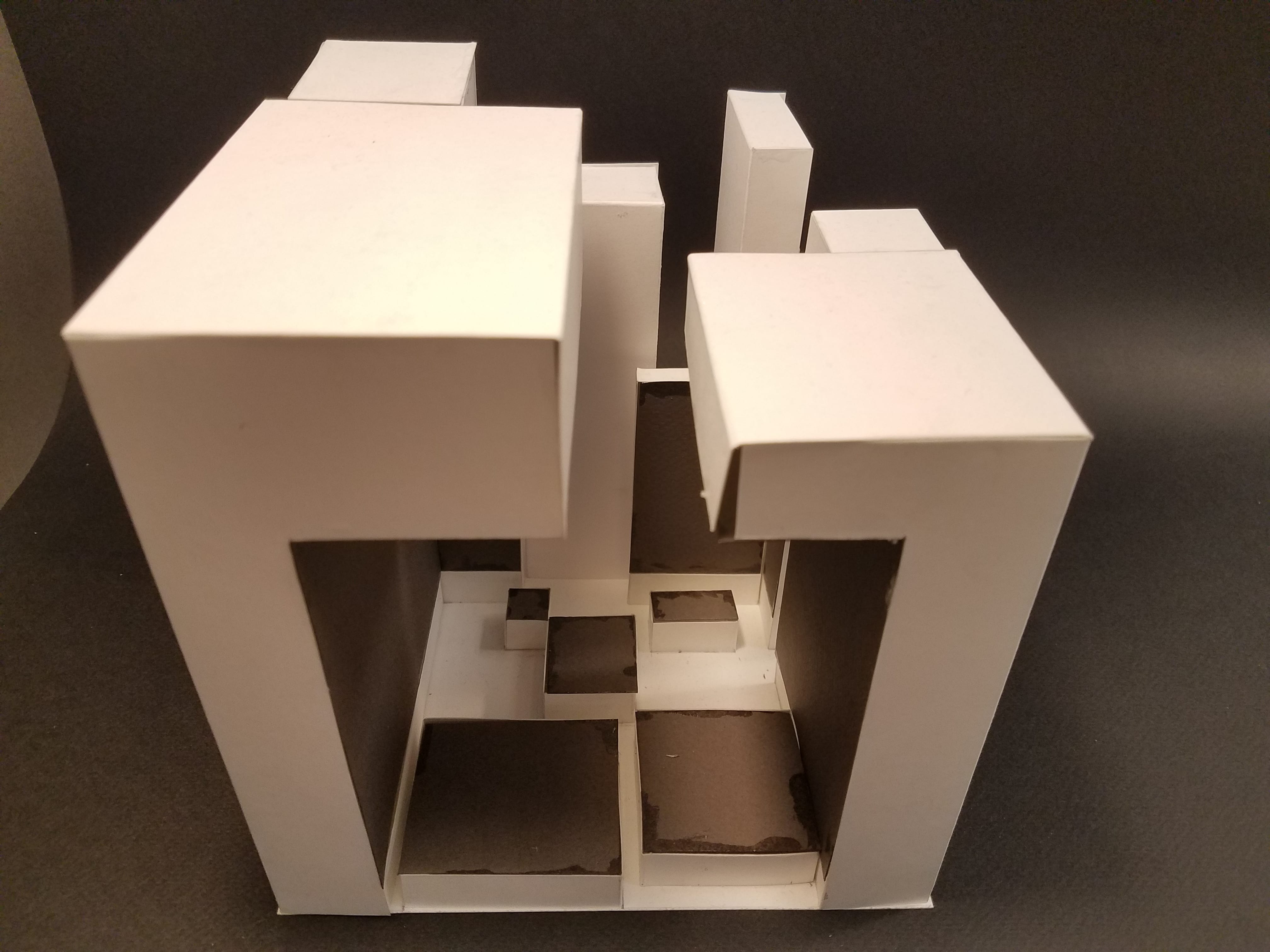
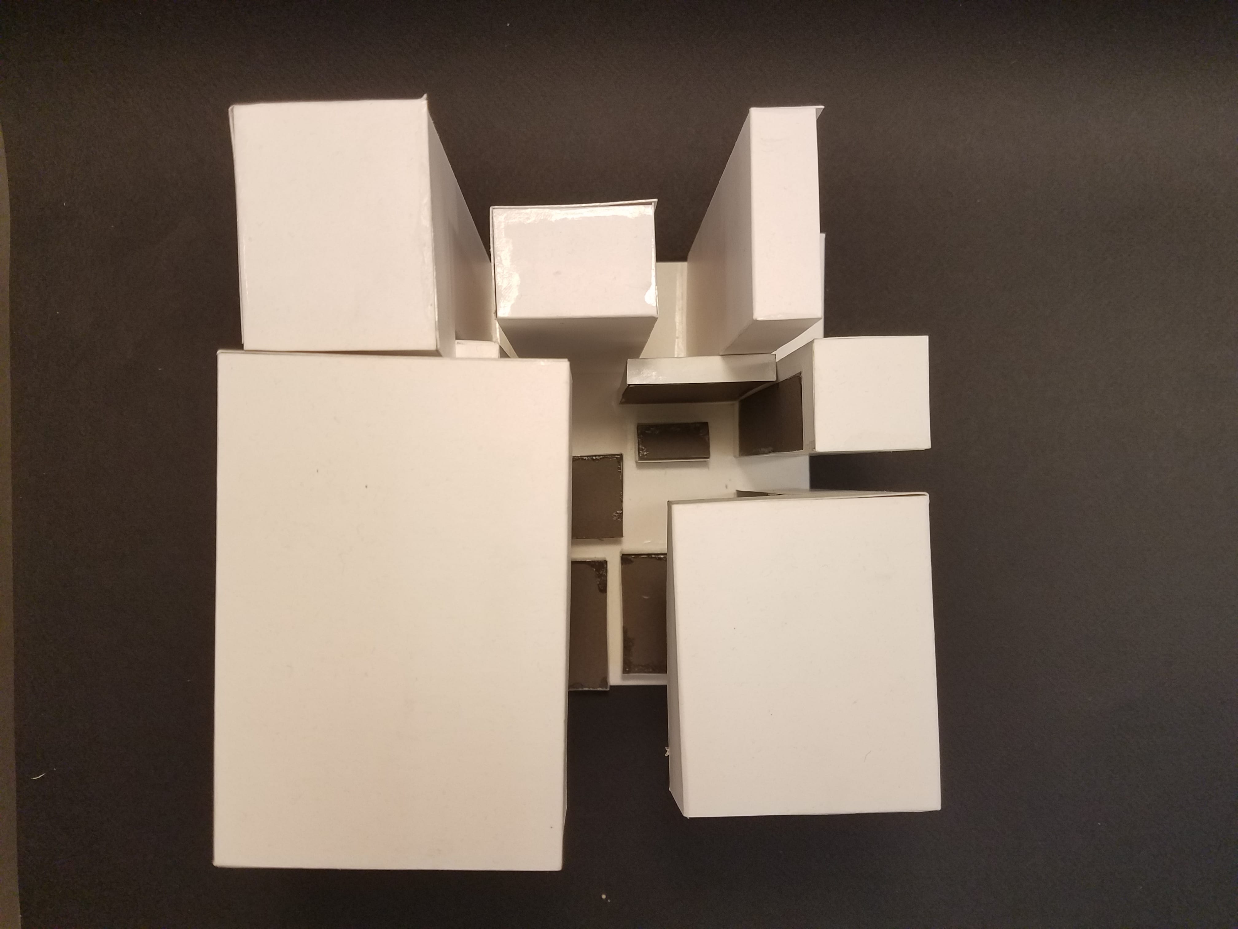
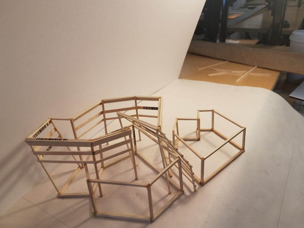
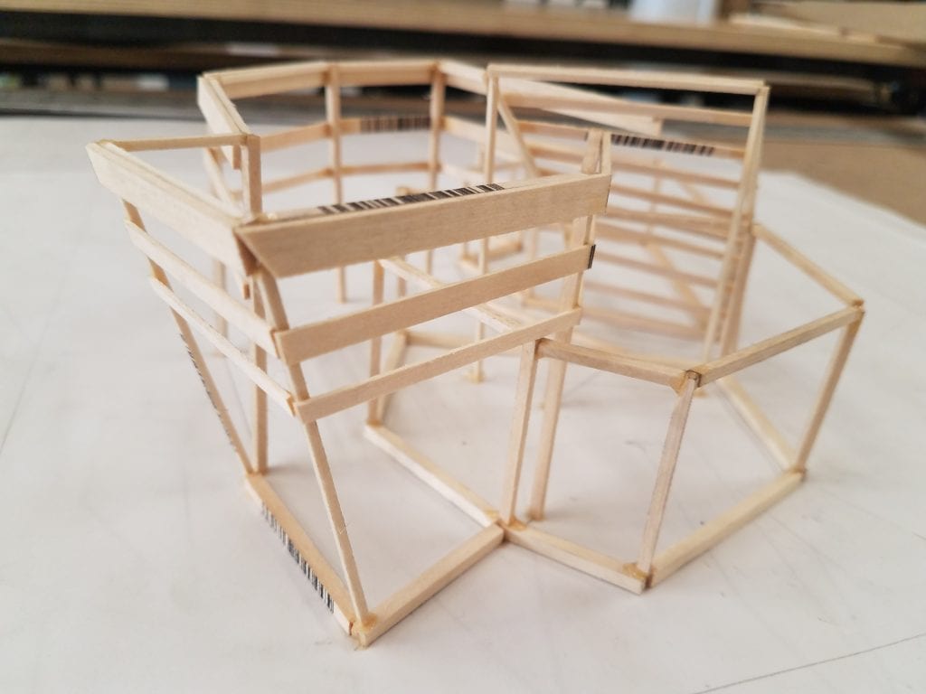
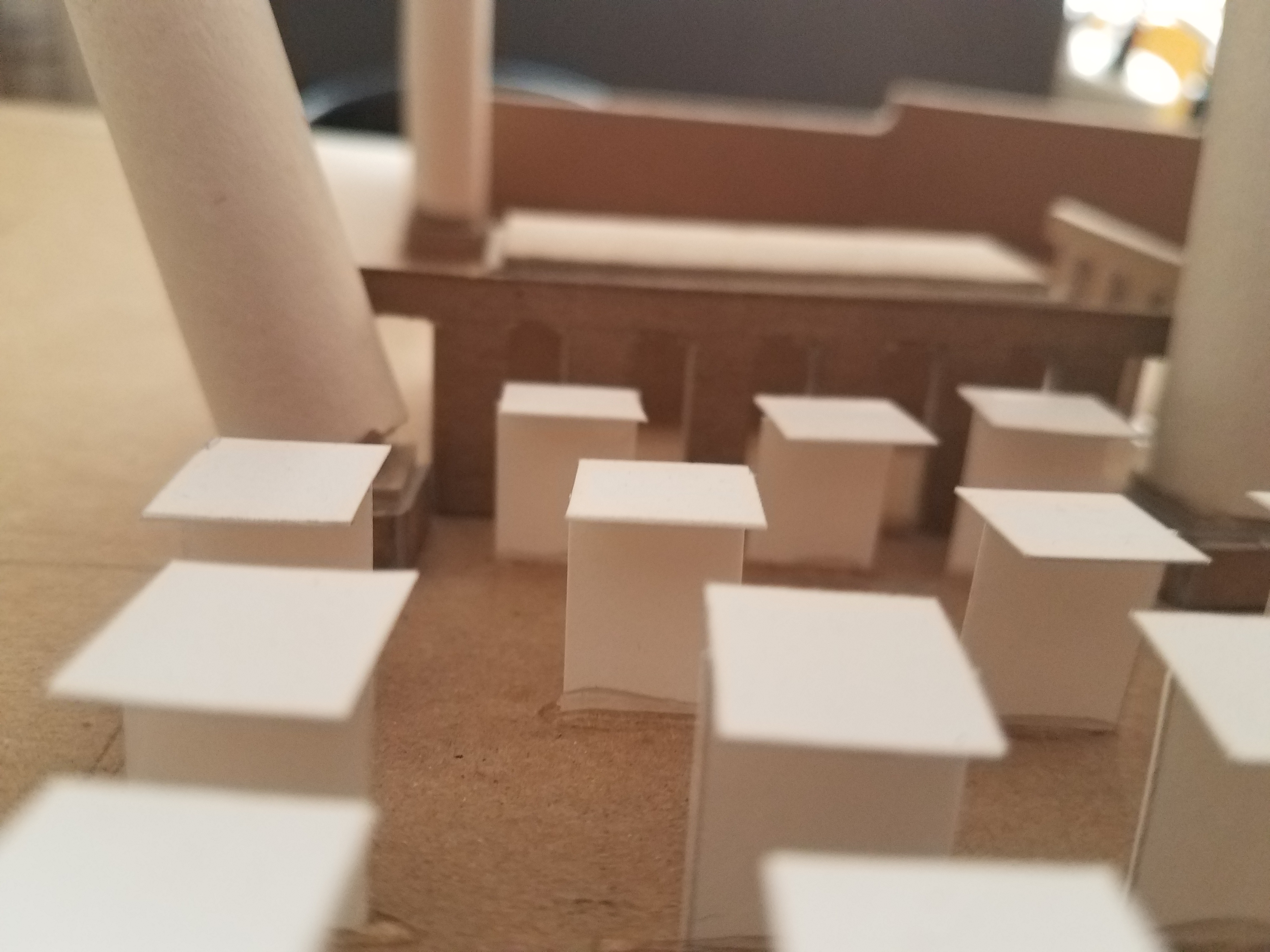
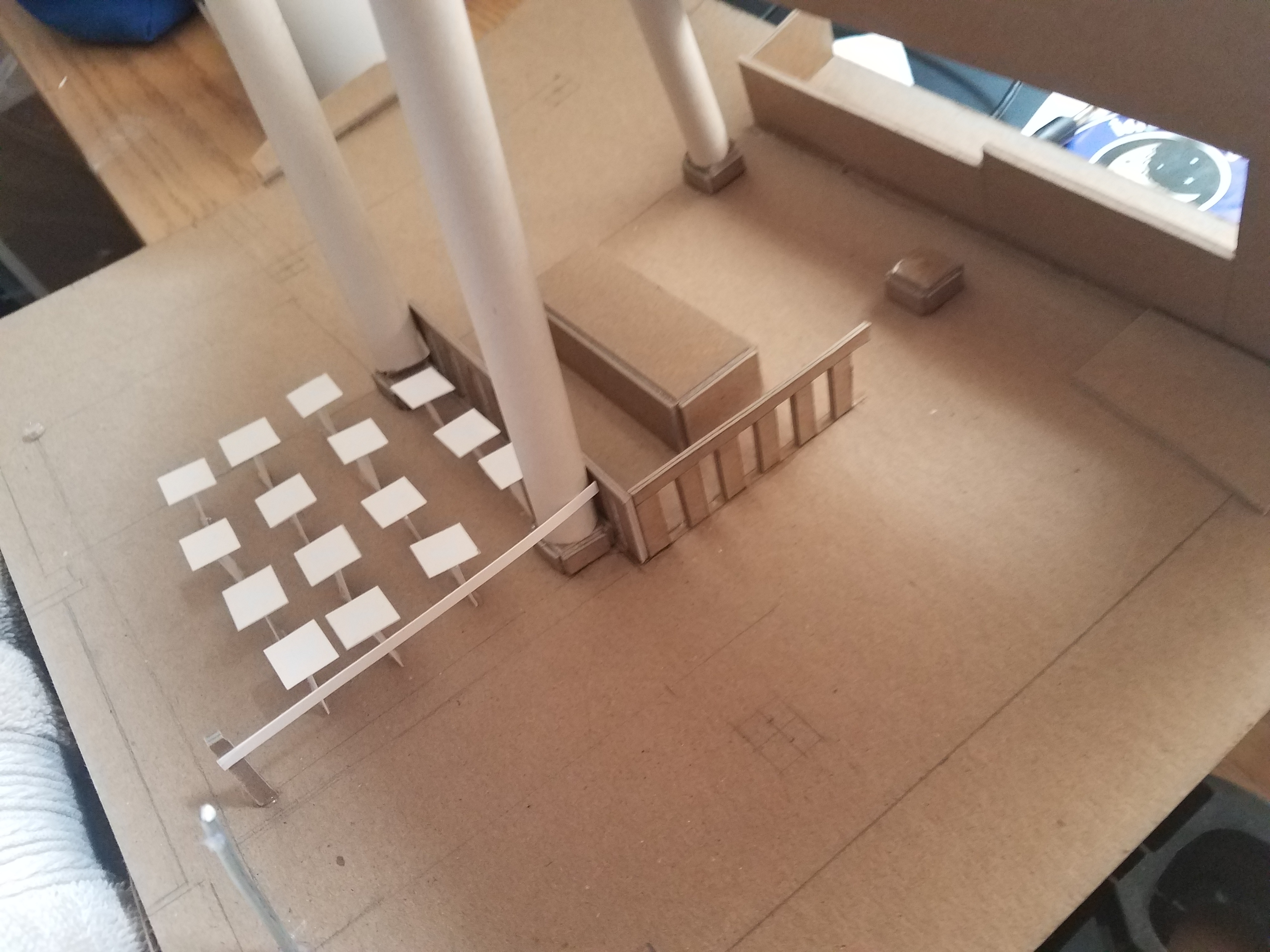
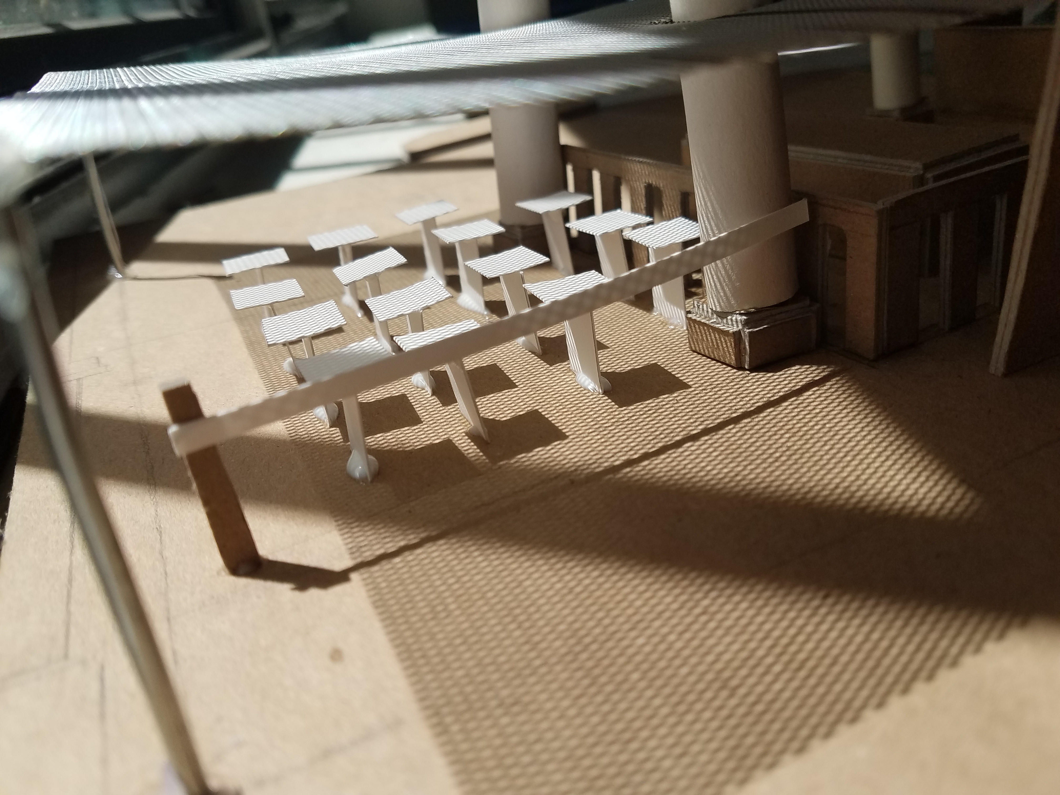
These flaws were satiated by creating 1/16″ circulation models:
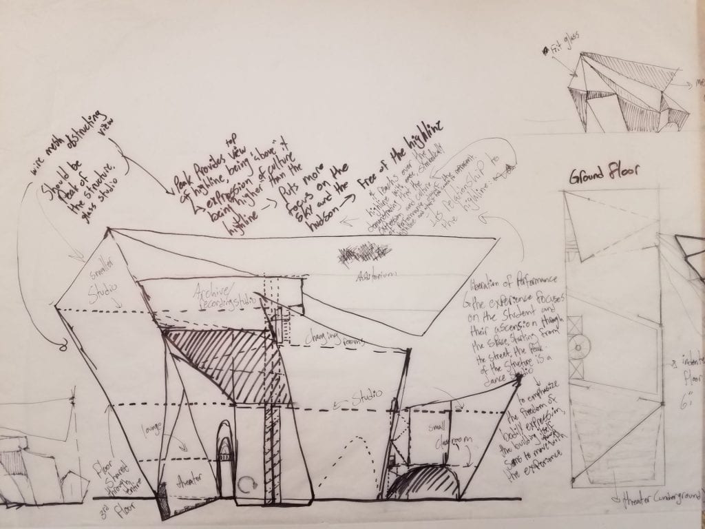
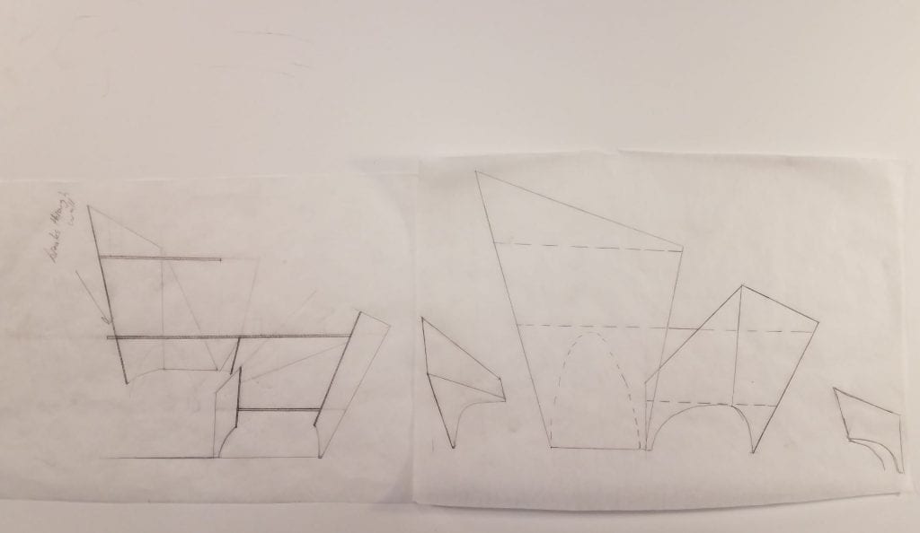
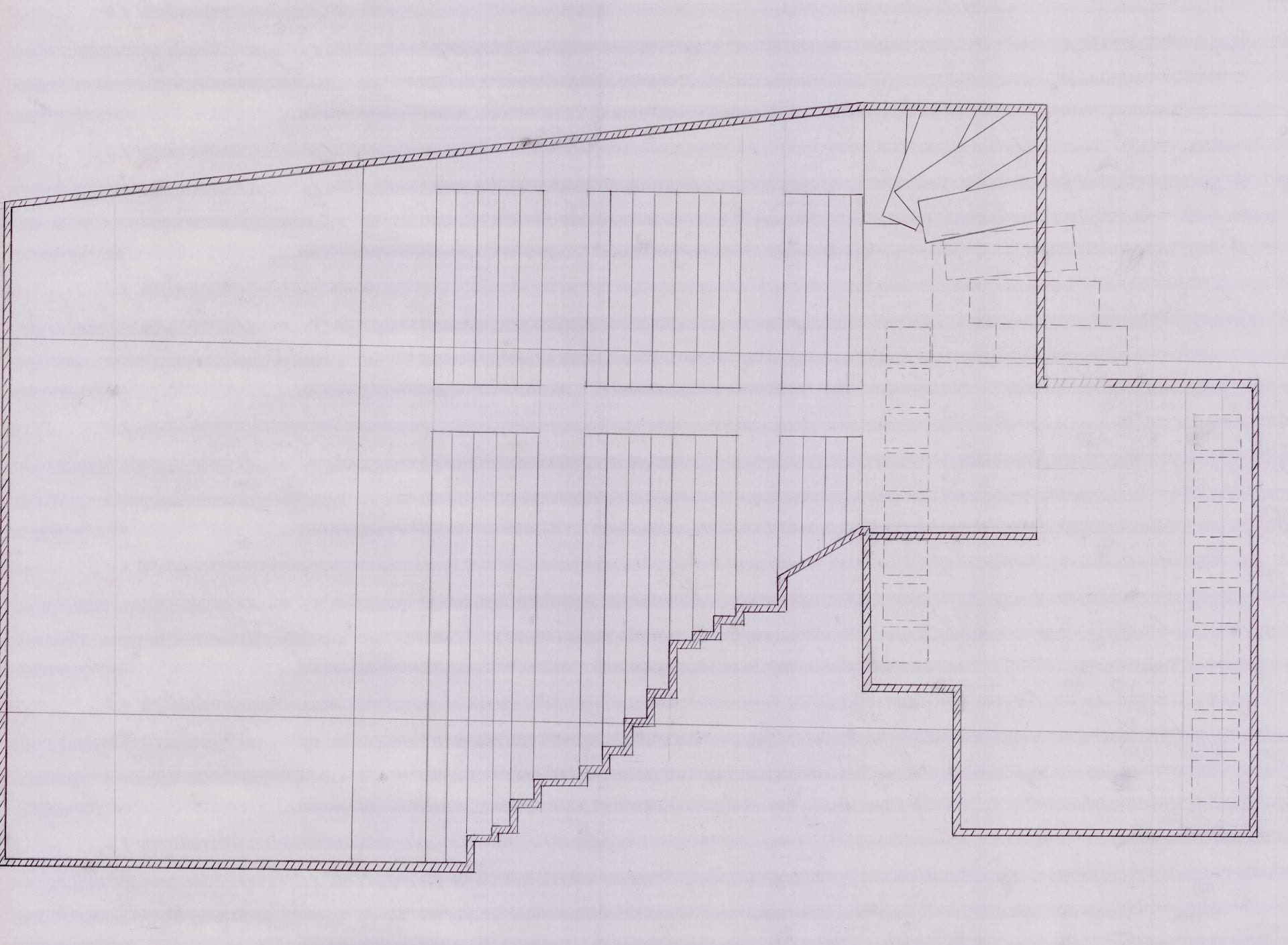
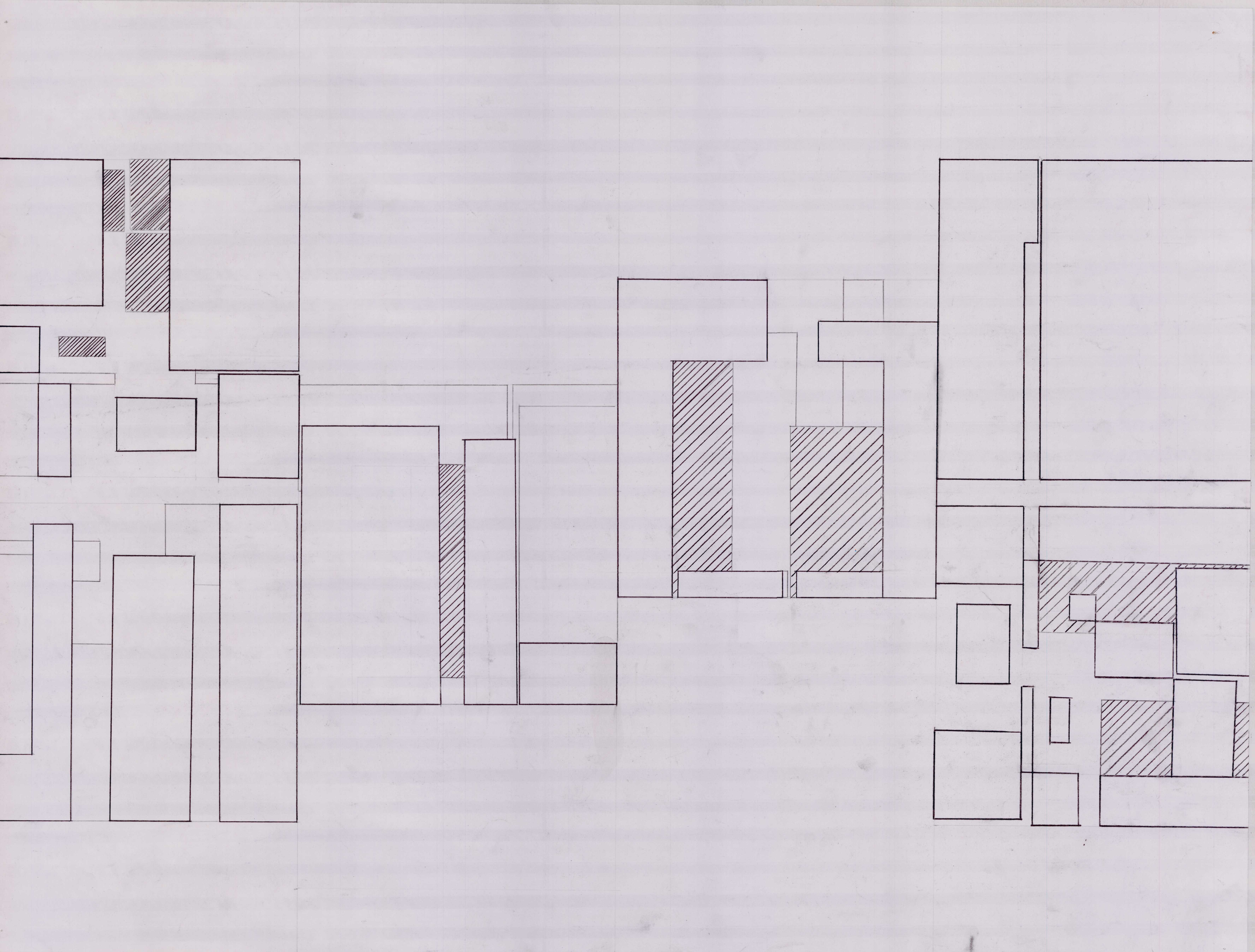
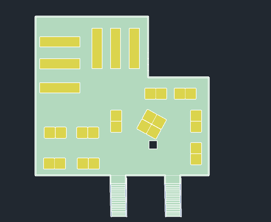
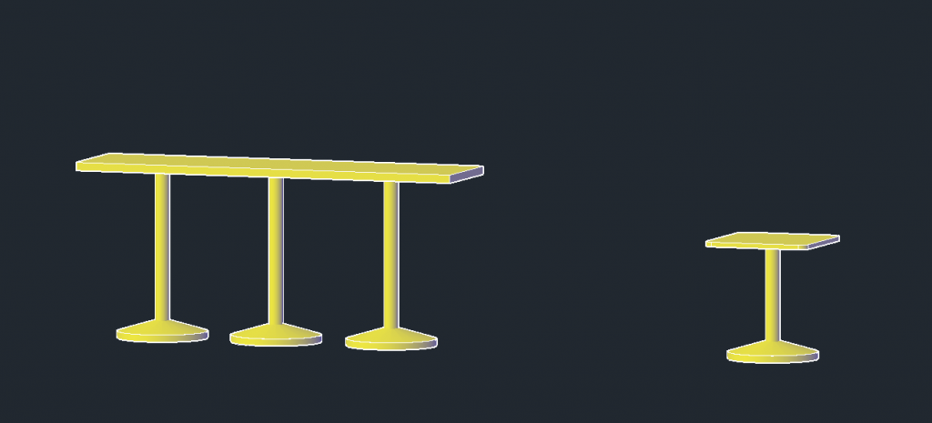
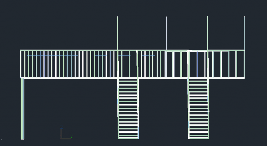
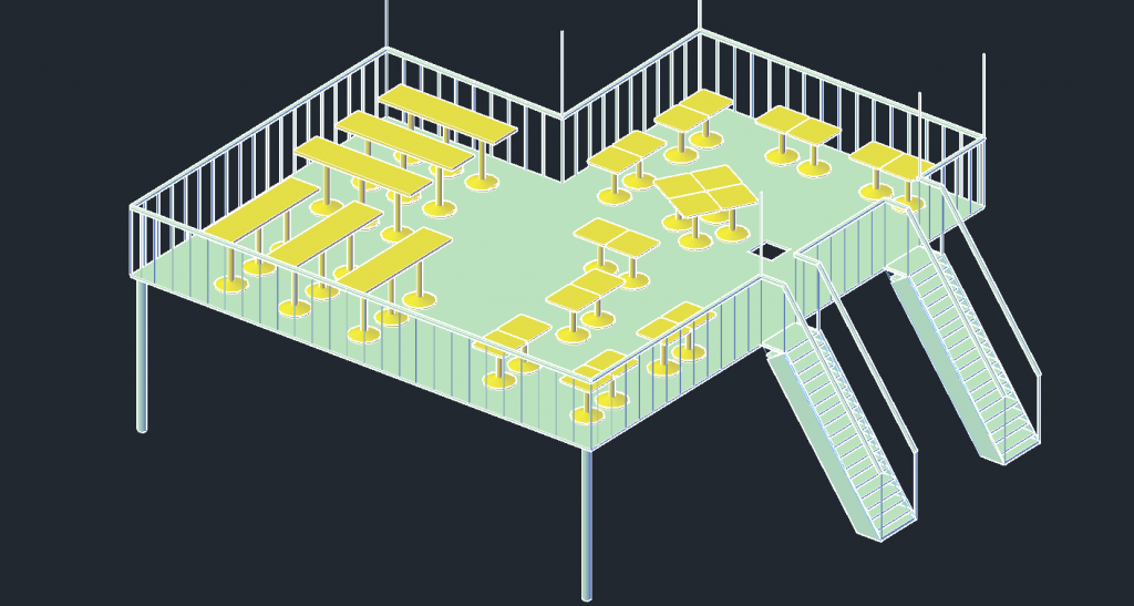
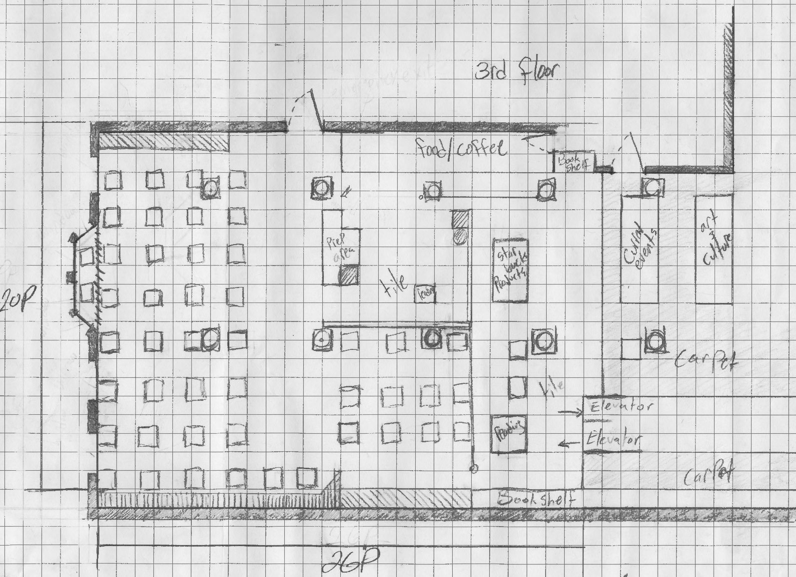
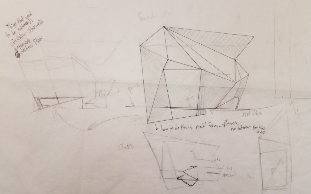
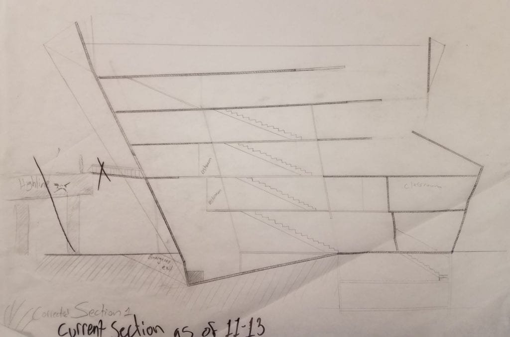
With these floorplates established, I was then tasked with drawing plans and sections of this structure.


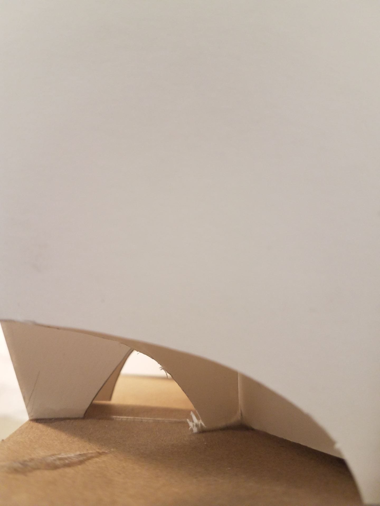
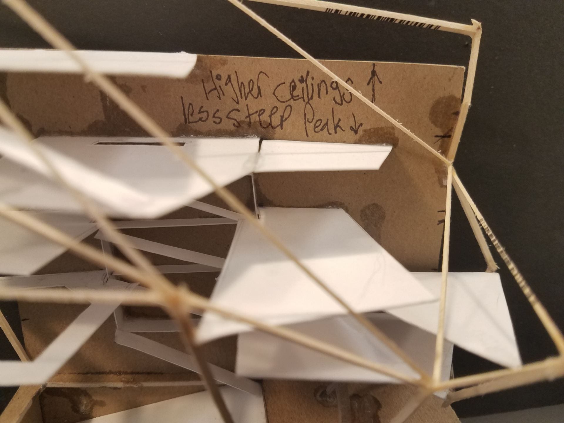
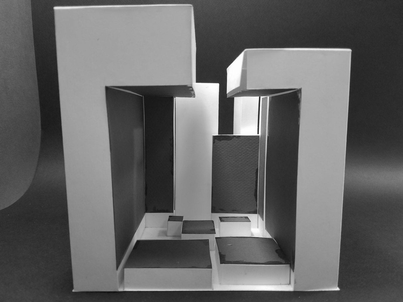
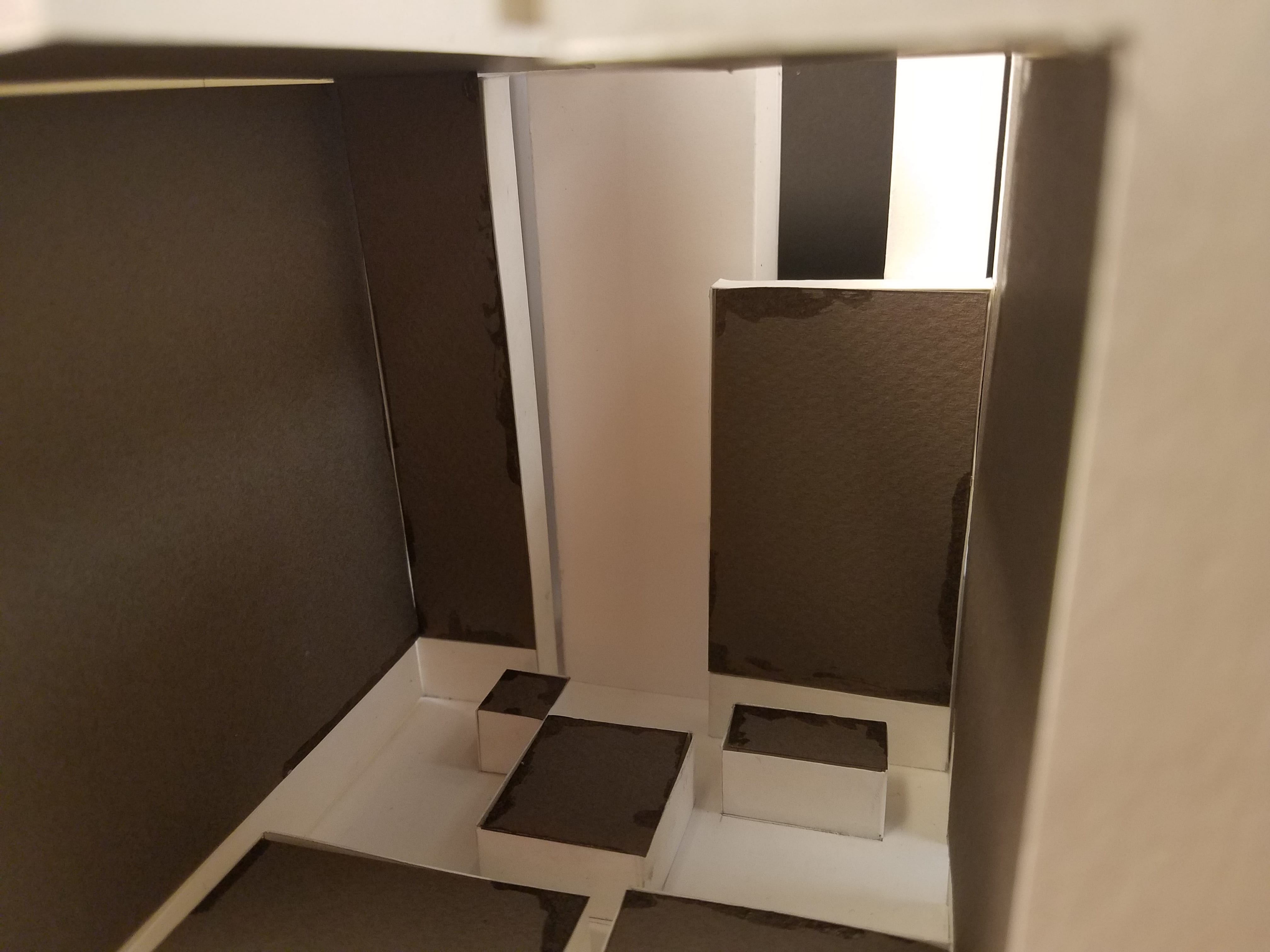
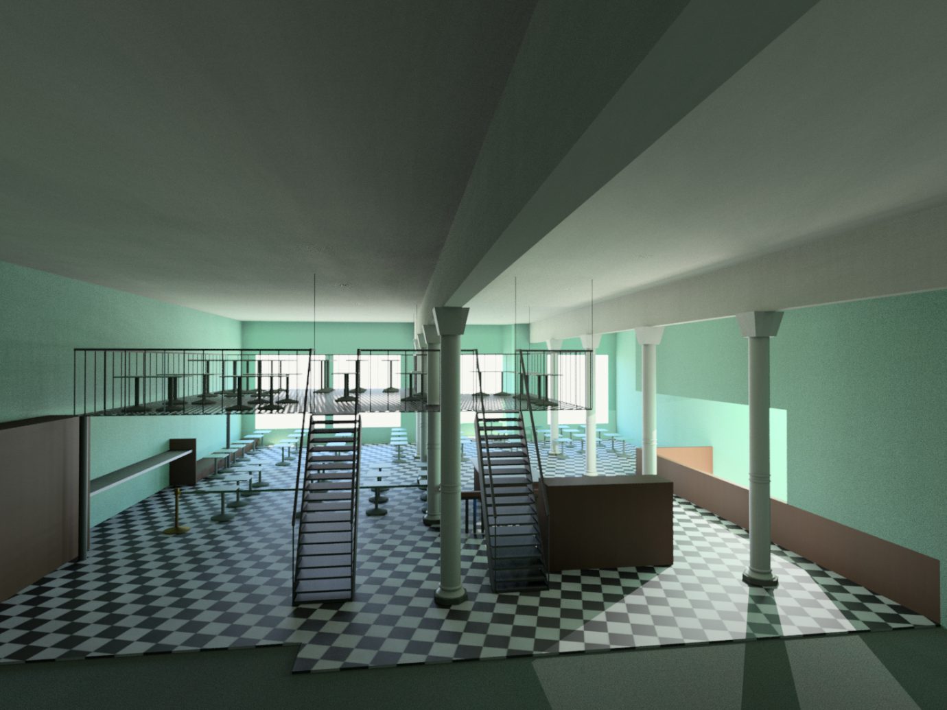
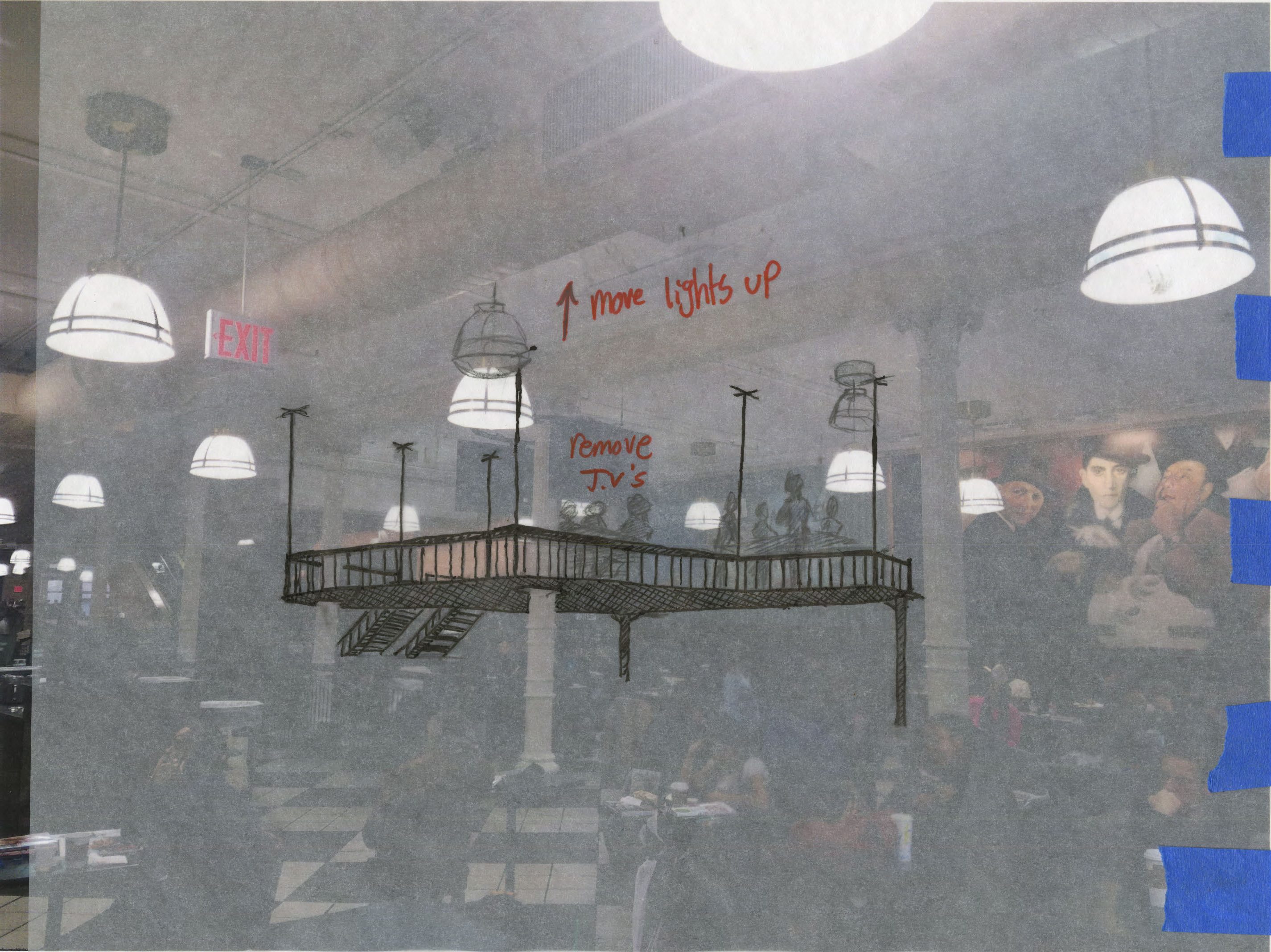
The whole organization of the floorplates was meant to progressively accommodate dancers as an individual travels into the upper levels. the structure seems to lean away from its foundation, each floorplate being slightly taller than the last, almost as if it were taking off. This feeling of weightlessness was meant to encourage the practice of dance in the upper levels as the freeing airy atmosphere would be complemented with a high altitude point of view of the Highline from the windows. This is the most exemplary on the sixth floor studio space, acting as the peak of the whole structure. The ground levels serve as a quick space to access for the public to view performances, the first couple of levels serve as the classrooms and lounge, all surrounding a “volume” near the staircase. This void is meant to shift the eye upwards, wordlessly encouraging the dancer to progress toward the interior’s peak. Essentially my structure is meant for the practitioners of dance instead of the people that wish to view dance. However it is not meant to entirely exclude these viewers, its a bit of a tangent but above the auditorium is a ring, or an oculus, that frames the upper levels, serving as a way to inspire a viewer that is debating the possibility of joining this practice. This experience is documented in this interior perspective:

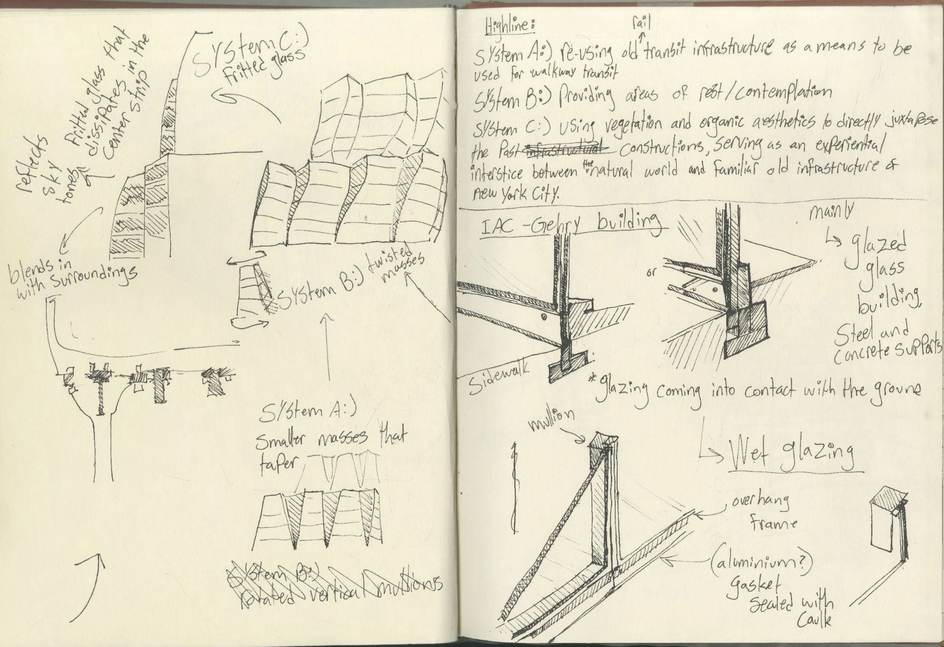
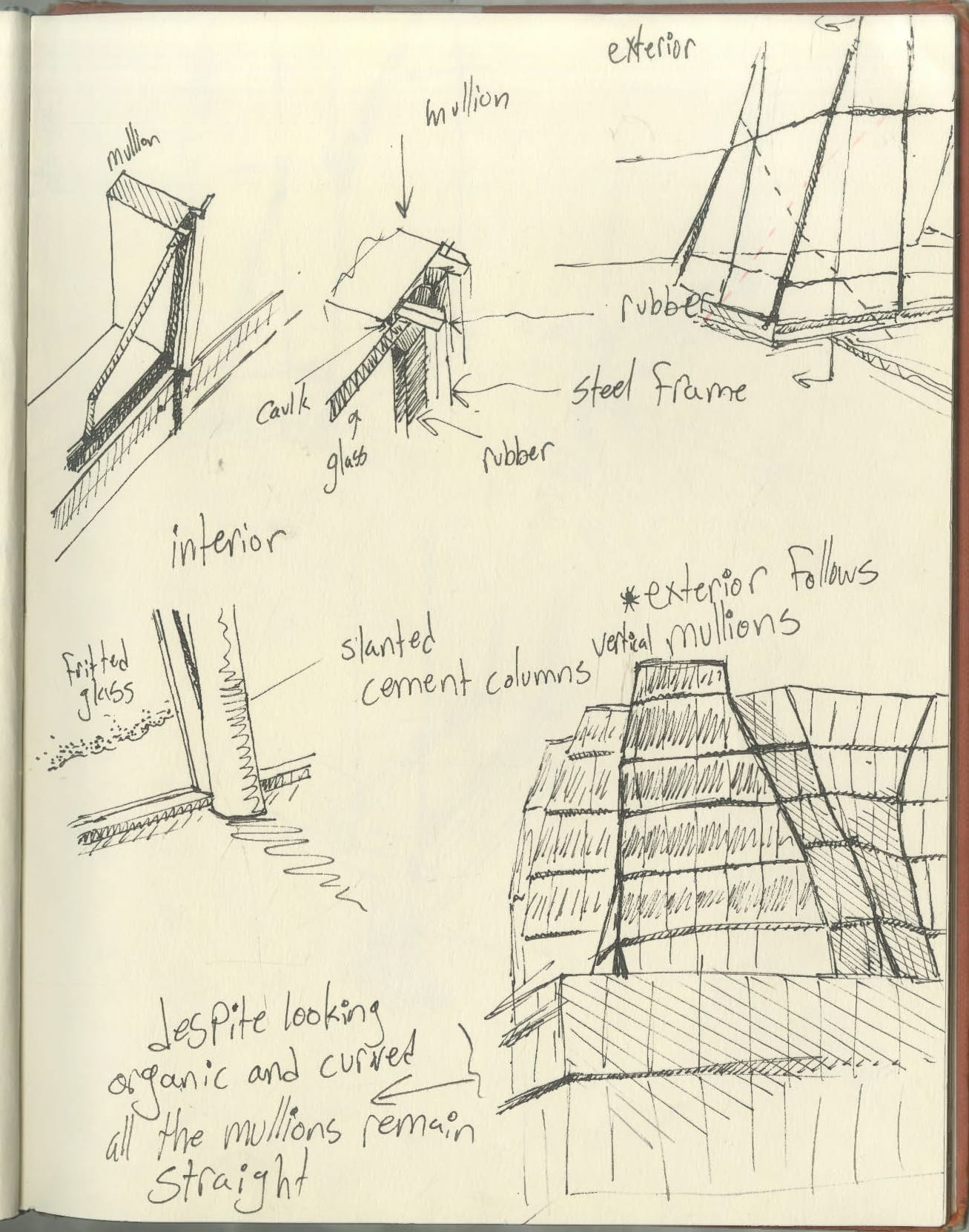
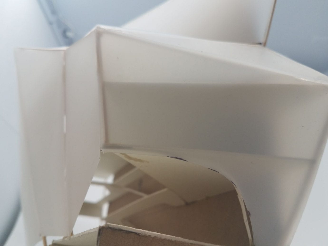
After deciding on the interior organization within this geometry, I also had to decide what the structures “skin” would be, or what it would be enclosed by:
-
-
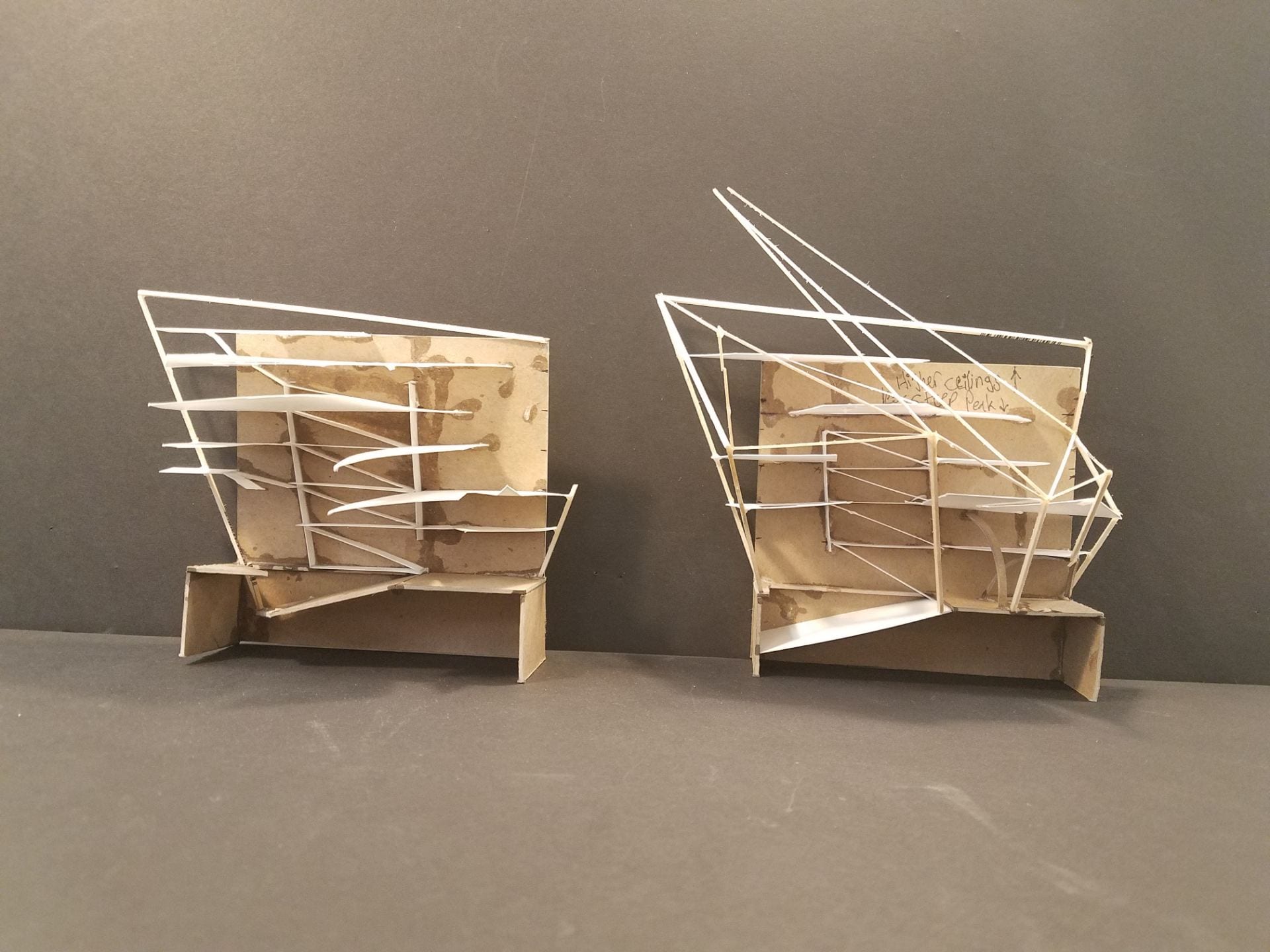
Firstly I decided to remove the tip of the structure as I felt it was too extreme for a dance academy
-
-
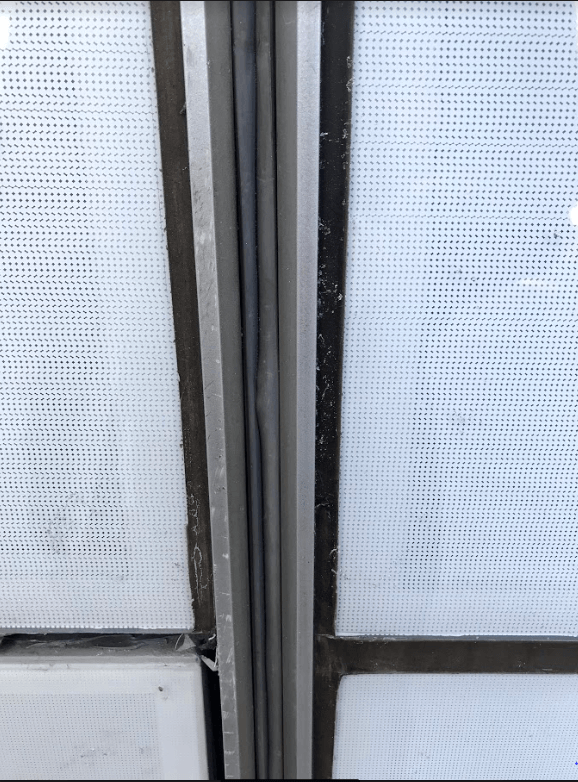
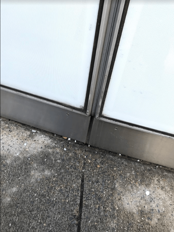
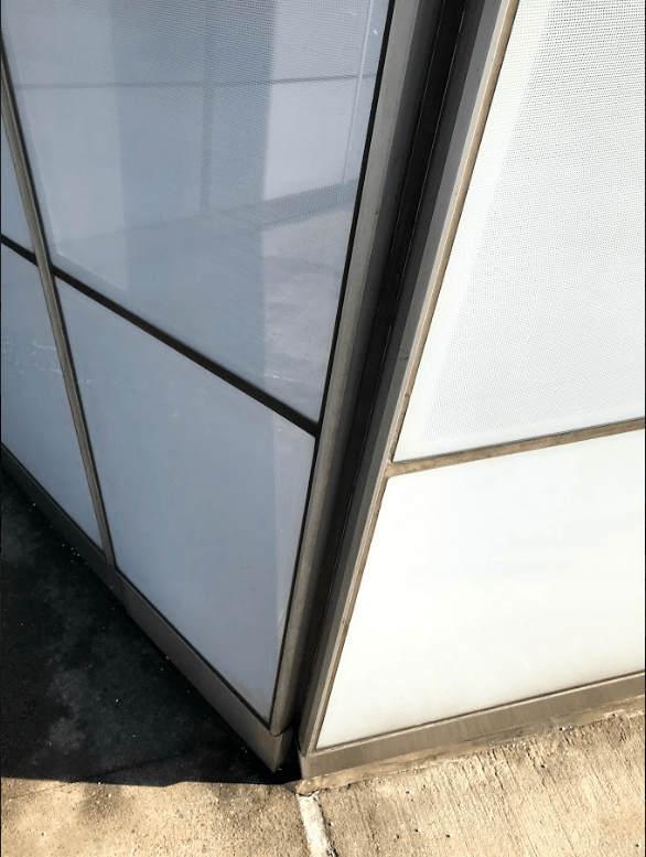
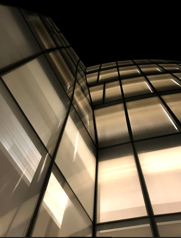
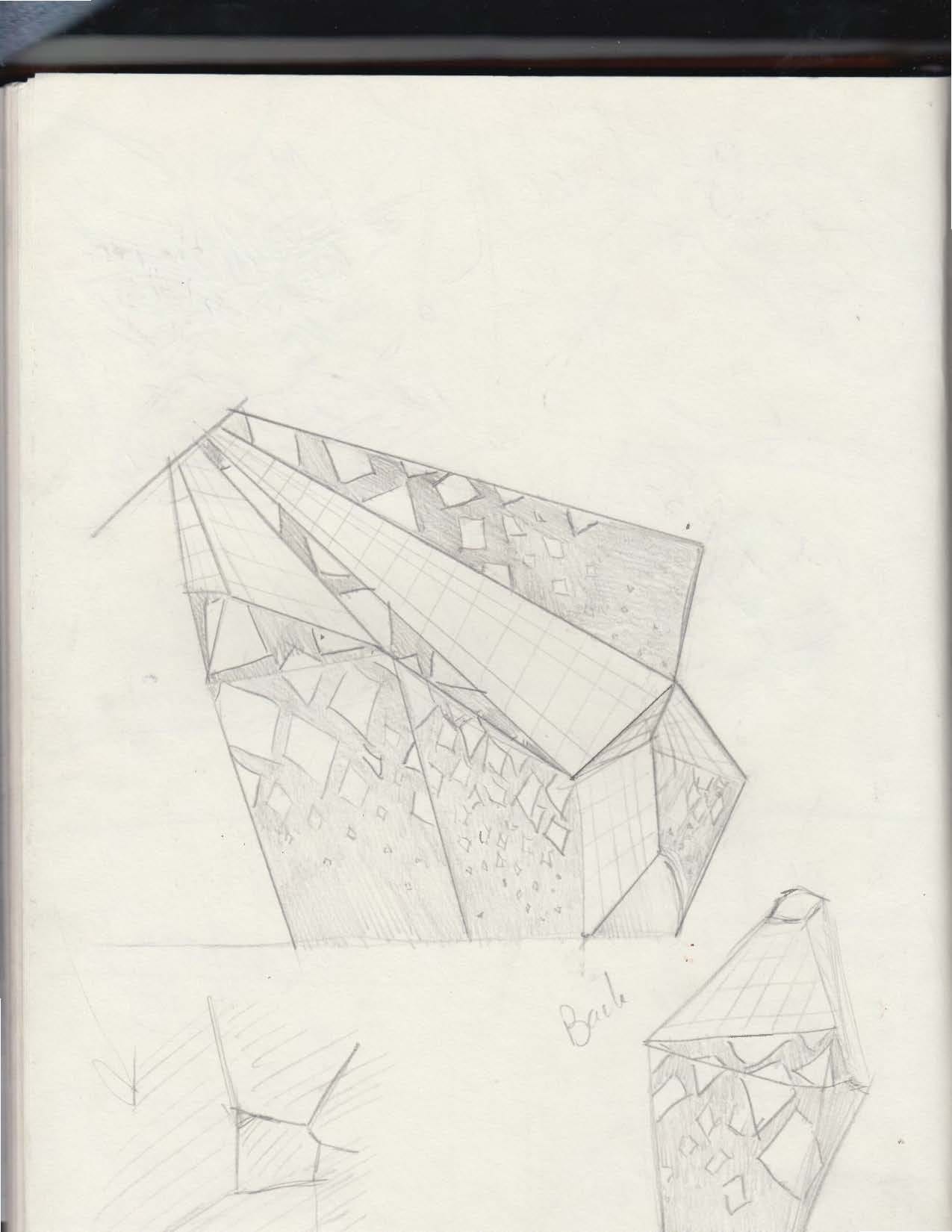
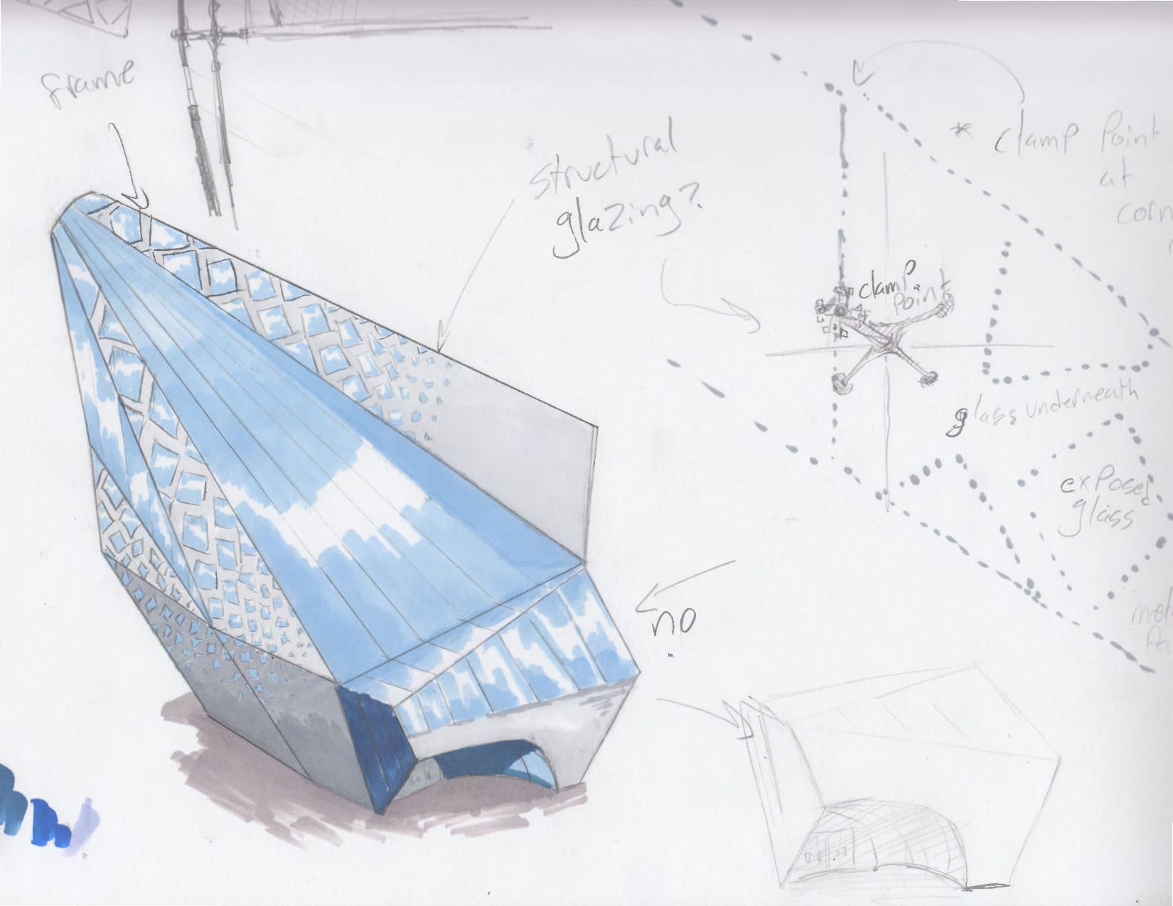
however I decided that the facade would feature this metal paneling that used a perforated diamond pattern throughout, this pattern would gradually grow larger as it increased in altitude, revealing more glass and allowing more natural light in.
Resulting in a facade that looks like this.
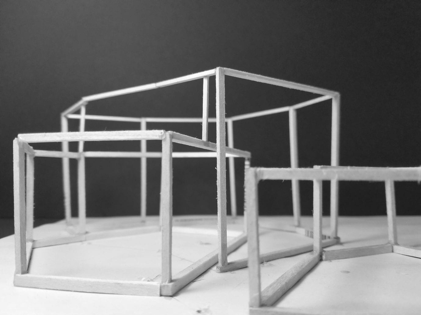
After diagramming and representing this structure, it was time to create a final 1/8″ scale model: