


For my timeline project, I decided to research the history of letters. The concept came easily to me since typography is a strong interest of mine. I made a list of events and ordered them chronologically before starting, making sure I met the guidelines of the assignment before designing the visual timeline.
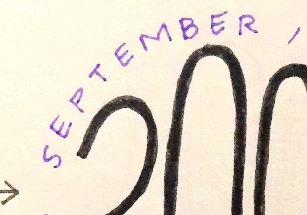
I measure EVERYTHING when I’m making art. I used a ruler to divide up the page into 12 equally sized boxes so that each circle/emblem would be equidistant to the surrounding circles. After measuring and re-measuring to make sure, I used a circular tin to trace 12 circles. The numbers inside the circles are a free hand font that I made up as I went along (lots of erasing happened when I worked on my first draft, the font you see in the final product was modified a few times to fit the circle). I used capital letters to write a brief description of each event surrounding the date in the middle.
After erasing stray lines and perfecting the shapes of the numbers and letters, I used a thicker micron pen in black for the date and a dark purple thinner micron pen for the outside lettering. Once the ink had dried, I erased all the pencil lines.
If I were to do this project again, I would use nicer quality paper such as bristol instead of standard letter size paper. I like the theme of my project and the events I chose because they were interesting to research and typography is a subject I enjoy learning about. Most of my work is linear, geometric, clean, and balanced and I think this piece reflects me as an artist.