-
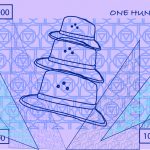
- Cool Toned Front of Money
-
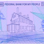
- Cool Tone Back of Money
-
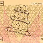
- Warm Toned Front of Money
-

- Warm Toned Back of Money
-
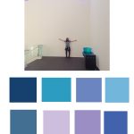
- Color Palette Cool Tones
-
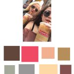
- Color Palete Warm Tones
-

- Color Palete Random
For the final draft of my personal currency I kept the idea of symbolism in mind. All of the symbolic patterns representing my friends and family stayed the same. Now my currency has two different color palettes. The cool toned color palette is color from a picture of a day of healing in one of my favorite places in Boston, The Museum of Fine Arts, and the other picture I picked colors from is from when I fell in love with New York City. My best friend Meg and I walked around the city that day drinking Dunkin Donuts, we are from Massachusetts after all, and went to her show. It was an inspiring day so naturally I made it a color scheme for my money. The fronts of the currency are related to my South African heritage, my dad, and my friends. The backs of the currency are related to my hometown in Massachusetts, my lack of importance of physical money, and patterns I draw in my sketchbook. Overall this currency is a self portrait. All of the places and people blend together in the patterns of the currency making up my money and myself. For this project, I used both illustrator and photoshop both of which were very much a struggle for me. These are programs that I was not very familiar with before hand, but now I feel like I have at least more of an understating about them. Overall a very rewarding project.