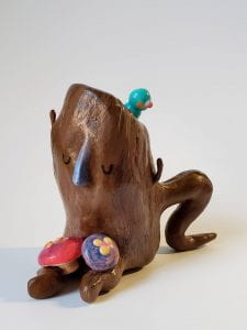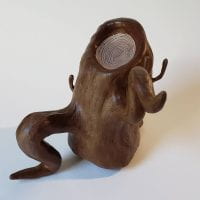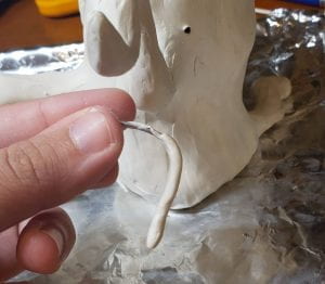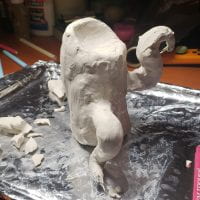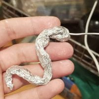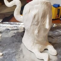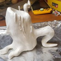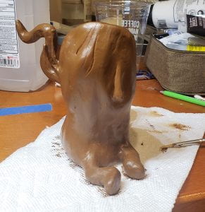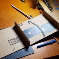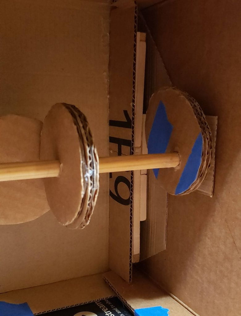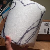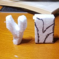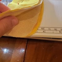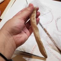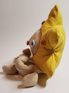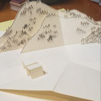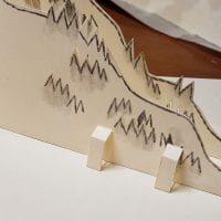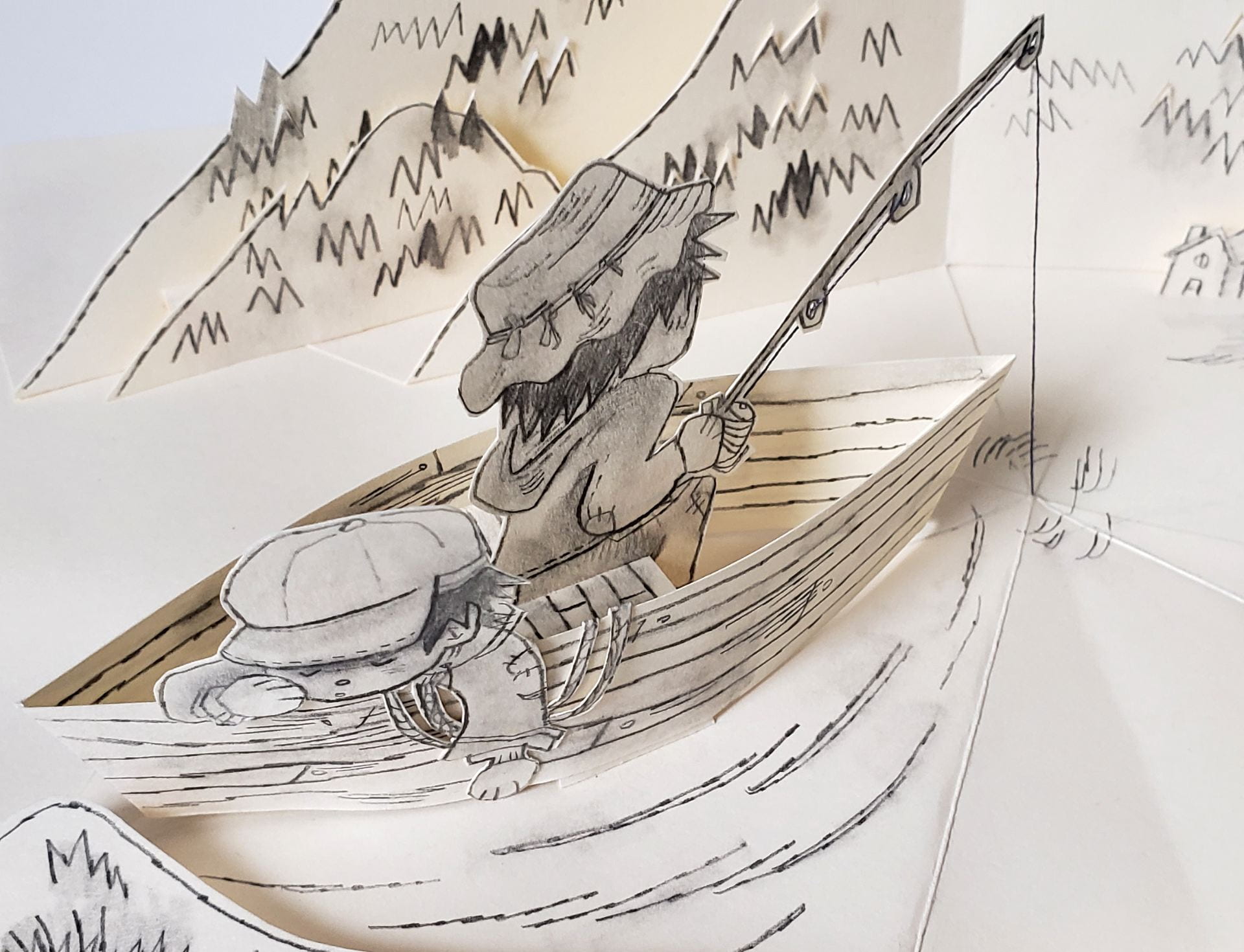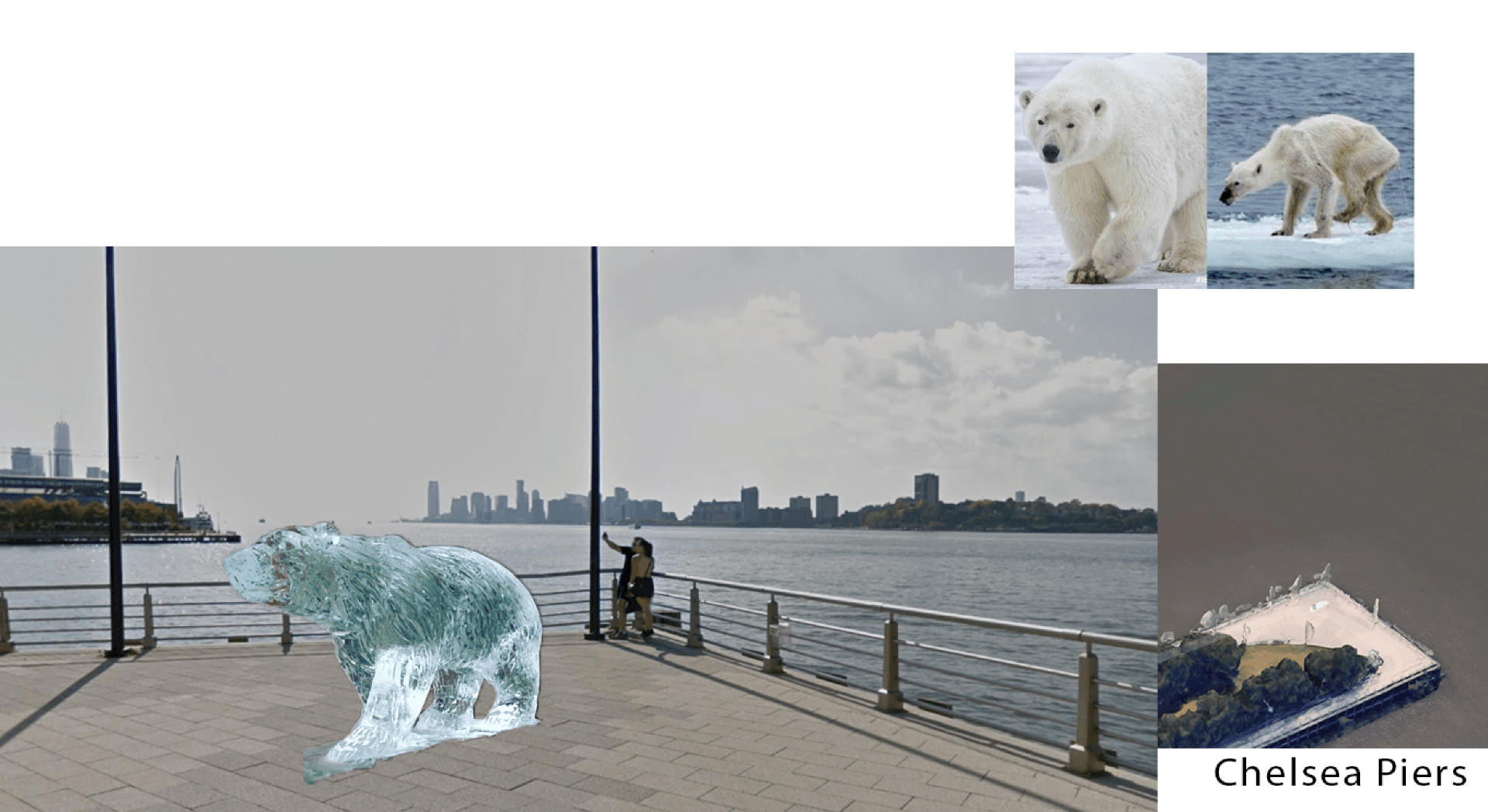
Original Mock-up
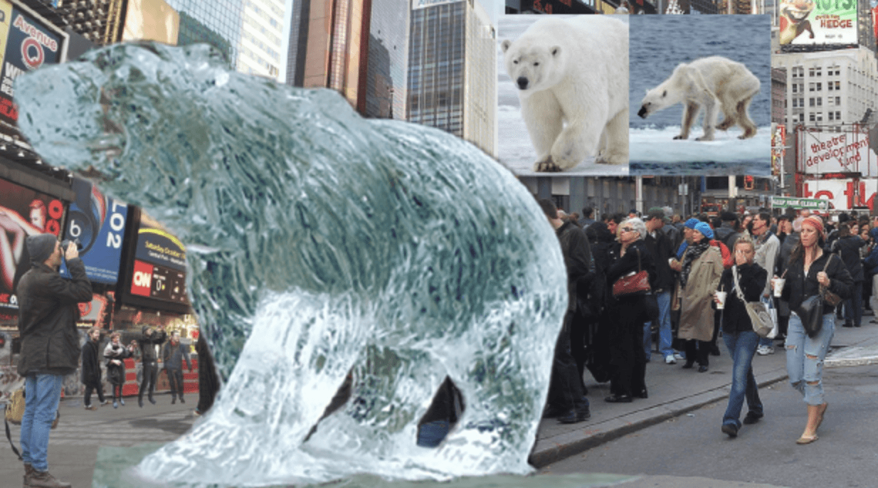
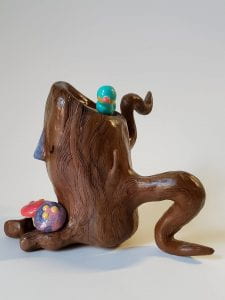
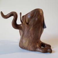
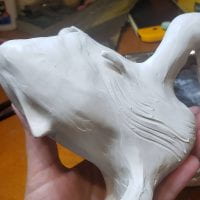
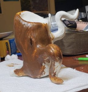
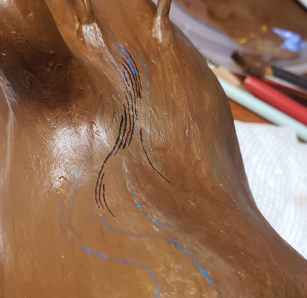
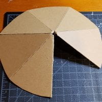
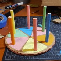
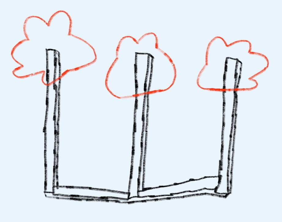
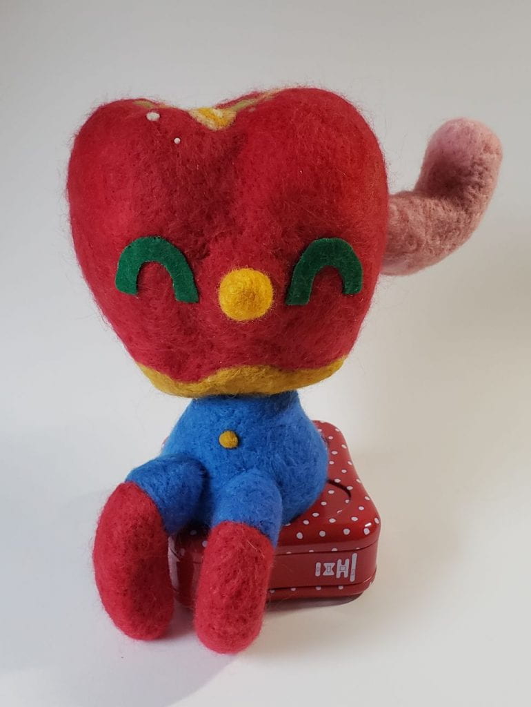
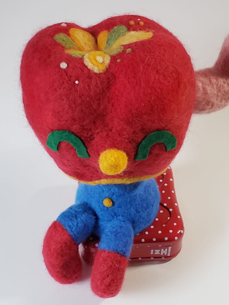
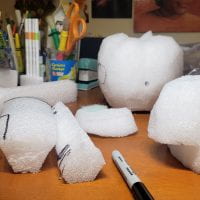
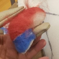
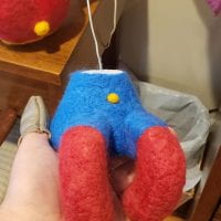
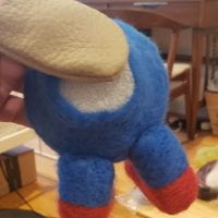
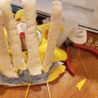
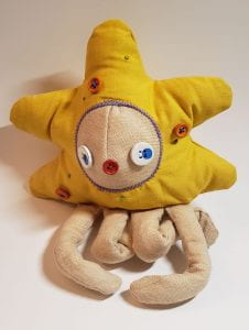
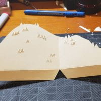
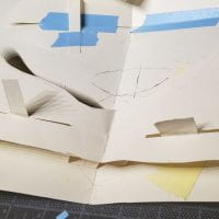
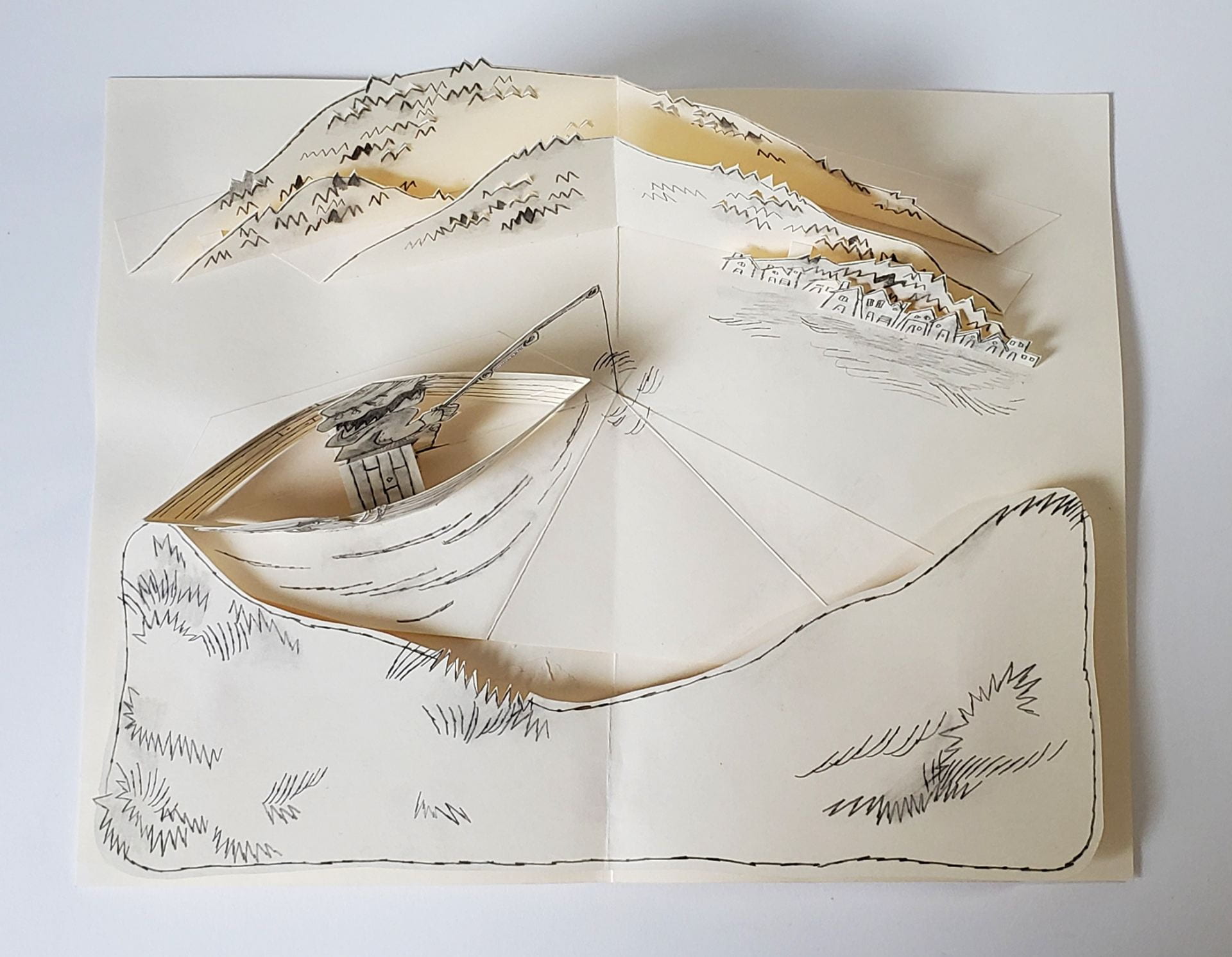
New Mock-up
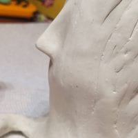
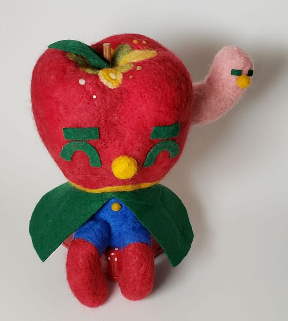
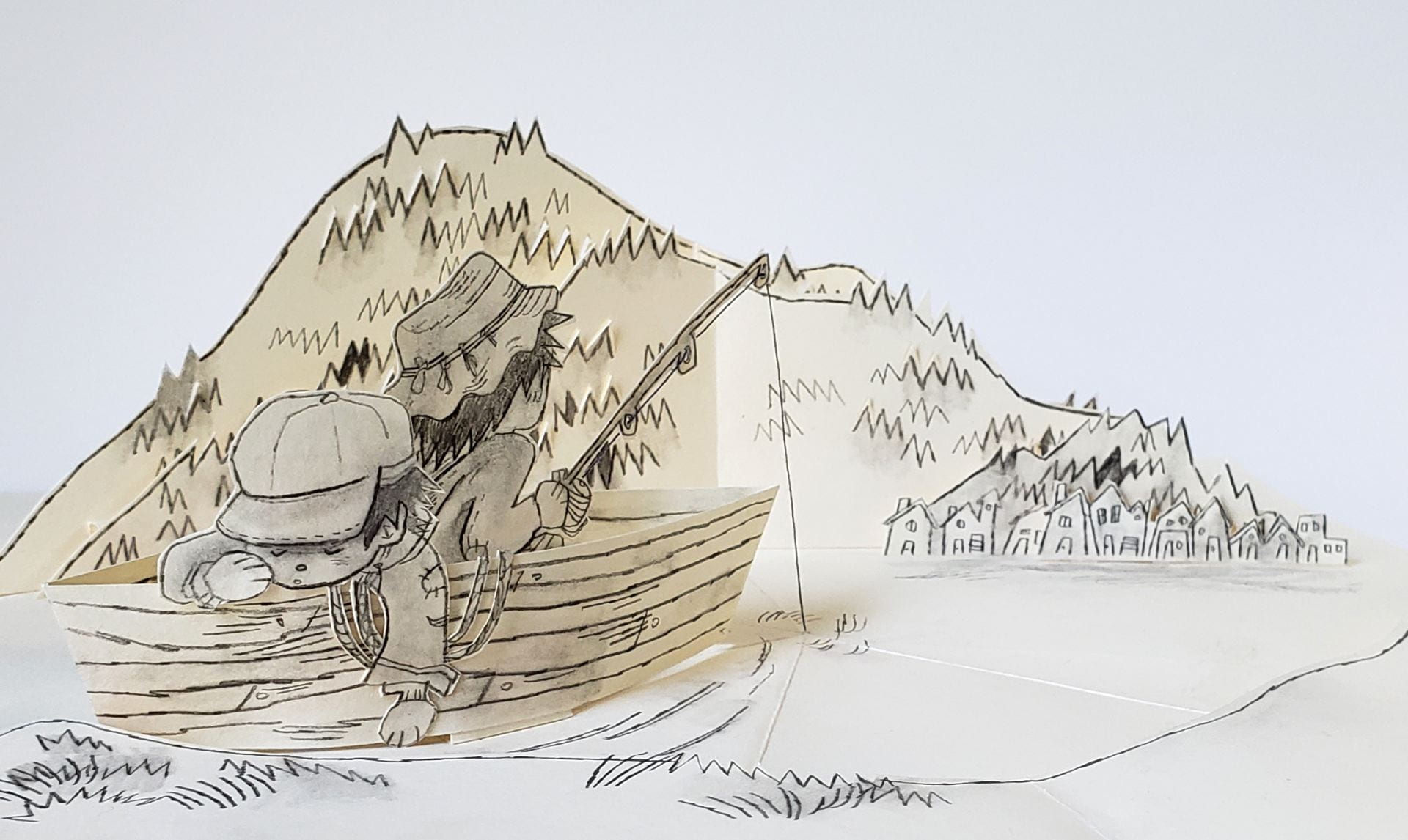
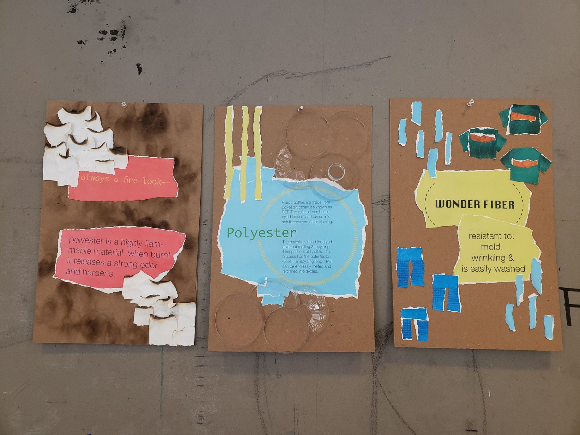
Wall Didactic
Kara Walker’s piece, “A Subtlety”, focuses on the tie between the sugar trade and its root in slavery and hard labor. Walker is able to utilize the size and state of her space to create a piece that is harmonious with its surroundings, ultimately highlighting the power of her central figure, Sugar Baby, and playing with percieved stereotypes and flipping them on their head.
Our piece attempts to comment on a seperate issue, climate change. We wanted to keep the scale and tie to social media present in the display of our piece, so the location is key– the project must be seen and experienced as it melts away. The temporary aspect of the ice sculpture is an important homage to the decay of sugar in Walker’s original piece, and like Walker, we wanted to memorialize the piece in photos that viewers would take.
This slideshow requires JavaScript.
Through my research, I found that Kara Walker was asked by Creative Time to create an installation for the Domino Sugar Factory specifically– in other words, she was asked to create a piece for a specific space. She was enamoured by the state of the sugar factory, with pools of molasses around the floor of the building, dripping from the walls etc. She speaks in greate length about her creative process, and about how the basis of her ideas revolved around certain specific concepts: 1. The idea of ruins (ancient, egyption, and the space itself) 2. A socially “accepted” idea of white=good, and black-bad. 3. The reclamation and of a space. The piece represents the sugar trade and its integral tie to slavery, all while utilizing the size of the space and and the temporary nature of the scultpure to drive viewers to engage with the piece through pictures posted on social media, ultimately creating a related, more performative piece, of racism in action.
Reflection
The research itself went more smoothly than I expected, due to the wealth of what’s written about Walker and this piece specifically. Having access to videos of Walker herself speaking about her piece was very helpful to me in researching her creative process, especially due to the popularity of this project specifically. Of course, there was some difficulty in researching more specific details of her inspiration for this piece, because it is so different from her usual work.
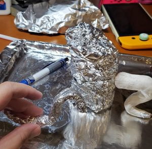
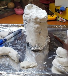
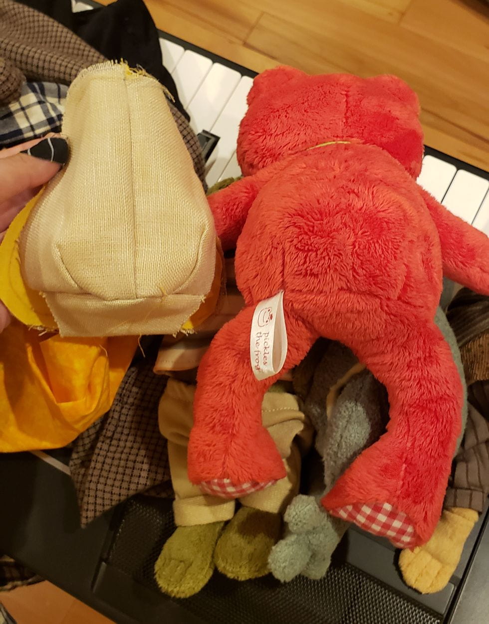
Working in a group was overall interesting in the rehashing of ideas and creation of our final mock-up. My group and I specifically lacked some communication throughout this assignment, but that showed mainly in our Seminar presentation. In discussing our final project, I initially had mixed feelings about our message, unsure if a polar bear being as a vessel to communicate a message about global warming was either original or the clear “successor” to Walker’s piece. And while some of these feelings still remain, it was interesting to hear from other people that felt differently.
I personally have always been very interested in Kara Walker’s artwork, seeing it for the first time when I was around 7 years old. However, I had never done any in-depth research on her work, so this assignment was eye-opening in regard to some of her developmental processes, as well as for my interpretation and apprecieation of her other pieces.
Our proposed alternative artwork, in its initial conception, ultimately seems underwhelming compared to Walker’s piece. I think that the message itself may be a bit overdone, but the comments from our critique were very helpful in creating the idea for a more successful piece. In our original mock-up, we had our piece sitatued somewhere near the river at Chelsea Piers. While this location is public, it’s not nearly as in-your-face as Times Square, where the sculpture could even become an inconvenience (and ultimately force people to feel the uncomfortable impact of climate change, an issue that many ignore because it “doesn’t directly affect them”.) Having the piece ultimately discuss enrionmental racism and its effects on people rather than the image of a polar bear would have, perhaps, been a more powerful initial approach.