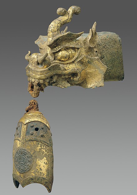
For the project which consisted of a portrait from personal and cultural items, I chose to search for identity in a space that I’m not very used to. I wanted to experience more Korean art, which I had never truly experienced. As I walked around the Korean Art exhibit in the Metropolitan Museum, which was admittedly very small and somewhat disappointing, I found a various array of Korean paintings and small artifacts, yet nothing seemed to capture me more than a rafter finial, which was in the shape of a dragon’s head and had a wind chime. I liked the way the dragon was depicted; with fire flaming from the ears, mouth, and nostrils. This dragon head would’ve hung off the side of a large building.

I chose to also use my unique teddy bear named Jason, my keychain, tattoo needles, and a denim jacket, which I had spiked and put patches and pins on. I also initially chose India ink, however, I chose to use the ink as a medium rather than an object. I chose these items for various reasons. I picked the tattoo needles and ink because I use them in hand poked tattoos specifically and have an abundance of them. I picked Jason the bear because there’s a story to how I got him; I was at New York Comic Con and I came across a booth for Jack’s Horror Show, a shop for taking molds of an individual’s teeth and making false fangs from the molds. However, in making the teeth, there would be duds that couldn’t be sold due to production error so Jack decided to take these teeth and attach them to various stuffed animals. At the time I was wearing a skull mask that Jack also had and he gave me a discount for purchasing Jason. I picked my keychain because I currently have four items on it; a set of plastic skull knuckles meant for self defense, a bottle opener, a house key, and a dead lighter that I use as a fiddle toy when I feel anxious.


I combined the items in various thumbnail drawings for a contour design that would include them all.

I eventually decided on a design where Jason would be in the lower middle area of the frame with the jacket in the background on the left and the dragon coming in on the right corner. There would be the tattoo needles in the background and the keychain would be in the foreground of the image, almost in a trompe l’oeil manner.
[Contour drawing file lost, will insert image once able to rescan]
For the next part of the assignment, which involved studying the positive and negative space of the objects, I made several thumbnails, but ended up deciding on a design where the outlines of the objects were most distinctive and easily seen and where position was implied through the scale of the various objects. I then scanned the contour drawing that I had made and traced over it digitally, altered the fill, and switched the fill and stroke to create both a positive-negative and a negative-positive image.


positive_negative_suzie_sp17_wonb-2jb6q2d
positive_negative_suzie_sp17_bonw-1xmuyf7
For the final step of the project, I created a drawing of all of my items in ballpoint pen, scanned the image, traced it in photoshop, and attempted to create a grayscale image. However, I found myself struggling due to a lack of closed shapes in my image to fill certain shapes with color. This caused complications with my value piece on Illustrator, however, I decided to work with this inconvenience by focusing mainly on the mixed media portion, which involved collaging over the grayscale piece. I found a lot of fun in this portion because I got to do some very experimental methods in this part, such as utilizing the India ink which I had decided to use as a medium instead of an object in the first portion of the project. I was able to decorate negative space with ink splatters, and even used the splatters on different papers such as paper towel to decorate the collage. I chose to add a three-dimensional aspect by referring to the studs and safety pins on my jacket and glued several along the shoulders and back of my jacket outline.

[photograph of mixed media collage to be taken]
After some work on Illustrator to become more comfortable with aspects such as the pathfinder and grayscale, I was able to rework my value piece to include more shapes, colors, and stroke widths. Having to work in this way helped me become more comfortable with the program as a whole and made me utilize the basic skills that we had learned throughout the project.