


For the final poster we changed the colors from blue and green to just blue, inspired by the Coalition for the Homeless’ logos. That was the organization that we contacted for our fieldwork research and they gave us a lot of data that we used on the poster. We also wanted to change the colors to make the text more readable. Originally the text was layered on top of a brown bottle of alcohol, which made it hard to read after it was printed. We removed the bottle after receiving feedback from the class because most people could not understand what it was so it ended up being distracting. On the other hand, after removing the bottle we lost the icon that represented substance abuse. To compensate for this we inserted simple icons that represent homelessness. We incorporated vector art representing a homeless beggar to make up for the alcohol bottle taken out.
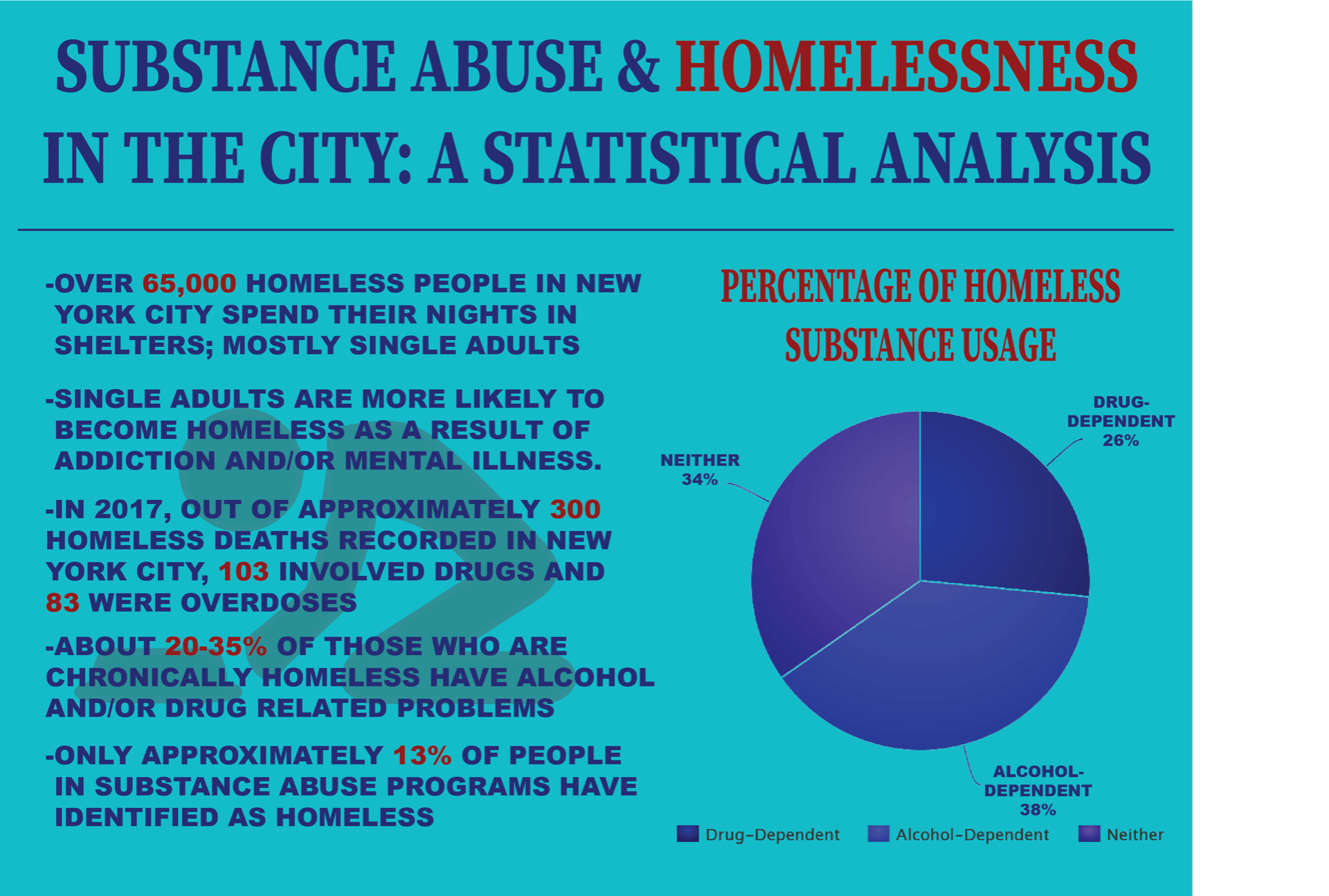
On the first design there was not much of a correlation between the title and what was presented on the poster so we changed it from “why it matters” and “did you know?” to “Substance Abuse & Homelessness in the City: A Statistic Analysis”. This title is more straightforward to the viewer and is a more appropriate way to present the text. We also had to reevaluate the way we were presenting our data and how effective the pie charts were. The statistics showing percentages of homeless people that use drugs or alcohol was merged into one chart and we erased the other two charts. We felt that it was not necessary for the data to be in pie charts, so as an alternative, we put the removed pie charts’ information into a bullet point on the left hand column.