Concept:
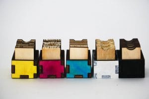
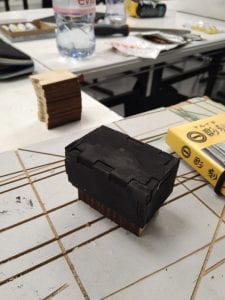
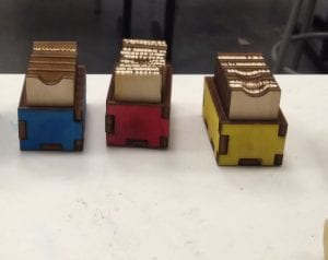
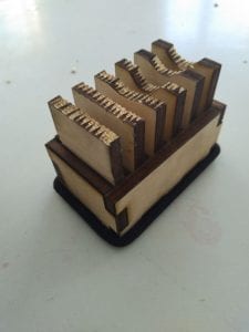
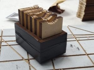
“Primary Tactile” is an experiment to pursue the favorite tactile made by wood. It was painted in the primary color, black and white.
The project was referred by philosophy of word and image. On the description of this project, it says not to use glue. We manipulate the meaning of “no glue allowed.” French philosopher, Ronald Barthes mentioned that image can be seen in multiple way depends on one’s cultural background and history that one has. “Rhetoric of the Image(1964).” In the article, Word and Image by W.J.T. Mitchel, the argument starts with the fact that words can be seen as image. My conclusion of the book was, meaning can be taken different way depends on the combination of word and image. This artwork is a conceptual artwork that expressed different tactile and philosophy of word and image.
 I see this image as Arabic font with golden shining line goes around the font. In Muslim religion, one sees the font itself as God. Which indicates that word can also be taken different way depends on cultural aspect. If you search “arabic god” on google, whole bunch of this font will appear.
Process:
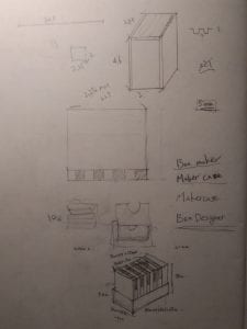
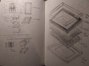
The shape of this project comes from a flame with box. we changed shape of the cardboard contained in flame, and we used the shape of box to hold them together.
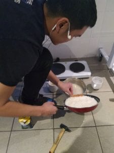
Using glue can have different meaning. First, we used rice, water, and sugar to make an ingredient to make the wood stick together. Also in the syllabus, it mentions that one can add any other material as long as it remains secondary.
Second, we used glue gun to make form around the gap, let it dry, so each piece of wood stick together without using the literal function of glue.
We chose to use primary color because one can make any color by mixing the primaries. It is an expression of “we can all takes an image(which define as anything we can see by eyes), differently.”
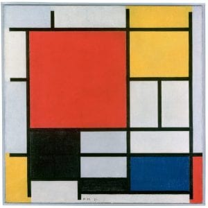
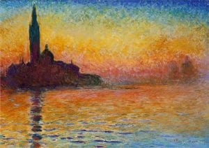
Also we are inspired by Composition of Yellow, Red, and Blue by Piet Mondrian for the choice of primary color. Primary color was the color that Cloud Monet used to express the light in impressionism, and finding the right tactile from this work is really depends on one’s impression of the texture.
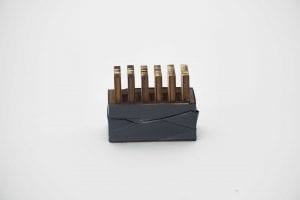
We also looked for another way to put everything together. As one option, we used fabric to tighten up the box together. The method literally follows definition of the description, but it is conceptually weaker than using different types of “sticking together” since it has concept in philosophy.
Go all the way or go home – Quote, Ryuku Otsuka. lol
Development that could be done:
- Pursue the technique to use the glue on this project. Gets to the point of craftsmanship of using glue.
- Apply nails that is less than 5mm(2) on each corner instead of using “glue,” which makes aesthetically pleasing.

