In my first Int. Studio class, we partnered up, interviewed each other, and made an abstract sketch of our partners. Then we took key visual concepts from our sketches, and brainstormed on paper to create a simple pattern to be repeated on a piece of paper. We didn’t have enough time to finish this in the first class, but we learned a lot about our peers and exercised our sketching and conceptual design muscles.
For the sketch, we had to draw our partner as a jelly biscuit. I chose to draw fire instead of jelly, and rather than having the biscuit sitting atop of the wrapper like everyone else, I decided to crumple the wrapper up and put it behind the biscuit. My sketch also had an unusual perspective to it. I drew the wrapper in the foreground of the picture, shaped kind of like a boat. The biscuit seemed to be pointing away from the wrapper, as if it has left it behind. The perspective wasn’t conscious but when I finished drawing I realized it fit very well with the themes I wanted to convey. Wrappers are used to contain or restrict things, so to me, what I did with the wrapper symbolized breaking free of societal norms to pursue something more meaningful, and the fire in the biscuit symbolized my partner’s passion for creativity. This is the essence of what we talked about in the interview, as going into creative fields like art and design are not always respected. When I asked my partner what shift in her life brought her to Parsons, she said that her shift was knowing that having an artistic career was possible. She always had a creative streak and an interest for design, fashion, and business, but if she didn’t know her dreams were possible, she never would have followed them. A lot of people choose not to go into what they love because they don’t think it’s possible—I did this myself when I went to my first college straight after high-school, until I realized I needed to follow my dreams. The passion can be there, but without opportunity and courage, you might never pursue it.

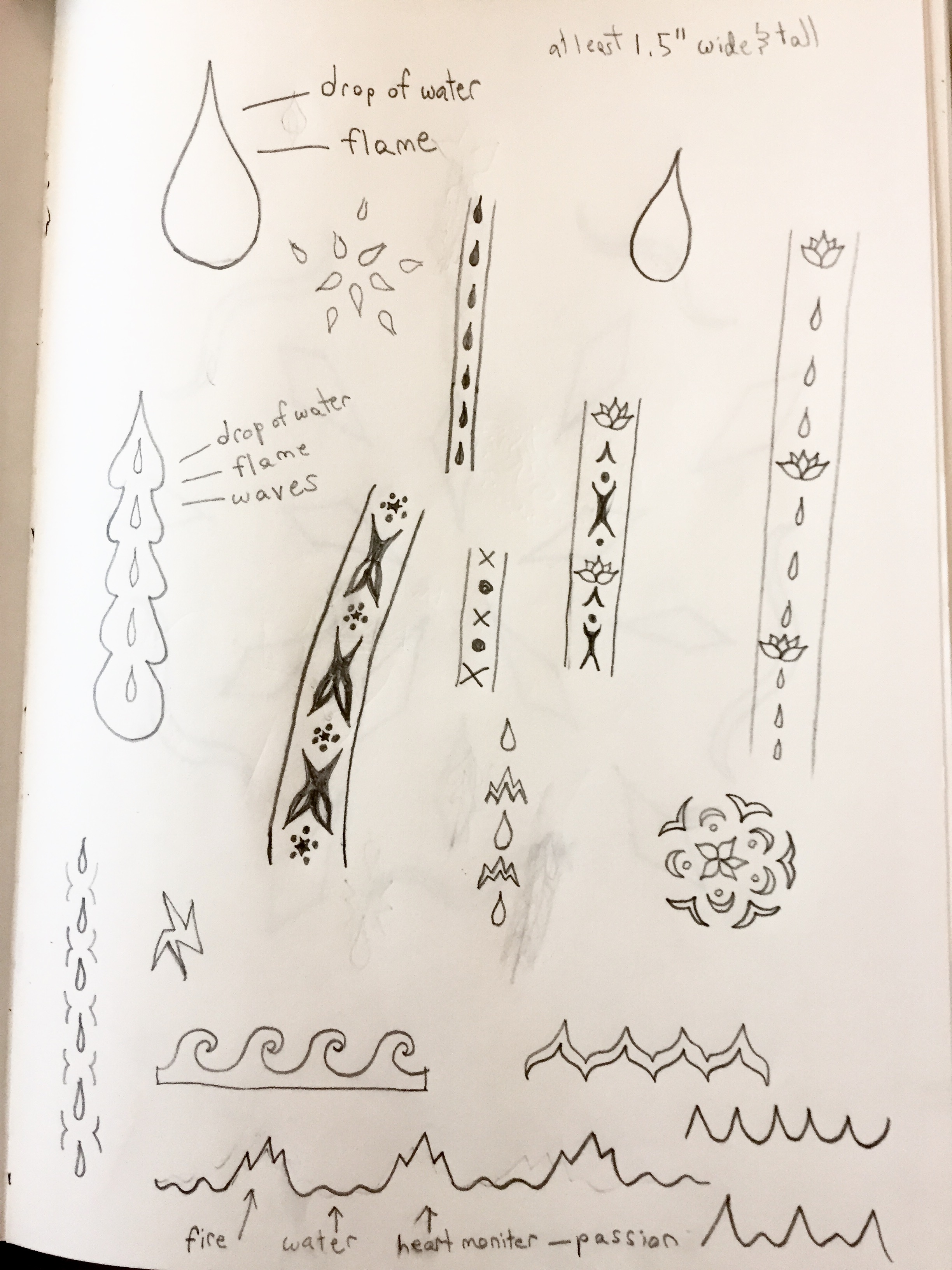
For the abstract design brainstorming, I decided to go with the concept of fire and water, to evoke passion, freedom, chaos, and fluidity. I started out with complex, ornate designs but worked to simplify and simplify them until I had one basic shape: a drop of water—which can also double as a flame. I then sharpened the edges so it would be possible to cut out on paper, and arranged the shapes into a pattern.
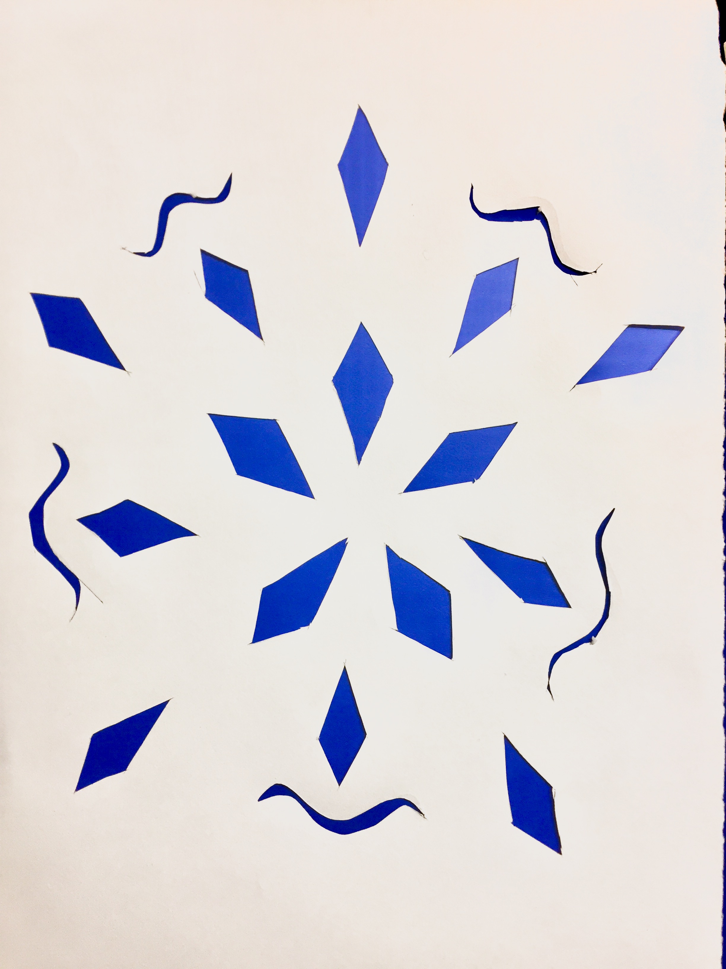
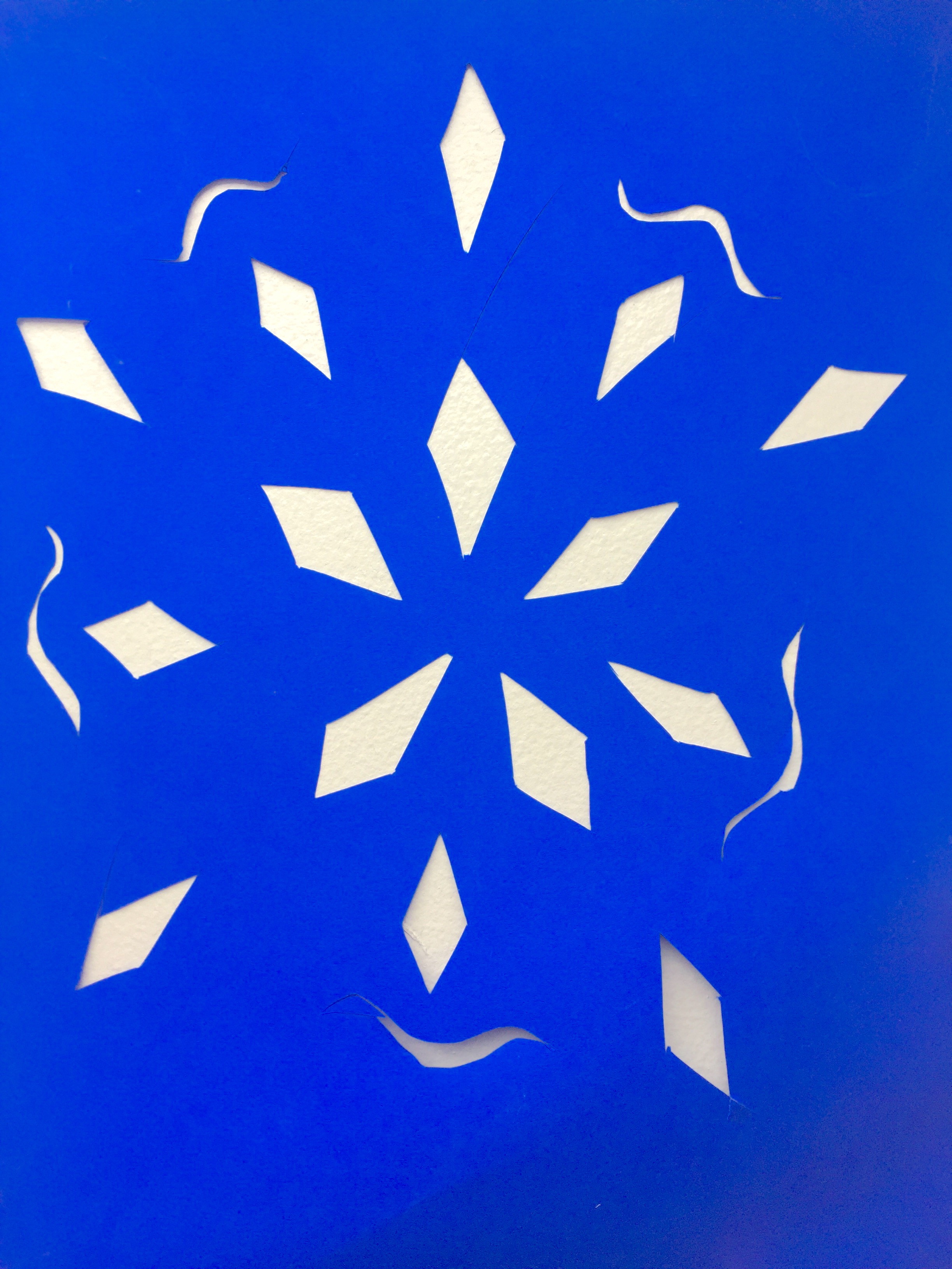
I chose to use orange and hot pink for my underlays, as they are colors that commonly represent fire and therefore play into the fire/water theme of my project. Also, blue and orange have a complementary relationship in color theory, and adding pink would make that a split-complementary relationship from blue. Here is the final product:
