Studio: Interpretive Self Portrait

For my Interpretive Self Portrait, I went to The Met. A vibrant blue chalice in the Egyptian Wing captivated me instantly:

Artist unknown, this chalice was made from a material called faience, and fashioned into the shape of lotus flower. It was made during Dynasty XXII (ca. 945-924 B.C.).

I jotted down notes about it and began to draw up a concept. Here you can see my thought process…

And here is the final product:

Studio: Still Life Collage

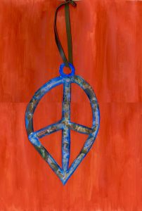
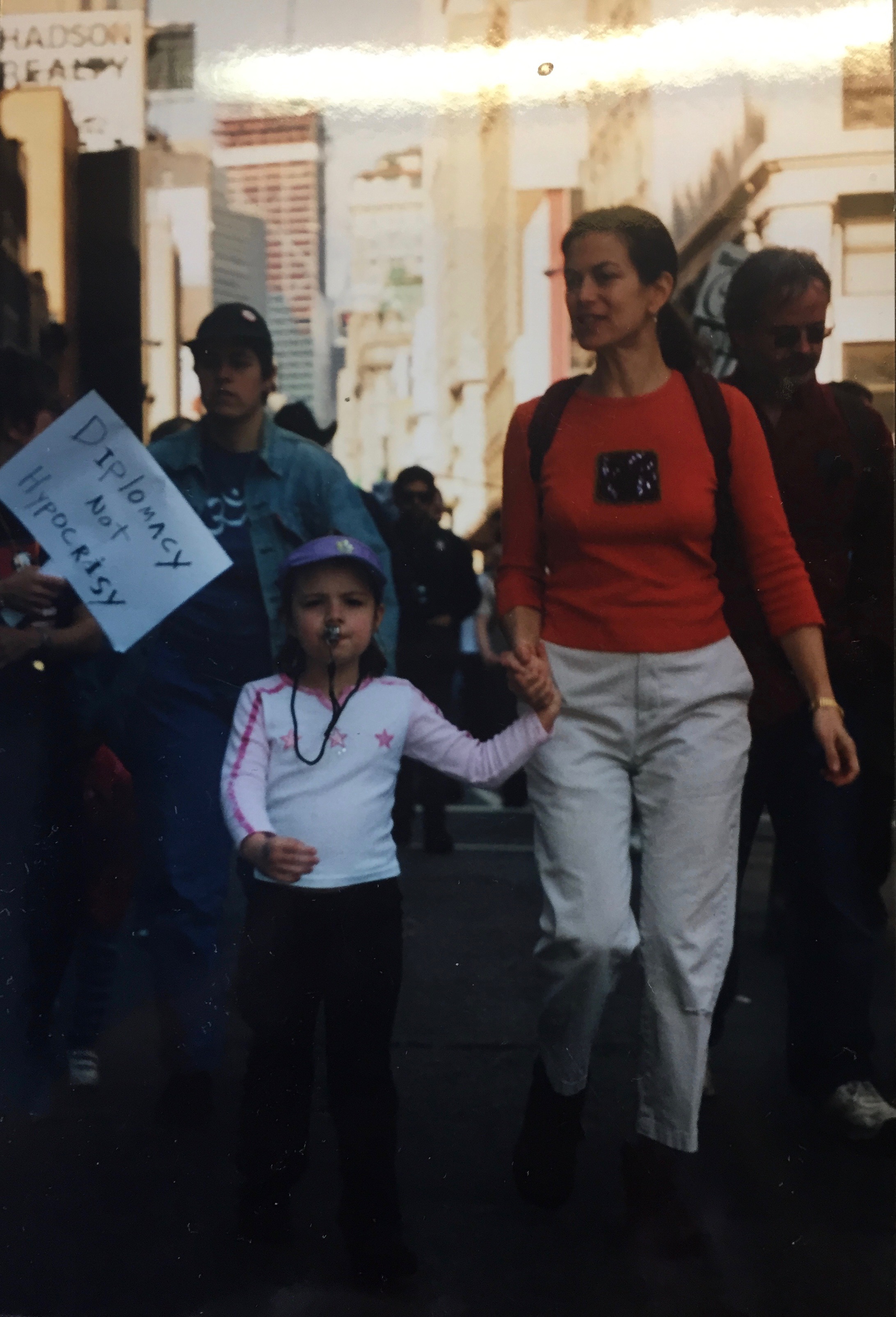
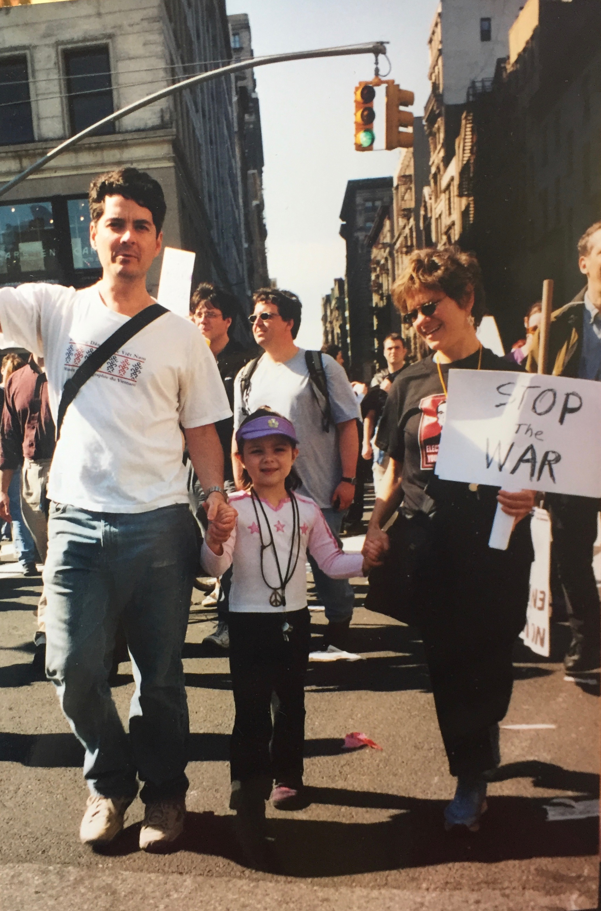
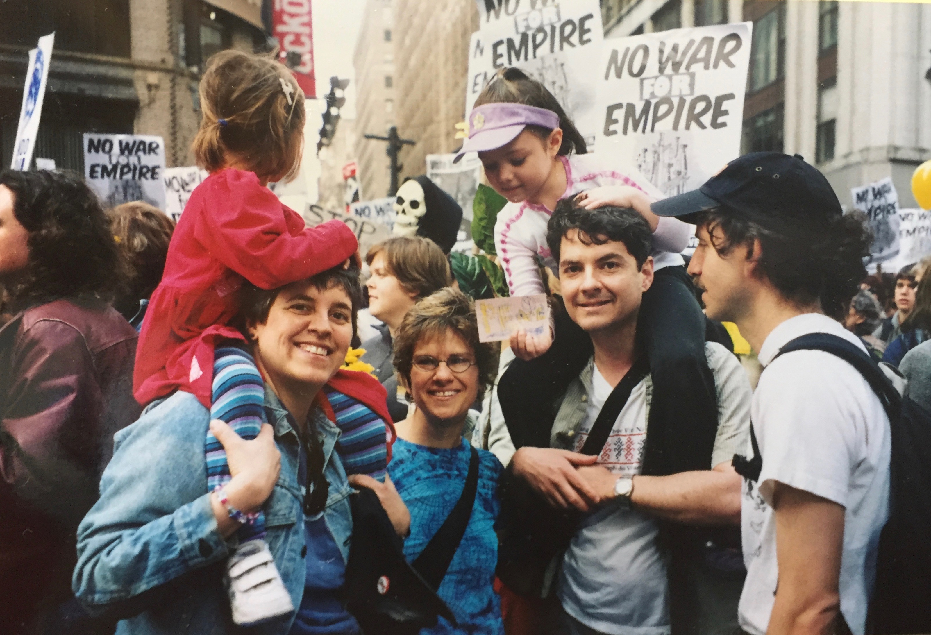
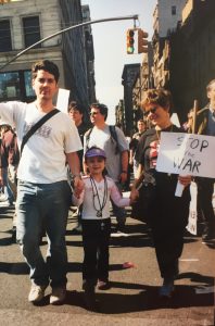
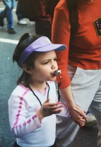
The object for my Still Life collage is a peace sign necklace that was given to me when I was 6 years old at a New York protest against the Iraq War.

Half the height of the other protestors, I decided to revive the chant after it had died down: “What do we want?” “PEACE!” “When do we want it?” “NOW!” The chanting attracted a lot of attention, including a lot of surprised faces, a radio journalist who interviewed me, and a man who I will never forget.

“You’re quite the leader,” he said to me. “You remind me of myself when I was your age. When I was a kid I marched against the Vietnam War, and a man came up to me and gave me this necklace…”

He handed it to me: a silver metal peace sign hung on a thick leather chord.

“The man told me it symbolized peace,” he said. “He passed it onto me for marching, and now it’s my turn to pass it onto you.

“Someday you can pass it on to the next person who deserves it.”

This necklace will never lose its meaning, but after moving to so many different places, things are easily forgotten or misplaced. I’m pretty sure that today it sits in a box somewhere in Vermont. Whether I have the object with me or not, I will never lose what it represents.

Colors: Blueish silver, very dark brown, warm reddish orange. The orange reminds me of the shirt my mother was wearing, along with a wall in the apartment we lived in when we went to this march. This color feels like home to me, warm, cozy, and familiar, but exciting and lively at the same time. When I see this color, a flood of childhood memories washes over me.

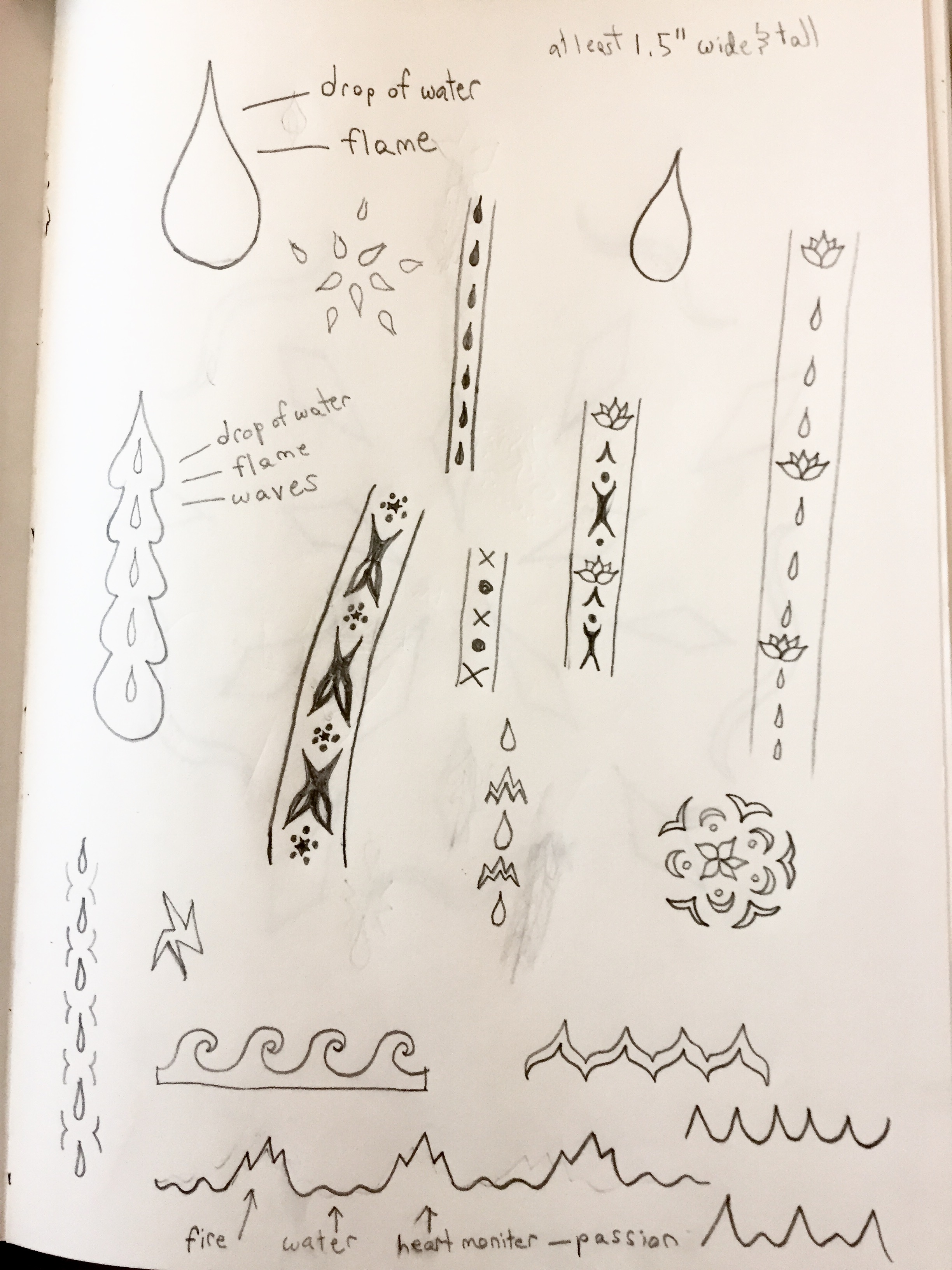
Textures: Strong, smooth texture of the metal peace symbol, next to the earthy, gritty texture of the leather cord it hangs from…

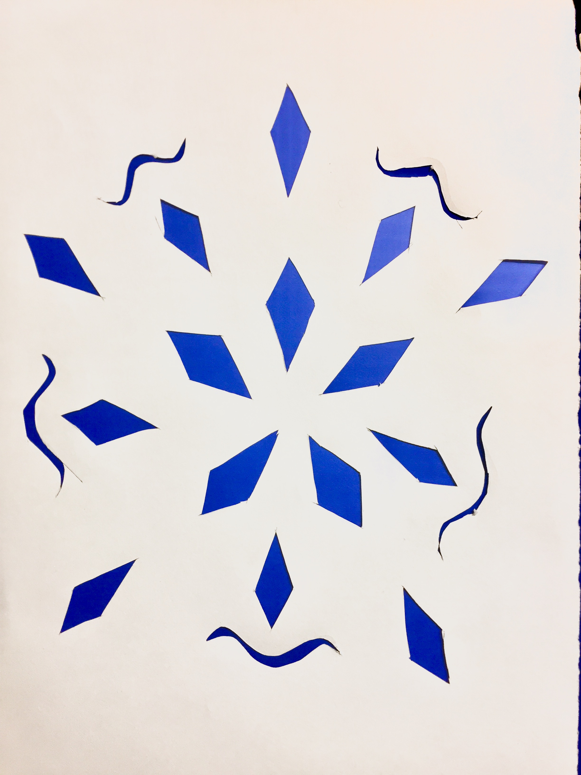
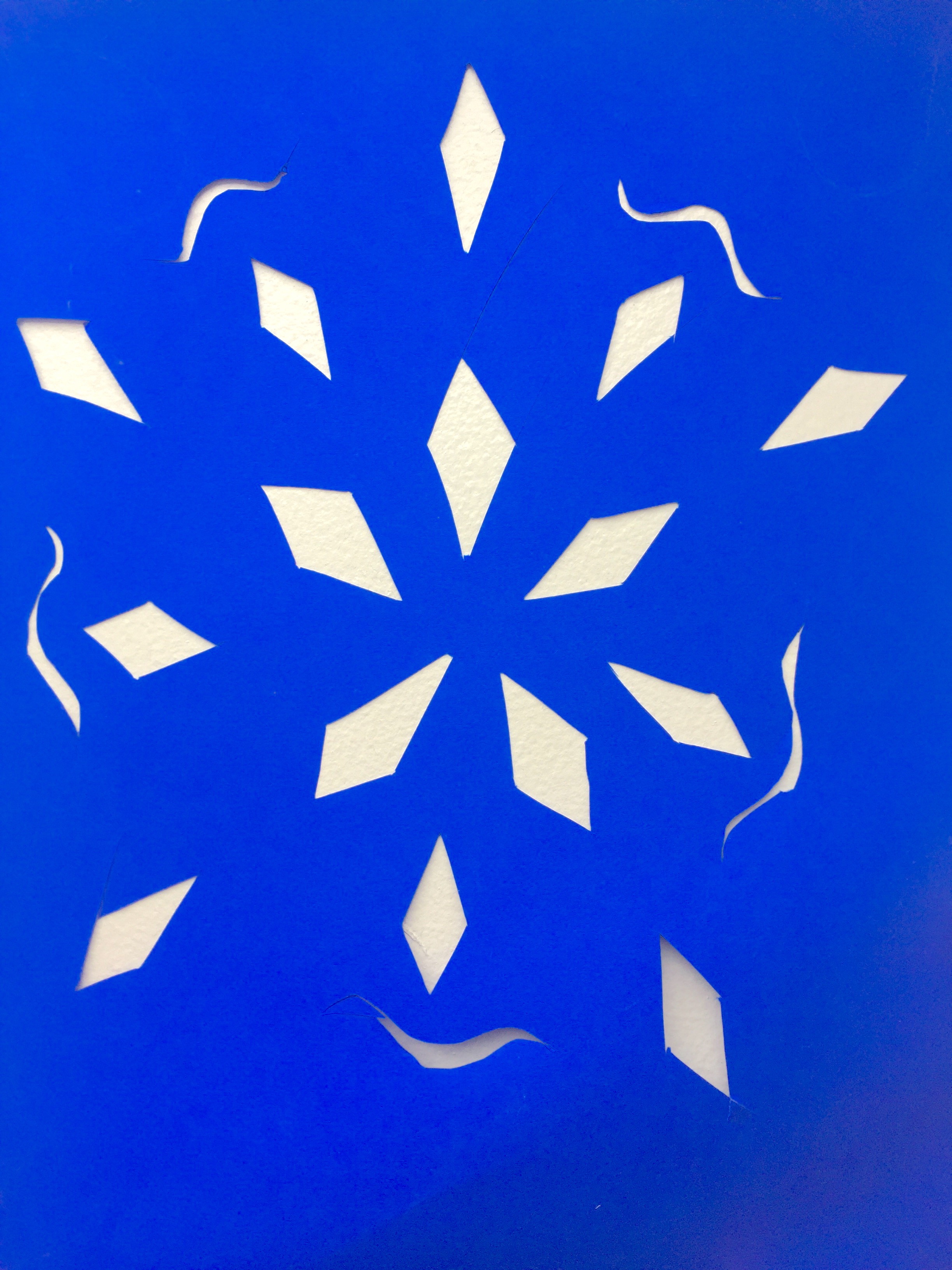
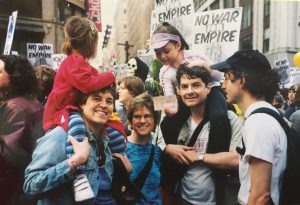
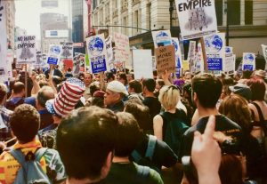
Here are some photos from that day:

I decided to use the actual photos from the day, cut them up, and put them into the shape of a peace sign to show how this object is rich with memories and lessons. I painted blue over it, partially because the color blue means a lot of different things to me, partially because it represents the silver metal, and partially because it is a the complementary color of the orange background.

I wanted the piece to feel more real, so I bought an actual leather chord and weaved it through the paper. I painted the background a warm reddish orange color, to emphasize the nostalgia around this object and the passion for activism that it ignited in me.

I’m not very happy with the quality of this final piece, but I am very proud of the rich symbolism and the extensive thought I put into it.

Int Studio 1: Shift: Graphic Cut Out Motif


In my first Int. Studio class, we partnered up, interviewed each other, and made an abstract sketch of our partners. Then we took key visual concepts from our sketches, and brainstormed on paper to create a simple pattern to be repeated on a piece of paper. We didn’t have enough time to finish this in the first class, but we learned a lot about our peers and exercised our sketching and conceptual design muscles.

For the sketch, we had to draw our partner as a jelly biscuit. I chose to draw fire instead of jelly, and rather than having the biscuit sitting atop of the wrapper like everyone else, I decided to crumple the wrapper up and put it behind the biscuit. My sketch also had an unusual perspective to it. I drew the wrapper in the foreground of the picture, shaped kind of like a boat. The biscuit seemed to be pointing away from the wrapper, as if it has left it behind. The perspective wasn’t conscious but when I finished drawing I realized it fit very well with the themes I wanted to convey. Wrappers are used to contain or restrict things, so to me, what I did with the wrapper symbolized breaking free of societal norms to pursue something more meaningful, and the fire in the biscuit symbolized my partner’s passion for creativity. This is the essence of what we talked about in the interview, as going into creative fields like art and design are not always respected. When I asked my partner what shift in her life brought her to Parsons, she said that her shift was knowing that having an artistic career was possible. She always had a creative streak and an interest for design, fashion, and business, but if she didn’t know her dreams were possible, she never would have followed them. A lot of people choose not to go into what they love because they don’t think it’s possible—I did this myself when I went to my first college straight after high-school, until I realized I needed to follow my dreams. The passion can be there, but without opportunity and courage, you might never pursue it.

For the abstract design brainstorming, I decided to go with the concept of fire and water, to evoke passion, freedom, chaos, and fluidity. I started out with complex, ornate designs but worked to simplify and simplify them until I had one basic shape: a drop of water—which can also double as a flame. I then sharpened the edges so it would be possible to cut out on paper, and arranged the shapes into a pattern.

I chose to use orange and hot pink for my underlays, as they are colors that commonly represent fire and therefore play into the fire/water theme of my project. Also, blue and orange have a complementary relationship in color theory, and adding pink would make that a split-complementary relationship from blue. Here is the final product:

Hello world!

Welcome to your brand new blog at The New School Sites.

To get started, simply log in, edit or delete this post and check out all the other options available to you.

For assistance, visit our comprehensive support site, check out our Edublogs User Guide guide or stop by The Edublogs Forums to chat with other edubloggers.

You can also subscribe to our brilliant free publication, The Edublogger, which is jammed with helpful tips, ideas and more.