PHOTOGRAPHIC PORTRAIT : 4 ( Ice-cream Packaging)
Reasons why I decided to personify Nicholas as his own brand and flavour of ice cream:
- His body language and personality reminds me of ice cream.
- We went tp see this exhibit in the Museum Of Modern Art once called by, and I remeber him pointing to this bile of circular boxes that looked like ice cream tubs, only they had large eyes on them. I absolutely loved that exhibit and I started to associate Nicholas more deeply with that image of ice cream.
- Then when I was just thinking out loud and verbalizing a very loose idea i had for this self portrait to him, he told me this story of how when he was a child in Australia, his family would take him to this farm, where he would get Lavender ice cream. that was a huge light bulb moment for me. And I thought YES! OFCOURSE! NICHOLAS IS LAVENDER ICE CREAM!
- This decision was further supported by other stories that he told me about his childhood, when as a boy he would pick lavender and flowers from his garden to make flower arrangements for every room in his house.
- He also told me that he loves the smell of Lavender so much, that he sleeps with a a satchet of lavender under his pillow.
STEP 1:
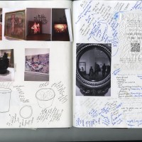
I researched a lot of existing ice cream packaging that I really liked.
Then I designed my own box based on a list of elements I noticed were a basic requirement of all the ice cream tubs
BRAND NAME: FrigidBitch+ loving kawaii sweetheart (One of his nicknames)
FLAVOUR: Lavender Prince ( a phrase he associates with himself)
IMAGE: A picture of a very happy, excited Nicholas coming out of an ice cream tub.
The reference pictures that were taken before creating this image, that were left mostly unused.
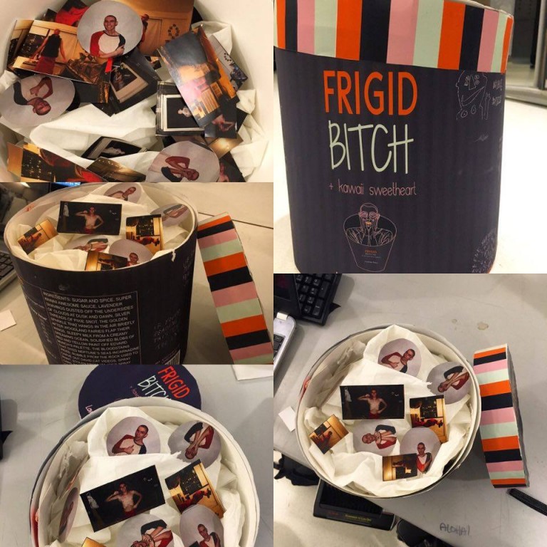
The inside of the box will consist of tinted toilet paper. because the texture of toilet paper is soft and floaty and ethereal, and delicate and reminds me of ice cream. and partially hidden partially not, within the ocean of toilet paper will be small pictures of Nicholas, the ones above, and the pictures that are bloopers and may be show him in a more goofy light, that people can go through. Initially the ice cream tub was going to be huge , but now it is going to be the size of a small trash can. And I will be calling people forward to go through it.
The following images will be placed inside the tub. They will be of very small sizes, and each set of images will be a different shape. I intend them to resemble choco chips or fruit bits present inside some flavours of ice creams.
Along with these images I also intend to also slip in the blooper images where Nicholas is mid conversation, or doing something really goofy. Nicholas always carries himself so elegantly. Even when he isn’t posing his posture tends to make shapes out of the negative space around him, which really activates the composition. Even for an amateur photographer like me, it is really difficult to mess up a picture, when Nicholas is its subject. And so, I really valued the few shots I have of him where he looks like he has been caught unawares.
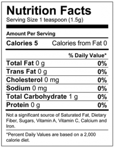
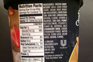
NUTRIENT FACTS:
reference images:
And the following is the one I created.
Caution: The following image is extremely punny.
The scribbles I added later to the walls of the tub to build character were retraced graffiti works by Jim Joe, one of NIcholas’s favourite artists. Some of his work is below. These were the images I used as reference.
And then I worked digitally on the packaging. The name “but also loving kawaii sweetheart ” was changed to “+kawaii princess” because it made he composition look not so visually compelling. Finding the right font and colours was a struggle.
Eventually I had this:
Here are my feeble attempts at prototyping.
I realized that the shape of the ice cream tub that i had set my heart on was not going to work and that I would have to make it cylindrical.
While people go through the actual ice cream box, I am going to ask them to smell lavender.
Or maybe the smell of incense.
FINAL PROJECT:
FINAL PRESENTATION:
(I forgot to bring Lavender to school. Oops.)
And that was that.


