Responsive design started with the May 25, 2010 article Responsive Web Design by Ethan Marcotte discussing media queries. Flexible layouts and responsive images are two additional ingredients required for responsive web design to work.
Flexible Layouts
I have discouraged you from using percent in specifying your measurements. They are a cause for confusion when first starting out. That time has passed, and we can begin to think of a completely new and flexible way to laying out websites.
Responsive means to respond to the conditions, instead of being rigid and fixed. To be rigid and fixed means specifying everything in terms of pixel measurements. That way the layout does not move, no matter what.
The first think one can do to bring in some level of flexibility is to size everything to a central scalable unit. When that unit changes, everything changes accordingly. This happens when using the em as a relative unit of measurement.
An em is a unit of measurement in the field of typography, equal to the currently specified point size. The unit was originally derived from the width of the capital “M” in a given typeface. These days it stands for the height of a font. This unit is the same for all fonts at a given point size. For example, 1em in a 16 point typeface is 16 points, the default size for browsers.
CSS allows one to measure everything in em units, and it is best practices to do so. You set the size of the em in the body tag when you define the size of the text. Ifbody {font-size: 16px;}, it would be the same as the default size of the browser, and unless a user changed that default, it would not make a difference.
Now imagine if everything in the entire document were specified in em values. If div {width: 20em; height: 10em; padding: .25 em That would make the box 328 pixels wide and 168 pixels high because of the added 4px padding, as long as the em is defined as 16 pixels in the body. Change that, and the entire layout would increase or decrease, but all the elements would remain proportional, that is, the look would be maintained no mater what the size.
This is easier said than done, and now that browsers automatically keep documents proportional as they resize them, it is no longer necessary. That said, it is still a good idea to tie all of your font sizes to a central em size determined in the body of the document.
Because percentages are often used to resize fonts, it is possible to add percentages on top of percentages. When the font size of both a child and its parent are set at 80%, the child ends up being 80% of 80% of the em. To avoid that, CSS3 introduced a rem, which stands for reference em. Unlike the em, the rem is not affected by inheritance.
To calculate the size of a headline: divide the desired size by the reference em or rem. The same formula target ÷ context = result is used to figure out the correct percentages in fluid layouts.
Fluid Layouts
Fluid layouts expand and contract with the size of the window or viewport. Instead of using pixels or ems, a percentage of the parent element is used. This width is applied to the elements floated to the right or left that make up the layout. This example starts with a pixel based layout and converts it to a percentage based layout.
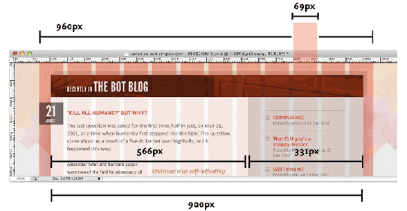
A 960 pixel wide web page is more or less standard these days. That 960 pixel wrapper div can be divided up into a grid of 12 columns, each measuring 69 pixels across and separated by regular 12px-wide gutters. Taken together, those columns and gutters give us a total width of 960 pixels.
If the main article were 6 grid columns, and the side column were three grid columns, with a column between them, that would fit in a container 900 pixel wide, leaving around a half column on either side. If we were to break this into pixel width, the main column width would be 566p pixels and the side column would be 331 pixels wide. See illustration above.
A fluid grid is proportional to the window, or viewport. Assuming that the viewport is 100%, give the wrapper div a little padding on either side, and instead of 960pixels, make it 90%. That is 90% of the body tag, or 90 % of the window size. Once we have that width of the page established, we use it to define all other widths.
Figuring out the percentage of a 900px container in a 960px page, plug it into the formula target ÷ context = result, dividing 900 ÷ 960 = 0.9375. That makes the container that holds the two columns 93.75% of the page size.
The two columns fit inside of a 900 pixel container, and when the width of the column is divided by that results in two more values that can be used, or 62.8888889% for the large column and 36.7777778% for the small column. Do not round the numbers off, as the layout will be more accurate if you keep that information.
There is a lot more to do in the layout, to translate all of the padding and margins to percentages, but you now understand how to apply the formula target ÷ context = result, dividing the child into its parent to get the right percentage.
The fluid layout will always be 90% of the window size. The layout will be problematic when the window becomes too small or large. Use min-width and max-width to keep it from doing that. This would be where media queries come in handy.
Flexible Margins, Padding, Text Formatting and Images
Everything needs to be flexible. The padding and margins that need to be flexible, the text formatting needs to be flexible and the images need to be flexible, All of them need to be written in percentages of their parent’s width, so they can resize along with the fluid width of the columns.
This is accomplished easily enough. Just set the image width to a percentage of the parent element, and it will resize along with it. Background images too, can be set in that way, or can be tiled or can be cropped.
That is easy. Now you have the ingredients of creating a fluid based web site. Aren’t you happy I didn’t try to explain this when you were first learning about how to layout a web page?