The biggest “productive failure” happened yesterday. After printing and reprinting the same design brief for an hour, I realized that the reason why it won’t come out in the right size was because I made the document in the wrong resolution. And since I can’t change the resolution after I had already made it, I had to redo the entire board. Even though I started remaking the board thinking that I screwed up everything, the board turned out better in that I had time to reflect on my decisions and remake them in a better way. In the new version of design board, the proportions are better and the texts are clearer. I am very happy with how it turned out in the end.
Author: xiaf635
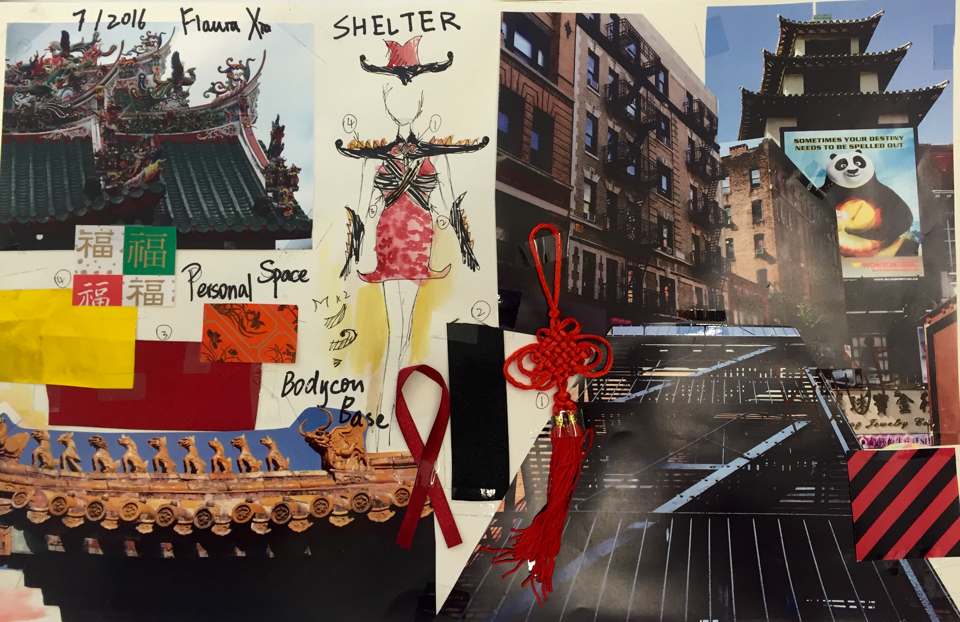
Mood Board
The first big assignment we completed on our own was the mood board for urban design. To start, I researched and dug into my inspiration- Chinese temple roofs. I found some photos of the various types of pointy and curvy roofs and that was the foundation of my mood board. I also included some of the materials I found in Chinatown to further visualize what my garment was going to look like. Interestingly, my design of the garment changed after I closely looked at the research photos. 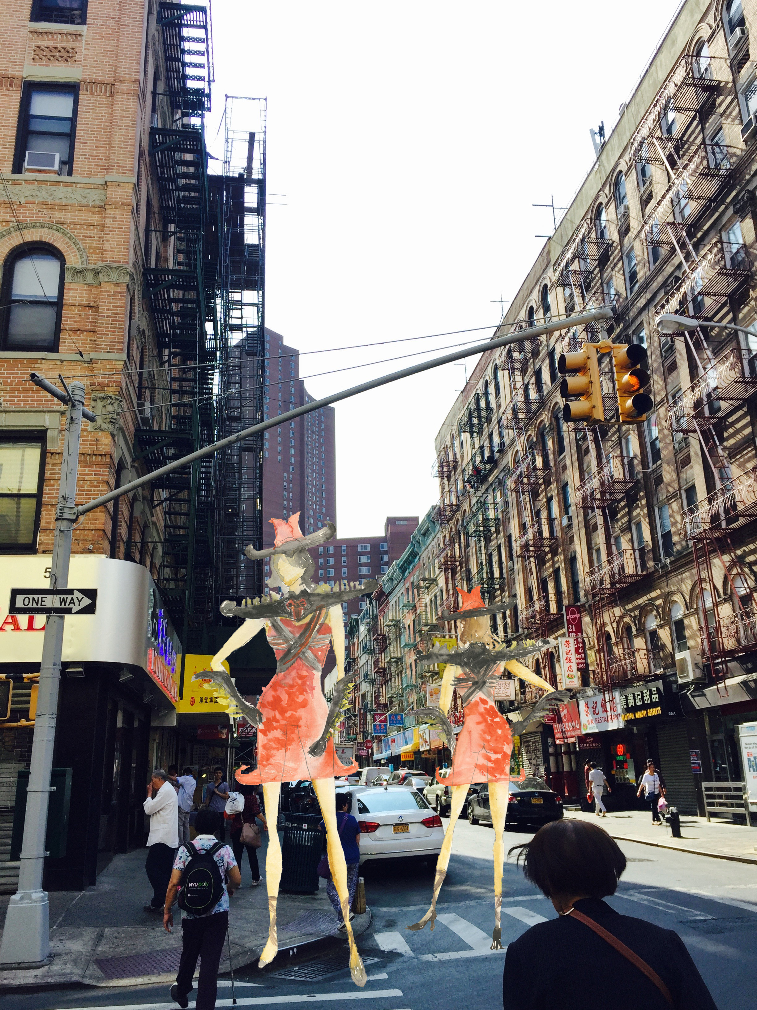
Design brief making process
Design the brief board has been the best part of this project because the assignment allowed me to explore the inspiration and story behind just the product itself. The final product is actually my second draft after I had already half-finished the first one and decided it was too much for the eye to comprehend. I started working with a memphis design pattern and photoshopped it so it could give more space to my product images. The product-in-use images featuring Aaron are the main focus of the board, and the quality and perspective of the photos add much fascination to the board. When I put everything together in the end, the color cohesion, theme and element cohesion all spoke to one another. I personally am very pleased with how it turned out.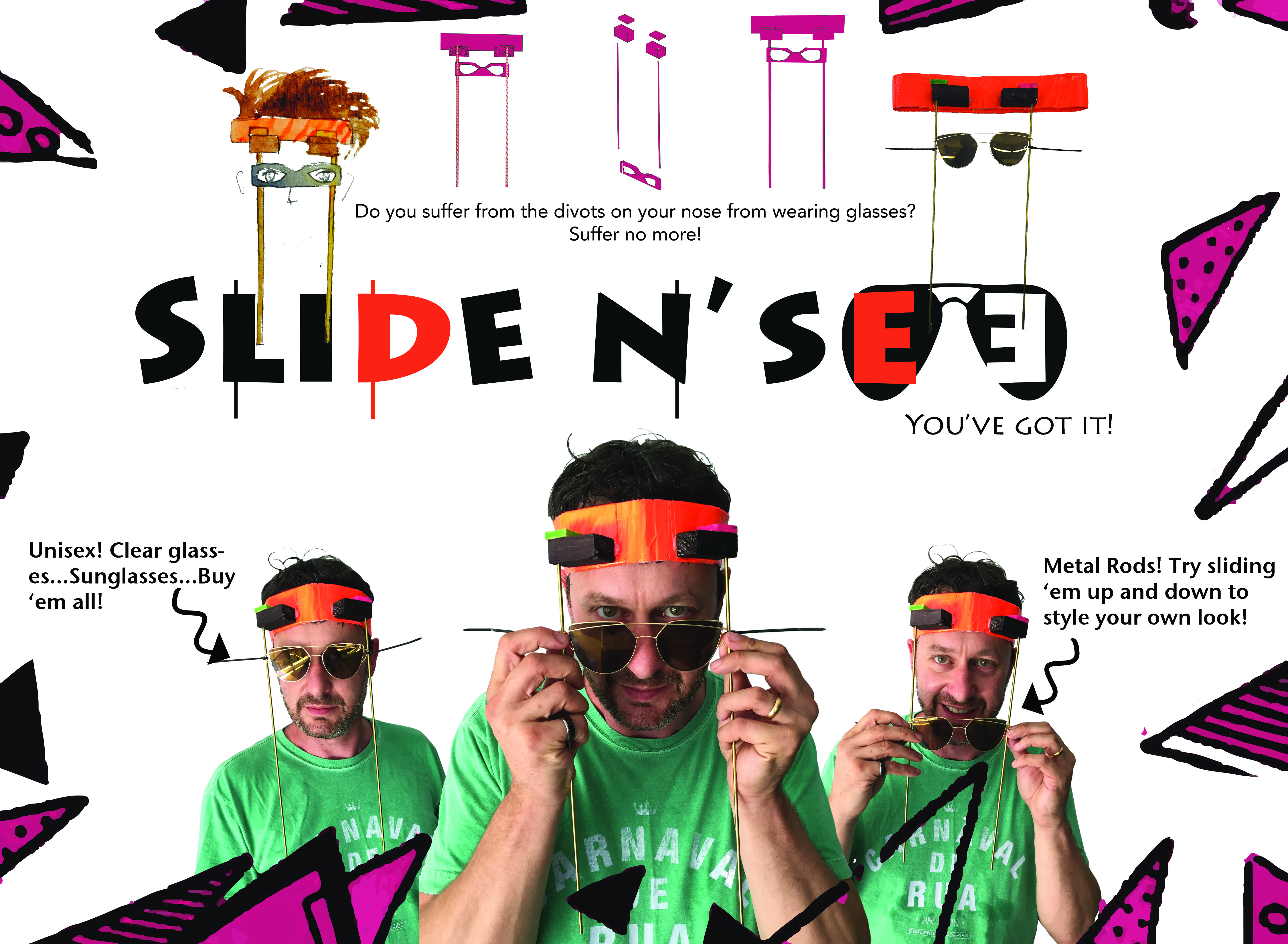
Logo Design
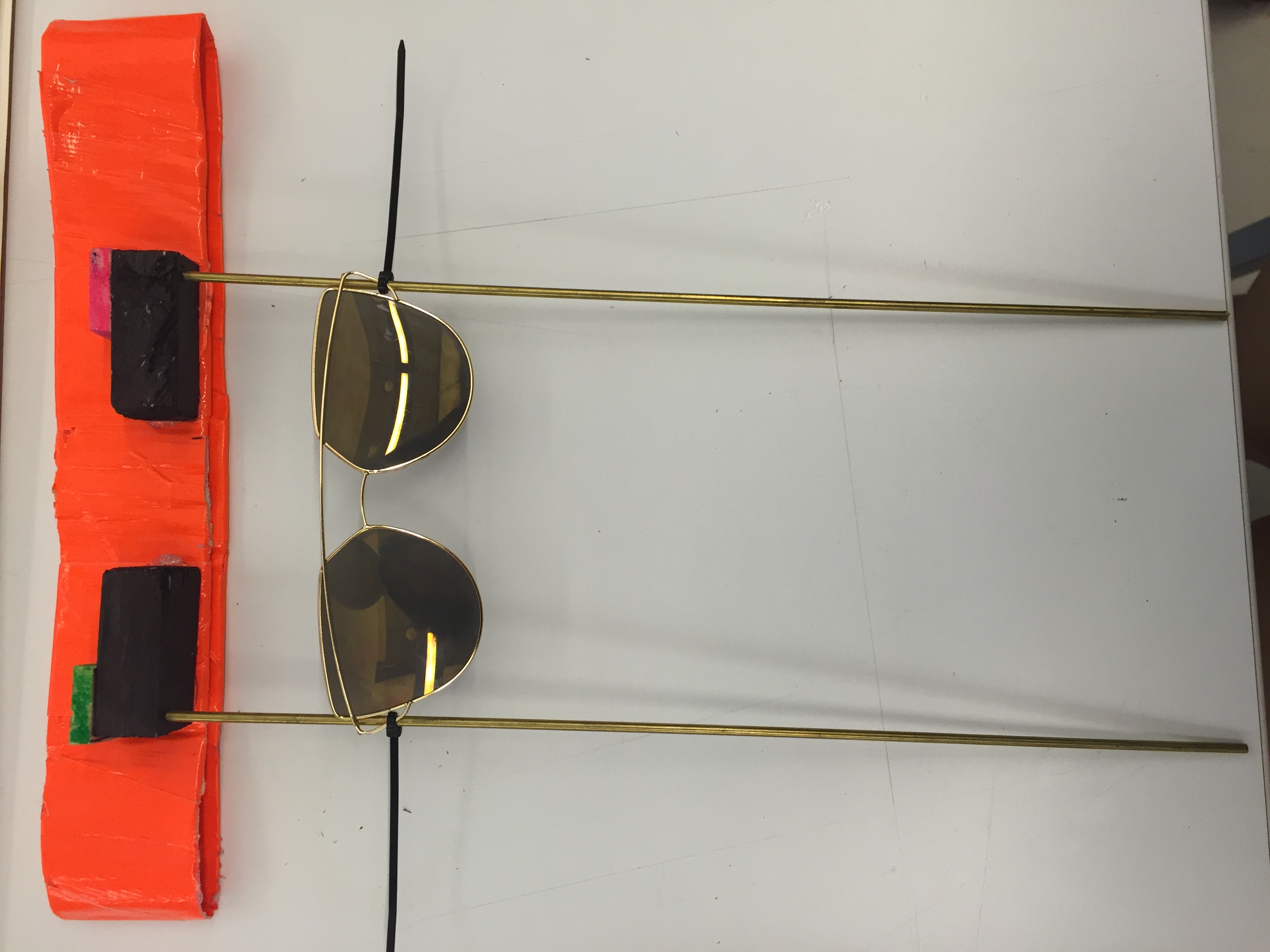
Today I designed my first ever logotype for my Chindogu design. I related the function of my Chindogu to the logo name: “Slide N’ See”. It was a different experience for me because I really had to imagine what typeface would coordinate well with my Memphis style design brief. The end result is integrated with the elements, sunglasses, metal rod shape and Memphis color pop. It made me realize how special a product presentation can be if it has a strong logo design.![]()
Chindogu Design
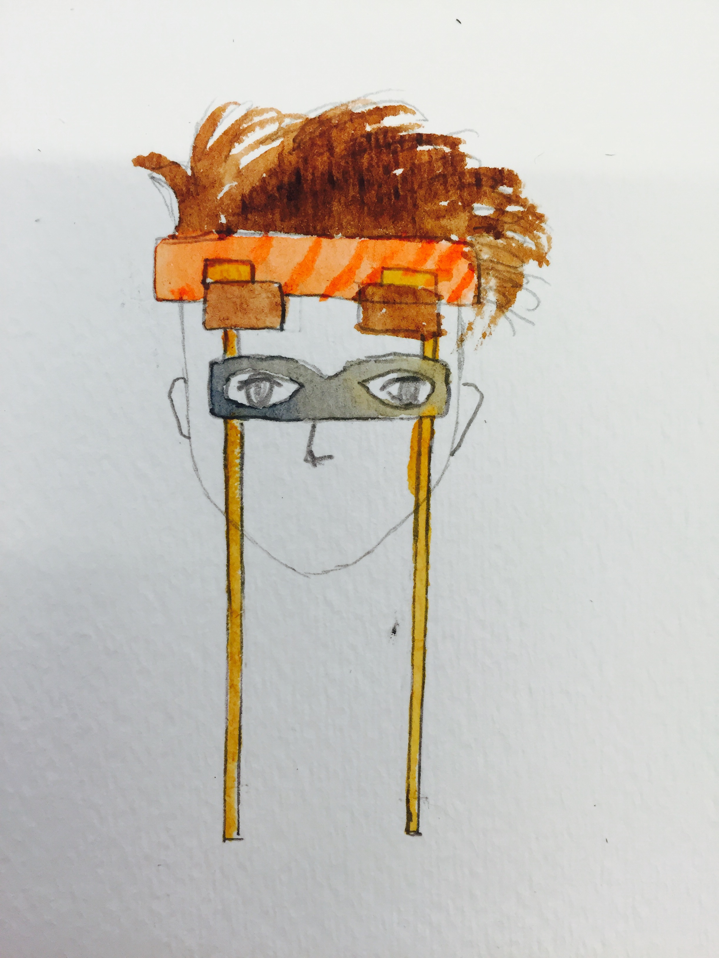
For those who suffer from the divots on their noses due to wearing glasses for a long time and refuse to bear the harm of contact lenses, “Slide and See” will save them. “Slide and See” acts like a headband attached to glasses/sunglasses that can easily slide up and down. There is no contact between the lenses and the nose, which protects the user’s nose. The user can also store multiple pairs of glasses on the metal rod attached to the headband, which is more convenient for the user to switch in and outdoor if he has a pair of regular glasses and a pair sunglasses. When purchasing “Slide and See”, the user would buy the headband and metal rod as the basic set and buy the special glasses designed for the set individually. “Slide and See” basic set is unisex, and it comes in different sizes depending on the user’s head size. Lenses come in all shapes and sizes for users of all ages.
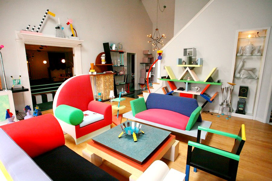
When I first started designing this “machine”, I was aiming for it to be both fashionable and almost useful for those who have the needs for a machine like “Slide and See”. The color design of the Chindogu was inspired by images of the Memphis Design (Picture below). The actual execution of the design changed slightly when I realized it would be much simpler to buy a pair of glasses and work around the design. The final product is made out of duct tape, wood block, brass rods, zip ties, and a pair of sunglasses.
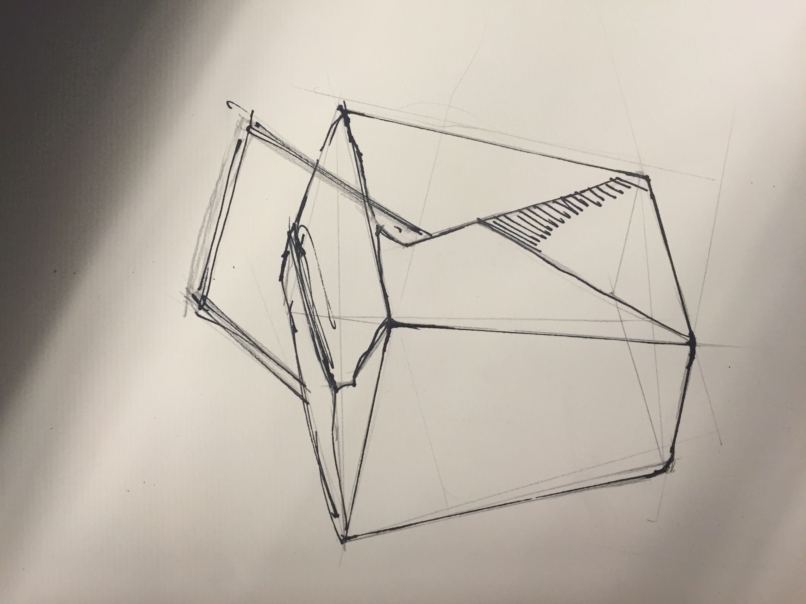
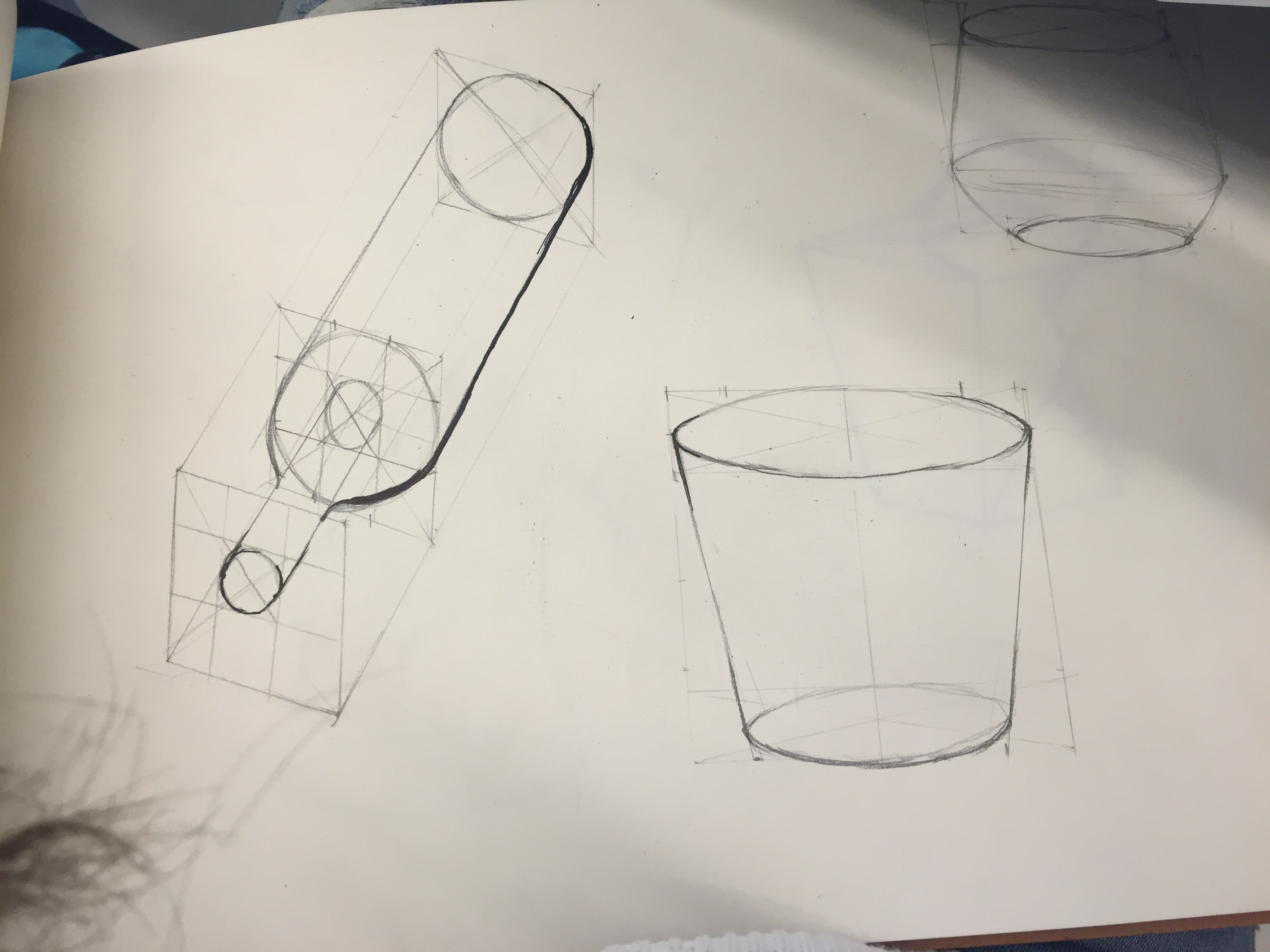
Analytical Drawing Practice
In the morning, half of the class gathered in 312 to practice analytical drawing with wine bottles, bowls and water pitchers. Analytical drawing is different from the practice in the past because it contains no perspective, but a transparent drawing for the engineers to produce the product. Analytical drawings are based on the fundamentals: prism, sphere, cylinder, cone, and pyramid. Anything that is not prism gets a little more complicated. We started with wine bottles, which is simple to draw because it only contains two cylinders and a sphere, however when we launched into water pitcher it became more complicated.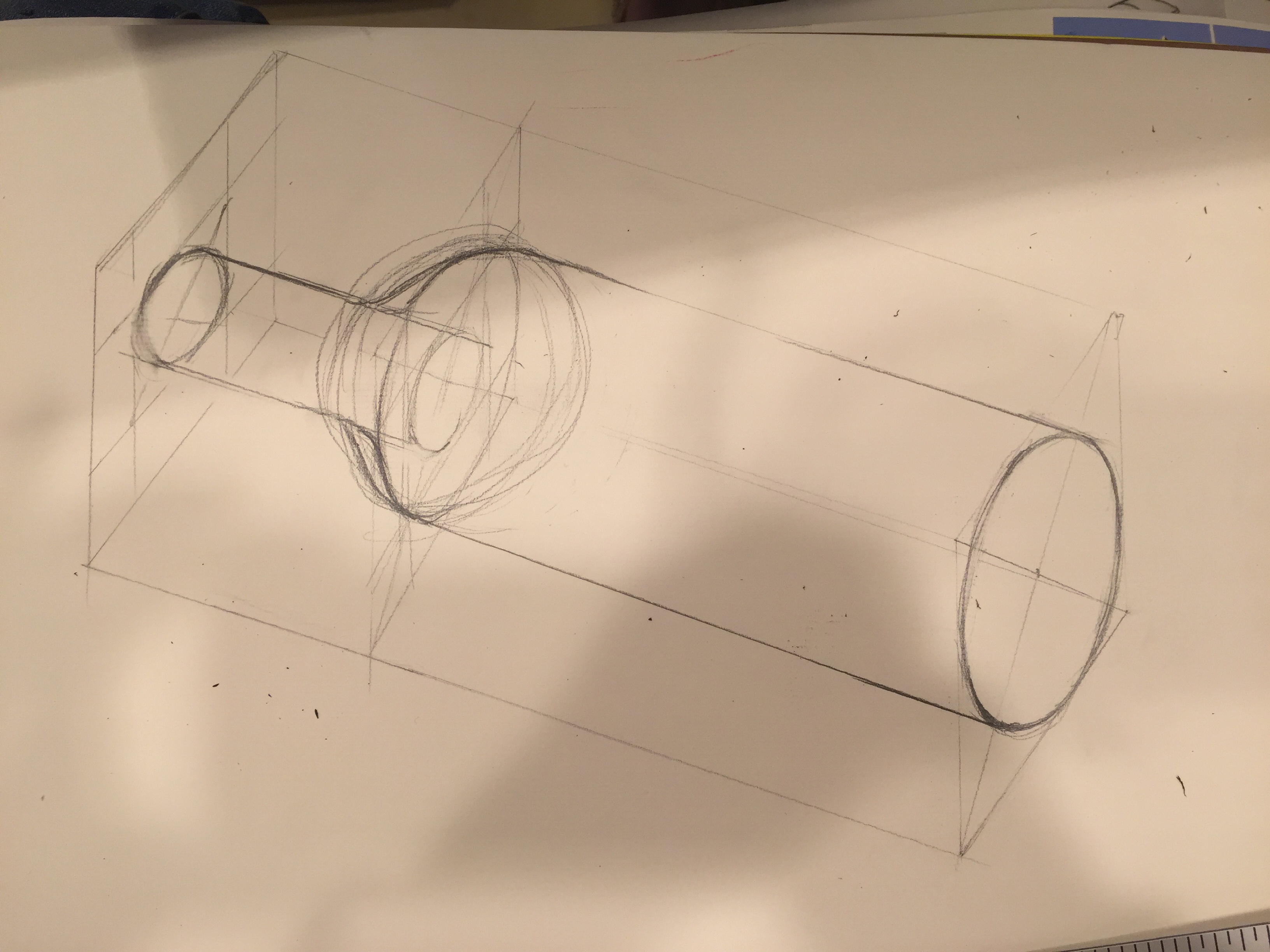
Cooper Hewitt Museum+ Lunch Lecture
We as a class went to the Cooper Hewitt Museum for design in the afternoon finding inspirations for the design of our Chindogu. The museum was curated in a way that fulfills the viewer no matter where we go. I enjoyed seeing beadwork from South Africa, sculptures and jewelry and even clothing. The variety of display offers multiple perspectives.
At lunchtime we went to lectures from Steven and Angela. Steven focused on the importance of motifs in the fashion design, and I was greatly inspired. Sometimes a seemingly simple shape can be multiplied and varied into very intricate designs. He also emphasized how the 3D and 4D experiences can greatly influence the visuals. (he gave an example of how a person transformed the massage movement into the draping of a dress)
Angela inspired me in that her design for the syrian refugees ties fashion to real world problems. Most amazingly, she developed her idea during her senior year in college, which is now being used as the foundation of an institute. All of this started only because she was interested in current events.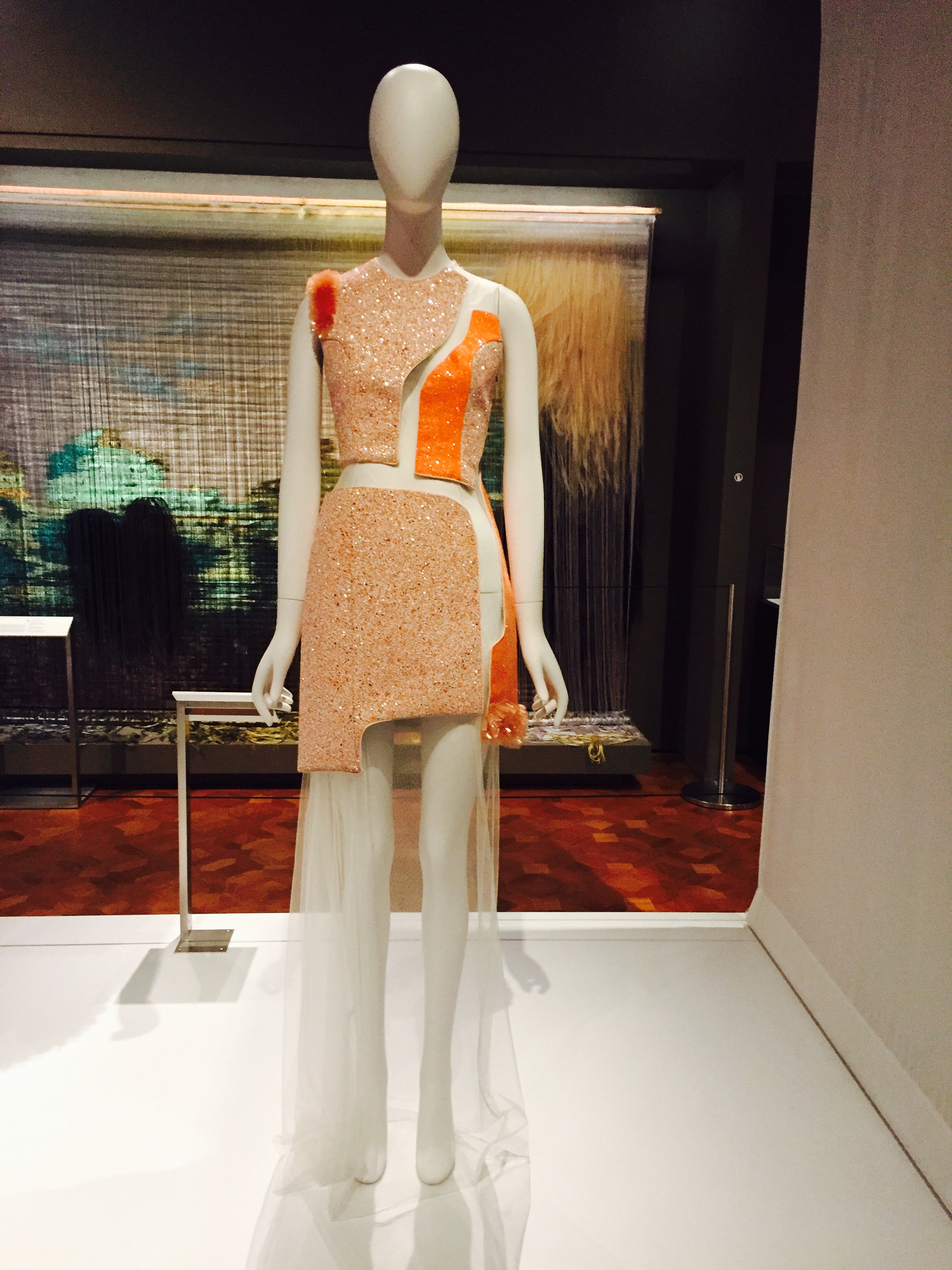
Hand tag Design+Fashion Photoshoot
For the basic design of the handtag, I integrated the silhouette of the shoulderpiece and the cross over on the torso. A diamond shape stacked on top of “X” creates interesting negative space around the hand tag. In the afternoon cheyenne and I completed our fashion photoshoot in China. Even though wearing colorfully-designed clothing attracted lots of attention, both of our pieces appear to be very dynamic. The next step is putting the photos into photoshop to polish the light/dark and focus. 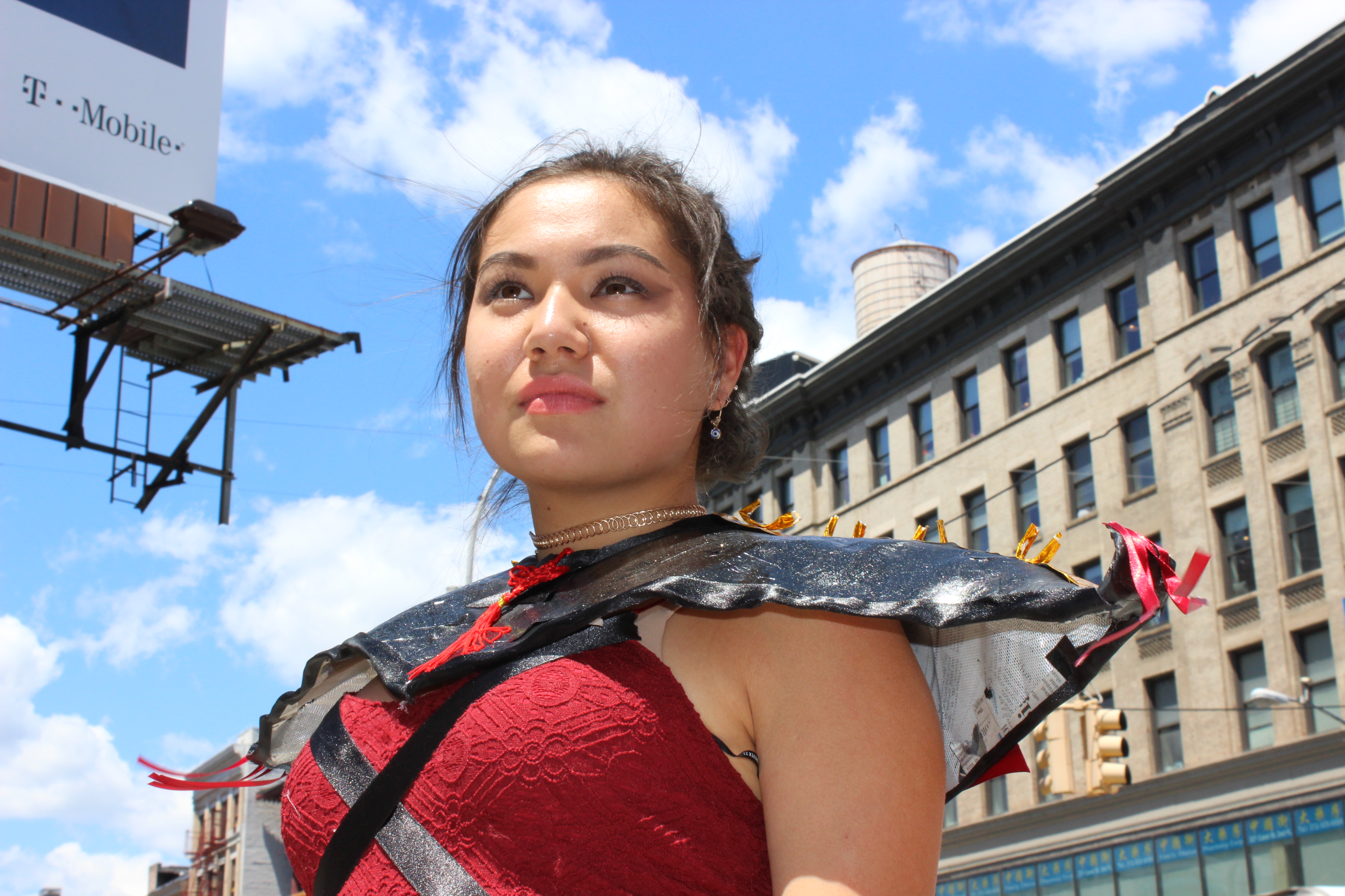
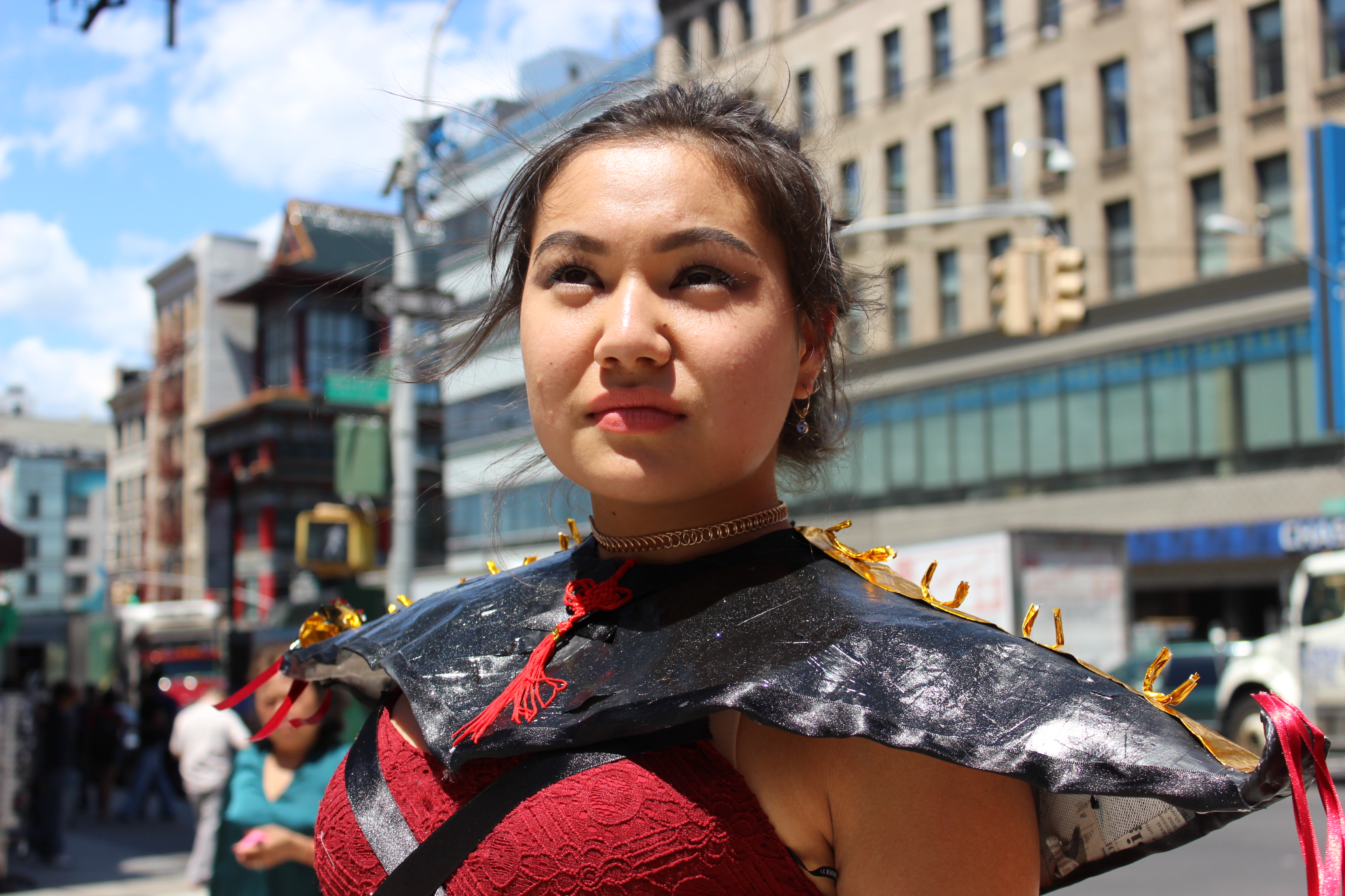
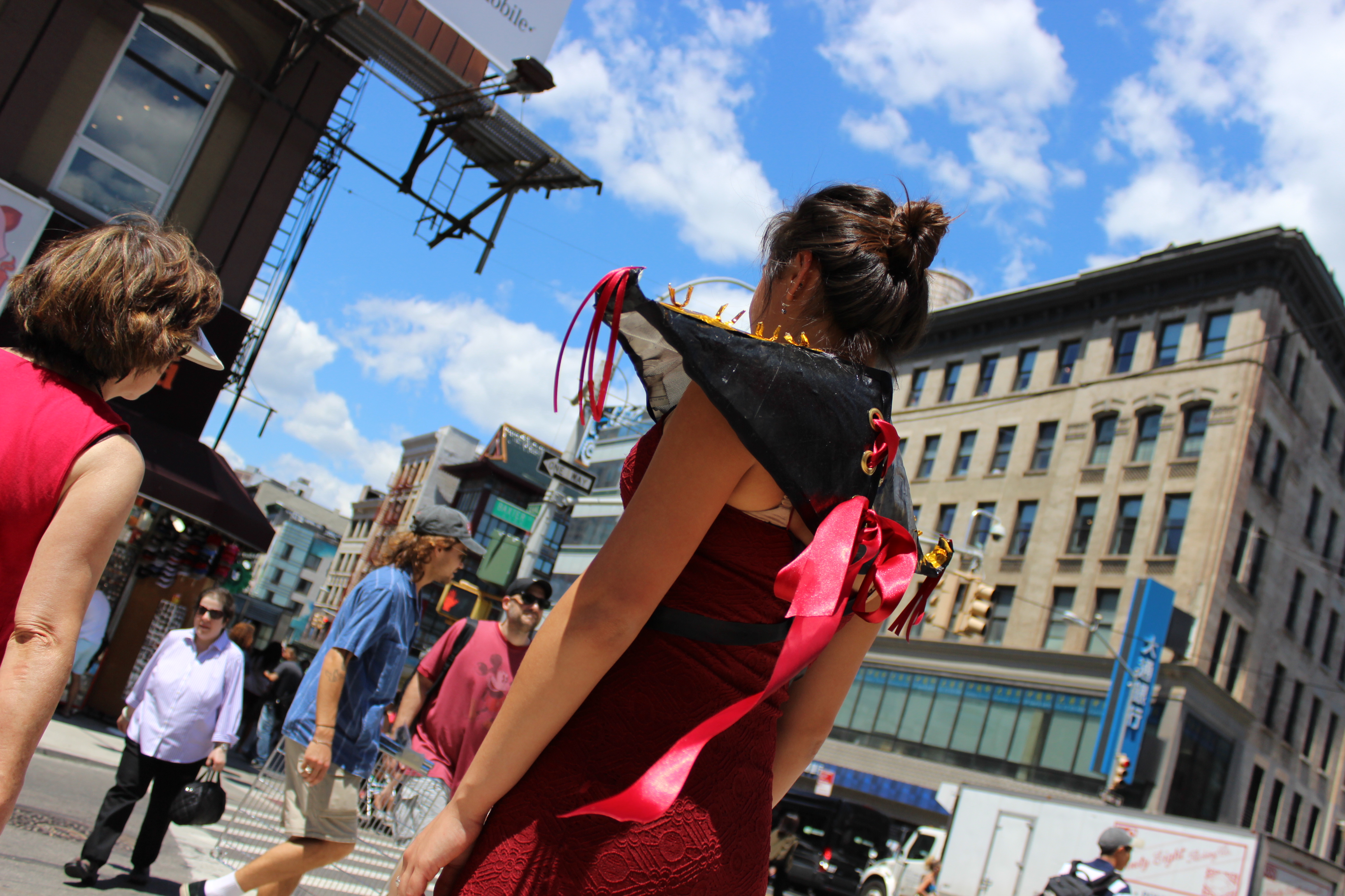
Garment finishing touches
Inspired by the pointy and curvy roofs of traditional Chinese Temple, I created my piece of red and black garment called “FierXe”, with both my initials and the adjective in it. To see the garment coming out from paper to real life was an exciting experience because I had many more inspirations for the garment while I was completing it, such as the gold leaf around the hem of the skirt and the red fringes. Due to the sudden rain and water on the ground we weren’t able to do the fashion photoshoot today. However, we were able to look at examples of urban photoshoots and figure out what we want to do.
Fashion Figure drawing
We spent all morning with two fashion models doing 9 heads fashion figure (croquis). It was interesting since I have never done one but also in some way intuitive because of the model’s stance. In the afternoon we developed our design into watercolor figures. It really helped me to see my ideas fleshed out on a model. At night, for homework, I photoshopped the designs back to the pictures I took at Chinatown and they immediately start to look so much better.