Background Context & Project Intention:
In the earlier stage of this research project, I started to apply the methodologies from UX/UI design to frame the background context of the education topic. The design method that I observed in traditional digital product design sometimes is being used to nudge users behavior and information perception. I found the goal of UX design is fascinating in current product designs that we see. So I had the idea of applying this information guiding nature of UX into some of the obstacles in science communication. It has been a long time challenge where people has less attention time span due to the changing information perceiving speed through digital interfaces, even with infants(https://www.washingtonpost.com/business/2019/04/24/who-infants-under-year-old-shouldnt-be-exposed-any-electronic-screens/?utm_term=.df2fb6120a35&wpisrc=nl_most&wpmm=1). As the ongoing debate with environmental policies after the current administration step up, some of the regulation has drastically changed worldwide. Environmental factors have become less of a priority to consider in comparison to economic growth. Even though the government might choose to neglect environmental challenges in the future of policymaking. The consequences of having an above-standard air pollutant emission accumulate daily in our body. Long term consequences relate to scale and social justice at large. In the time where we do not necessarily have the power of modifying the regulation on energy sources, the public should still stay informed with what is happening. The reason why that I wish the audiences to interact directly with data, is to provide an objective way of portraying the issue without my own bias that might get involved while I design this platform. The complex nature of scientific data regarding this subject has itself become the barrier to provide people with transparency on how energy sources’ environmental impact. The idea with the platform is to leverage some of the existing tangible forms that exist in museums to make these factual evidences in science research accessible to people through interactive data visualization. The design of information flow in the user experience design field helps to guide users navigate through the dense information context. (NAS-Communicating Science (1))
Research in existing interaction form – web and tangible:
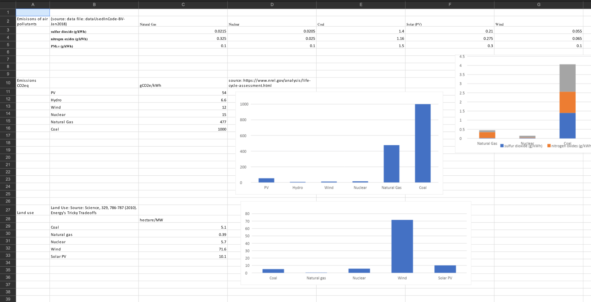
I have been working on the project for awhile in web format, I realized the interface is mainly targeted towards audience already with the desire to learn about the subject matter, there is still a somewhat steep learning curve when interacting with the web format. Then it leads me to explore the tangible interaction format for thesis. My goal for the thesis is to explore a format of the learning platform about different energy sources and how they affect the city in terms of emission levels. Many of my main precedences also struggle to find a way to convey the message behind their interaction format. Based on the precedences I looked at, many of them focused on form development, and have the interactivity of the project as the priority to keep audiences engaged. I visited a few museums to observe and experience with some of the similar forms. Tangible interaction developed by MIT tangible interaction group still struggles to deliver the message through simple user engagement. Based on my personal experience with the interactive platform in Cooper Hewitt, audiences get to move the “buildings” around the town and experience visual representation. However, what is being conveyed through the interactive visual still remains unclear. Same challenges remain with other educational interfaces that were presented in the City Museum of New York, Future Lab. A different project that teaches users about urban public space planning uses aesthetically pleasing visuals to decorate the shoreline, but the takeaway of the project still remains unclear.


On the other hand, precedence from New York Times informing the public on food and climate change issues has done an extraordinary job on Human Information Interaction. The Climate team and New York Times Food team collaborate and put together this website. They also did a great job on source citing in terms of data integrity. Their information presenting model in digital interface is the most successful I have seen so far in all the research.

Educational Outcome
As part of the prior research to this project on a more traditional digital interface format, lots of the experiment with information architecture and how audiences perceive different information architecture was being done in science educational tool development at my research job. Every year we collect data on a group of 20 students by handing out same sets of survey prior and after they interact with the education tool. We conduct an analysis on our outcome in qualitative response, we found that the involvement of design tool augments the learning process for the students in understanding the pros and cons of energy sources. I presented the collaborative research project with Sean Hughes and Bhawani Venkataraman at SENCER(Science Education For New Civic Engagements and Responsibilities) conference. In the conference, I shared how we use interactive data visualization tools to create a platform for transparency for audiences to understand environmental challenges through data. In addition to the elements of storytelling to frame the background information to inform the audiences on: Why is this important to our everyday life? The development of the web platform helps me to understand how well audiences perceive the information based on differences in how the information is arranged and presented to them.(Scientists in Civic Life_FINAL INTERACTIVE 082718) Later on I derived the research finding into the brainstorming of the tangible interaction.

Earlier research on UED and Science Communication in web interface format:
Again, I used methods in UX/UI to design science information perception for educational web platform. In the information architecture chart, I created a hierarchical information structure for all information to avoid overwhelming users for information overexposure. Each source is cited below the chart.

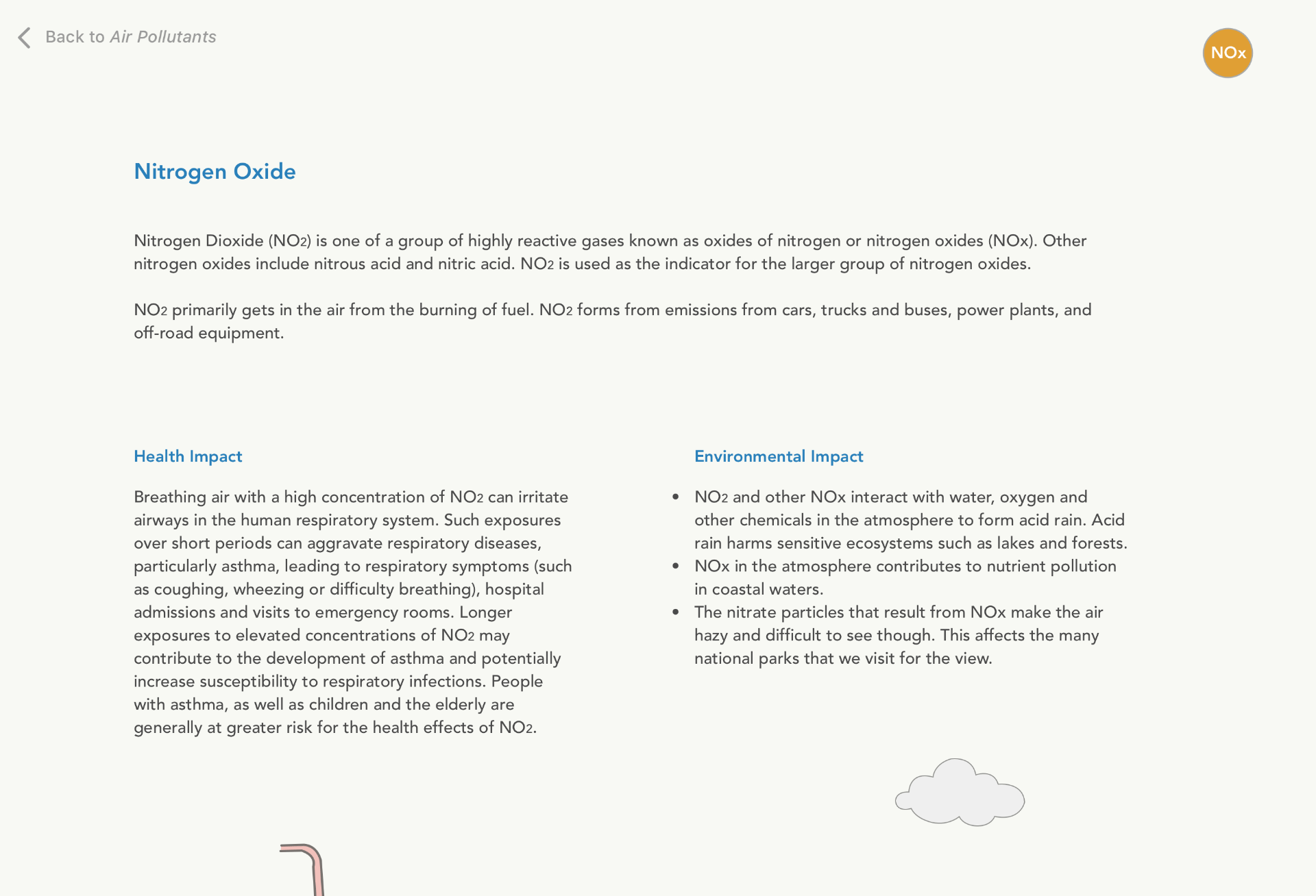
Below is the latest mock-up that was used for user testing. I want to gather information on how visual guide helps people perceive information. I conducted user test with two users, ask them to tell me a piece of information about the difference in energy sources and how they affect public health. The feedback was that they both like the storytelling infographic that provides the background context of the subject, but the information with the power plant can be better presented so that the audiences will be able to compare at a glance. In sum, they learned that air pollutants and greenhouse gases emitted from power plants have a negative impact on human health, and each power plant might cause a differet impact based on their emission. Even though web interface wasn’t the aim for my thesis outcome at all, but it is a much easier mock up tool to conduct user testing and to collect feedback from the user experience. Pollutant data are from EPA.


Energy Playscape – Tangible Interaction for Environmental & Health Data
After spending time understand the basic of User Experience Design and education, I moved onto the tangible interaction form which I pitched for thesis. There were many many obstacles I encountered along the way, most resolved at the end, few remain an unsolved challenge. Many of them come from the merging of disciplines with design and science information. I am always making accommodation for one or the other. My biggest struggle was to find the balance point between the two. Moreover, to be really honest that the most daunting part of the project is to be at the middle ground between disciplines, where I continuously seek help from both sides, but eventually, the biggest challenges are left for myself to resolve. I knew before committing to this thesis topic, that things will most likely be ambiguous most of the time. And working with an educational topic requires higher expectation for the final outcome. However, as I mentioned earlier in the precedence, where some of the top institutions still struggle to find the balance point between data accessibility and the educational aspect. I am happy with the overall journey it takes me to deliver the final outcome.
Prototypes & Iterations
In the beginning stage of thesis ideation, I keep on getting stuck with the interactive form of the interface. I spent a large amount of time trying to figure out: what kind of interaction would have been the most engaging for audiences? This notion is inspired by Teamlab’s block town project, where the interaction format was so intriguing that kids are drawn to the platform. I wish to leverage the interactivity of technology at its max capacity to create a fun interaction. I kept on referring to the “nodes” (the coordinates) as the main interaction. Putting nodes onto the table and create urban spaces. I eventually turned down the “nodes” because of technical difficulty and time constraints, but more importantly, I was not able to relate the different types of spaces to public health data.


After realizing the brainstorming method solely focus on interaction wouldn’t work. Then I abandoned the tech aspect for a little bit, just to purely flush out the interaction of the platform and how is it going to relate to different pieces of data. In the user testing of my boardgame version, I observed that the users might get lost in the beginning and try to figure out the game rules. After one or two round, they will be able to pick up the game and start thinking about how they want to arrange the power plants in the town. Audiences were engaged wanting to win the game versus their opponents.
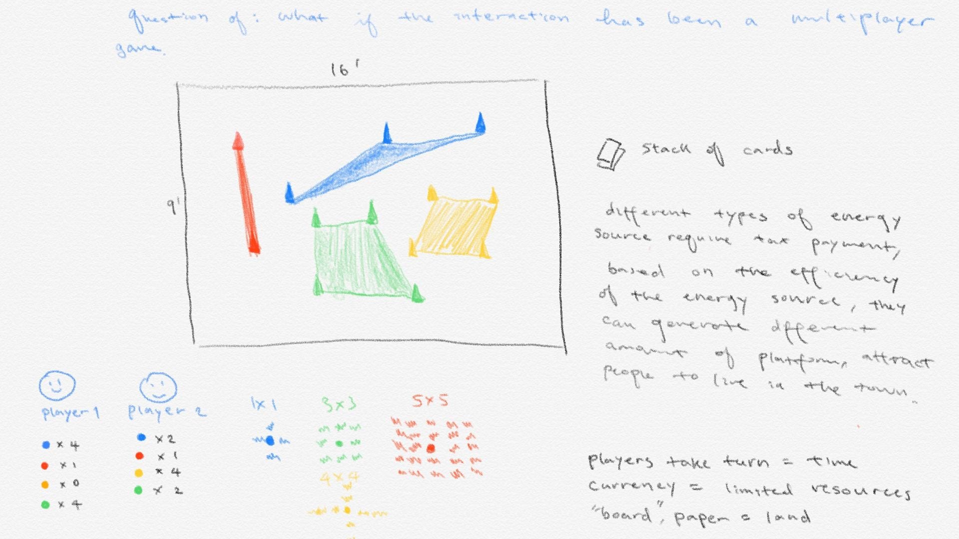
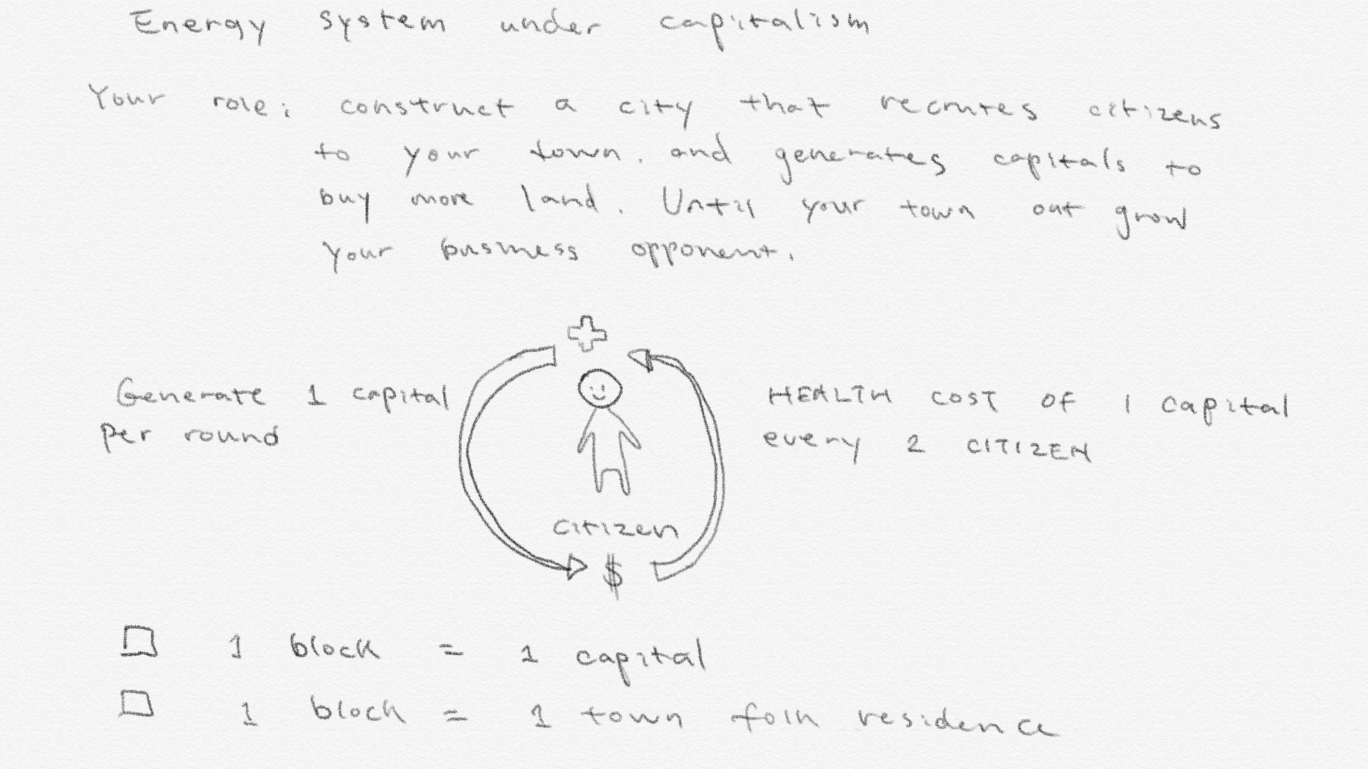

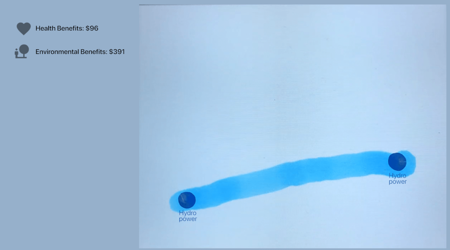
Based on the user test and professors’ feedback, I decided to further simplify the message coming back to the digital interface. I faced the technical and time constraints where I won’t be able to program a game interaction like my boardgame with openCV. But the experiment with the analog game allows me to understand what intrigues the user and get them to think about the pros and cons of each individual asset. I observed that people are more engaged when there is an evaluation of performance. This is a feature I did not have in the earlier versions when I was purely focusing on interaction. So in this prototype, I added citizens to measure their performance on planning the energy portfolio of the town. If their energy portfolio is not beneficial for the environment, the town would suffer and citizens die (disappear). It is the metric that I designed to monitor the performance of the player.
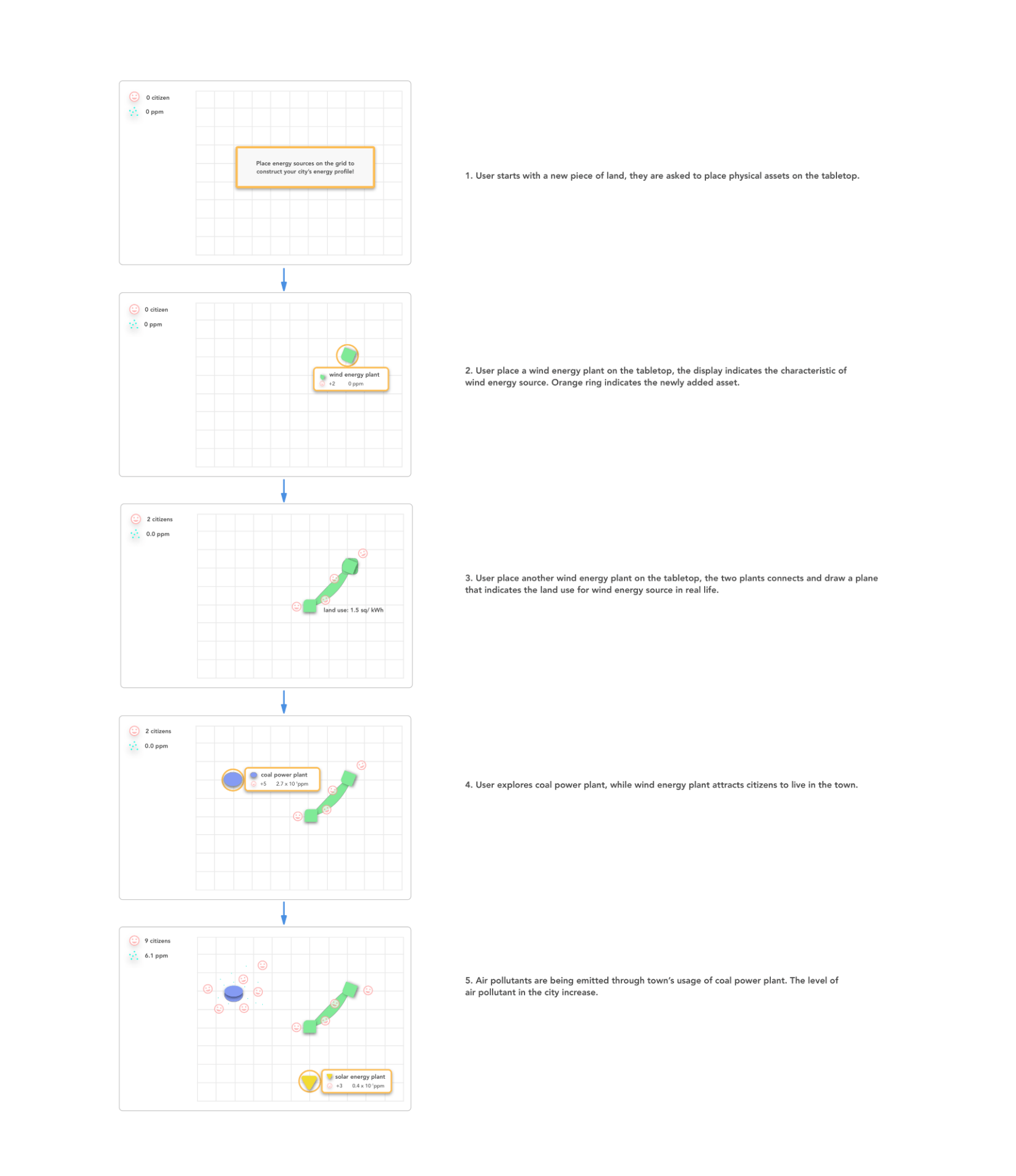
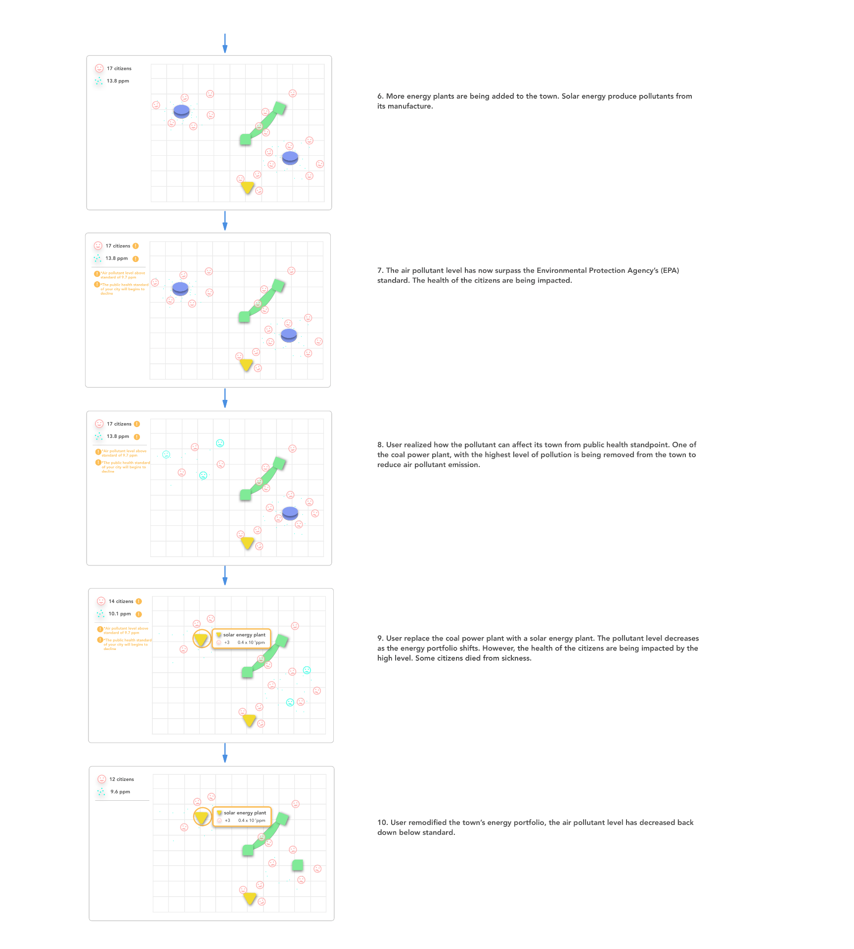
I conducted a beta user test with two other users, walking them through the interaction flow and asking them to tell me some differences between each energy sources and how they affect the environment. They were able to notice that coal power plant produces much more air pollutants than others and also that you are required to opt for other energy portfolios once your citizens’ health is at stake.
Some feedback I got was that the indication for air pollutant levels is not clear, I should label it as air pollutants rather than numbers and ppm. Overall, I think both users that I tested were able to grasp the main connection between energy sources and public health. I will incorporate the feedback into the next iteration, but moreover, I still hope to make things more engaging and fun. Again, because of the production timeline, I move on with the next step.
Interactive table user journey map:
The concept of the project is completed by an engaging user with the subject matter, by learning about each power plants and their pros(energy dense, more citizens) and cons(pollutants). During the process of comparing different sources, they will be able to register “the right thing to do”, which is to create an energy portfolio that is the best for the environment. By this point, I have simplified the interaction to the minimum, I only expect audiences to notice how each powerplant cause a different impact on the environment and public health. From there it leads to the reflection stage where hopefully the project could get audiences to start thinking about the future of energy by putting a post-it on the comment section. If not, it would be nice even they can have the takeaway on how the energy sources are different from each other in terms of emission. This relates back to the intention of creating a platform like such, where users are able to comprehend the data directly through visualization. From there, this platform in a way creates transparency between environmental decisions at a larger scale and our personal/urban health.

Data Integrity
Data integrity is one of the main focus of the project. I choose to have users interact directly with the data instead of any other recreated abstract forms to represent the systems. I use data visualization in the project to serve as the most direct connection to bridge the information and audiences. I aim to simplify models from the environmental science field into the gamify interaction. The intent is to present the same system in environmental models through animated visuals that represent the same concept. This idea was inspired by literature from Thinking in System by Donella Meadow, where she explains ways of using simplified analogy teaching audiences about the system, specifically relating to public education on environmental issues.
In the beginning stage of the project development, I was having large difficulties to come up with a complete set of interaction that illustrates the concept and convey the challenge that I am trying to express. Then I realized I need to come up with my own data model that illustrates the users’ interaction in the specific setting based on the rules I designed in prior steps. So I draw from models from academic papers(see in the chart) or environmental data source such as EIA ,EPAand census to gather the data I need to create my own model.
The data set is being collected from prominent research papers that were published in the field. View data file here with sources included next to each data set.

I used AQI models to determine how the health of the citizens get impacted. I used the standard to carefully model the gamify interaction, make sure the impact of air pollutants aligned with the actual AQI model.

Integration into the interactive visual:

In the program, I imported the emission data into the visualization in response to the visual particle’s born rate; the numbers of citizens that a power plant can support is in direct relation to the energy density of each energy source. In addition, the above AQI model, I also simplified it into two simple health states of the citizens either health or unhealthy depends on the total pollutant threshold.


Based on the project intent, I draw data from power plants’ emission(CO2, NOx, SO2 and PM) link them to AQI and census data to evaluate the measure of pollutant’s effect on each individual. The complete data model that calculates emission and measure public health factor based on the energy portfolio. Please see diagram below see how each data sets connect to each other and how they reflect in user’s interaction.

Initial analog brainstorming version, some data were converted by hand in order to fit into the model with a unified unit.

The program itself, including the calculation data, is fully functional, can be found at Github. The model itself is an accurate portrayal of the approximate environmental and public health effect from the energy portfolios. The model in this gamify interaction has the capability of computing actual health effect based on actual scientific data from EPA, EIA and more. The interaction part is easy and accessible for museum-goers, with relatively simple interaction required. Through their engagement and critical thinking, they are able to grasp a simplified model of energy sources and environmental health by playing with tangible assets in a museum setting.
Reflection & What is next?
The technical next step is to redesign the installation set up again so that the camera can track accurately and conduct user test. But overall for my thesis project, I think I have address the design challenge that I set up for myself at the beginning of the project. I made scientific data accessible through a playful approach to convey issues around environmental challenges with energy sources. I created the engaging experience through interactive data visualization that calculates a scientific model based on user input. Lastly, the gap between information was bridged from the two combined, where people can visualize the scientific model and see the effect on the table by placing assets on it. After the journey of creating my thesis, I still strongly believe that this challenge with environmental policy and the public has become more urgent due to different political belief based on the current administration. Science Communication at large would help the general public to stay informed with the direct impact of democracy and our health. It is a subject matter I would like to continue working on perhaps in grad school or future career as a designer. Design has the ability to nudge people’s perception/behavior. It is largely adapted to tech companies when creating their products for profit-oriented goals. There are also many ways of applying this nature of design to other fields that work toward social good. I hope to take study/research like this further into interaction design conferences and meet others who share the same goal.
