For the Bridge 2, I re-created a flyer that I found in East Williamsburg that was advertising a Personal Trainer in a Tribeca gym. The following is the add that I choose to re-create:
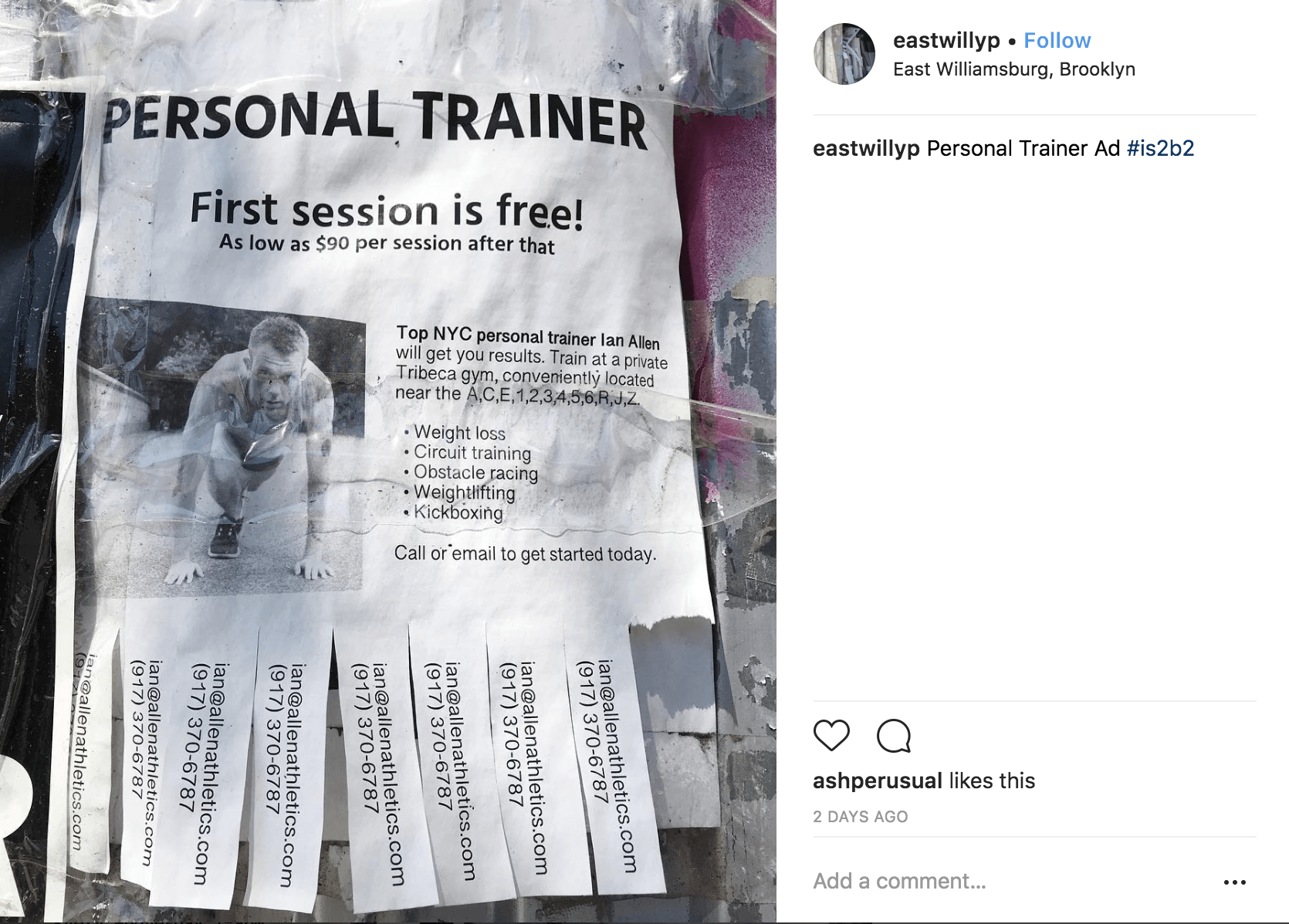
The following is the link to the Instagram post of this image: https://www.instagram.com/p/Bla1tQRg6zl/?taken-by=eastwillyp
The flyer’s primary image is a man, which looks like a trainer in a position ready to run. There is not the presence of a logo in the advertising, but there is written information. The written information does not include a particular tagline or slogan, but it does provide information about the personal training session (such as its price, its location, the contact information of the trainer, and the types of workouts that the program offers). The personal training location is in a Tribeca gym that has easy access for the subway lines A, C, E, 1, 2, 3, 4, 5, 6, R, J, and Z. There is not a clear indication of who the target audience is. Nevertheless, I imagine individuals that are interested in losing weight, gaining physical body strength, and improving their heart condition. I believe their target audience could, therefore, be adults looking to achieve those goals, and that have the financial means to purchase the personal training sessions (90$ per session). The way this personal trainer decided to advertise their product was by printed flyers of 81/2 by 11 inches.
Description/Analysis/Interpretation of the Original Ad
- Description: The flyer is digital, and was printed in black and white. There are three sizes of font: The “Personal Trainer” appears with a bigger type than the rest of the ad, then goes the “First session is free!”, and following goes the rest of the written words. Also, the “Personal Trainer,” “First session is free!”, “As low as $90 per session after that”, and “TOP NYC personal trainer Ian Allen” are in bold. The composition of the flyer is symmetrical with a title and subtitle section on the top that are centered, and two columns at the bottom. On one of the column is the photo of the man, and on the other side is a description of what the personal trainer offers and its location. At the bottom of the poster, there is the email and the phone number of the personal trainer nine times.
- Analysis: The poster had no presence of texture or depth of field. The descriptive text on the column of the right is aligned to the left. There is a repetition of the email and phone number at the bottom of the flyer. There is not much negative space. The kerning of the letters is the same for every word.
- Interpretation: When I saw this flyer I wondered: Why is it printed that small? Is it necessary to include all of the information? Is there a way of making this poster more appealing for the viewer? What if it was printed on a bigger format with less information and in color? I also thought it could be interesting to create a slogan for the personal training sessions that would have the purpose of appealing a specific target audience.
Re-designing Process
To re-design the ad, I first thought of creating an Instagram campaign including a video, but then without having a successful outcome with the little time we had for this assignment, I decided to try to create a better version of the poster. The following is the video I was working on:
I decided not to make a video. I worked on making digital posters. The three flyers I created would be both printed, and posted on Facebook and Instagram. Also, it is important to note that they would all be located near the subway stations that are accessible to the Tribeca gym.
The redesigned Ads
Ad No. 1:
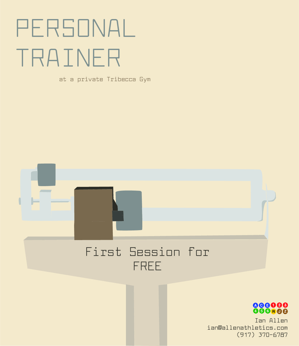
Process: For the first ad that I redesigned, I thought of making it minimalist and to the point. To do that, in Indesign I drew a balance and then added color to the shapes. After that, I decided which information I wanted to include on the poster. I used LarabiefontRg-Regular as the font for the title, subtitle, and contact information. I also played with the color palette of the balance to decide which color I wanted to use for the background and the font. In the original poster, there was an emphasis on the easy access to the gym on the subway. I wanted to add that, and to do so, I took png photos of the subway stations from the internet and put them at the bottom right of the flyer.
Process Photos: 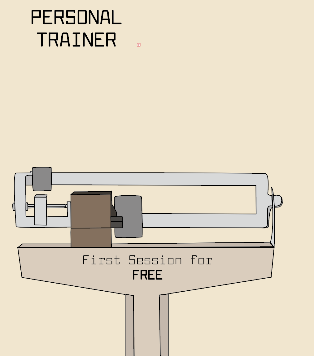

Identify the primary image/ images (including logo, or tagline): The primary image of the flyer is a balance. There is not a logo or slogan, however, there is a description under the title that says “at a private Tribeca Gym.”
Identify your target audience(s): For this poster, my target audience is individuals both men and women from 20-50 that are interested in getting a personal trainer in the Tribeca area. My target audience will want to save some money by having their first session free.
Identify your Platform(s): Printed Poster, Facebook, and Instagram.
Identify the Location: printed outside of the subway stations A, C, E, 1, 2, 3, 4, 5, 6, R, J, and Z. It would also be online (both on Facebook and Instagram).
Ad No. 2:
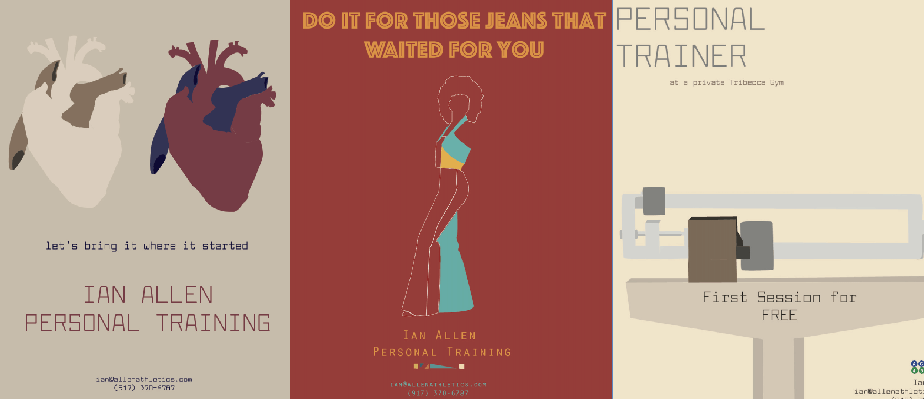
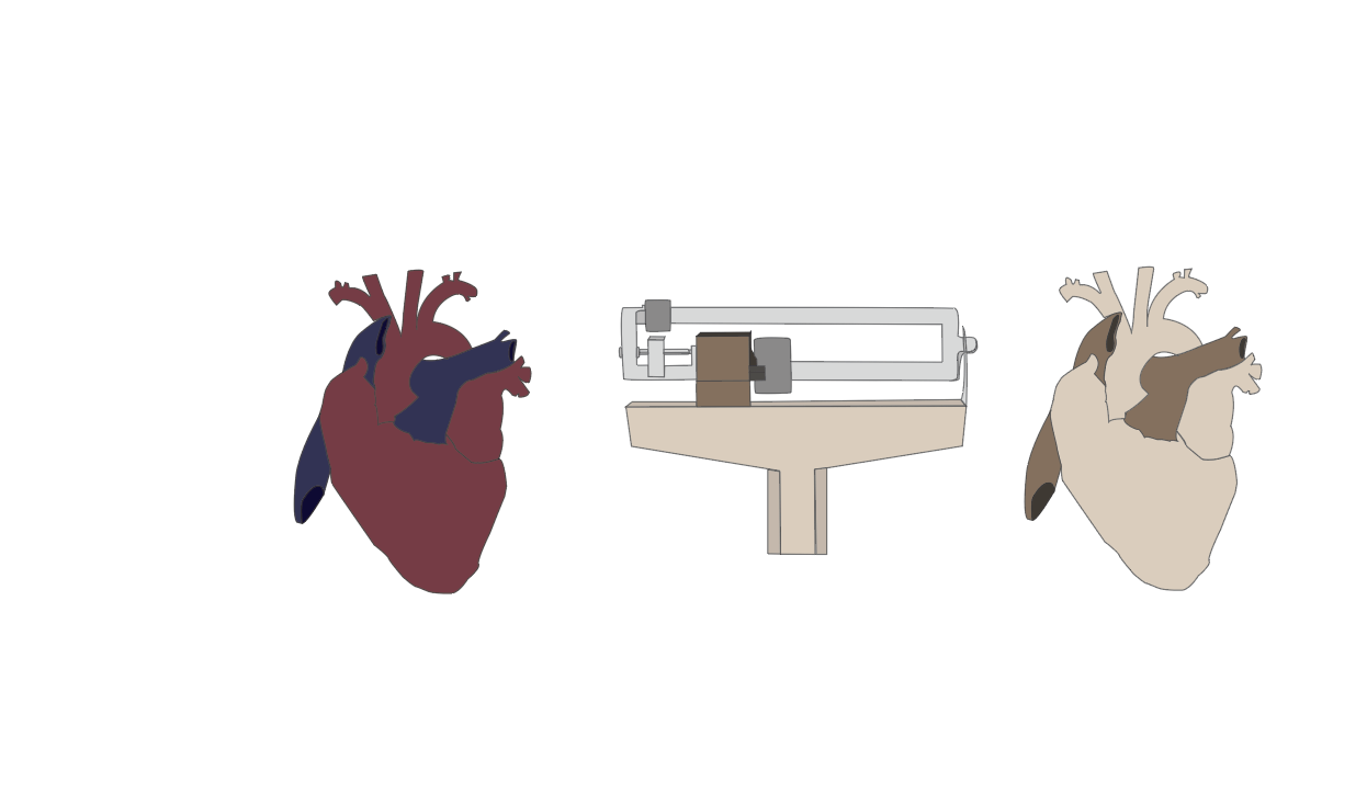
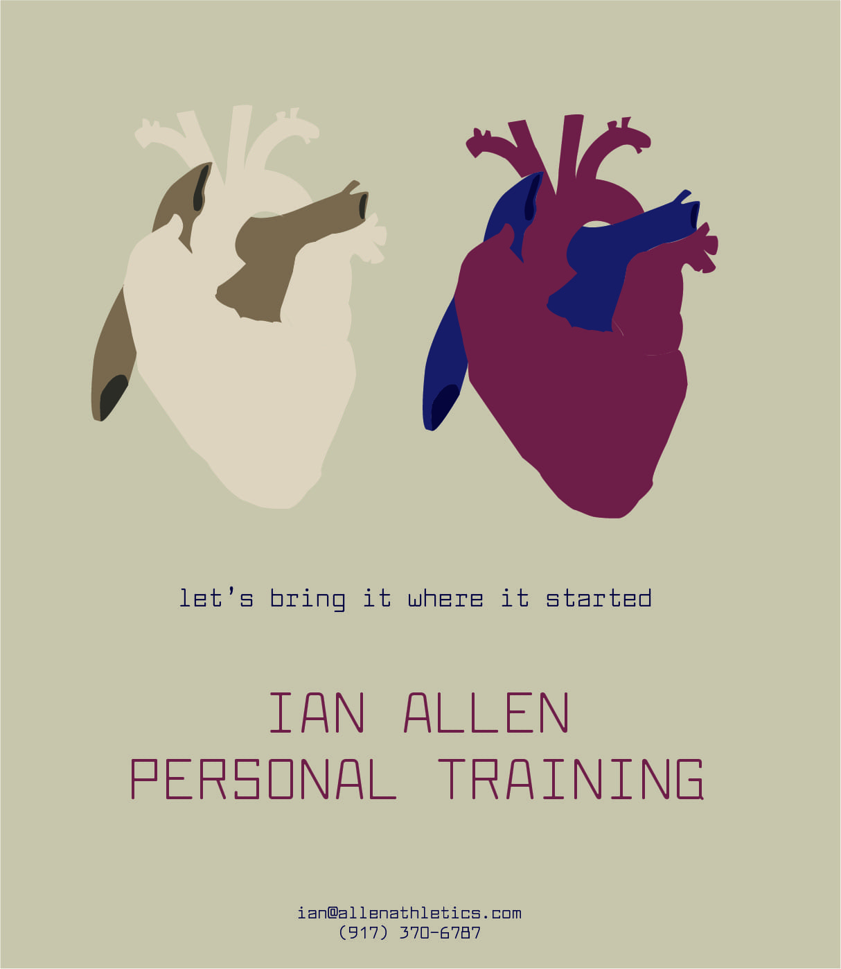
Process: For this flyer, I thought about what makes me interested in getting personal training. The main reason for me is to be healthy. When I thought about that, an image of a heart came to mind. I first drew the heart on Adobe Illustrator and painted it with the typical colors of a heart. Then I thought of making a poster with three drawings that represented reasons to go to the gym. These drawings were going to be a heart, the balance of the first poster, and a brain (for the mental benefits of exercise). Once I put the heart and the balance together on my Illustrator file, I thought it could be interesting to have another heart with the colors of the balance which were very desaturated. Once I saw the heart with the colors of the balance, I decided to take the balance out and leave the two hearts only. The difference between the colors on these two drawings made me think of a healthy heart and one that is not doing so well. With that in mind, I came up with the tagline “Let’s bring it where it started” and include it on the poster. Since I did not want my audience to get distracted with unnecessary information, I decided to eliminate the subway stations near the gym or that the first session was free. Finally, I changed the background color to one that will fit with the two hearts. I then used the color palette of the healthy heart for the font colors (blue and red).
Process photos: 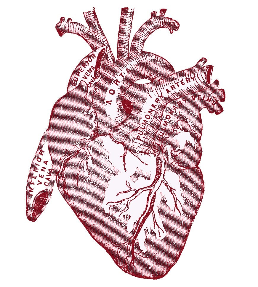
Identify the primary image/ images (including logo, or tagline): The primary images of the flyer are both hearts. Although there is not a logo, there is a tagline, which is “Let’s bring it where it started.”
Identify your target audience(s): My target audience for this flyer was similar than for the first one (men and women from 20-50 that are interested in getting a personal trainer). Different from the first flyer, here I am not stating how much the first session costs, therefore the target audience is not necessarily looking forward to saving money in the first session. These people, however, want to get a healthier lifestyle.
Identify your Platform(s): The same as the poster No. 1 (printed, Facebook, and Instagram)
Identify the Location: printed outside of the subway stations A, C, E, 1, 2, 3, 4, 5, 6, R, J, and Z. It would also be online (both on Facebook and Instagram).
Ad No. 3:
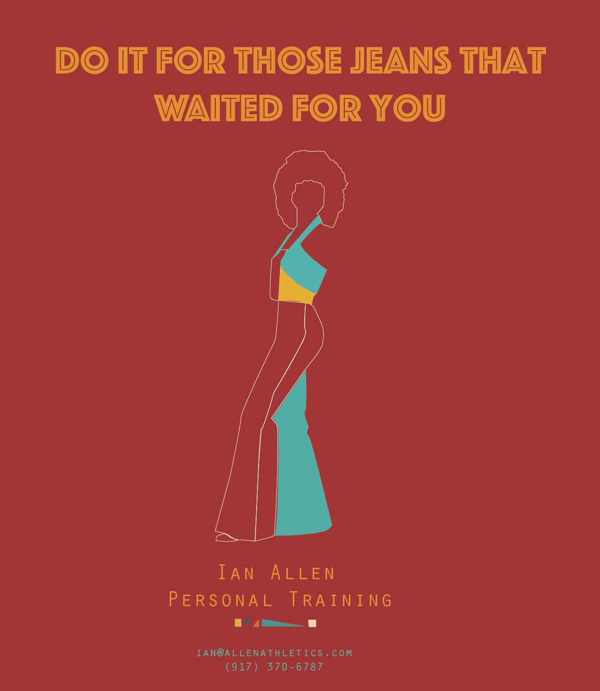
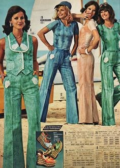
Process: For my final ad, I thought of ways of making it more playful and interactive with the audience. I made my audience more specific and decided to design it for women of around 40 – 55 years old. To do, I wanted them to remember how it used to be to feel young. I thought of jeans and how now the 70s/80s jeans are in fashion. Then, I came up with the slogan “Do It For Those Jeans That Waited For You.” For the slogan, I found a font that resembled the 70s, retro. Consequently, I drew in Illustrator the shape of a woman with an afro that was wearing jeans from the 70s. After having my shape ready, I thought on which color palette I could use for the flyer. Online I found a color palette that was saturated yellow, orange, pink, and purple. I was not too convinced with those colors. Therefore I looked for a different palette. For my final piece, I used red, orange, and blue. In the flyer, I also included the contact information of Ian Allen. For the font of the name of the personal trainer and his contact information, I decided to use a different font than the one for the tagline because I wanted my audience’s attention to first be drawn to the slogan, and then they could read where they could achieve their goals.
Process photos:
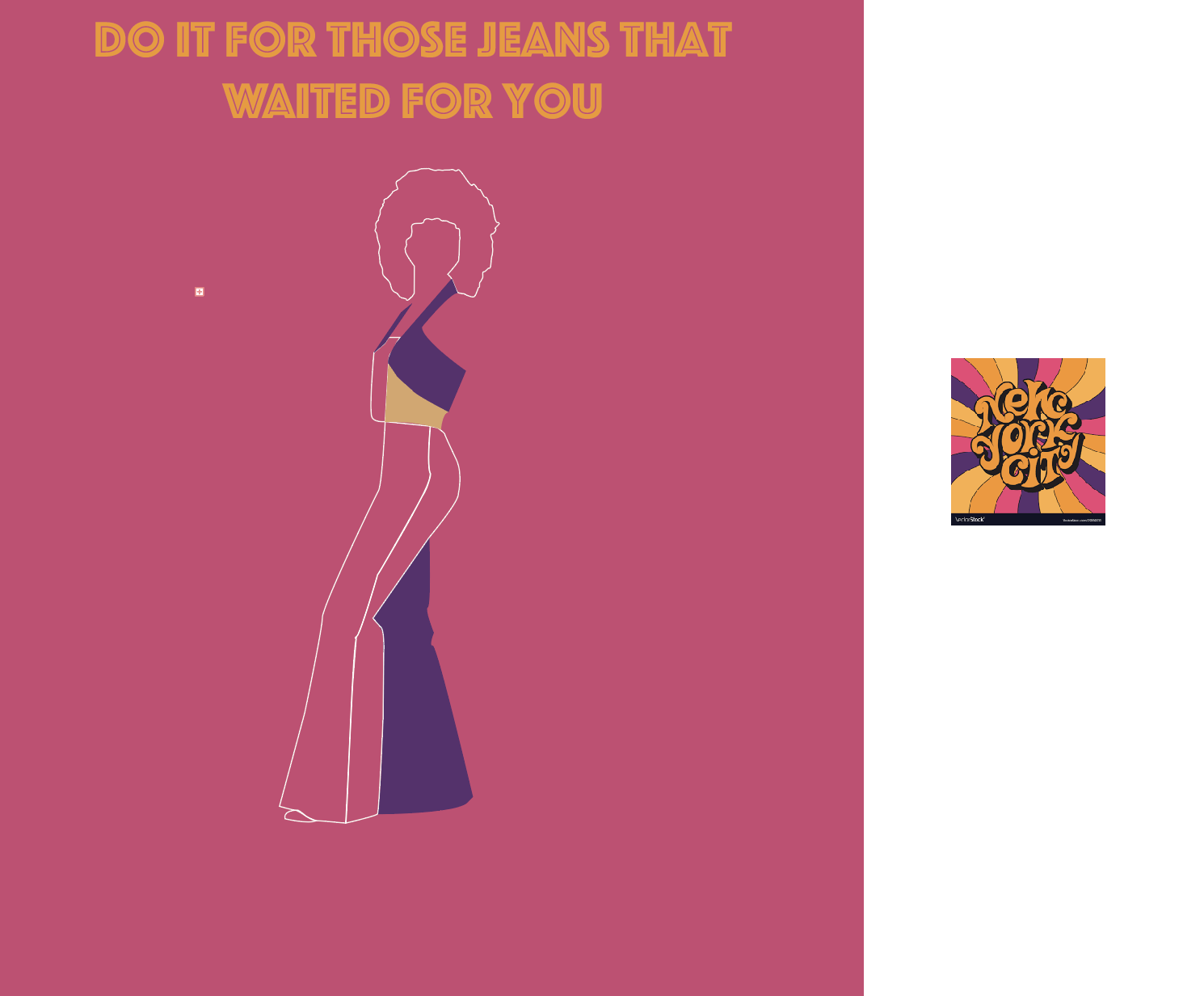

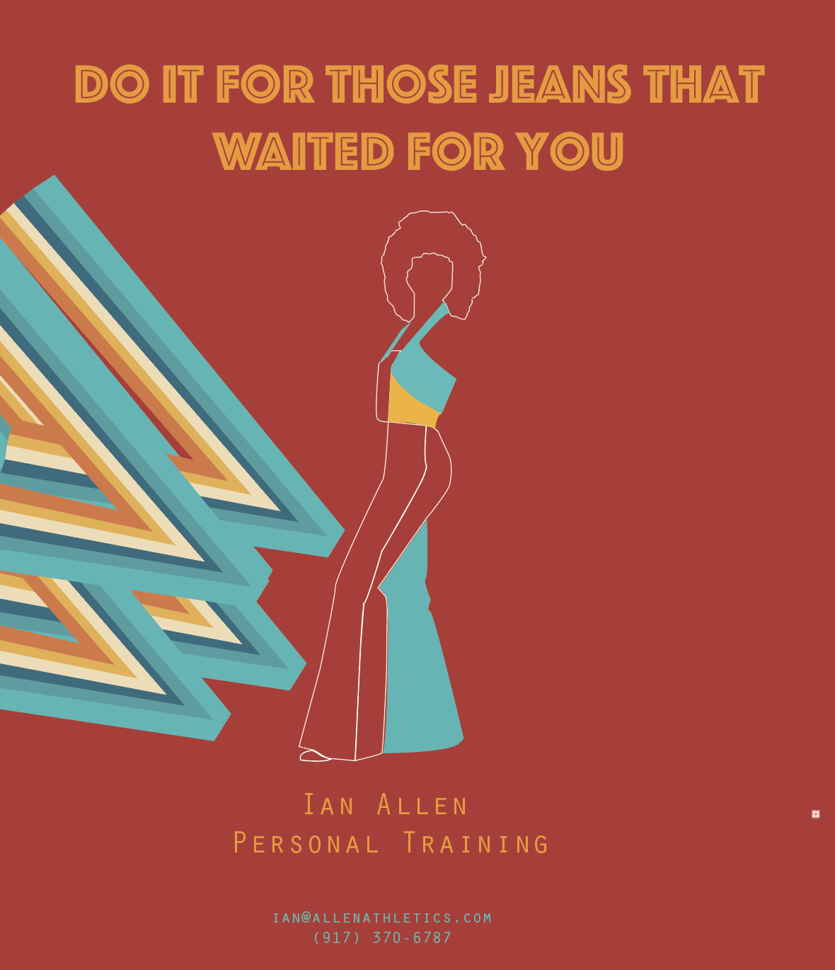
Identify the primary image/ images (including logo, or tagline): The central image is a female body that is wearing a 70s outfit, and her hairstyle is an afro. The slogan is “Do It For Those Jeans That Waited For You.”
Identify your target audience(s): Women around 40-55 years old that want to lose weight and would be interested in doing so with personal training sessions.
Identify your Platform(s): The same as the poster No. 1 and No.2 (printed, Facebook, and Instagram)
Identify the Location: printed outside of the subway stations A, C, E, 1, 2, 3, 4, 5, 6, R, J, and Z. It would also be online (both on Facebook and Instagram).