Defining Branding/Product:
For this project, instead of promoting a school club or redesigning my parent’s company, I decided to come up with a hypothetical business idea and brand it.
I came up with the idea of miniature ice cream cones as my product. I want the theme to be light and cute because I think that best represents the product itself; a light and cute snack…
I think the primary “users” of these ice cream cones would be teenagers and adults living in a big city such as New York or Miami where many of these creative dessert places pop up. Kids usually want big desserts, whereas an adult or teenager might just want a bite-sized taste of sweet while sightseeing or just enjoying their everyday lives.
Being a teenager that lives in Miami, I see many of these unique dessert places pop up every day, and they are very popular amongst people my age and a little older.
Research:
I found three ice cream places to look at the way they’ve branded their ice cream trucks/shops…
Big Gay Ice Cream
![]()

This ice cream company stuck to a rainbow color palette with a unicorn icon as well as a rainbow ice cream cone with their name for a logo. With my brand, I want to have the opposite of these bright colors. I want a softer, more pastel color palette to complement the “lightness” of the snack. This company sells normal sized if not bigger ice cream cones and pints so their poppy rainbow color story makes sense; it’s just not what I want to do. Yet, I do like the way the type is put in the ice cream cone in the logo…
Chill’N Nitrogen Ice Cream
![]()
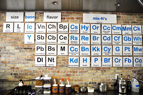
This ice cream shop is one of a kind as they make their ice cream using liquid nitrogen. They took this idea and based their logo and their name on the fact that nitrogen is an element on the periodic table. Everything in their shop is decorated and works the way a periodic table does. The colors they use with their brand are electric blues with black and white; it’s a very polar ice type of feel. They use a simple, yet bold font in their logo to represent the coldness of the ice cream. I know I want my color palette to be a lot more subtle and “pastely” but I do love the blue theme because blue is a cool color and ice cream is cold.
Azucar! Ice Cream Company


This ice cream company also has its special edge: the fact that it’s homemade Cuban ice cream with flavors having to do with Cuban traditions such as eating guava with cream cheese (represented in the Abuela Maria ice cream flavor which I must say is amazing.) This company uses a pinky color palette, addressing the sweetness of their ice cream, and pink is a sweet looking color. They go with a curly font for titles and specific phrases but information is written in a simple, thin font. Also, their logo is an ice cream cone with the name in big letters. Although I wouldn’t go with the pink in my color palette, as I prefer the blue to represent the coolness of the ice cream, I love the curly font because it’s very cute and sweet.
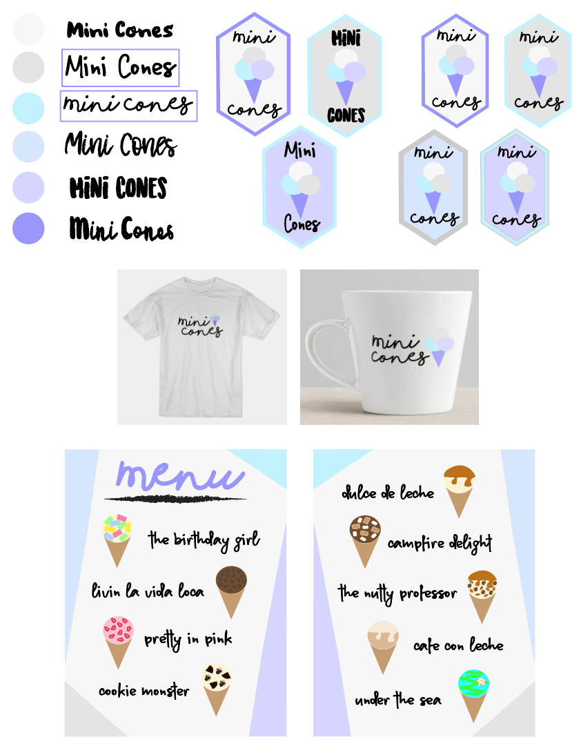
My Brand: Process
For my color story I chose a cool color palette mainly of light blues and purples as well as grey. In this piece I experimented with several different typefaces that I thought would compliment the sweetness of ice cream. I mainly went with curly fonts to make it cute. The ones with boxes around them are the ones I selected for my logo and business cards…


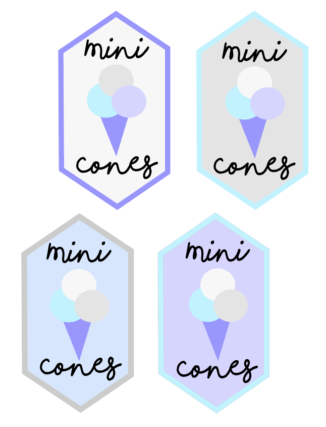
Business Cards:

Menu I made in illustrator:

Mockups: