


Magazine Concept Possibilities
1.Colorism (prejudice between people of the same race): Dark v Dark prejudice and light v dark prejudice. In many countries, this post-slavery mindset of light skin is better than dark skin continues to enslave the minds of many. A satirical magazine based on this concept will shed light on just how silly racial conflicts truly are.
2.Celebrity marketing: using celebrity to market a terrible product in order to convince consumers it is beautiful. This idea surrounds the notion that celebrities are always right because their social status says they are.
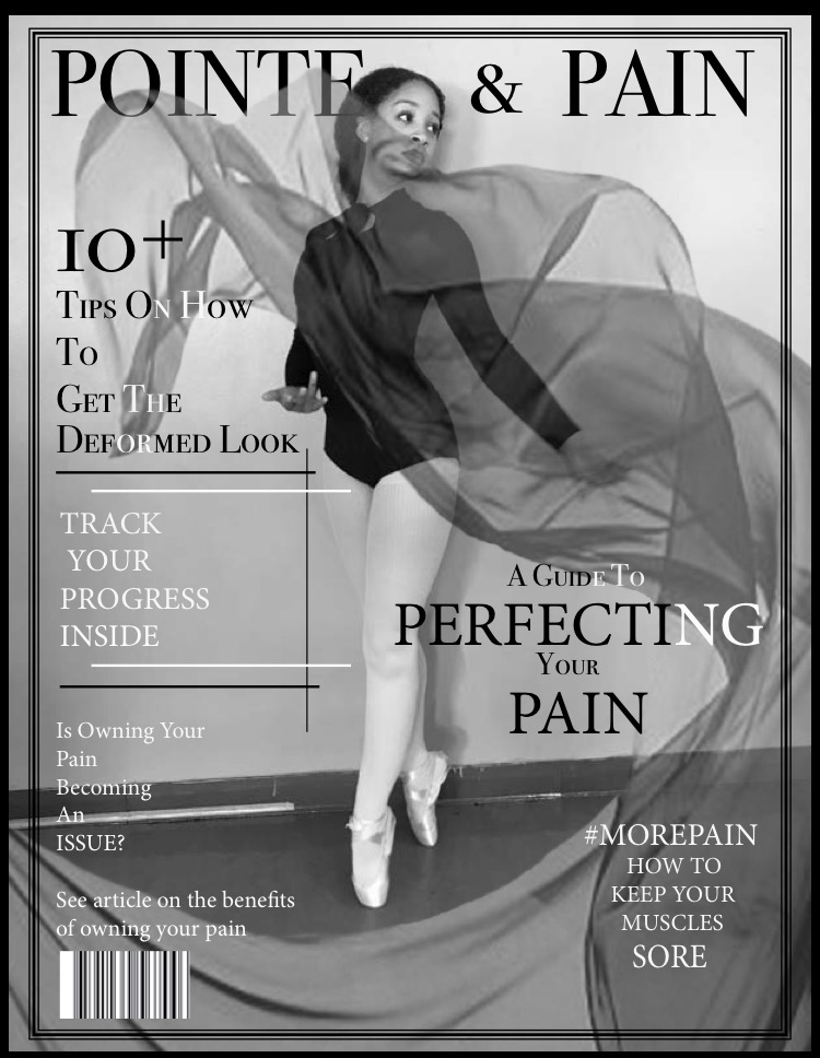
3.Ballet: using the art of ballet and its surface beauty, I will make a comparison to the realities of how it distorts the body. I will portray classic ballet themes to their extremes making pain and injury the goal, making it a marker for reaching success.
magazine layout inspirations


Actual Layout Design

Magazine Idea Finalized: Ballet
Outline Ideas:
beauty is pain: the most uncomfortable clothes for ballet
10 tips to deformity
get the deformed look
track your progress: comparison deformity images
x-ray deal advertisement to aid your journey
tips on how to react to people who think you are crazy (article on this)
Tone Setting Spread

Project Reflection
Initially, my idea for the project has not changed much regarding the concept and presentation. My main goal was to bring attention to the pain that comes along with being a ballerina something that is often overlooked for all the harm that comes with the territory. However, a constant issue that I did have throughout the entire process was making the overall magazine satirical. Due to the fact that I wanted to keep the common generalization that ballet is serious and classic present; it became difficult to convey two seemingly contradictory themes simultaneously. Back to the drawing board, I went. I decided that I would make the images realistic and serious in tone while making the article and article titles to convey a satirical tone.
Using myself as the model for the photoshoot I wanted the images to attract readers; so much so, that they would read the magazine and become confused later resulting in understanding. Overall, I believe that the overall magazine beyond the first couple of spreads could have been more cohesive. Also after seeing it printed, I realized that some of the images are quite pixelated and the text is too large. However, I did enjoy the project and would do it again.
Final Magazine PDF