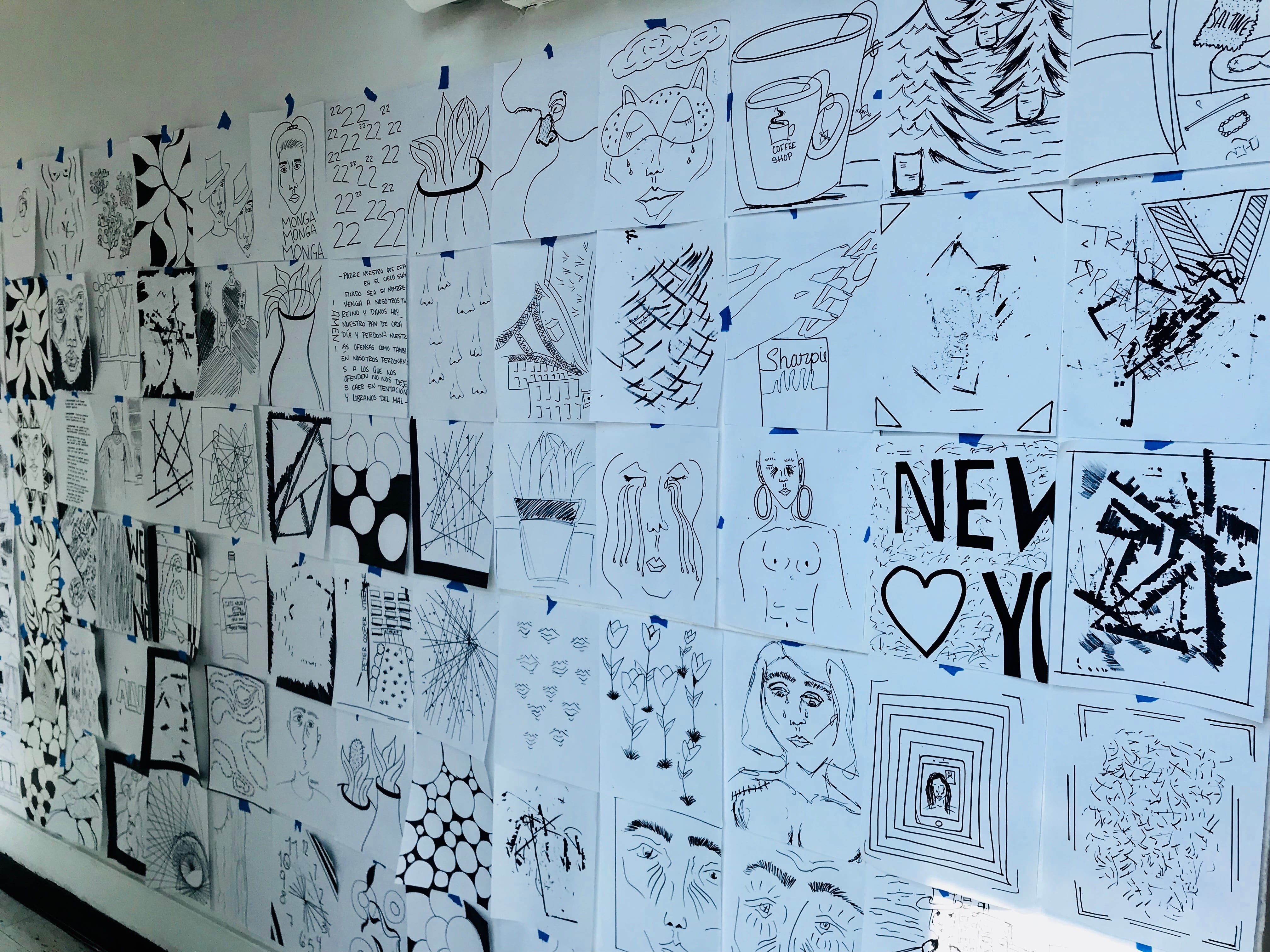
As I looked through my 100 Drawings, I came across various themes that continuously presented themselves throughout the course of my work: repetition of similar figures such as faces and predominantly female bodies, the creation of heavily contrasted organic forms, and abstract imagery produced through the making of other drawings. When looking at these themes altogether, it becomes apparent that each theme has an entirely different style that is attached to it. The more representational images of human features tend to have quicker lines with less depth, they could draw a parallel to a quick sketch which purpose is to capture the gesture of a person, rather than the details. The idea of the quick sketch quickly gets replaced by images portraying organic, precise lines and dark patches of black to create a contrast with the shape within the drawing as well as the white background of the paper. These lines have been purposefully placed exactly where there is no chaos or confusion within the images. The third predominant theme within my collection of drawings was abstract imagery made up of the lines left behind by the creation of another work. These could be considered accidental drawings but when observing each one individually, the viewer is able to see the process by which a drawing has been created. It is no longer just a remnant of an art piece or a scrap piece of paper; these works illustrate the human presence behind the “finished” drawings and bring a rawness to the entire body of work.
In curating my collection to illustrate the themes within it, I was aware that I needed to pick the pieces that would best showcase the motifs I chose within my work. As I laid out the entire collections of portraits I had created, I chose those which I felt showed a large array of the faces as well as a few of my favorites. Although many of them were rather similar in shape and size, I think it is important to illustrate the contrast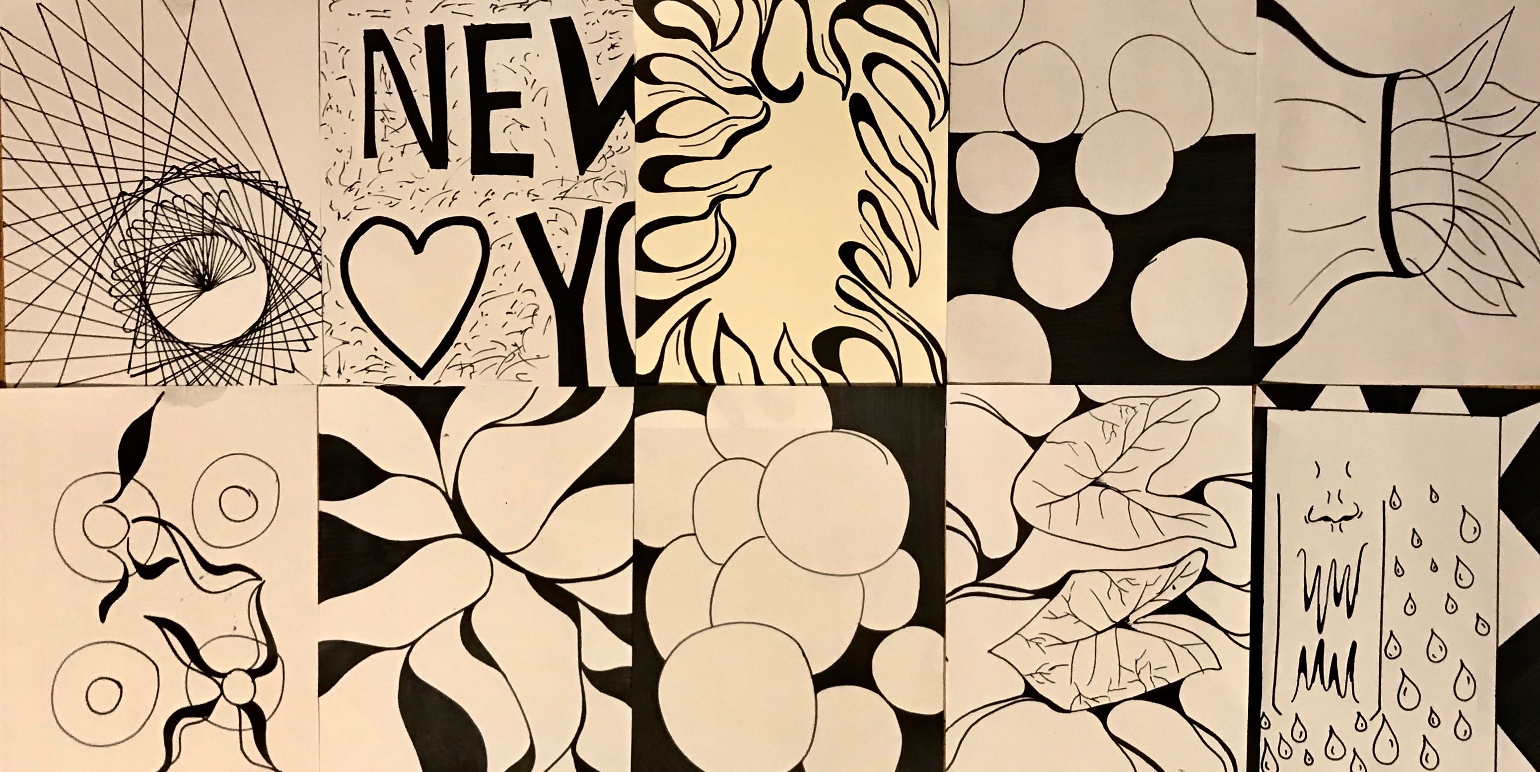
 in images that may appear similar but in reality are not. This is meant to draw in the viewer and make them an active participant in the viewing process.
When I moved on to the next theme, I wanted to find the most strikingly contrasted images within the 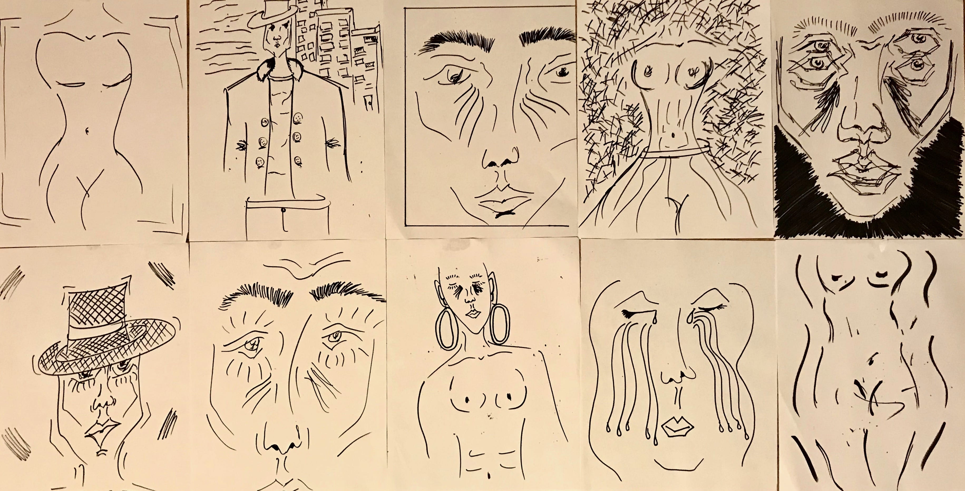 collection. Due to the use of large organic objects which often go off the page, I wanted to create a whole image by connecting the many smaller artworks. The organic shapes allow for this to happen because they all flow into each other, almost as if to create a harmony within the viewer who although is meant to analyze the piece, can find themselves in a meditative state through following the lines.
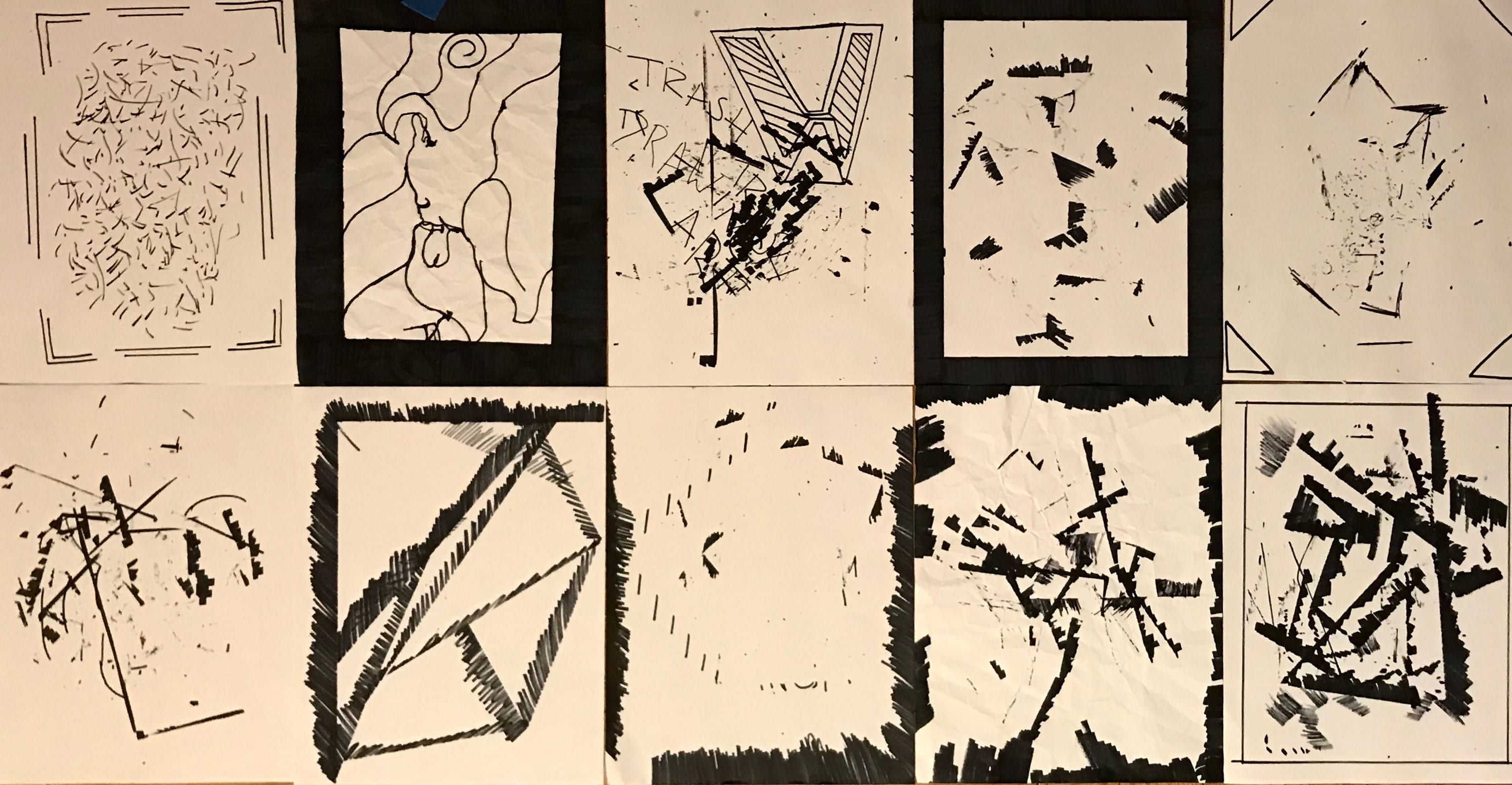
The third and final curated theme within my collection was meant to instate a sense of chaos and disorder within the viewer. Unlike the two other themes, the abstract forms created and the harshness of the lines do not allow for a harmonious viewing experience. They could potentially lead the viewer to look deeper into the artwork with a heightened need for analysis because there is nothing obvious about it.