MoMA
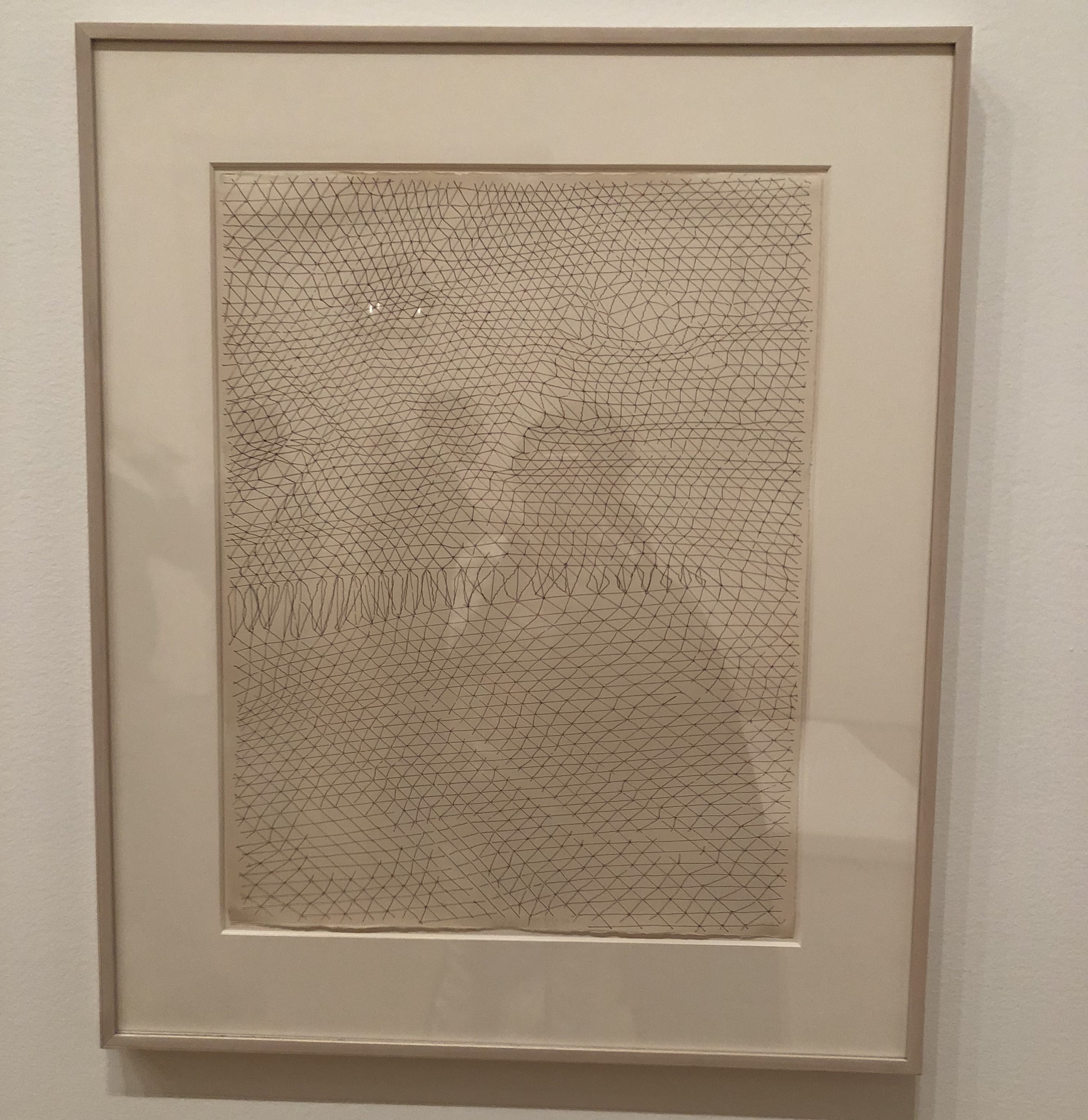
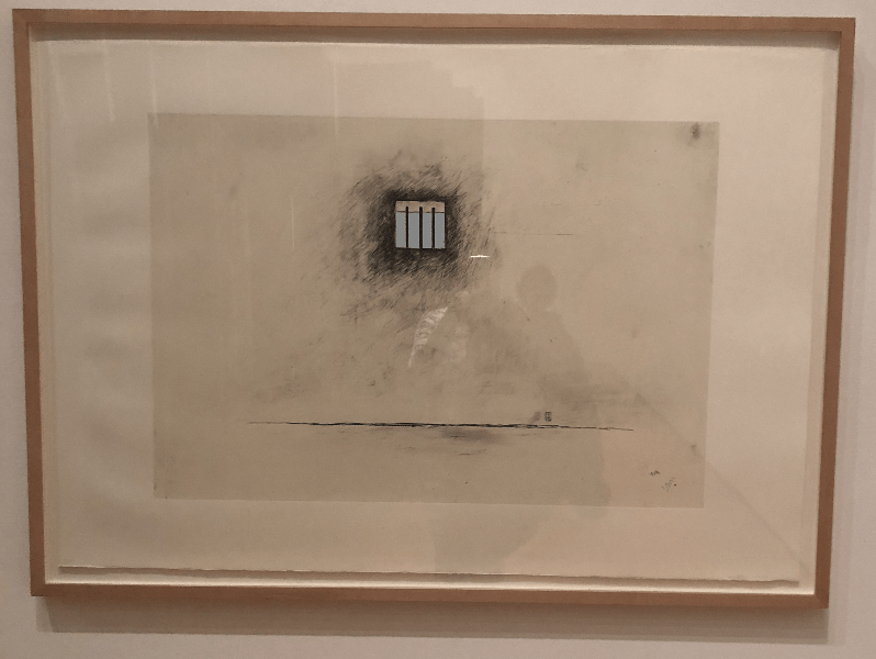
In the first artwork, by Gego, shallow 3D space is created by using diagonal lines to give the illusion of texture, like a topographical map. I wanted to use this subtle but effective linework to create perspective in my own drawing. In the second work by Robert Gober, there is shallow but apparent space through simple perspective achieved by the line shelf in the window. I kept this in mind while adding structures to my piece, as it showed a way to create perspective.
Times Square Photos
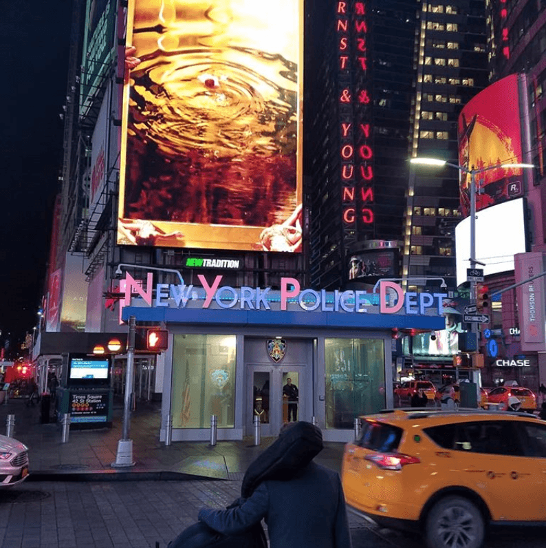

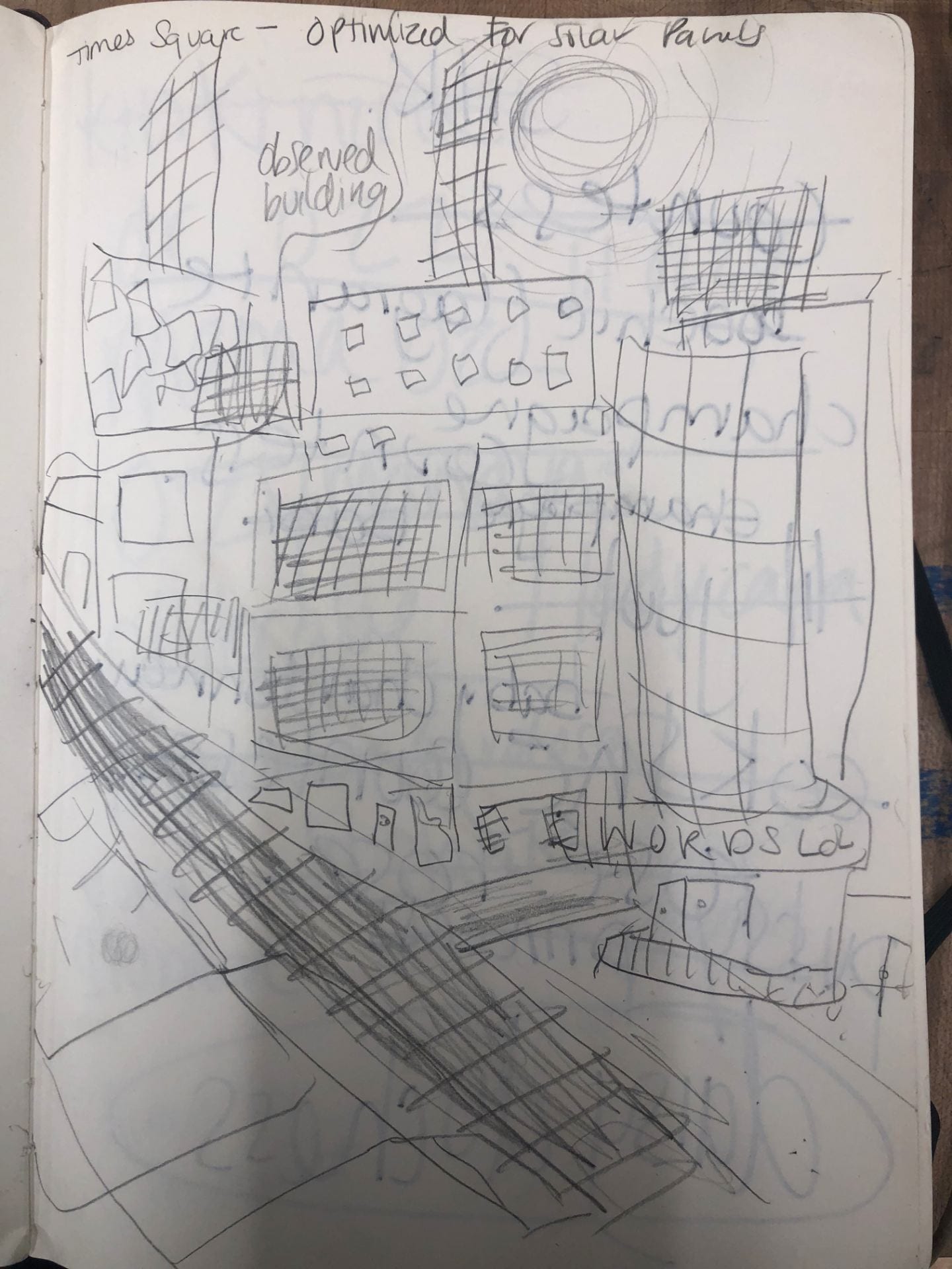
Something that interested me about Times Square was that the artificial light from the advertisements were so bright, they lit up the night like it was daytime. This interesting mimic of sunlight informed my idea to insert solar power, imagining what it would be like if this light was sustainably generated. I think this idea of artificial light overpowering the natural nighttime comments on man overtaking nature for its own purposes as well.
Perspective Sketches
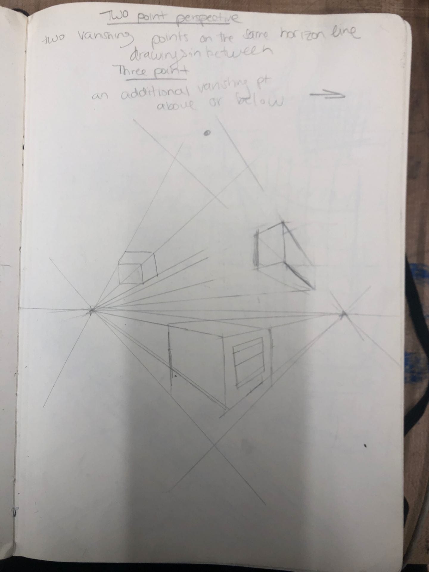
Perspective Analysis


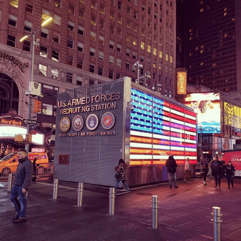
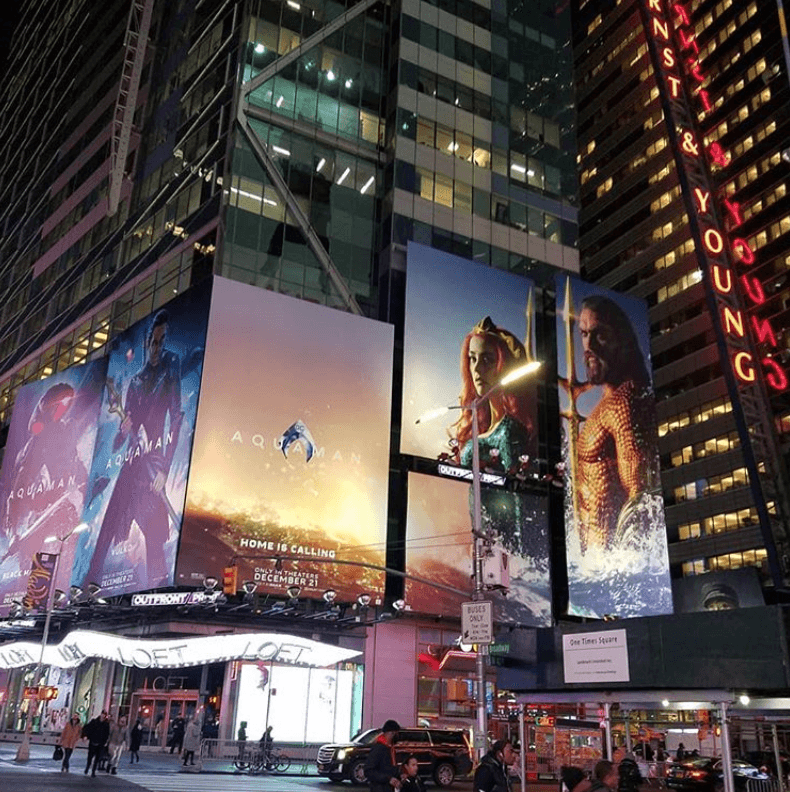
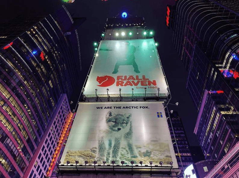
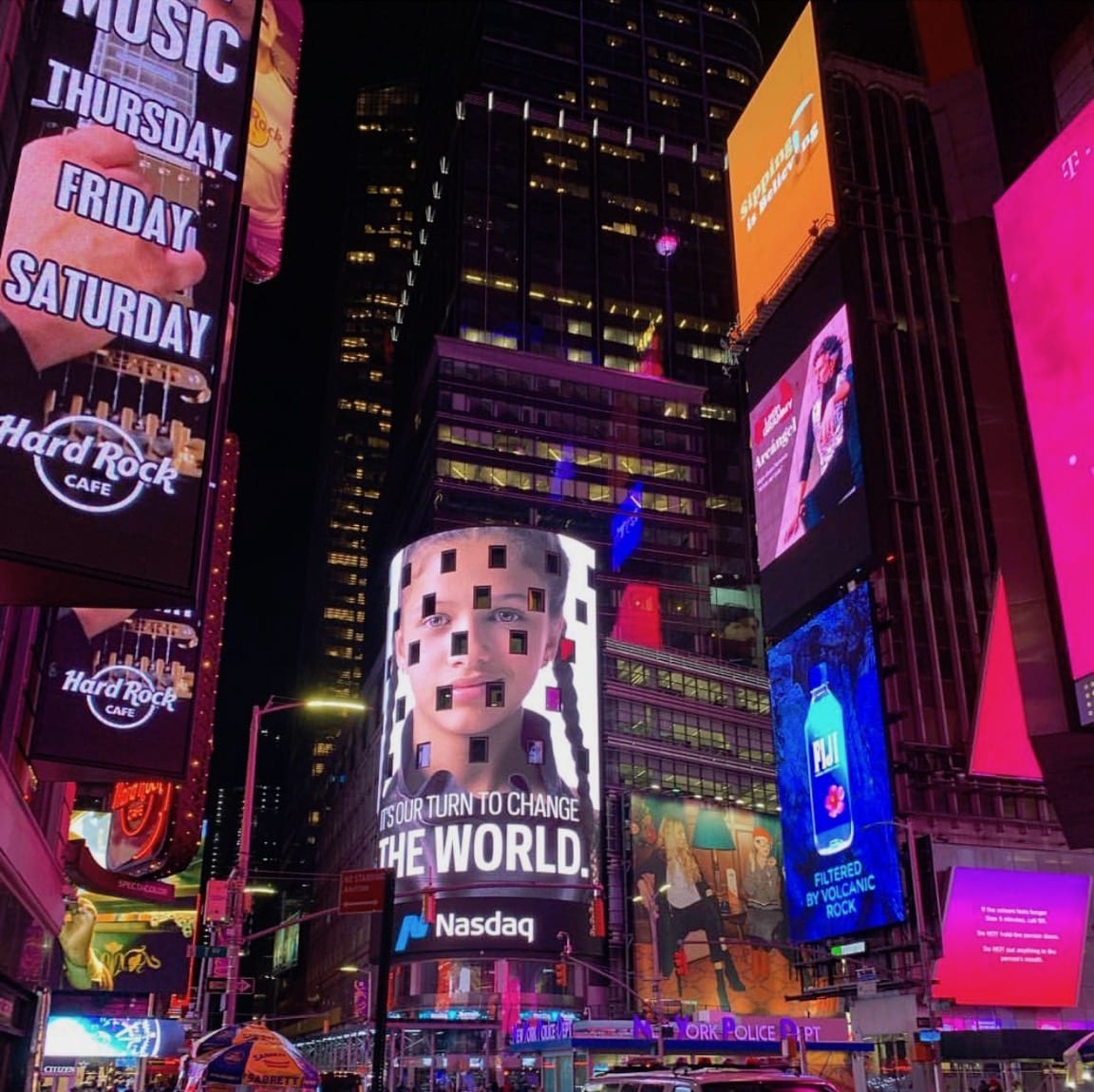
I think the first image follows three point perspective, with vanishing points above and to each side of the center building. The second image follows two point perspective.
Sketches
My other ideas for the project were Times Square Under Communism, thinking about removing the advertising from Times Square, and Times Square in the 1800s South, thinking about the architecture and cool swamp imagery, but I chose to go with Solar Power and develop it because it was a topic I was interested in for reasons past aesthetics.
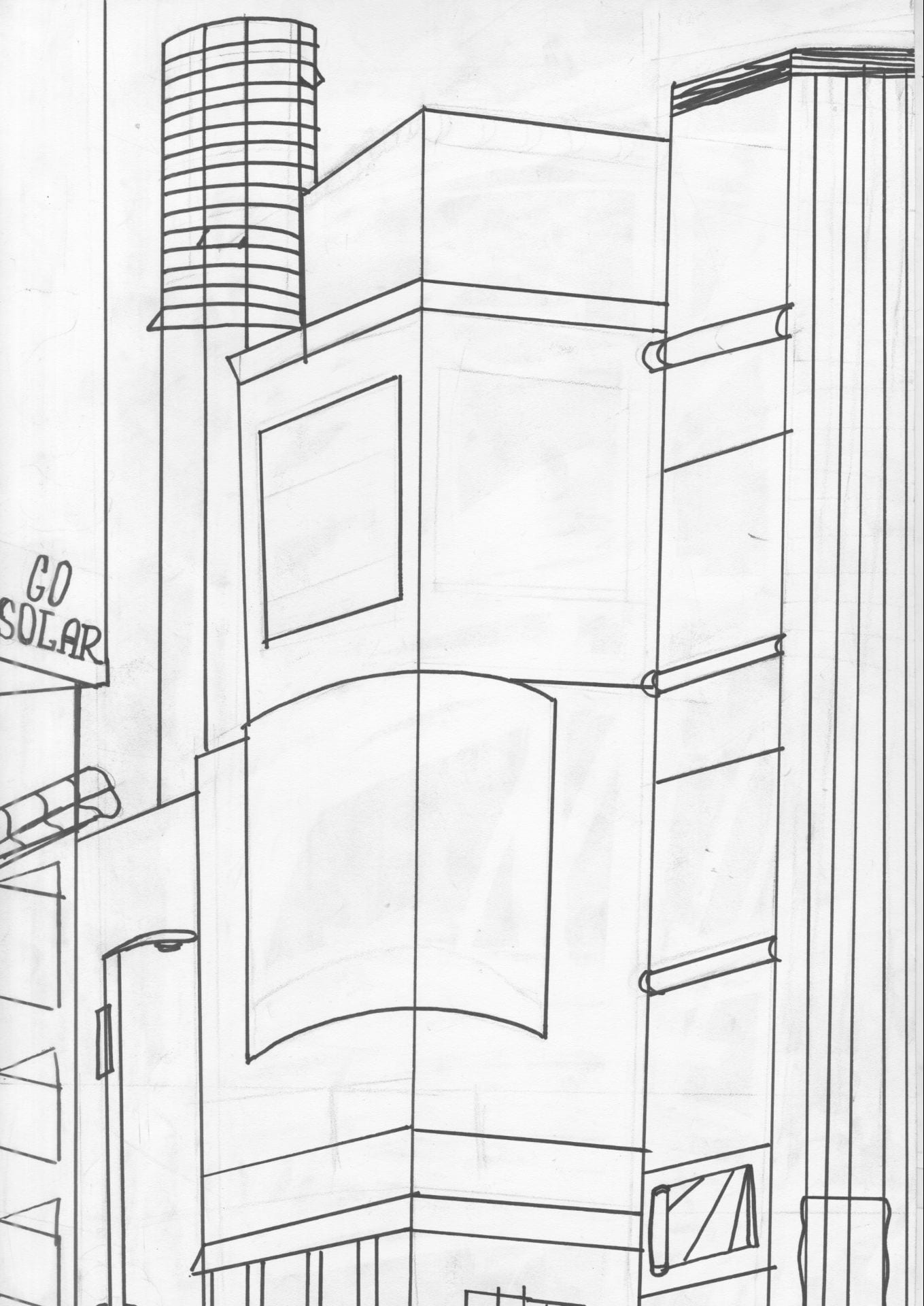
Line Drawing
Illustrator File
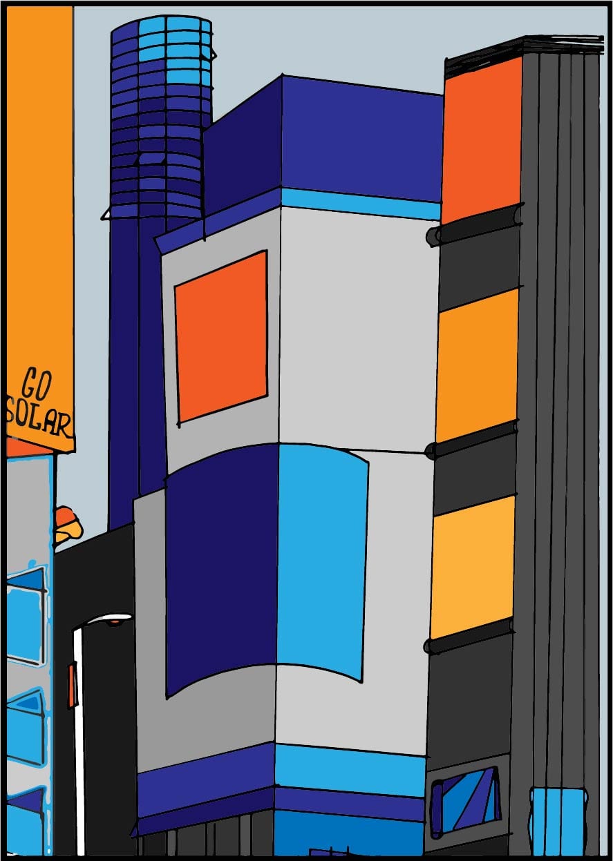
To color my image, I wanted to stick to a neutral palette that only included complimentary orange and blues to make it more cohesive, as I figured things would become otherwise messy when playing with textures from images. Colors matching well together is something I value strongly in my work, as I think it has the power to make or break any piece. I chose blue because it was the color of solar panels, the main focus of the piece, and then orange as blue’s complimentary color to contrast it with what would be the “advertising” space, commenting on their opposition through color.
Final Image After Working in Photoshop

Solar panels and the use of solar energy are, oddly enough, present in a lot of my work this semester. From this project, to my studio final where I incorporated transparent solar panels to power an LED installment, they continue to occur and I continue to integrate them into my work. My major goal for this project was to create a somewhat realistic idea of a solar-optimized times square, while still staying true to my eye for color and not straying outside of the simple palette I wanted to use. I achieved my goals in terms of color quite well, using blue to represent solar energy and orange to represent advertising spaces and et cetera, and further unifying the colors with overlays in photoshop. Perspective drawing is not my strong suit so there was not as much complexity as I would have liked to have in my drawing, but I paid close attention to the placement of solar panels and which ones would be most effective in garnering energy with shadows taken into account to achieve my goal of a relatively plausible outcome.