To wrap up my semester in Drawing Through The Making Center, I was assigned to go to the MoMA’s exhibition “The Long Run”, and create a visual response based on a reaction I had to one of the artworks on display. After choosing an artwork, I had to pick one lab I was introduced to during the course of the semester and use it to create my response. The exhibition took up the entirety of the museum’s fourth floor, and as I walked around I looked at various works, while taking notes and thinking about my reactions. The artist that stood out the most to me was Philip Guston, more specifically his abstract paintings portraying members of the KKK.
Philip Guston is painter who helped transition abstract expressionism to neo-expressionism, which is a style where the objects are simplified representations, rather than completely abstract. He worked mostly in New York, moving to Woodstock when he was 22 year olds. He started making political cartoon style paintings in the 1930s with murals that depicted violence against African Americans. As the 1960s approached, he was influenced by the political problems of the decade to continue with the cartoon style of paintings, more specifically envisioning himself as the KKK members he painted in his works. I noticed his piece titled “Edge of Town”, with two cone shaped figures in a car smoking cigars. At first glance I thought the piece was very “cute” and cartoon like. After I read the description I really resonated with why it was created, rather than the actual appearance. Philip said “When the 1960s came along I was feeling split, schizophrenic. The war, what was happening in America, the brutality of the world. What kind of man am I, sitting at home, reading magazines, going into a frustrated fury about everything – and then going into my studio to adjust red to a blue.” That quotation alone prompted me to want to respond to his work because I felt like I could relate to how he felt, with all of the current events going on today and I read all about them but at the same time I create art and spend so much time perfecting my pieces.
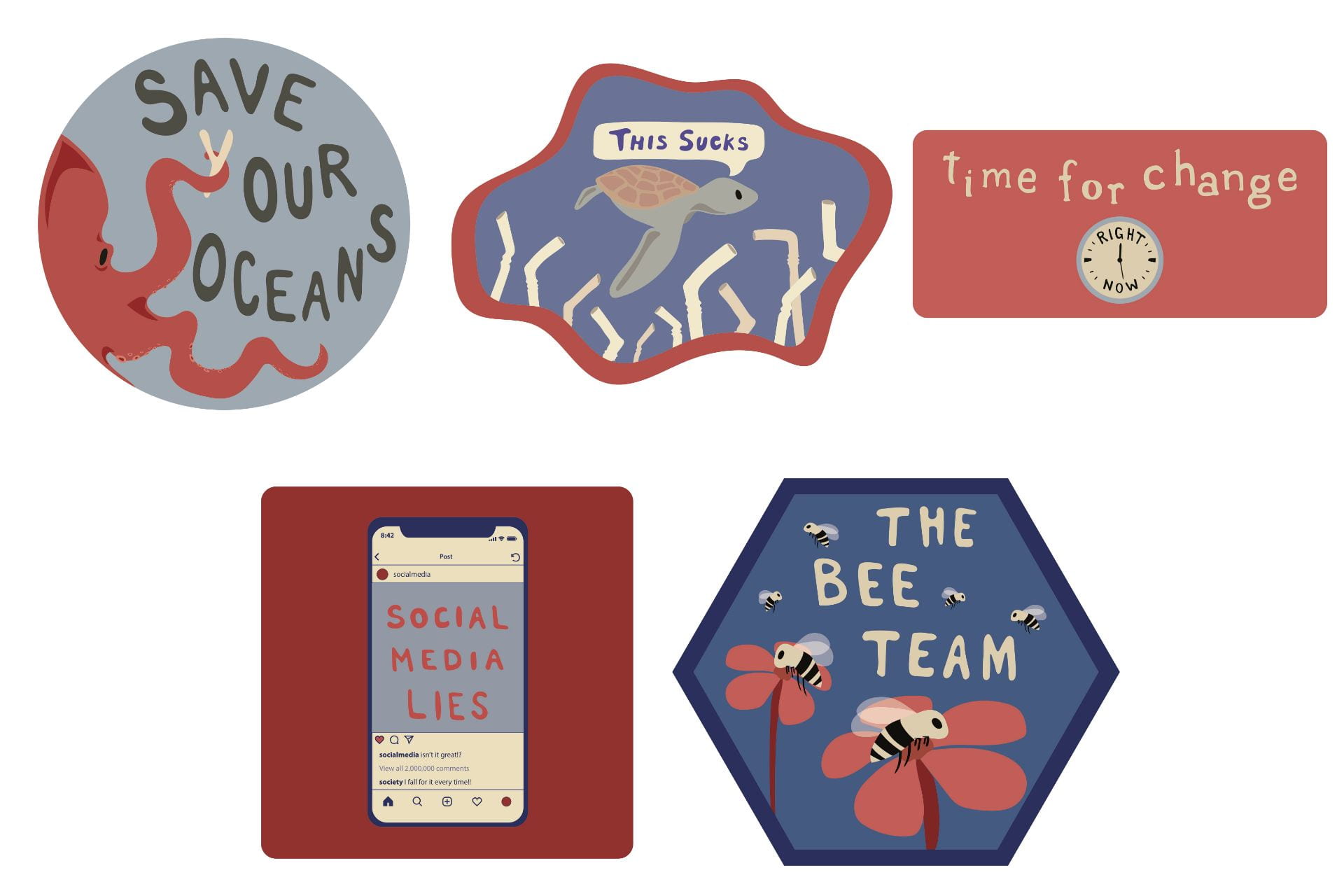
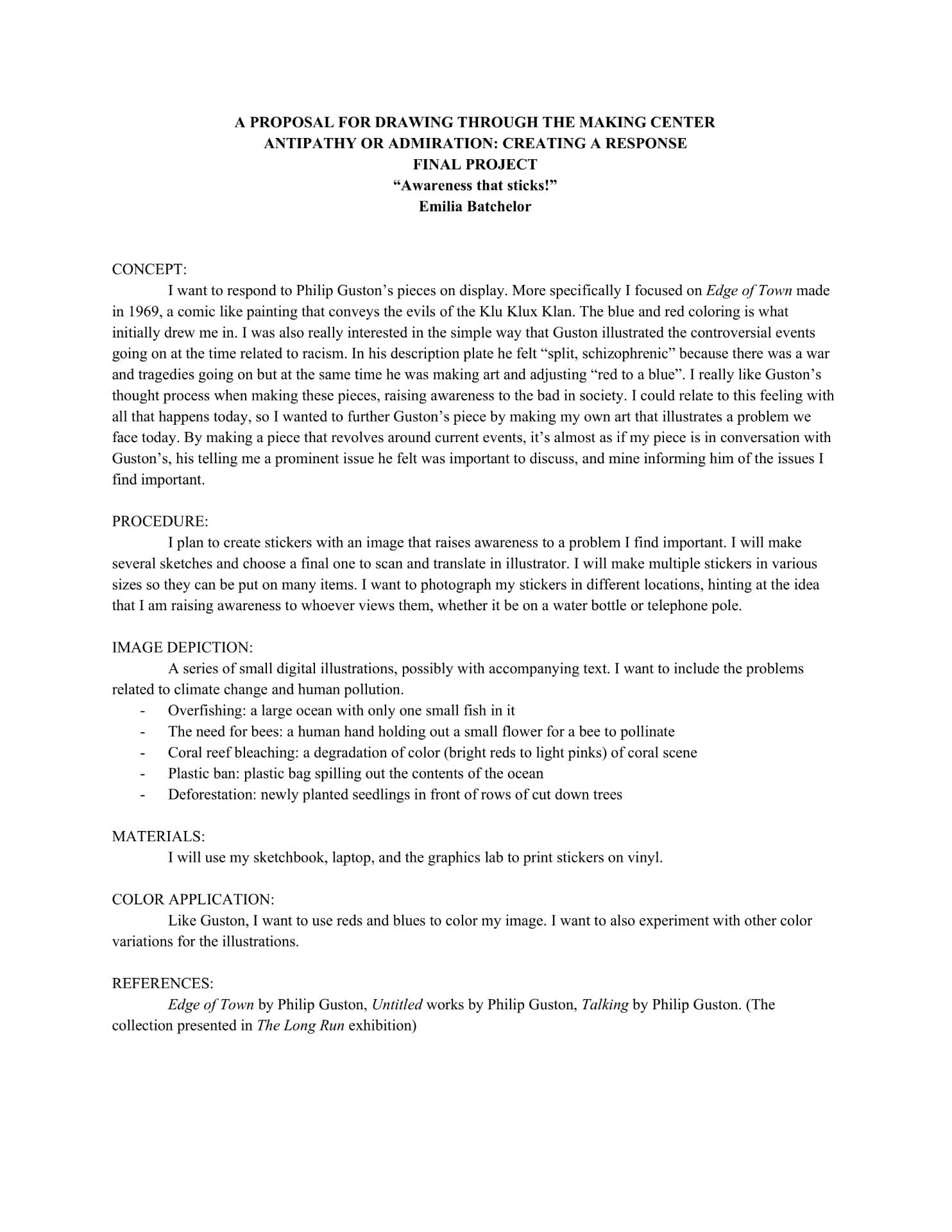
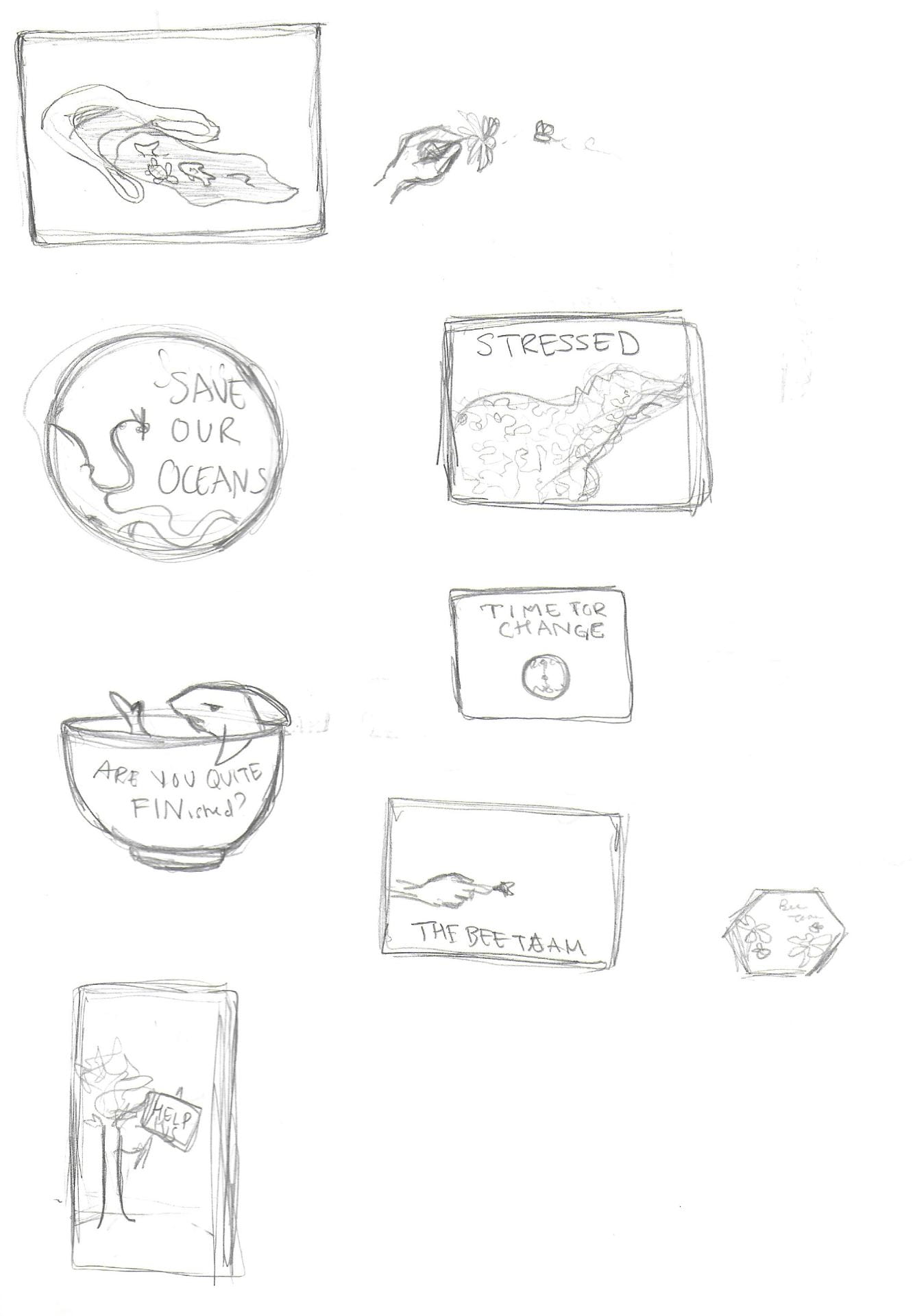
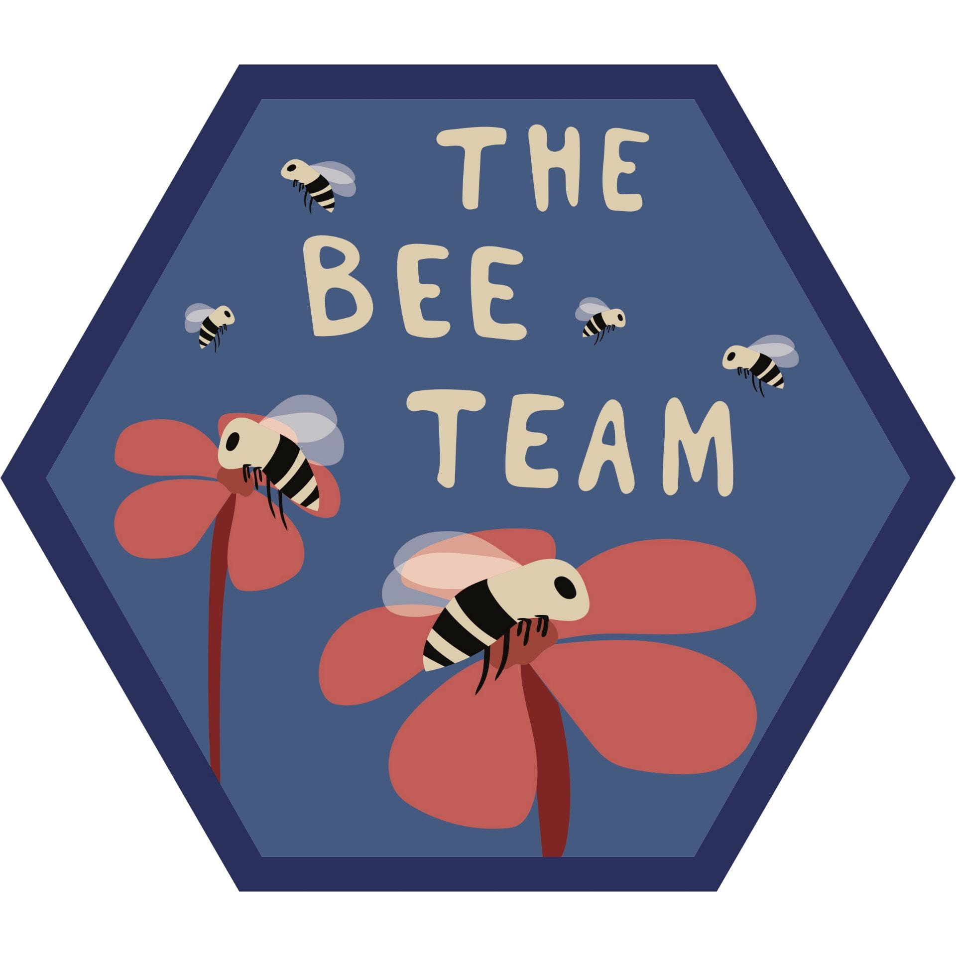
I knew from the start I wanted to respond with a piece that highlighted certain issues going on in today’s society that I found important. I began with my proposal stating I would work in the Design Lab to create stickers with designs that related to current events. I created several pages of sketches with potential concepts that could turn into stickers. To make my final stickers I made an illustrator file and chose to make 5 final designs. I chose to make the stickers in a blue and red theme, in keeping with the original color scheme, along with making the creatures I included in a cartoon style. Two designs relate to how our oceans and marine life are being destroyed, an issue very close to my heart. I included an octopus with the text “Save Your Oceans”, the Y in a different color held up by the octopus to emphasize how the oceans benefit not only the creatures that live in them, but also humans, so we should keep them clean for all species. I also made a sea turtle saying “This sucks” surrounded by straws, commenting on how one use plastic items are polluting and killing sea animals. I added a more general sticker that has a digital form of the design I made for a T-shirt for the March For Our lives, that says “Time For Change” with the arrows of a clock pointing to the words “Right Now!”. Another issue I find really concerning is the influence of social media in people’s daily lives, and how platforms can create jealously and facades. To capture my stance on how social media can negatively impact a person’s life I made a sticker of a phone screen that appears to be on Instagram, looking at a post made by the user @socialmedia, that reads “SOCIAL MEDIA LIES”, captioned “Isn’t it great?!”, while the user @society comments: I fall for it every time!” The last sticker I created was to highlight the importance of honey bees in nature, drawing little cartoon bees pollinating flowers and flying in the sky, with the text “The Bee Team” included, a play on the phrase “The A Team”, calling the bees the elite “soldiers” who pollinate the world and bring life to the plants and us.
To present my project, I proposed that I would stick them in public areas to raise awareness to those who see them on the streets of the city, hence the name “Awareness That Sticks!”. I printed multiple sized stickers and walked around Greenwich Village, posting them on signs, poles and walls, while photographing the locations of them.
Overall this process has been really interesting. It made me think a lot about how to communicate a lot with a few words and simple drawings. I also challenged myself to use only 3 colors (with their shades) to give the piece dimension, something I’ve never limited myself to before. It was difficult to choose only a few issues I wanted to convey because there were so many things and creatures I wanted to speak on behalf of, but I feel like the ones I chose fit well with the project, and represent who I am as an artist with a voice. Looking at the final products I am very happy with how the stickers turned out, and although my impact may be small, I like to consider that at least a few people saw my stickers and thought about the issues I was trying to shed light on.


