We got our idea of wicked problem based on our own experience, it was a great process for us to explore something close to our daily life; however, it was quite challenge for us since this system has a variety of reaches that make it a wicked problem.
I think from the process, we learned to focus on some specific pints in odder to research deeper. For example, our first idea was research the overconsumption problem existed in fast fashion industry. Then to narrow the topic down, we decided to focus on brand Zara. Then we want to target the market in United States. At last, in order to gather enough information, we choose people form 18-25 as our main research customers. Also, people of this age are the most frequent to buy Zara.
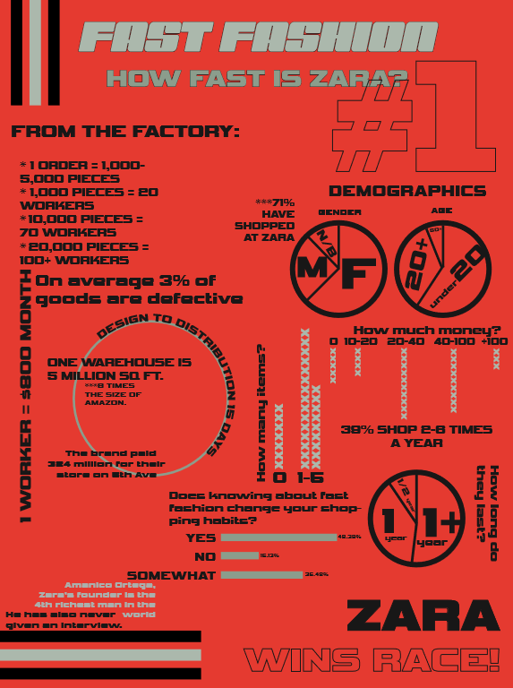
Also, there were problems happened during our research. The factory doesn’t want to provide us core information for their business. Therefore, we have to figure another way to gather the information, instead of asking the manager of the factory, we interviewed the worker from the factory directly. At last, we gained more real and accurate datas. We learned the extreme high profit during the research and understand the consequence of overconsumption
Our poster is based upon both qualitative and quantitative research done on the wicked problem: overconsumption in fast fashion. We designed the poster using a play on words, the idea of “fast” fashion shown with an aesthetic reminiscent of nascar. In order to catch the audience’s attention we used a saturated red background, with a bold font and large title. We also displayed the quantitative research in a variety of ways, from line graphs to pie charts, in order to create a flow of information on the poster. By using text as image the design becomes much more economical in terms of space allowing for more information to be provided while still being visually appealing. The quantitative graphs and charts catch the viewer’s eye along with their kitschy style, then the viewer is more willing to delve into the qualitative research on the left side of the poster. By giving certain facts visual hierarchy over one another the viewer is drawn to the intriguing facts that are in a larger font size, than other more wordy or less direct facts. Through using a cohesive color scheme and style the viewer is more likely to want to interact with the poster. Furthermore we prioritized a balance between negative and positive space, a design that is over crowded would ultimately frustrate the audience, by using an economical design sense and being precise the audience will desire to read what is there. Moreover, sacrificing space for areas of large text is a way to add an element of design, humor, or shock, that will draw the viewer in; for example most viewers are not going to see graphs, pie charts, and font that they can not read and run to see what it is about, people want to see information that is accessible, blunt and bold, and to the point. Our poster addresses an audience that may not be very informed on the topic but may be akin to the system.