Color Terms/ Value, Temperature & Intensity

Hue
Hue is the color quality of a pigment or object. Hue and color are interchangeable terms, but in color theory the term hue implies a specific discussion of only hue. For example a “light red” color has the hue of red and a high value.
hue

Value

Value is the amount of light in a pigment or object. Color hues a have intrinsic value qualities.For example, yellow is the “lightest” or highest value hue.Blue-violet is the “darkest” or lowest value hue. Red has a more middle value. The value of a dark hue is made lighter by adding a higher value hue (or white). The value of a light hue is made darker by adding a lower value hue. Imagine the values of the hues below in a black and white picture.
yrb

Tints and Shades

Adding white to a color creates a tint. Adding black creates a shade. For example pink is a tint of red; maroon is a shade of red. See the tints and shades of blue below.
tint
shades

Intensity

Intensity is the amount of brightness in a pigment or object. This is a quality of pure hue that creates a visual vibration. Which green is more pure, or intense?
intensity

Tone

Tone is a hue mixed with gray.The gray will neutralize or tone down the color. This also decreases the hue intensity. Depending on the value if the initial hue, the addition of gray may also change the value appearance, making the hue lighter or darker.
tone-1

Warm and Cool Colors

Temperature is an associate quality of color. In general warmer colors are orange, red and yellow. These colors “feel” warm and also emerge or move forward in space. Cool colors are blue, green, and purple. These colors “feel” cool and also recede or move back into space.
Now forget these categories and think more precisely in terms of relationships. A bit of color ying and yang, as warm color is defined by cool and vise versa! This means that in a comparison of red and blue, red is warmer. But in a comparison of red and red, one red will be warmer then the other.
 redblue
reds

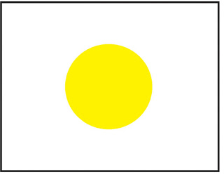
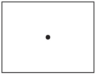
Complimentary Colors and After Image

Complementary hues are defined as two hues, which create after-images of each other. Yellow has a blue-violet after-image and blue-violet has a yellow after-image.  On most color wheels complimentary colors are across from each other. Placed next to each other compliment hues have the greatest possible contrast. When mixed together the result is a neutral hue.  Complimentary colors also induce the visual phenomena of After Image.  When the eye to focuses on a hue for an extended period of time, then looks away it will see the complimentary hue. For example, stare at the yellow dot below for 30 seconds then look immediate at the black dot below. Viola! Visual Magic!

yellowdot

Dot


Leave a reply

Skip to toolbar