Wall (noun.):
1)
a: a high thick masonry structure forming a long rampart or an enclosure chiefly for defense —often used in plural
b: a masonry fence around a garden, park, or estate
c: a structure that serves to hold back pressure (as of water or sliding earth)
2)
One of the sides of a room or building connecting floor and ceiling or foundation and roof
—- Definition by Merriam-Webster Dictionary
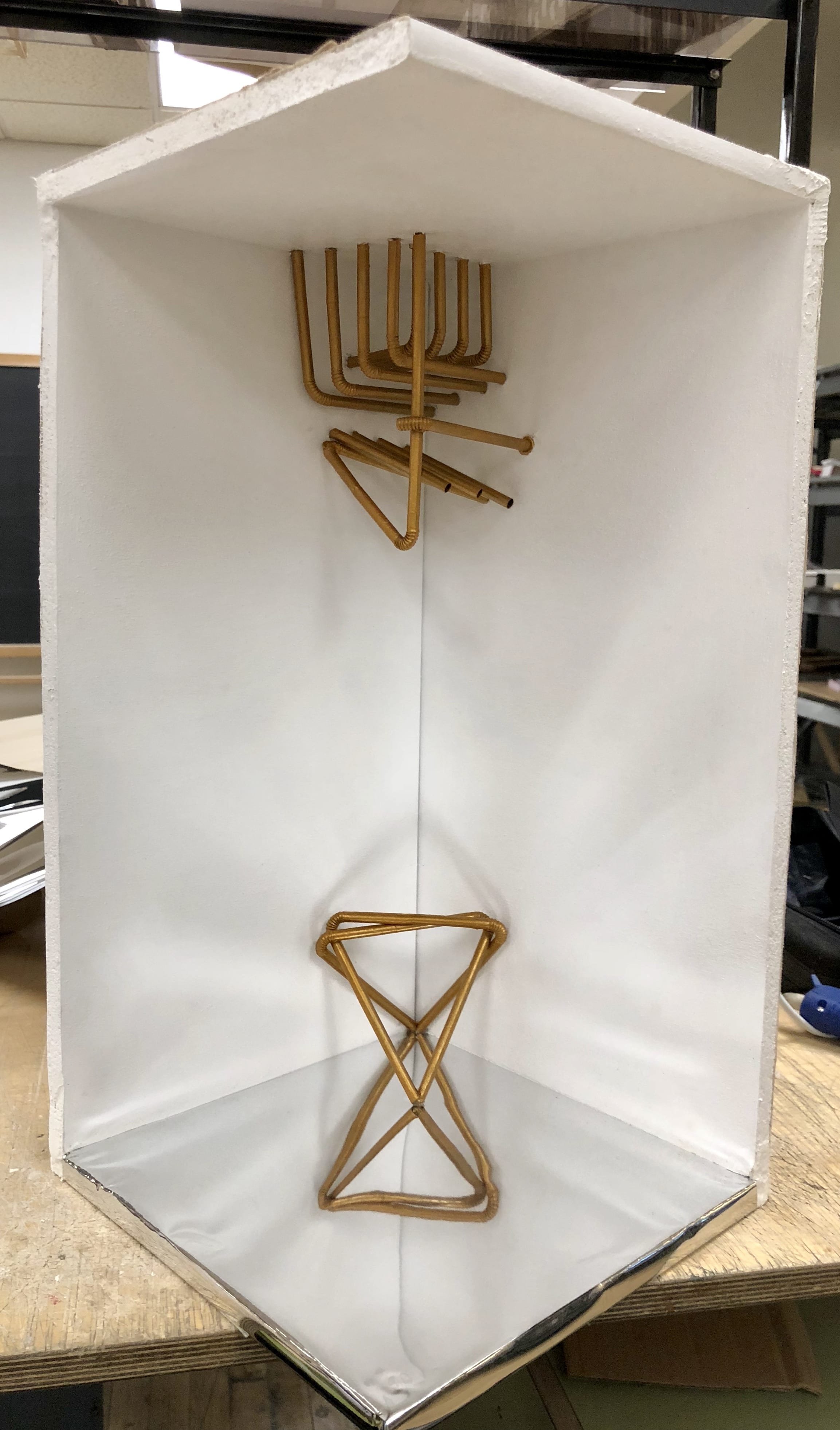
Inspired by Young & Ayata’s Wall Reveal – a series of creative insertions attached to a gypsum-board constructed corner – I designed a set of wall insertions using plastic straws as the material to reveal the functions of walls in modern lives. The design centered around two main concepts of walls: the first sees walls as the provider of fundamental support to every architectural structure (basically, every human shelter was built with at least one wall enclosure for purposes regarding load-bearing or weather protection); and the second explores the walls being the objects of segregation and divider (of communities or spaces). The night before I set my mind on the final design, I brainstormed several possible forms on my sketchbook.
The next step was to choose the design and build my first prototype. I was already very determined on how I want my final insertions to look like, but the prototype gave me great inspiration on using light and shadow as an important design element as well. I also detailed my prototype with a piece of aluminum foil to help myself gain a general understanding of the mirror board’s ‘continuity’ effect. The tube forms were made by rolled gold mirror paper to resemble plastic straws. After I built my prototype, I no longer had any doubt on the use of straws and mirror board paper.
For the final presentation, in order to express the first concept, I built a very simple structure using two straws that had one end attached to the bottom corner of the wall site and the other end touching the mirror board on the site base. Along with the shadow created by the straws and the reflection created by the mirror board paper, I was able to achieve a 3 dimensional effect. Overall, I want my lower insertion piece to look as structural as possible whilst maintaining a simple, minimalistic rigid appearance.

Image 4 – Overall view of the wall insertions
The top insertion resembles the look of a cage, a prisoner cell, or even Japanese blinds, but is not bonded to any specific architecture. It is the feeling of confinement I want to contrast with the bottom insertion. With more than 2 times the amount of straws used, the top insertion, however, does not succeed in creating a greater sense of space in comparison to the bottom one. Instead of creating an opened, ‘welcoming’ space, the top insertion looks separated from the rest – it does not extend out of the corner like the lower insertion does by taking advantage of the mirror board’s reflective quality – it is ‘stuck’ to that corner.
Looking at the reflection of the top insertion on the mirror board, one can observe a deformity of the originally orderly designed structure.
This meant to bring out the negative effect walls may have on individual and societies by preventing the development of open minds or cultural integration. (Considering the meaning behind the Great Wall in China)
There was also a reason for choosing plastic straws as the featured material. First of all they are flexible in terms of bending but also has a rigidity that will create subtle structures. The light weight quality of straws also make it possible to use glue dots as the joint adhesive, which makes the whole insertions detachable as well. The overall forms share similarity with pipes and steel rods used in urban design, so it in addition gives the insertions an industrial, modernistic feeling.


