Seventh Stop: Apple
Main Materials: Glass, Wood, Metal (aluminum), Limestone
The Apple Store is a great example demonstrating how a fixed set of interior design concept can be implied for multiple stores for branding purposes. For all apple stores across the US, certain interior elements are generally found in the store – the grand structural glass staircase, wood product tables, and the featured metal that corresponds to the trending/promoting products (in this case, the space gray anodized aluminum panels used in interior decor are the new metal color feature/option for the MacBooks and some other Apple devices as well). The glass staircase attracts my special attention because it acts both as a structural support for the architecture – which is quite unusual as we usually associate glass with quality of fragility – and as a transitioning threshold/connection between the first and second floor. The glass was laminated, meaning multiple layers glued together to make it stronger, and is also tempered to make it shatter proof. As I look more closely, I noticed some surface treatment to the glass stair tread, which can be understood as an effective treatment to increase friction and prevent slipping.
Eighth Stop: Camper
Main Materials: MDF Wood, Laminated Wood, Linoleum, Concrete
Camper left me with a very strong impression by its saturated color that may implies to an active, passion, explorative or fearless theme that the brand is trying to visualize. However, its material choice, compare to the previous stores, also implies that the customers camper target are not in the high-end market. First of all, the table is made of MDF composite wood fiver – a comparably cheap material to the others – with a smooth lacquered finish. With its matte surface, it is predicted that not a lot of layers of paint were introduced to the table surface and thus the table must have been made with a relatively low cost. The floor was made with linoleum sheet glue to the ground, presumably concrete. Linoleum feels like rubber which when we step on it kind of has a soft rubber texture but in fact, they are rolls of sheet glues that are fast and cheap material to replace original flooring pattern with a new pattern. However, I notices it is somehow easy to leave ugly scratch marks on linoleum. The shelves were made of plywood and mirror to enhance the spaciousness of the store, and the orientation were thoughtful enough to correspond with the line orientation on the floor and the table. The ceiling, made in slats painted duo color that can be perceived in direction – entering the store (white) and exiting (red) – is very interesting, though I did not figure out the exact material. I guess it could be aluminum or stainless steel.
Ninth Stop: 290 Mulberry Street
Main Materials: Brick
290 Mulberry Street introduces a new way of rethinking traditional building construction. What we normally consider as masonry in building technique is the stacking of bricks/stones on top of each other with a thin layer of connecting medium such as mortar. But here, by prefabricated brick panels and assembly them as a surface treatment, the boundary of architecture construction was pushed by the combination of technology and traditional method.
Tenth Stop: 10 Bond Street
Main Materials: Terracotta, Metal (Steel), Wood
With Chinese background, terra-cotta architecture is actually not unfamiliar but seeing such a modern version in New York can be quite surprising. I have a deep connection with earthenware, especially porcelain and terra-cotta. So when I first saw this architecture, I had the doubt of whether the exterior was made of terra-cotta, but I was unsure until my professor assured my suspicion. It was definitely a piece of art to see terra-cotta in this scale being produced and glazed so smoothly, without special machine, this will not be easily achievable.
Eleventh Stop: 40 Bond Street
Main Materials: Glass, Metal (Stainless Steel), Metal screen (Aluminum)
There are so many details in a single building, whether its surface treatment, or hidden treatment. For the plastic looking pipes, they are actually made of casted glass, but it is not glass that made of this structure but as we observed more closely, there is another layer of shiny, polished stainless steel that enhances the reflective quality of these glass pipes. Below are stainless steel sheets stamped with print, looking artsy, finished with iridescent paint. The most intriguing feature is the aluminum “graffiti” screen that also act as a fence/gate for the first floor residents to access the outer area. When I saw a man suddenly appeared out of nowhere from the graffiti screen, I was pretty shocked.
Twelfth Stop: 41 Bond Street
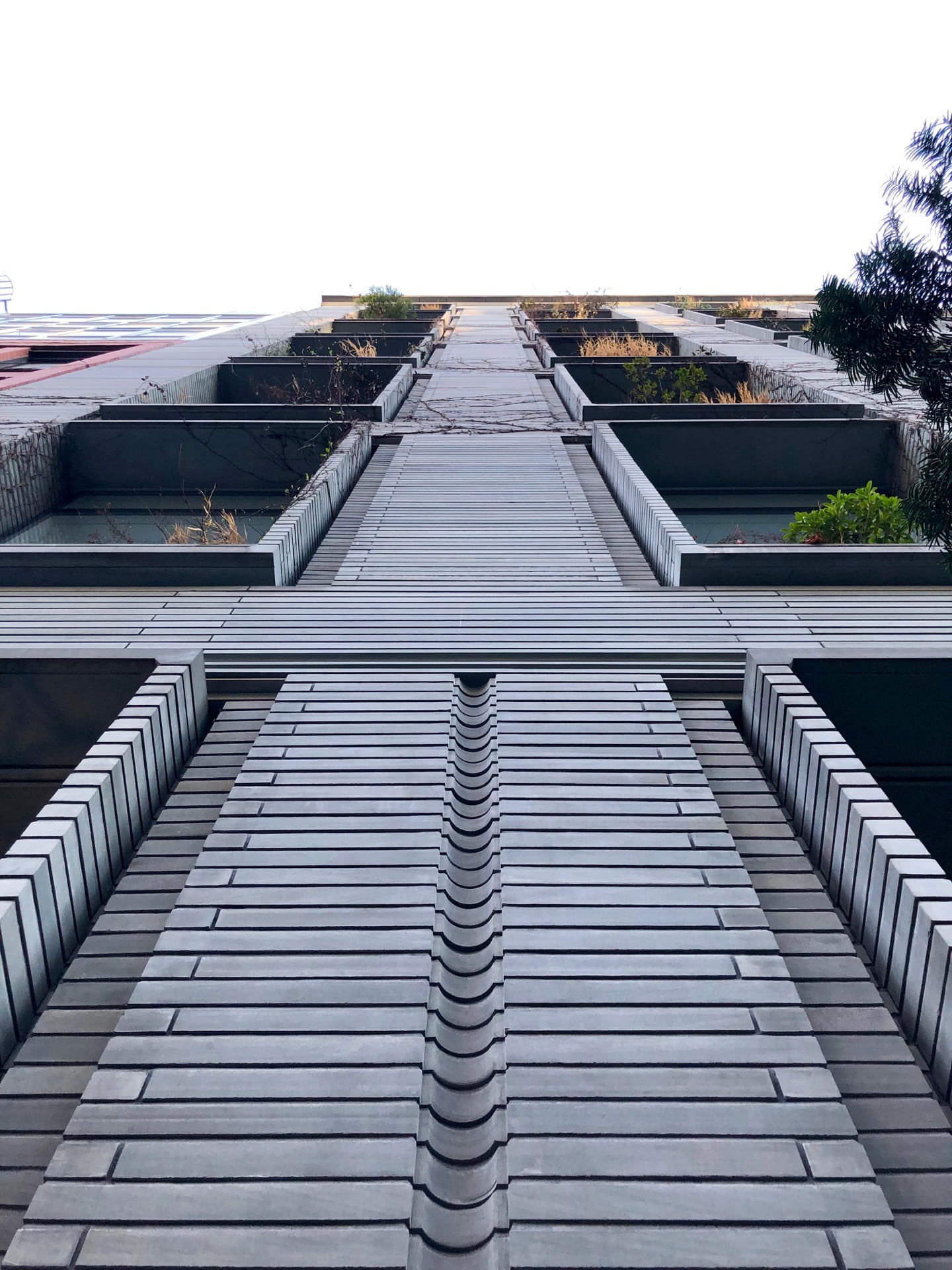
Main Materials: Masonry (Bluestone cut into bricks)
This apartment building was finished in a material that was available regional in the United States – bluestone from Pennsylvania. The treatments made to the stones showcased great craftsmanship and attention to detail. In total, there are about 5 finishes done to the bluestone that made the stone available in different types of form to produce different textures. The stones are left raw to be put along with the plants. They are also available in the general brick form. Then the brick form evolves to have other surface finishes. Whether it is feeling by touching the building or appreciating by looking at the building from far, it is inevitably a masterpiece of design that showcases the versatility of a single material.


