INQUIRY INTO AN OBJECT, FORM, OR IMAGE
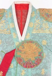
The purpose of this assignment was to choose a signifier, interpret it, and create an artwork inspired by my own interpretation of the signifier. My topic is Hyphenated American Identity, and I chose an image of Korean traditional dress, handbook. I’ve decided to work on this signifier because what you wear is an important part of you as much as traditional clothing is an important part of a culture.
Signifier:
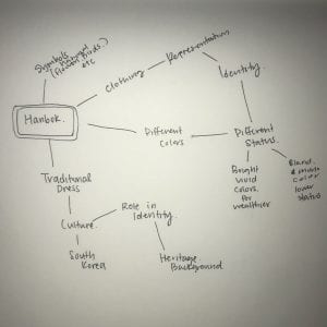
Mind Map:
Questions:
- How has hanbok changed over time?
- How did the Japanese colonial period change the style of hanbok?
- How did different hanbok styles show different social class distinctions?
- http://www.korea.net/NewsFocus/Culture/view?articleId=100729
- https://www.mutzine.me/features/a-brief-history-korean-korean-hanbok
Documentation:
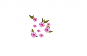
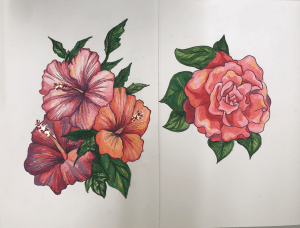
Hibiscus syriacus- Korean national flower
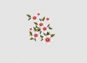
Camellia- AL state flower
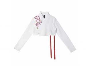
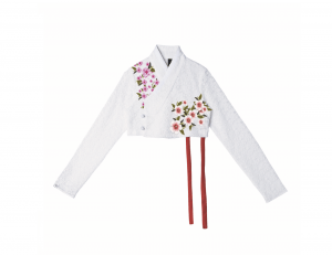
Diptych 1
I and currently still working on the left side of the diptych, but as for right now, the right side shows a part of hanbok, Korean traditional clothing, with an illustrated flowers of both Korea and Alabama, places I’ve lived. I wanted to focus more on the personal aspects of the theme.
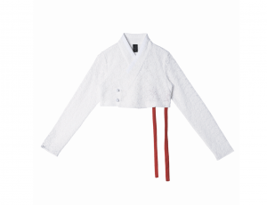
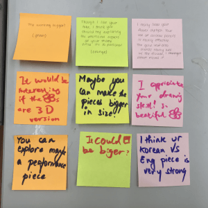
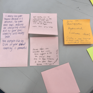
During the class critique, I was encouraged to explore more on the clothing of both cultures to show the theme. Also, I was told that the dress piece would have been more interesting if it was a combination of traditional clothing of Alabama with the jeogori (upper garment of hanbok).
Diptych 2
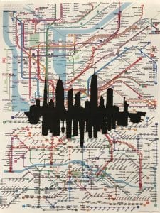
For the left side of the diptych, I chose to photoshop one of my signifiers. I tried to focus on my personal experiences and had a Korean flag and the US flag incorporated into a directional sign. I chose to work digitally because I wanted to blend in these different elements smoothly into one. For the right side, I put a subway map of Seoul, Korea and a subway map of Manhattan together. I attached a silhouette of these two cities together and on the background, I used a sewing machine to sew red thread according to the pattern of the subway lines. I think this material works well because it allows a sense of connection between these two very different yet familiar cities.
During the critique, I was encouraged to experiment more in the materials and was questioned how the work would have turned out if the silhouette was done in a different material ( maybe felt ). I was also advised to lower the saturation of the subway maps in order to bring a bigger contrast between the city silhouette and the background.
For the next three diptychs, I want to tackle the other struggles of a Hyphenated American identity. (beauty standards, language, cultures, etc)
Diptych 3
For this piece, I wanted to focus on the flowers that were occurring in my last two diptychs in order to give cohesiveness. I used colored pencil to mimic the bright vivid colors of the flower done on illustrator. I also used the gold metal leaf for the anther of the flower to bring emphasis. The feedback I found helpful during the critique was that I should tackle on the emotional side of the Hyphenated American identity since the works are based off from personal experiences. I was also told that by this work alone, it is hard to tell the intended use of the Korean national flower and the Alabama state flower so it needs support on the piece to tell the story.
Diptych 4
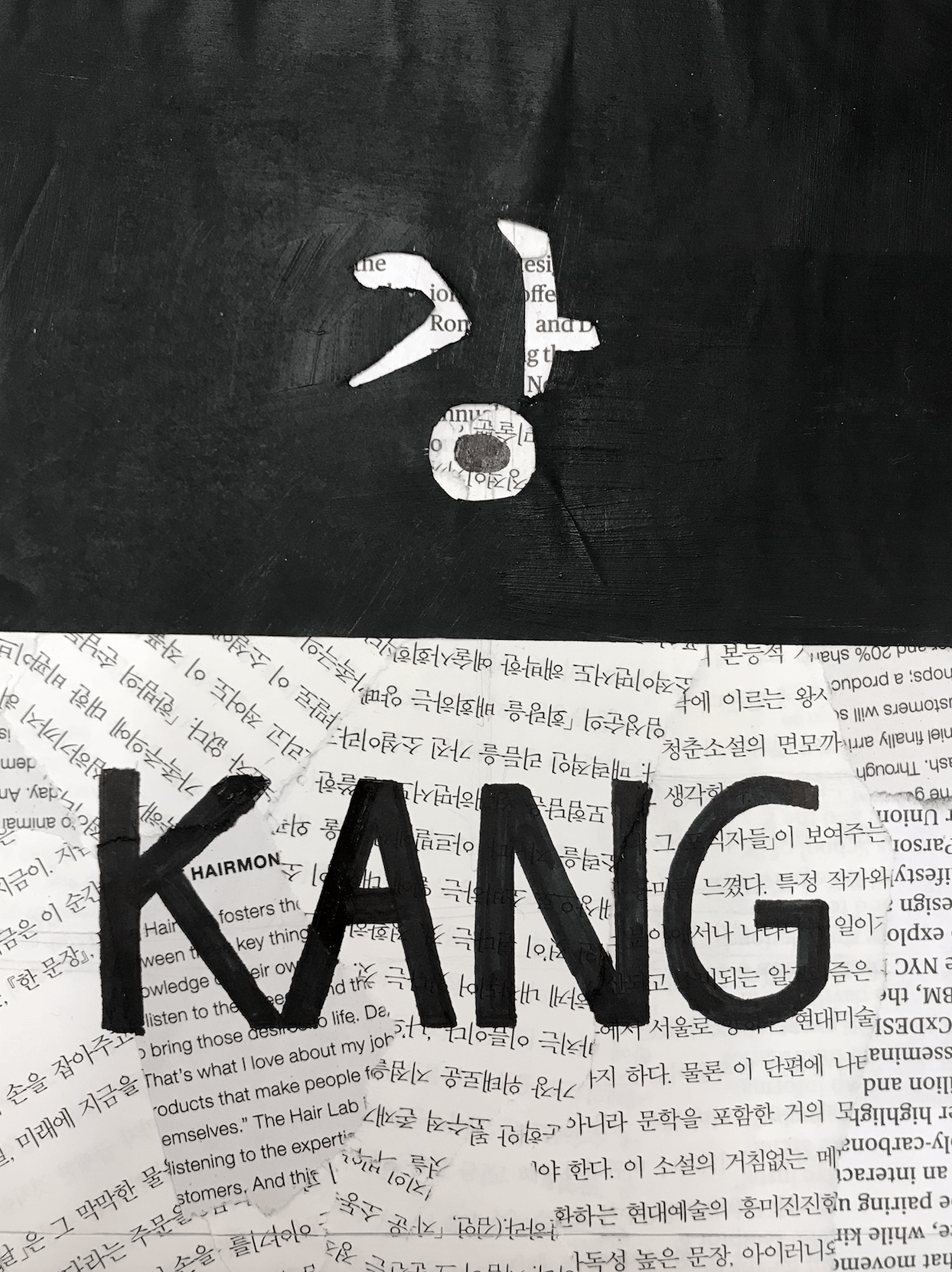
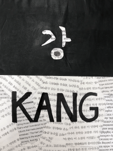
For the diptych, I wanted to portray the challenge I faced and still is facing due to the difference in languages. I first did a collage of both American and Korean articles and then went back with black acrylic paint to show my last name, Kang, in both languages. I think acrylic works well because it has a thick texture and pitch-black color gives a high contrast with the thin white newspapers in the background. I also like how the use of negative space on the top half turned out. The only critique I received for this one is the size of the diptych. Many suggested that I should work bigger.
Diptych 5
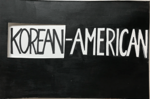
For this diptych, I wanted to continue the use of black and white to emphasize the contrast between two identities. I intended to let people see the black and trace back to the last diptychs (2 and 4). This piece is meant to look both individually and together on top of each other. I think this piece shows the obvious theme of hyphenated identity.
Critique
