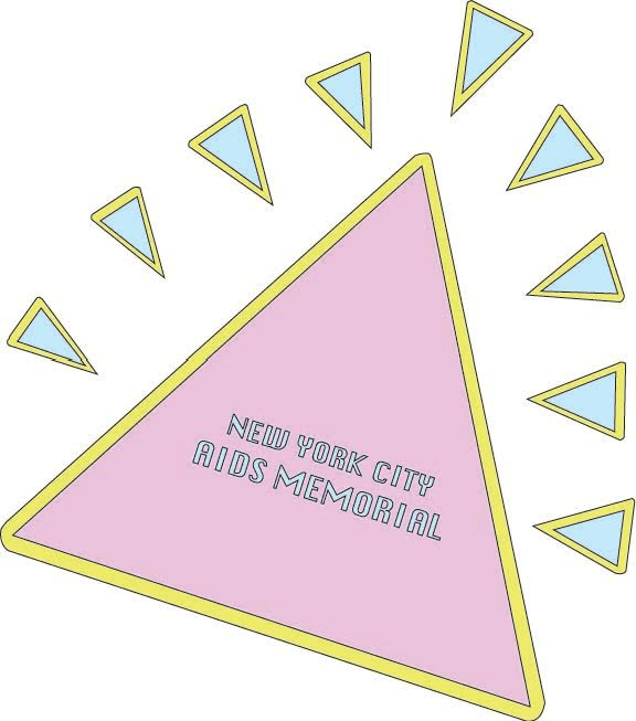
The new monument’s logo/brand is a fun flashy representation of our intent in recreating the brand. It’s purpose is to spread awareness and easily be recognized from miles away. We wanted to keep the design very simple and conserve the triangular shapes that were very important to the initial monument. The design is inspired by Keith Haring’s very recognizable stylistic moving cartoons. The triangle is tilted to the side as a way to add movement to the logo which Keith Haring tends to promote in most of his pop art and graffiti-like work. The colors and fonts we chose were choices that we believed clearly represented and defined the 80’s in which the epidemic first took place.