


The typography that I chose was the FF Graffio fonts (https://www.fontfont.com/fonts/graffio) created by Alessio Leonardi during 1995. The reason I chose this type was that when I was looking through the website, they reused the word “rag” as the standard word to create comparisons between all the types of fonts. The word, “rag”, sparked the idea of being poor, homeless, one who would not be able to find materials and daily household objects as easily as we could.
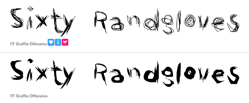
I chose the Graffio family because it was rough, made of multiple scratches as if they pen was at the brink of being empty of ink for some strokes. In addition, there’s no perfect line up of every single letter: some are slanted, some letters are lighter than others, and some are clear while others have tons of scratches to them. In correspondence to these slants, the letters are all in close proximity which leads to the idea of sort of being rushed into finishing whatever you are attempting to write. So with the word “rag” in mind, I believe that the Graffio font family perfectly encaptures what the feeling of “rag” is. The scarcity, the disorder, and cataclysmic nature of this state of being.