an original photo
cropped photo
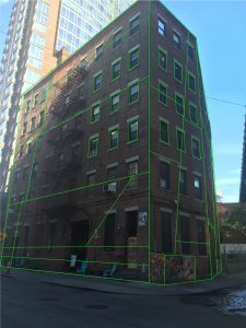
perspective analysis version
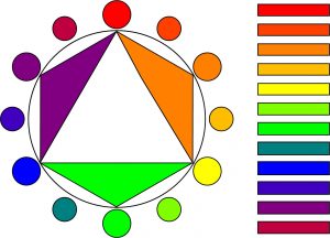
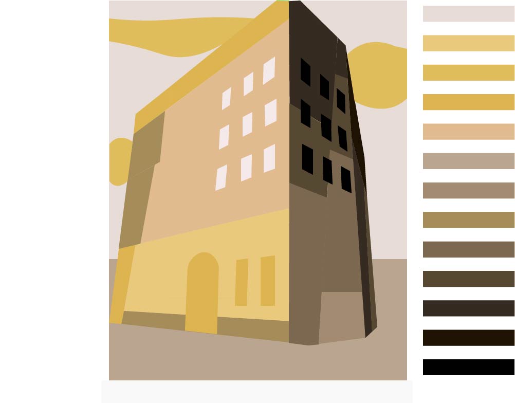
color wheel
-
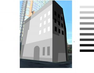
- Grayscale version
-

- Morning time of day
-
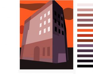
- Dusk time of day
I chose this picture because it looks to use more color on the two side of the building. I cropped almost every part of the original photograph. In morning time of day version, I convey the feeling of sunshine by using yellow tone. In terms of dusk time of day, I chose red and purple tone because it seems like sunset color and I wanted to show a feeling as like a warm sunset. In order to color the three versions, I deliberately divided the parts with lines and adjusted the color according to the contrast.
It was interesting to make different feeling only using colors in the same picture. However, the difficult point was that it took a lot of time to trace a line and split parts as a beginner of Illustrator. It was good to be able to learn the sense of color through these color combinations.