Please note, while this blog post is pretty much finished, the actual webpage that I linked below is being updated frequently based on feedback.
My Virtual Exhibition is set at Overpeck Park in Teaneck, NJ–Specifically on the bridge.
Click here to view the final result!
My programming experience is in software development (C#/DotNet), so my familiarity with HTML/CSS/Web design is limited, though I had a pretty easy time picking it up.
Rather than having multiple .html files that link to each other, I decided on a single page design. In my opinion, it just works so much better on mobile. That being said, I still wanted to stick with the more traditional “navbar” design, so I used anchor links to have the page auto-scroll to different <div> elements.
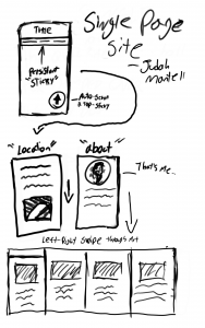
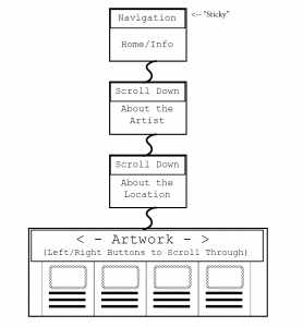
I’m not the best at hand drawing, but here’s my digital pen diagram of my plans for the site. Because it is a single page, a traditional site map wouldn’t work as well, so I made an image that shows what leads to what section when scrolling.
As indicated in both images, there will be vertical sections for different pieces of info, then when you get to the bottom (or click the sticky nav link at the top) it will change to a horizontal gallery of each piece of art. I wanted to have a horizontal scrolling area for this, but found it to be much easier to just have left and right buttons that switch the visible <div> depending on an integer. I did this with some simple JavaScript that’s at the bottom of the index file.
By default HTML pages don’t scroll smoothly, they just instantly jump to the appropriate points. I really don’t like this, so I added this to the CSS:
html {

scroll-behavior: smooth;

}
It just made everything feel so much more fluid.
Overall I think it came out pretty well. Everything is clear and easy to understand, and I really like the horizontal gallery with the left and right buttons. I tested it on multiple mobile devices, and it all looks great.
The one thing that frustrates me is that when the page is stretched out (i.e. viewed on wider devices/desktop) the formatting is a little strange. Because it is still easy to read/understand–and because I’m frankly a little too lazy to add MediaQueries to switch CSS depending on screen size–I didn’t worry too much about this.
Looking back, I could have used SaSS (aka SCSS files) to allow for easier use of variables and nested CSS elements, though I didn’t want to use anything outside the scope of the class. I highly recommend checking it out, it will make working with CSS so much easier.
I also made good use of the W3Schools.com references while working on this. It’s just a great resource/cheat sheet for CSS properties and some JavaScript.


