Exercise 1; Isolating the Senses.
What was noticed;
1. I heard a vehicle horn. A couple of people crossing by me, one of them is talking to his phone, very loudly.
2. A couple of boys are doing skateboarding, a group of guys is preparing for performance.
3. Windy, the wind is a little chilling while blowing on my face, but it’s not cold.
5. I smell perfumes, it’s probably from the girl group walking by me. The sky is grey.
Exercise 2; Walking through a “natural environment”.
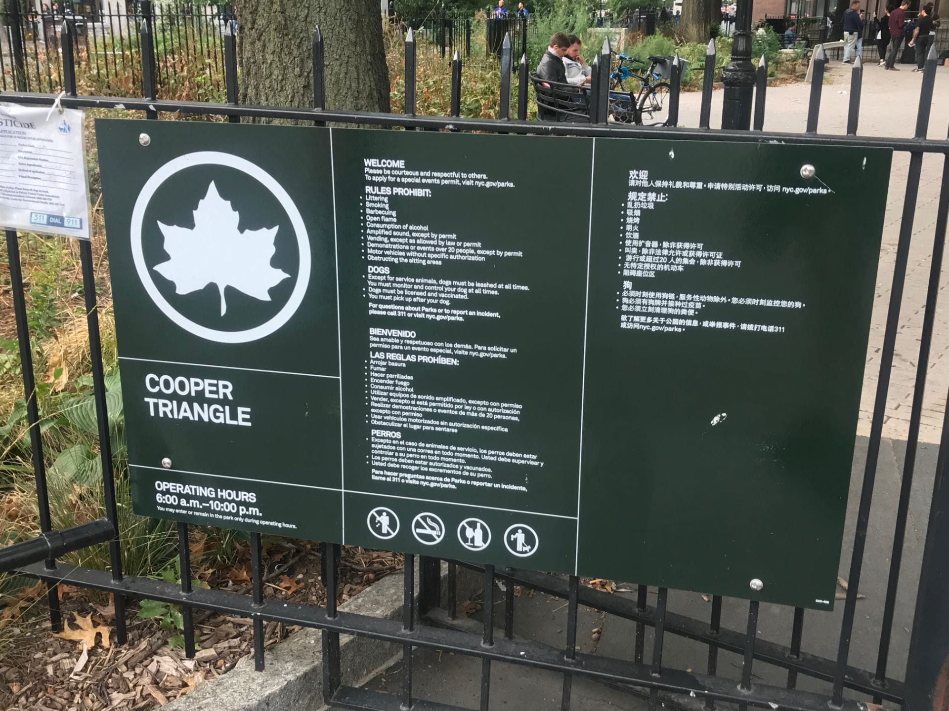
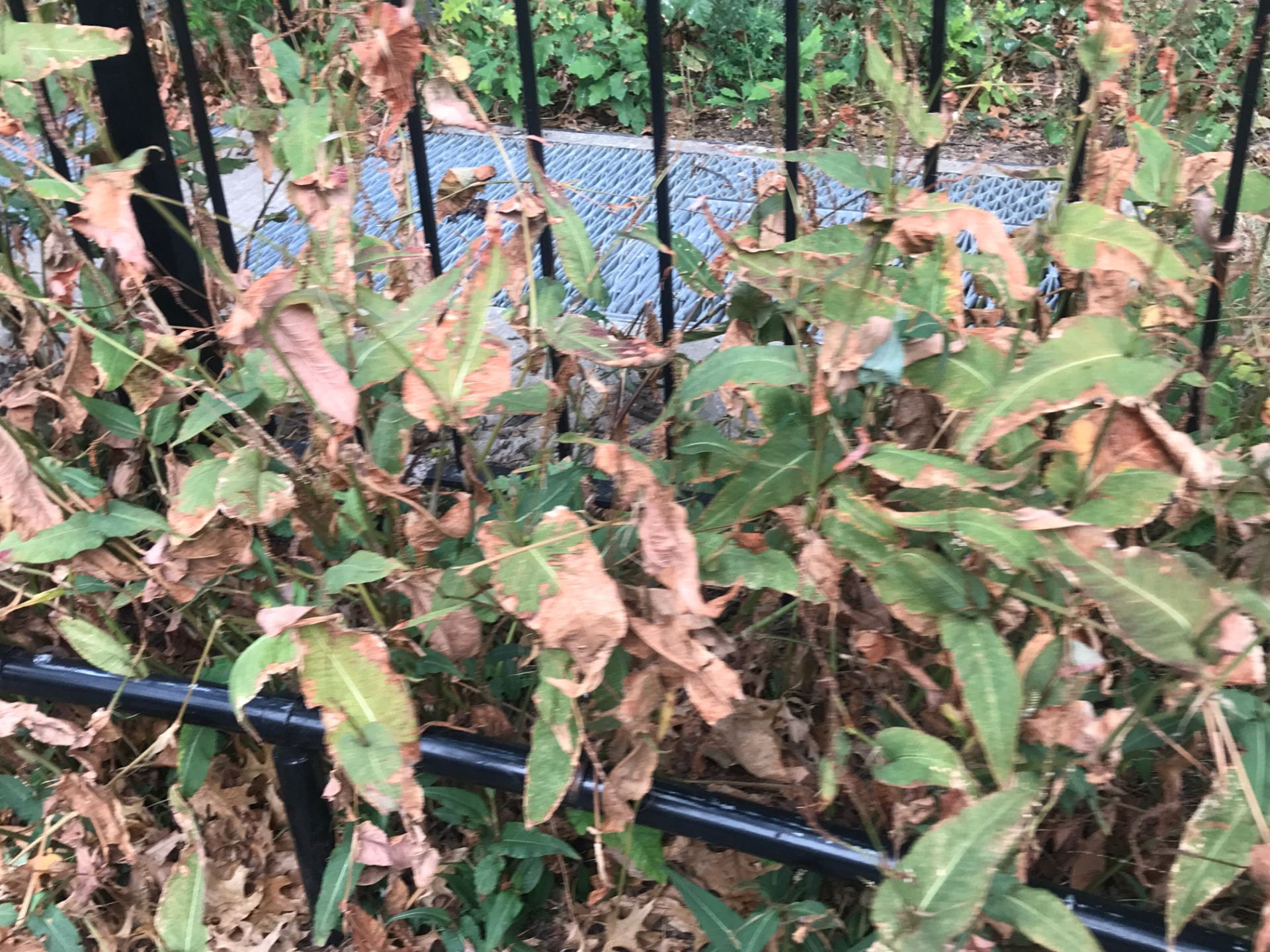
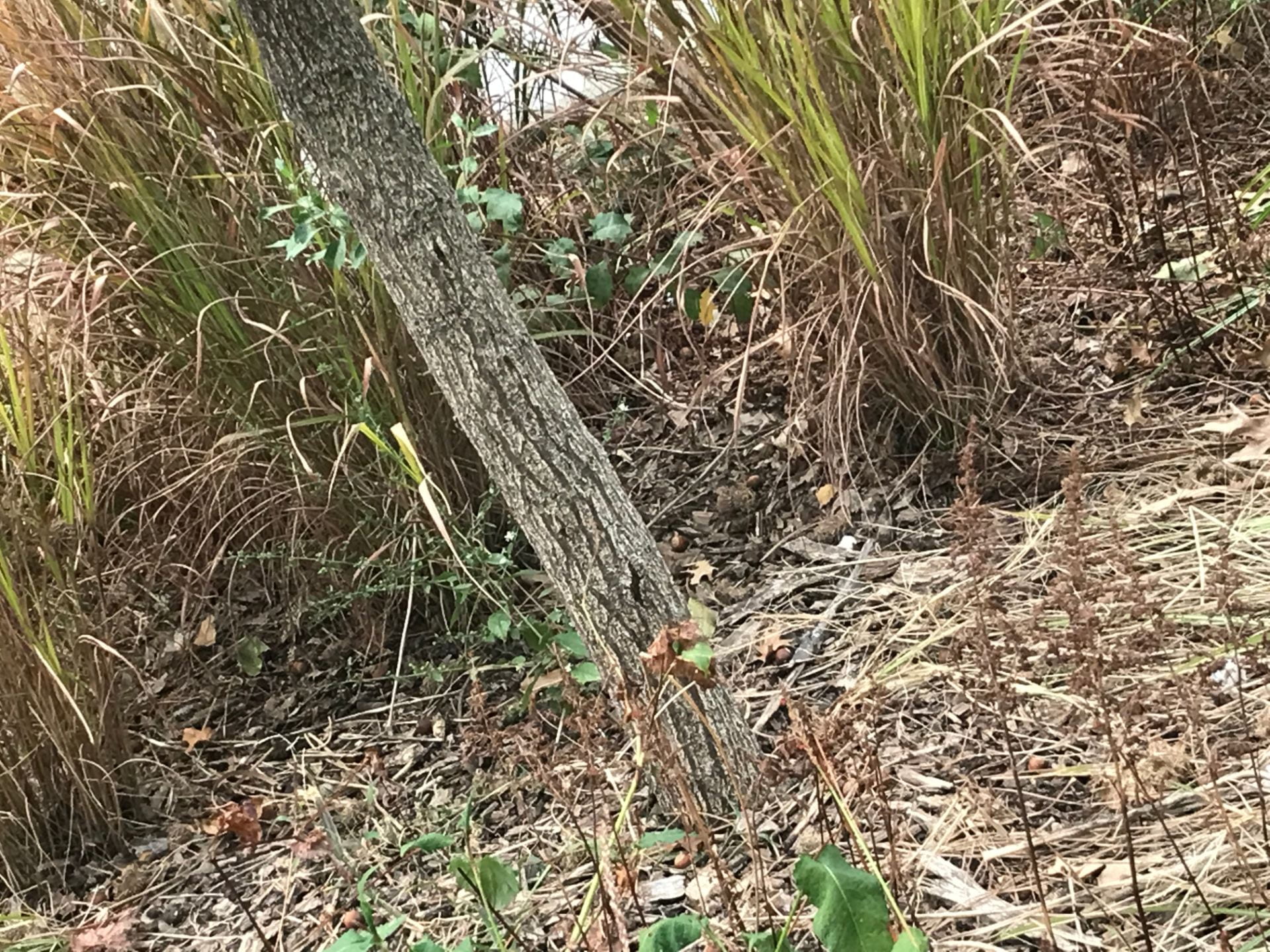
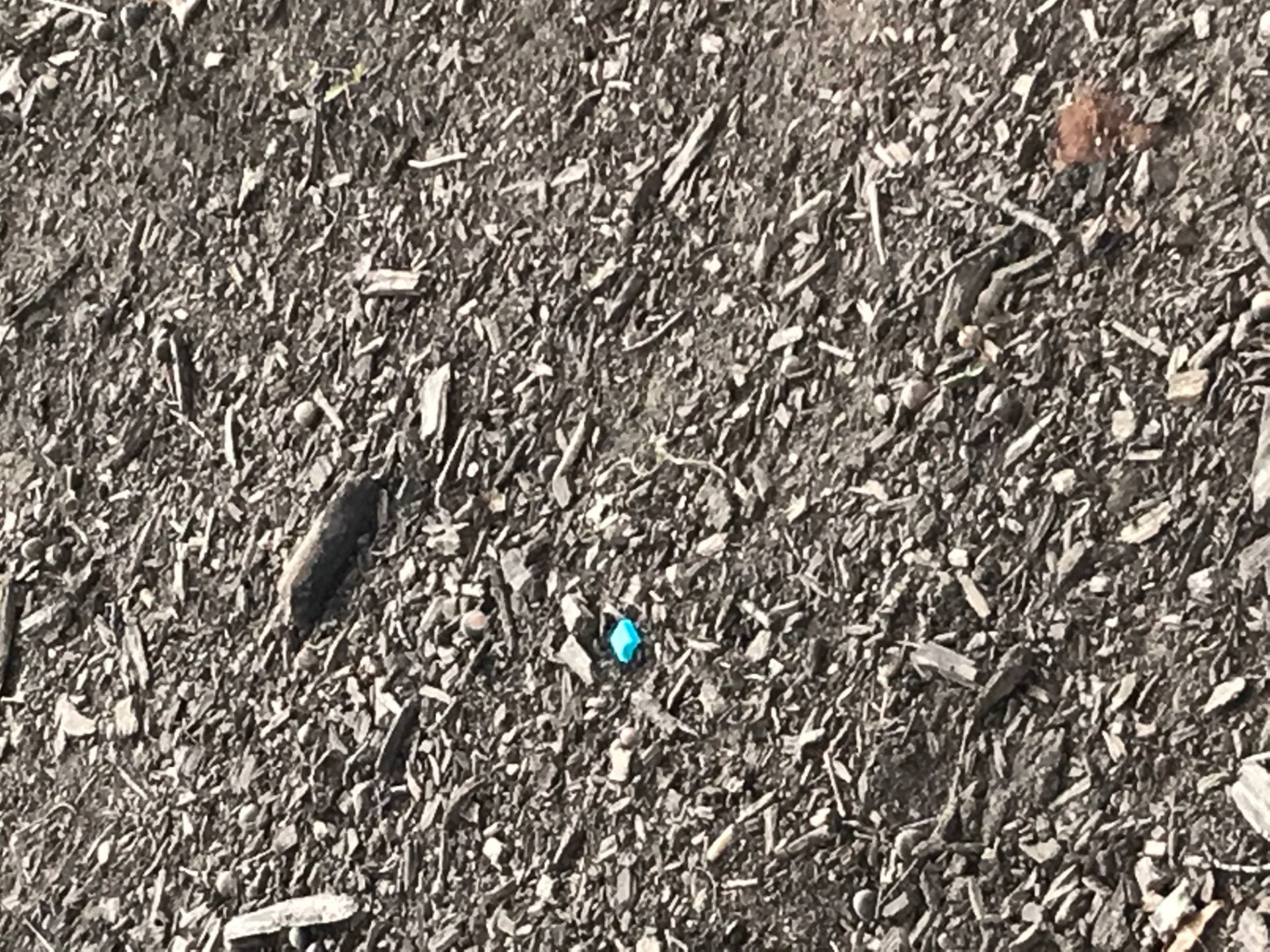
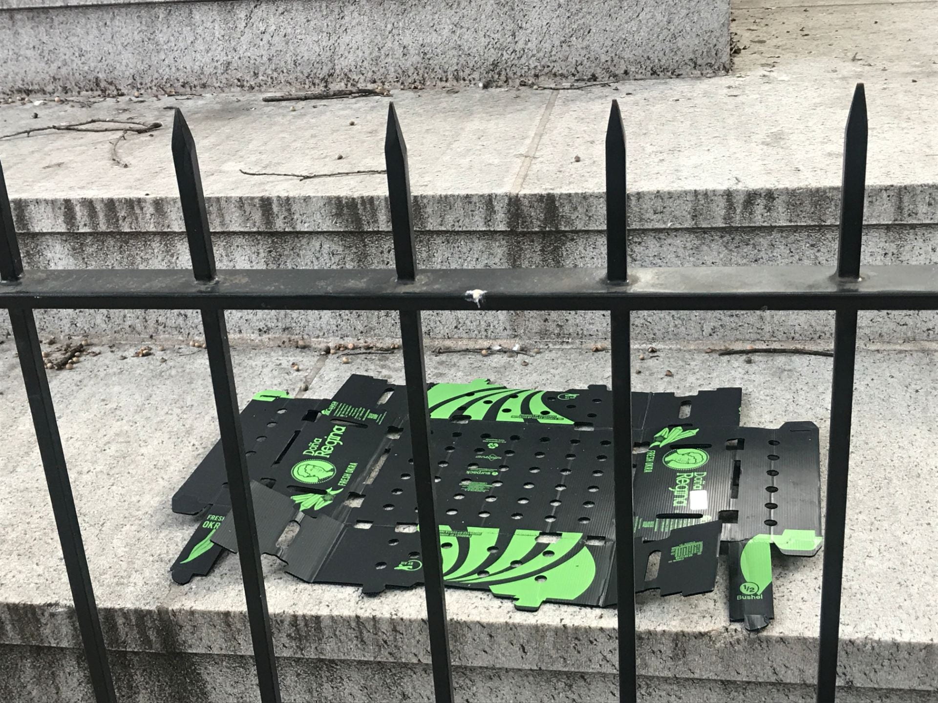
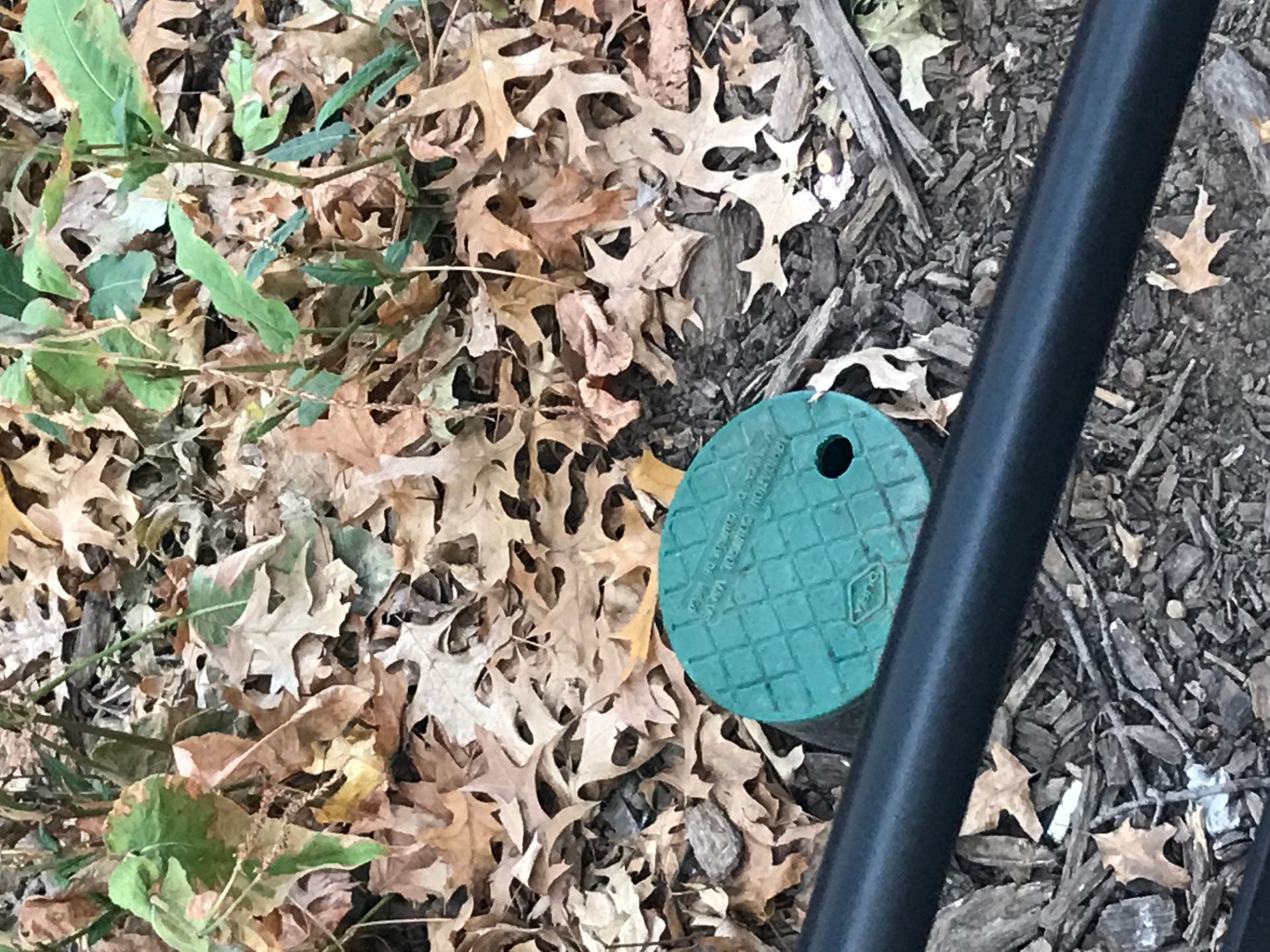
Location picked: Cooper triangle
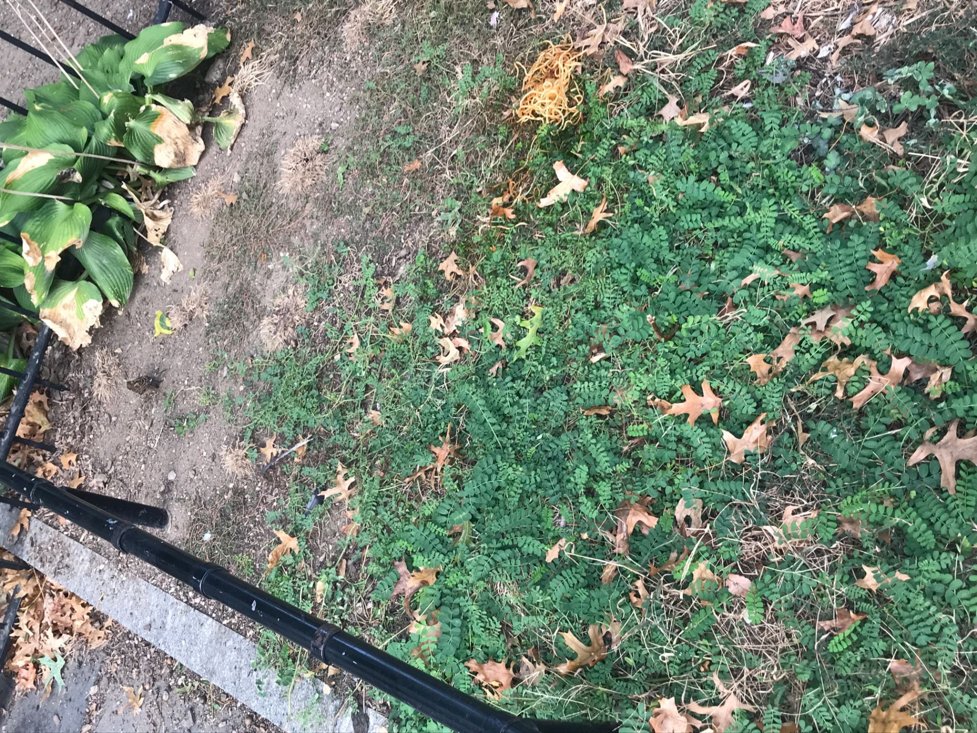
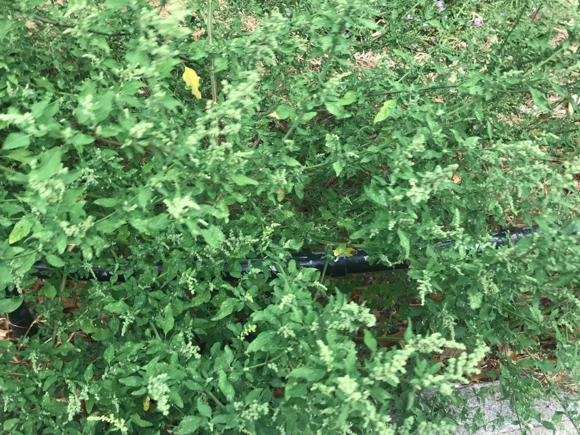
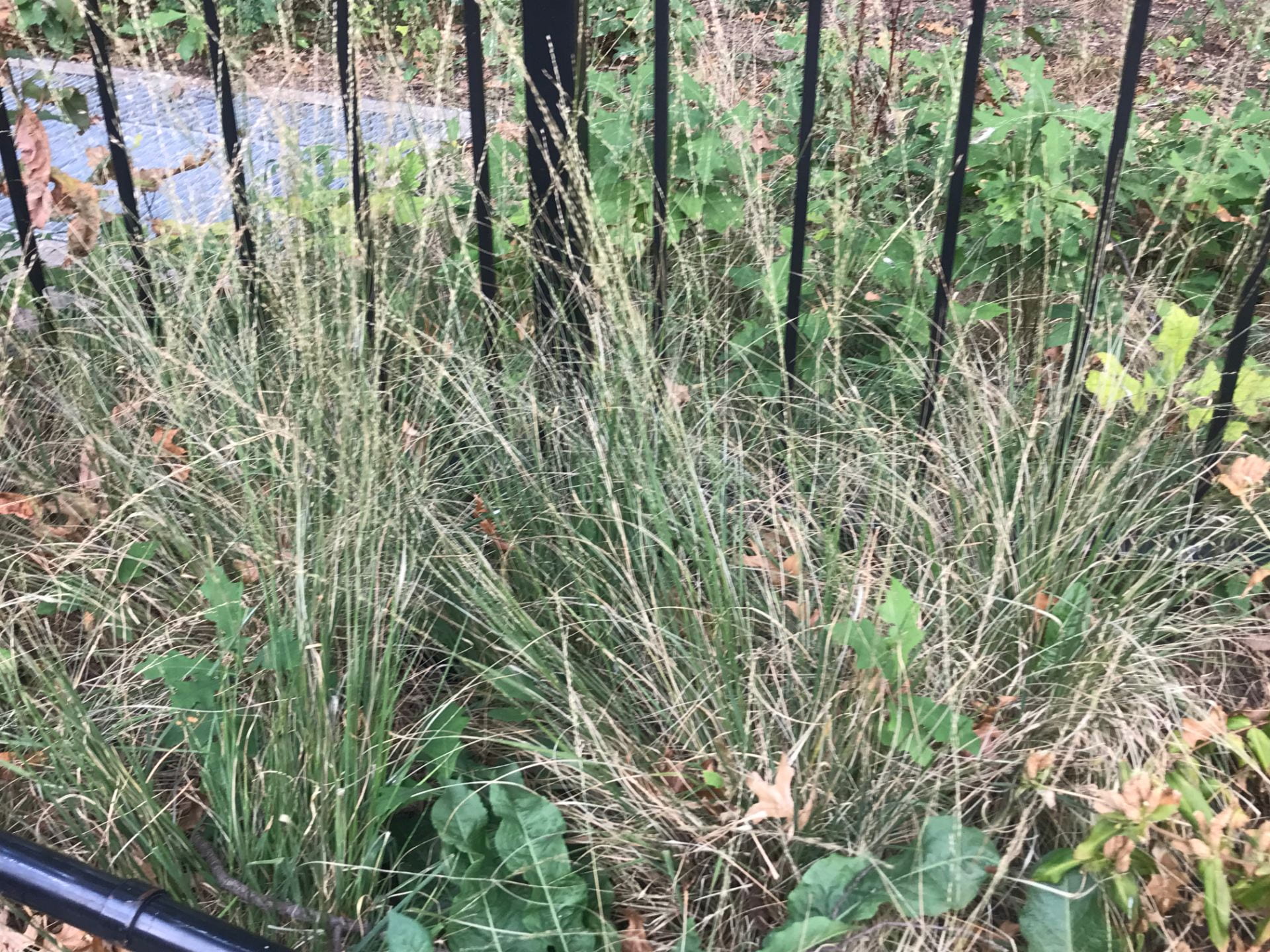
Color picked: Green.
Images


![]()


1. How often you find the color while exploring?
The color green shows up quite often because it is considered a nature park. I don’t see it much open on people’s clothes, maybe it’s due to the coming of fall, it isn’t a good time for green anymore.
2. Can you detect a pattern in terms of its use? What similarities and differences do you notice in hue, saturation, and variation. Is there any overlap between how color is used in nature and in design?
- There are different color saturations of green in plants as they are in different stages of life.
- There is a different type of green used in bins, and straws that were abundant. Their hue is a bit bluer than the natural plants, this might be used to differentiate the nature. I noticed a piece of packing box has the same shade with new leaves, maybe that’s what it was approaching: fresh.
- The green that was used for people’s clothes have more virality, but they are in a similar shade of plants, I guess there aren’t rule in fashion.
3. What is the color a result of?
Green is definitely a color of nature, the designs that involved the color green mostly have an approach to environmental.