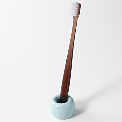
I chose this porcelain toothbrush holder for one reason: it’s a simple, clean, and elegant tool that only does one job—- hold the toothbrush. This little thing basically sums up the characteristic of most modern utilities. We always trying to make something useful and portable, so it’s convenient for us to carry around. Today I’m going to design the package of this adorable “porcelain donut”
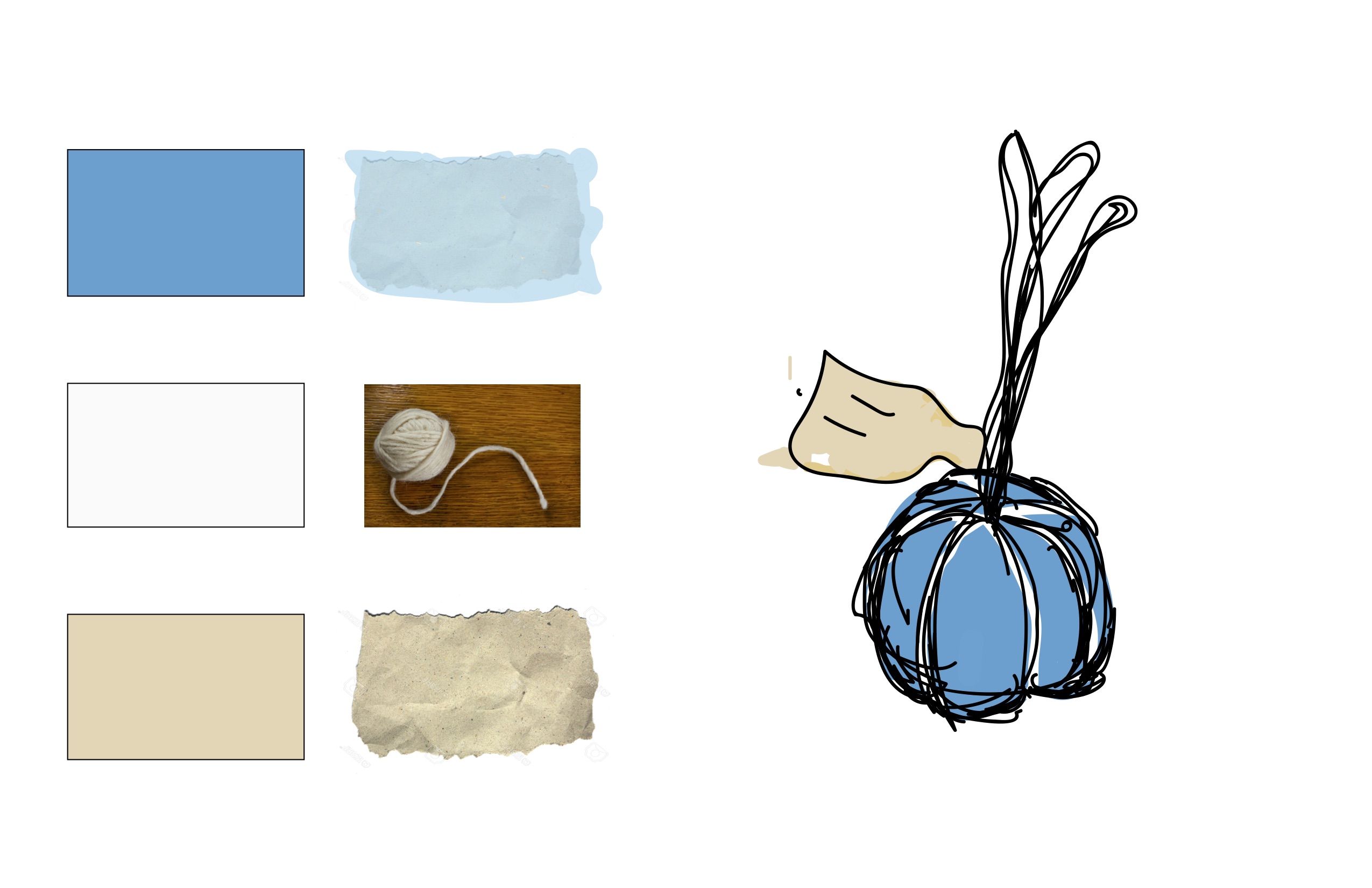
I had three design initially. Since the holder looks like ring or donut, I designed donut box for the holder, with bubbly typography and comical drawings.

The second design required to use transparent materials. One the surface of transparent plastic, there will be cartoon faces that corresponded to the place where the toothbrush holder stands. This gives a illusion that the toothbrush holders has characters. It is also a cute way to display you products. The typography is similar to comic’s style, since the whole mood of the packaging is quite playful.

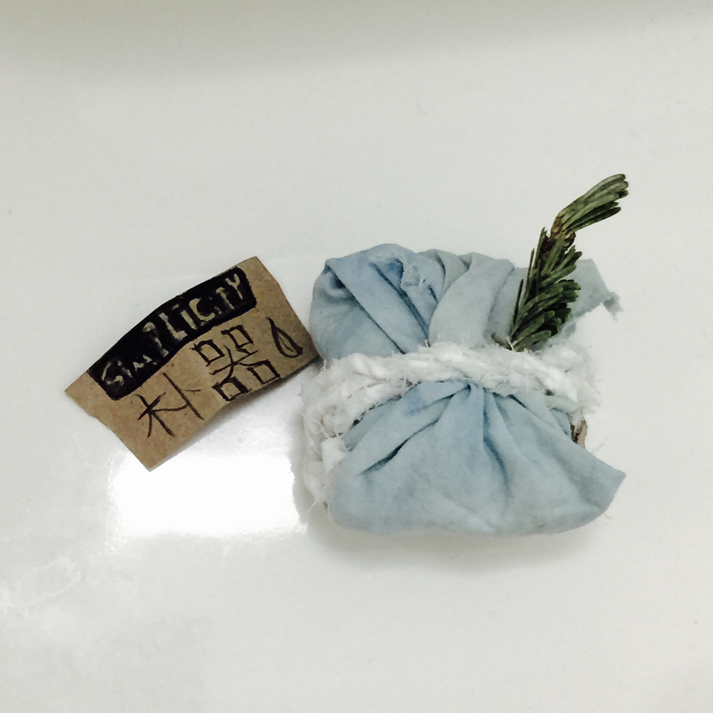
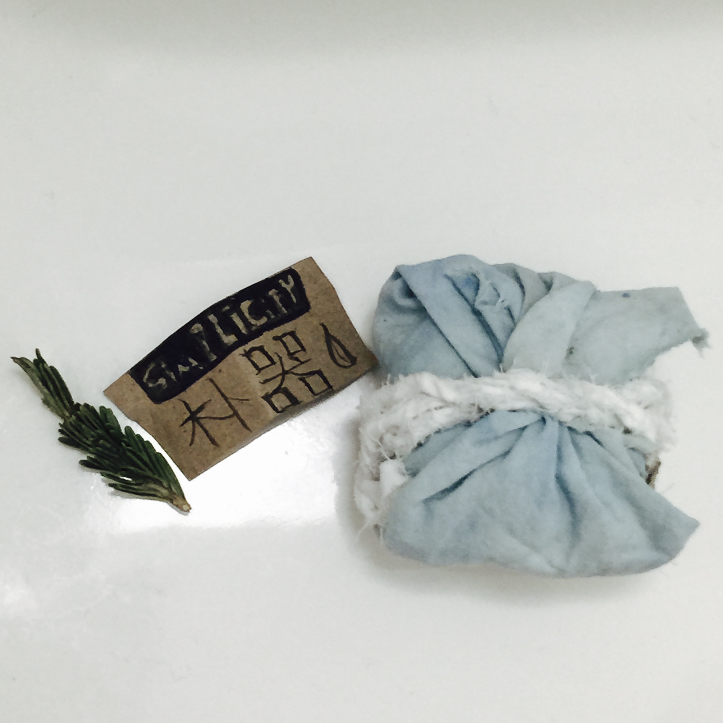
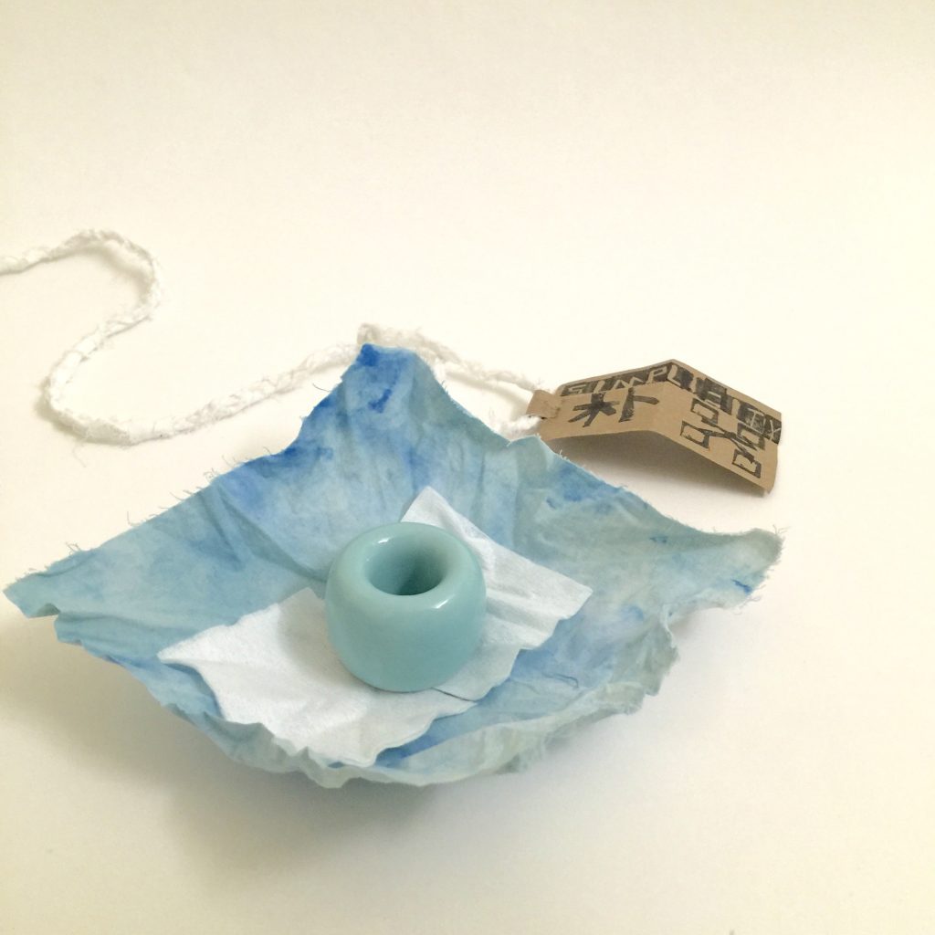
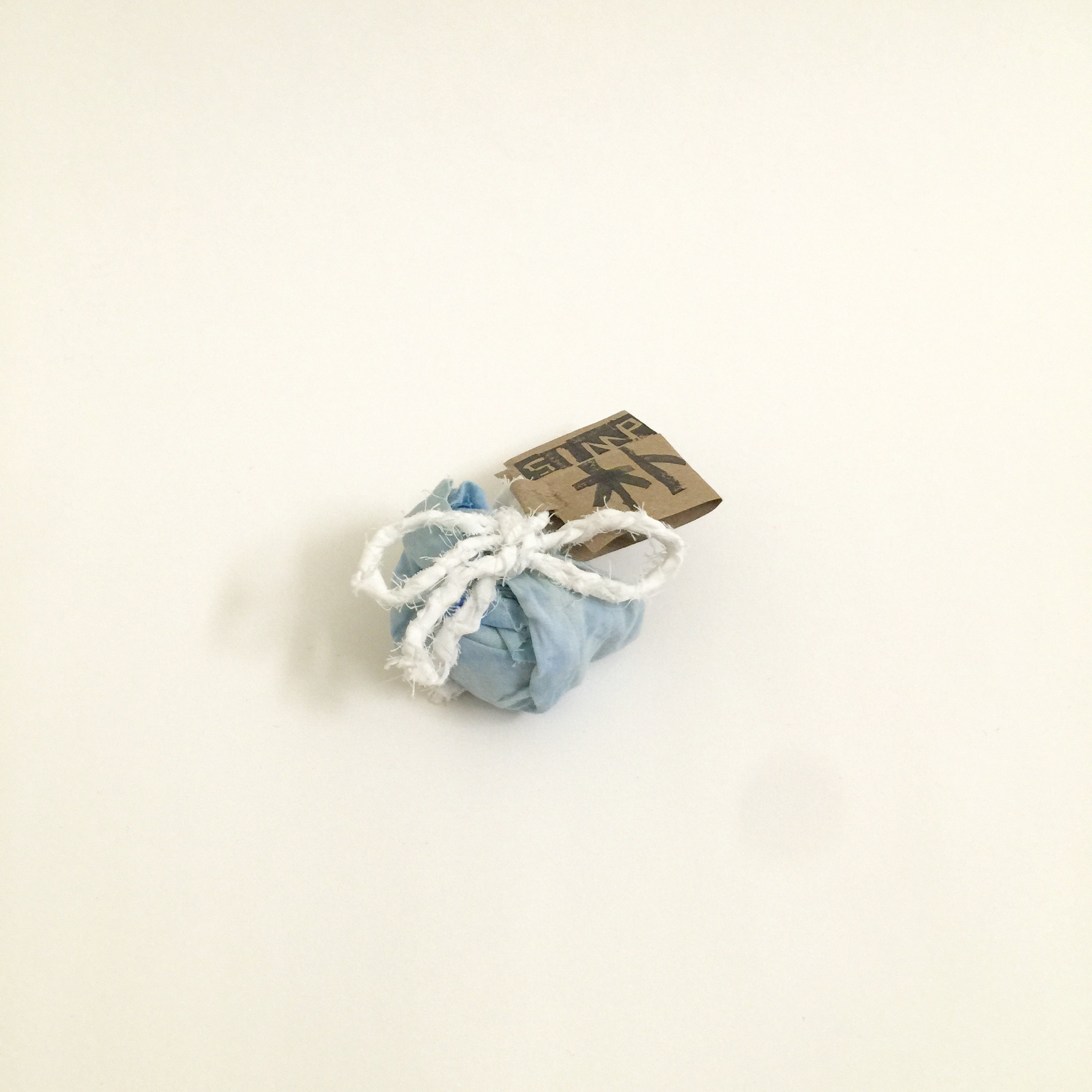
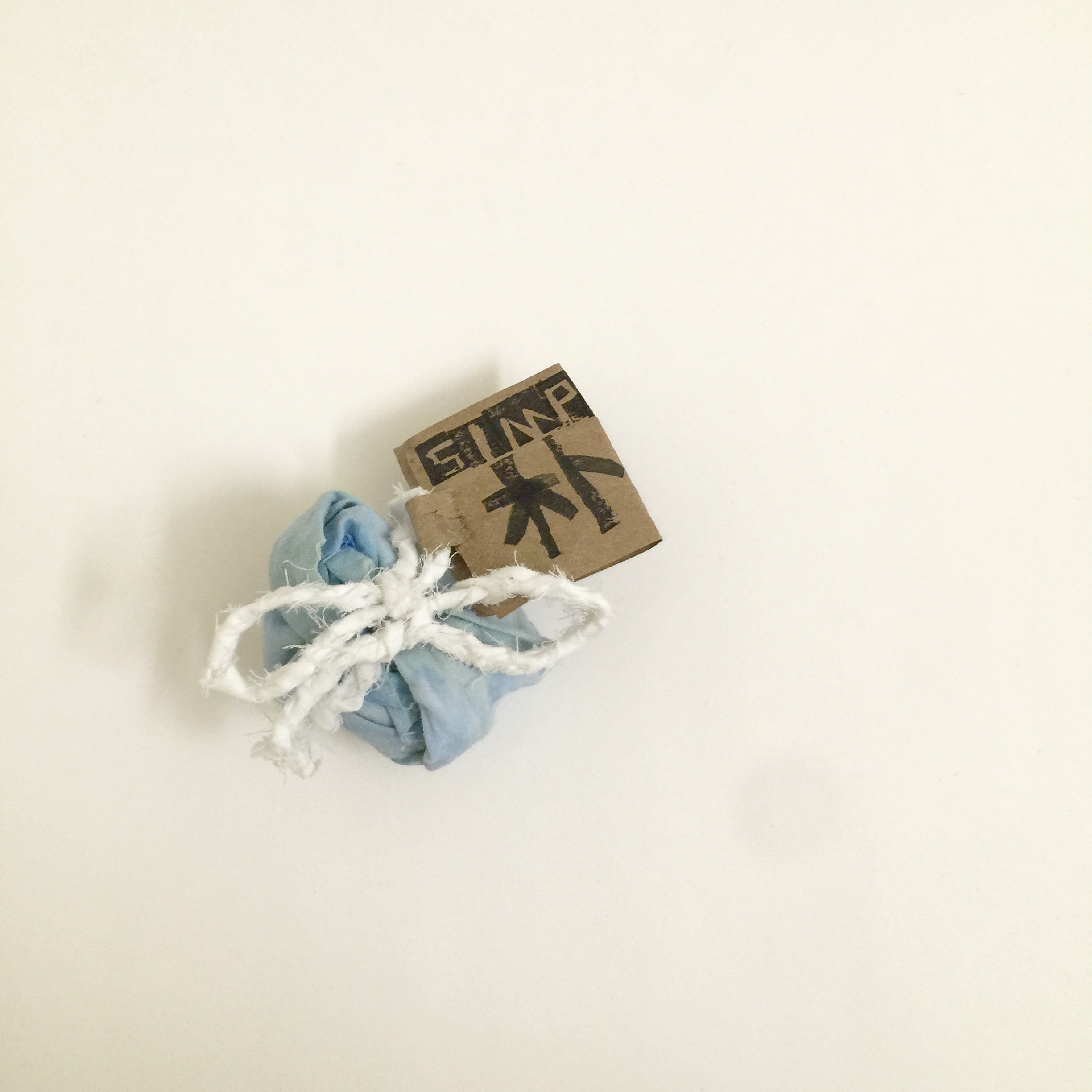
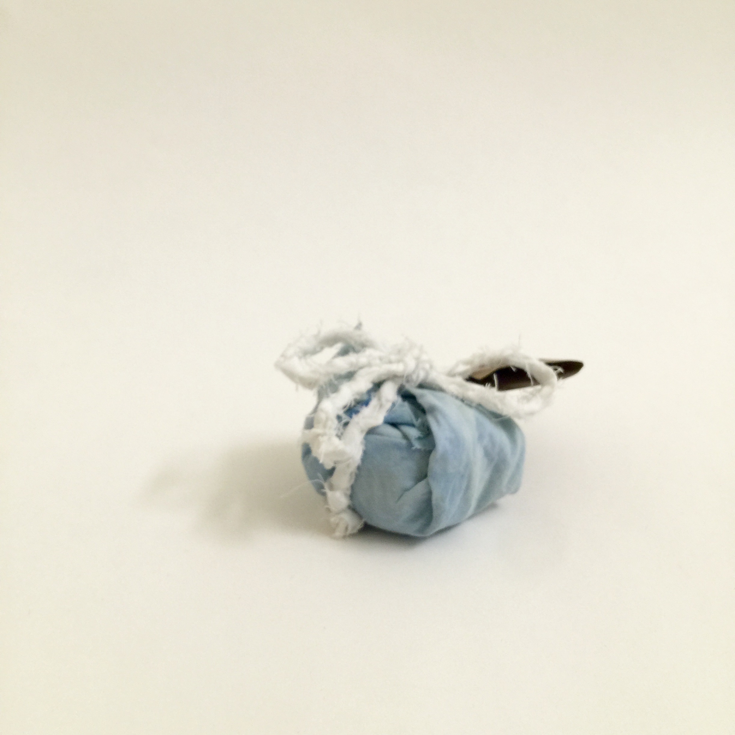
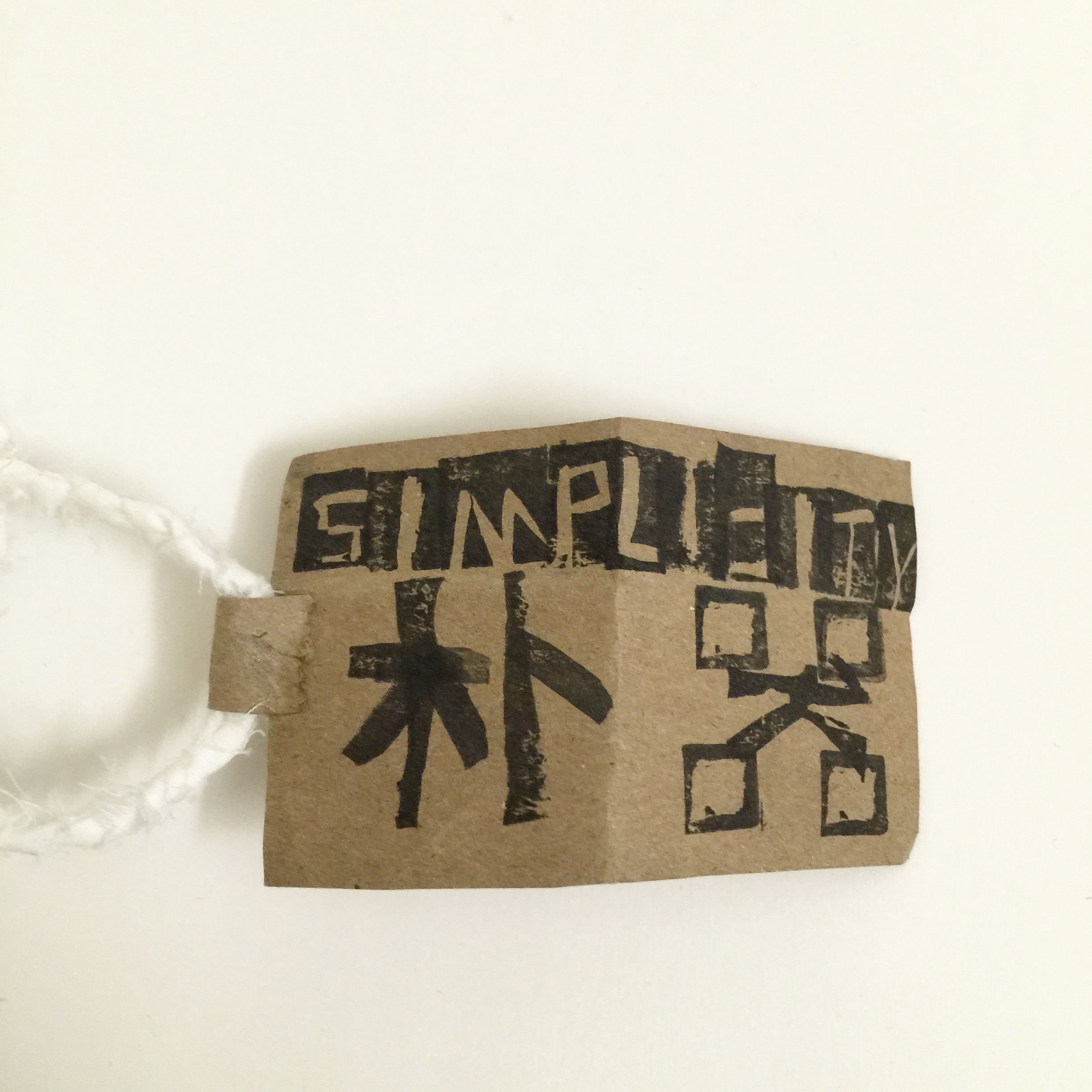
For the last design, I decided to turn my focus on the characteristic of this tool itself. It’s a simple clean tool that only does one thing. This is a down to earth porcelain tool with one purpose. So I decided to use cloth, recyclable paper, and strings as the packaging. The packaging focuses on the concept of “going back to Mother Nature”. Everything about this packaging is bio-degradable and recyclable. I made a chinese name for the logo”朴器” (Pu Qi), means: “Humble Tools”. I chose chinese because I like the way it looks and the pattern of the characters looks similar to trees and tools. This is really close to the concept that I’m trying to illustrate—- down to earth.

At the end I chose the last one, and deiced to put on blue to remind costumer that the holder is in blue. I chose cloth also because I want my package to be used too—as a handkerchief of the holder.
Cloth: I used blue dye, and white cloth initially. In order for the light blue to turn into turquoise, I added in green tea to the mixing pot. It looks really similar to the holder’s color.
Typography: To illustrate the earthly feeling of the product, I hand-carved the stamps
Strings: I weaved the strings out of the cloth I had. I chose white because it gives out a clean and clear feeling to the eyes.
Folding: I used traditional Japanese Furoshiki style to fold the package, and added evergreen as decoration.


Second Version: