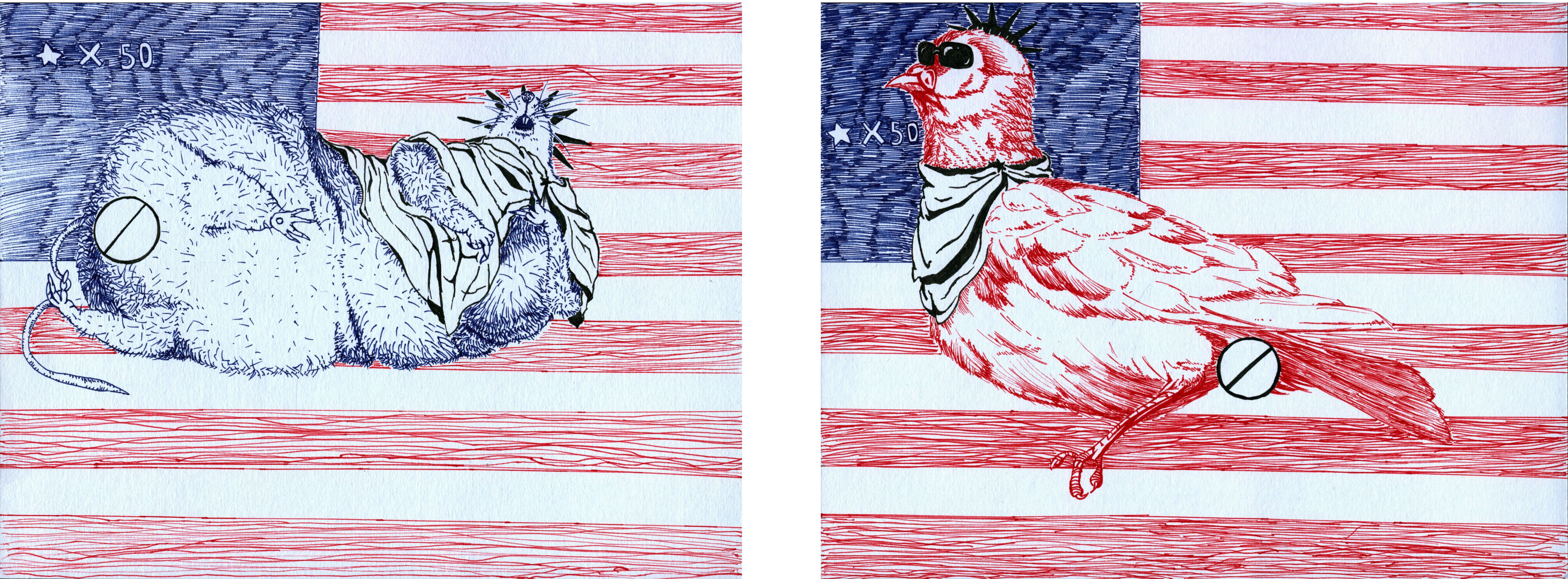
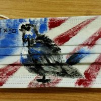
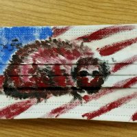
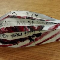
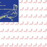
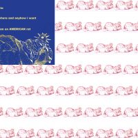
For my Bridge 2 assignment, I am initially required to do 5 diptychs related to the theme I have chosen. Since my theme is environment, I was curious on exploring the environment of NYC or even USA from different perspectives. I decide to create the diptychs on masks because masks are strongly related to environment by its functions, and after creating a mind map I find the idea achievable. I decide to use five different materials to explore the possibilities.
Diptych 1:
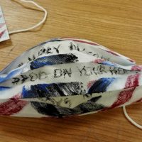
- pigeon
- rat
- text: #USA RAT #BEAT ME IF YOU DARE TO #MY DADDY WILL BEAT YOU UP
- text: #HOLY PIGEON #POO ON YOUR HEAD #ALWAYS RIGHT
- What conversation happened between each image in this diptych?
I draw a pigeon with sunglasses and a rat with sunglasses and headphones respectively. I choose to do these two animals because they are everywhere in NYC, which can be a reflection of “common scene”. They are both satires of American jerks who bully people from other countries because they think they are on the top of the world. In fact, I am personally doing this to express my anger towards my local suite mates who blamed me for not cleaning up THEIR mess.
- How was the medium selected successful at supporting the content of your object, form, or image? (if it was not as successful as others, why?)
I used acrylic paint, and I limited the colors into blue, red, white and black (the color of USA flag). The colors are really strong, and they stand out on the white surface of the mask. Right now I am still experimenting with acrylic, and I am really sacrificed with the “freestyle” of this diptych, which do create a sense of “dark freedom”.
- How did the materiality (medium used) affect the content or meaning of the individual artworks?
When I do this piece, I just apply the color without diluting, so the color appears to be strong on the “canvas”.
- What did you learn about your content through this medium exploration?
The mask is really soft and it “eats” the color sometimes, I cannot control it well especially when I was writing the tags because there is no support behind the canvas, and the result does not fully reach my expectation.
- How did the medium you used change the context of your object, form, or image?
The strokes are pronounced, in terms to reflect how furious and vexatious the jerks are.
- What websites / books / museums / galleries / other artists did you research during this process for ideas and inspiration?
N/A – I didn’t do research for this.
- How does this experiment shift your overall thesis question?
I was not planning to draw this until the unpleasant things happened in my dorm. I have been to USA for 4 times before I came to Parsons, and sometimes I can feel how white people and black people think they are better than us; after I move to New York and experience these discriminations more, I feel the topic “discrimination” is common in this environment. It also shift my view from only NYC to the entire country.
Diptych 2:
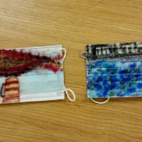
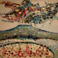
- a painting of Bohdan Borzemsky
- What conversation happened between each image in this diptych?
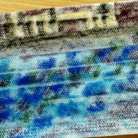
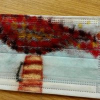
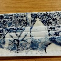
The first one is smokes coming out of a chimney on the street, and the second one is the serious pollution in Hudson River. Both drawings capture the idea of pollution.
- How was the medium selected successful at supporting the content of your object, form, or image? (if it was not as successful as others, why?)
Without any hesitation, I choose charcoal for interpretation. Charcoal has a naturally smoky characteristic, which I feel directly combined with pollution.
- How did the materiality (medium used) affect the content or meaning of the individual artworks?
Compare to other medias, charcoal has a sense of “transparent intension”, and it easily blends on the masks. On the chimney drawing, this really works to illustrate how the dust appears and at last merge into the air; as for the other one, it also shows how different pollution sources make the river dirty.
- What did you learn about your content through this medium exploration?
Charcoal doesn’t have a stable mark (after blending) compares to sharpies or pens, so I try to find a balance between blending and stabilizing. The chimney piece works better because it is created after the other piece.
- How did the medium you used change the context of your object, form, or image?
When I try to demonstrate the dust in the chimney piece, I have planned to use colors in red tone; as I put on the colors, I like how the red and purple merge on the light blue surface of the mask, which gives me a sense of “unconsciously poisoning the citizens”.
- What websites / books / museums / galleries / other artists did you research during this process for ideas and inspiration?
Before I do this work, I go to Ukraine Museum with a friend, and I am attracted by Bohdan Borzemsky’s paintings, In his oil paintings, the strokes are short and organized, and the combination of colors are very energetic. I want to use it in one of the diptychs, so I choose to imitate his style in this diytychs.
Regarding the whole process:
- How does this experiment shift your overall thesis question?
Rather than shifting, it helps me to dig deeper on “pollution of NYC”. A mask itself is related to air pollution, and this experiment result is strongly connected to this topic, compared to other pieces.
Diptych 3:
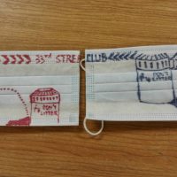
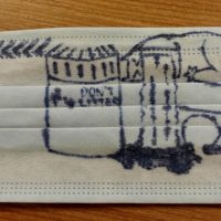
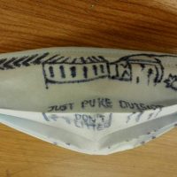
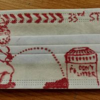
Left: a homeless people peeing outside of the garbage can in 33rd Street Subway Station
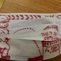
Right: a drunk people puking outside of the garbage can near a nightclub
Media: alcoholic sharpie
- text: #JUST PUKE OUTSIDE
- text: #JUST PEE OUTSIDE
Diptych 4:
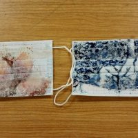
Left: the melting town in summer
Right: the frozen town in winter
Media: watercolor
(This is specifically Stuyvesant town where my dorm is.)
Diptych 5:
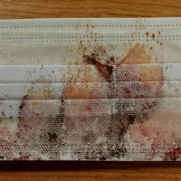
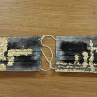
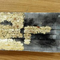
Left: an anonymous shooting towards the right side of the canvas
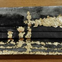
Right: a victim being shot by the bullet from the left side
Media: gold leaf flakes on acrylic paint
Diptych 6:
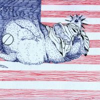
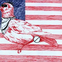
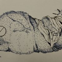
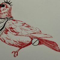
After bringing my Diptych 1 to the class critique, I keep some of the elements of the original diptych (color, background, and main objects) but change the media and text to capture my idea better. I also change the media from acrylic to fine line pen which I have more control with. My marble paper I draw on is white, and I use blue and red respectively to portrait a rat and a pigeon who are decorated as the Statue of Liberty (decor drawn in black, meaning horror humor). I was initially planning to put text on the empty spaces between the red bars (on the flag), but finally decide to give up to simplify the image.
- a rat sleeping on USA flag
- a pigeon pooping on USA flag
- progress
- progress
Diptych 7:
I decide to continue (or update) my diptych 6 because I want to develop further on its content. Diptych 6 is in a balanced status where I should not add more information (from my perspective), and by simplifying, duplicating and editing with 6, Diptych 7 is born which carries more obvious information that I want to express.
