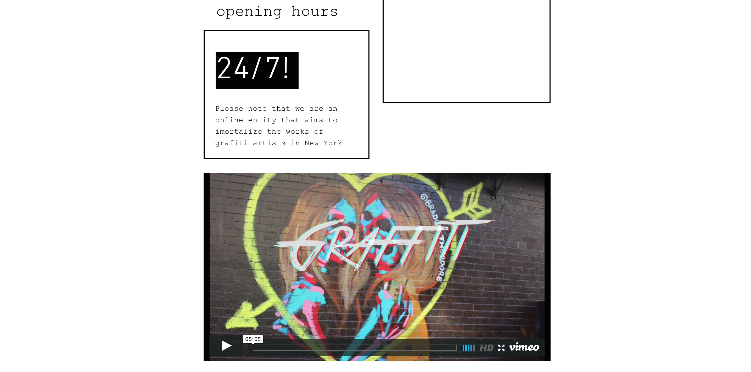
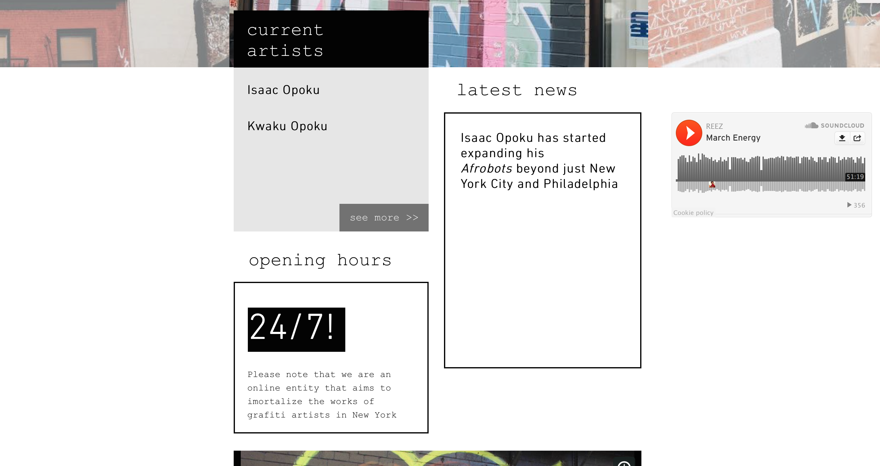
For my second iteration, I added a few more things to my website, after doing my expert review. RTQLT was my critic and he gave me a couple tips, as to how I could make my website better.
GENERAL IMPRESSION OF PROPOSAL
I love the proposal however, there’s a part of it which seems awfully strange to me –
“ At the same time, this project aims to include a generous selection of work by each of the selected artists and address the number one problem these artists face, in order to show the expressive and discursive richness characteristic of graffiti can be definitive. “
EXPERT REVIEWER
1 Isaac Opoku
2 He’s an artist who has explored street art through varying mediums
3 The strengths lie in the fact that the proposed idea would not only help preserve and share this inherently ephemeral art to a wider audience, but also because it would serve as a platform for these artists to expand their audience and propagate their individual styles.
4 Since there are a handful of similar platforms, it could make it a challenge for the proposed idea to make an impact in the street art [online] space
5 Yes the project definitely has legs. The question is, how fully developed are these legs? Does the project need to crawl till it learns to walk or is it already ready for a 100m sprint? I think the proposal as it currently is, may need to learn how to walk which in this case translates to finding its own unique edge that would make it standout among the rest. Because even though the project will be both feasible and helpful to the community as it currently stands, it can be made even better with a special cutting-edge feature.
http://www.complex.com/style/2012/07/the-10-coolest-street-artist-websites/phlegm
http://www.space-invaders.com/home/ <— this is a similar site but with only the work of one artist.
After his general impressions of my work, I went on to interview him. I also added some things to make my website look unique amongst the other sites. I added Music and also Video. This makes the site more fun to browse.

