
Seemingly disparate images can come together when the context is similar (in this case a hotel) and formal elements are similar (black and white)

In this case the content is very similar, but they are differentiated by changes of shape and small shifts of light and dark.

Color can play an important role in how we move across the picture plane. What role does repetition play in this image?

The connection between the elements can create groupings of content.

Gilbert and George – Cunt Scum 1977
Cunt Scum belongs to a series of twenty-six works known as The Dirty Words Pictures, which Gilbert and George created in 1977. They follow the format established in the preceding Red Morning series, to which Red Morning Trouble (Tate T07155) belongs. This consists of abutting photographic images mounted in narrow, black metal frames, arranged in a grid. Each work in the Dirty Words series is a composition made up of photographs the artists took of each other, obscene graffiti and east London street scenes. The graffiti words, from which the work’s title is derived, are placed at the top of the work. The artists have explained: ‘by putting the word along the top, then something vertical down both sides, it looked like a door. A door of hell. We found much of the grafitti in doorways … We became interested to know what makes a person do that.’ TATE
The placement of elements can direct our attention and create juxtapositions that suggest, movement, changes in time or even a sequential story.

Wolfgang Tillmans – Concorde Grid 1997
From Tillmans: “Concorde is perhaps the last example of a techno-utopian invention from the sixties still to be operating and fully functioning today. Its futuristic shape, speed and ear-numbing thunder grabs people’s imagination today as much as it did when it first took off in 1969. It’s an environmental nightmare conceived in 1962 when technology and progress was the answer to everything and the sky was no longer a limit … For the chosen few, flying Concorde is apparently a glamorous but cramped and slightly boring routine whilst to watch it in the air, landing or taking-off is a strange and free spectacle, a super modern anachronism and an image of the desire to overcome time and distance through technology.” – TATE
Notice how small color accents draw our attention to similar units in the grid. The same is true for similar internal structures within the various images.

Zoe Leonard – Analogue detail. 1998-2007
“A project comprising 412 photographs conceived over the course of a decade. Displayed in serial grids and organized into 25 chapters, Analogue documents the eclipsed texture of 20th-century urban life as seen in vanishing mom-and-pop stores and the simultaneous emergence of the global rag trade. Leonard took her own New York neighborhood, Manhattan’s Lower East Side, as a point of departure in the late 1990s. She then followed the circulation of recycled merchandise—used clothing, discarded advertisements, and the old technology of Kodak camera shops—to far-flung markets in Africa, Eastern Europe, Cuba, Mexico, and the Middle East.” – MOMA
Repetition, or the use of similar elements can direct the way that we look at an image.
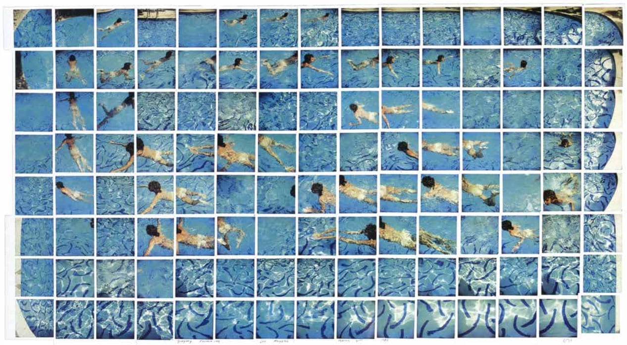
David Hockney – Gregory Swimming
Your content goes here. Edit or remove this text inline or in the module Content settings. You can also style every aspect of this content in the module Design settings and even apply custom CSS to this text in the module Advanced settings.