Notes From Chang 10/25 and 11/1

Notes From Chang 10/25/2019
- We discussed how the project might expand next semester. One possible route could be to silkscreen the images. Over winter break I can try and play around with ideas for color, and present these ideas in January. Chang also suggested scanning and printing (or phone pic and printing) the images to explore different solutions for markmaking/patterning/etc.
- Assess art as a pattern. See what elements need more push/pull.
- Go back through with one more pass of refinements.
__________________________
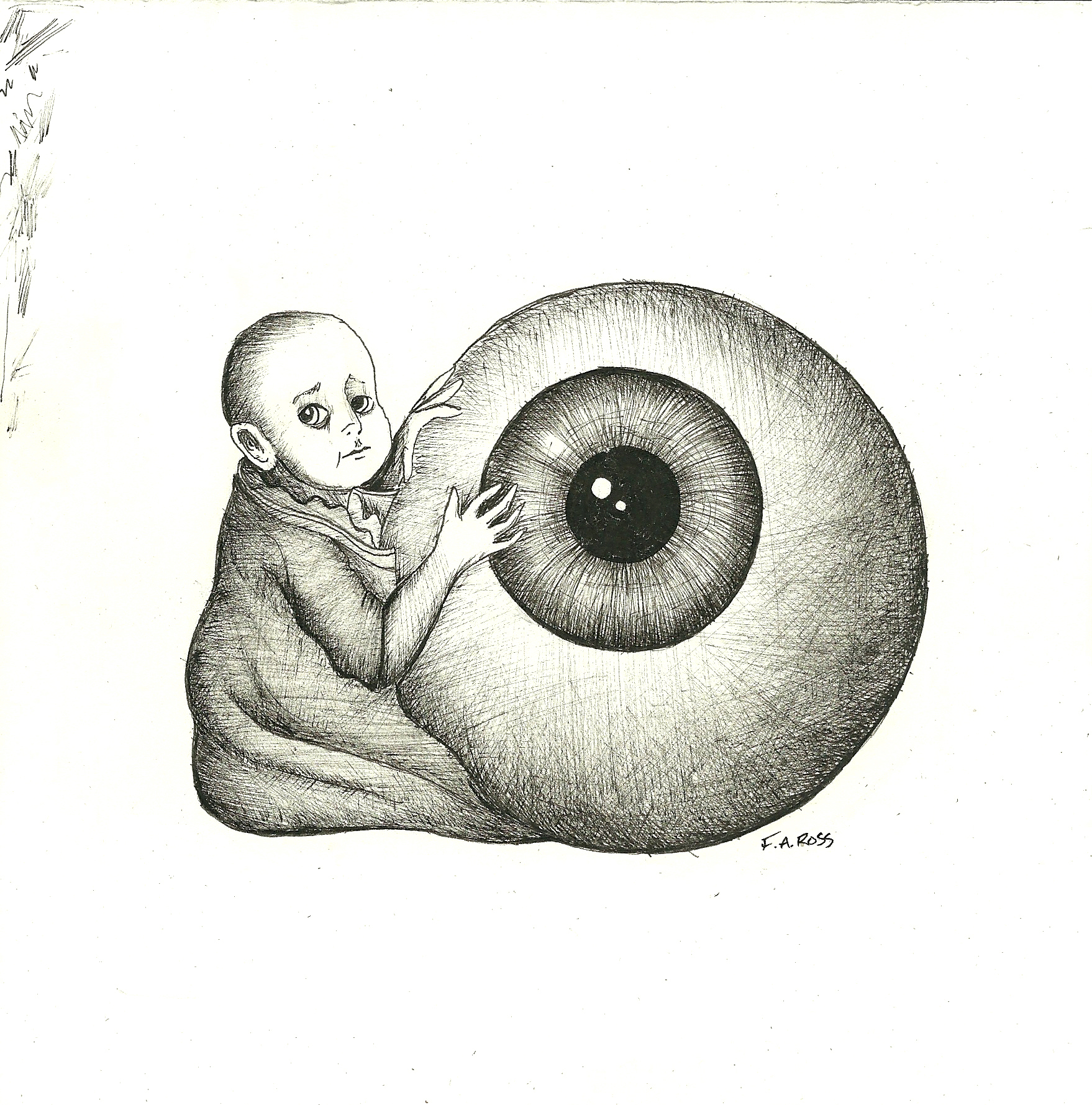
“Duck, Duck and Cover”
Chang said:
“play around with overlapping images.”
Here are two ideas I came up with. I prefer the first one, as i think the work lacks visual density and needs more dark areas. The patterning would be small and dense around the border, rather than large swoops as shown (but this was just a quick exploration. ) I’d like to collage some dahlias as well.
Xerox test 1

Xerox Test
__________________________________
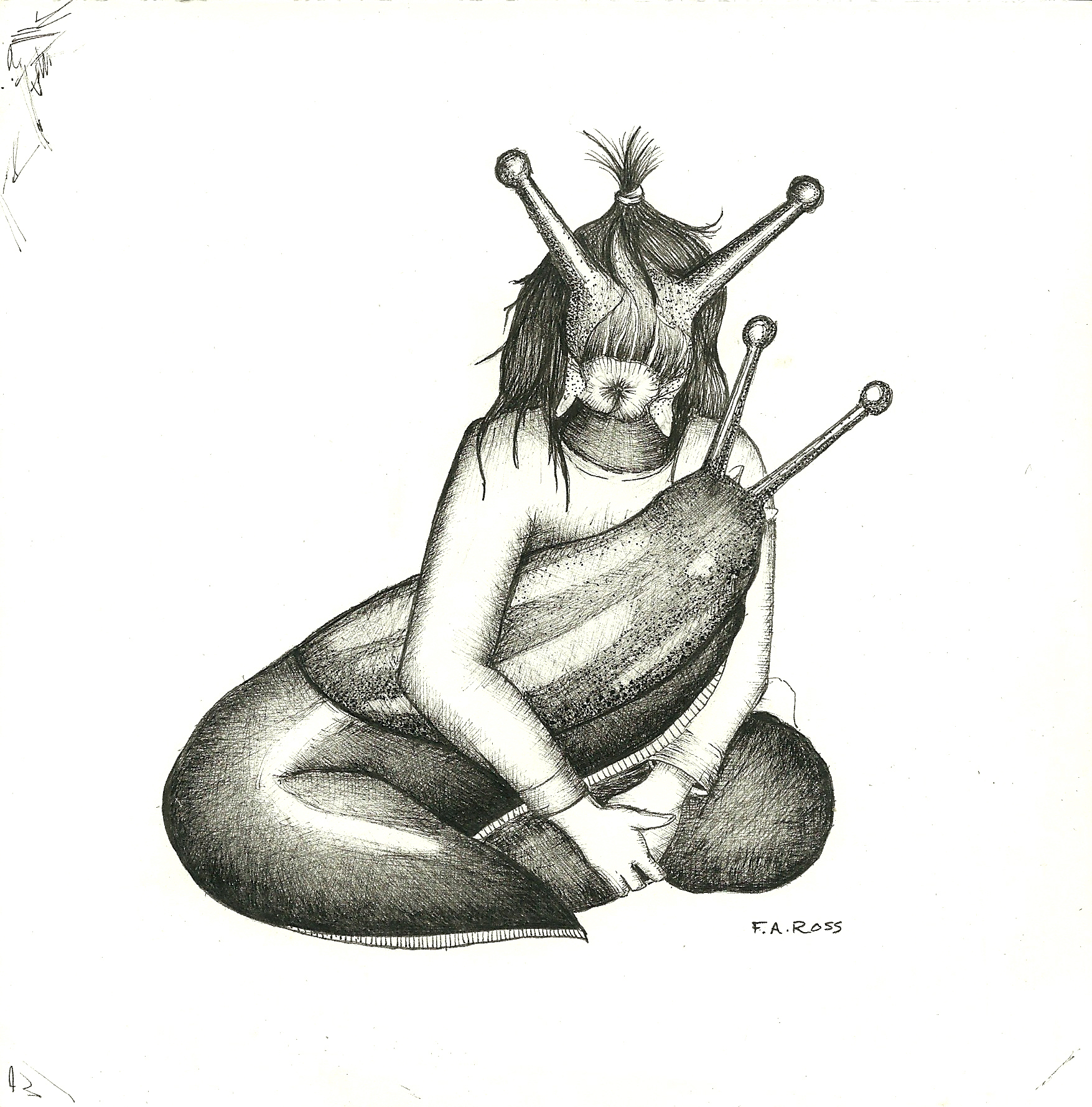
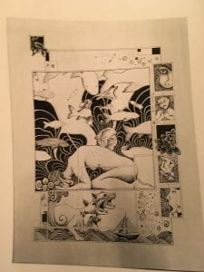
“Adam and Eve, once over”
Chang said:
“Fill the negative space with obsessive organic shapes.” (ie. dots as seen below)
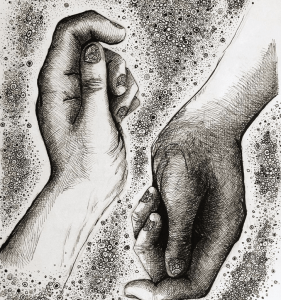
Old drawings of hands
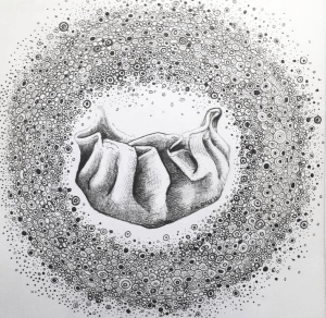
Old drawing of a delicious potsticker
This is the result:
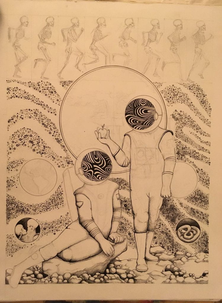
The obsessive/malleable marks contrast with the formal elements (ie. the posing of the figures, the architectural composition). This process is incredibly time-consuming, but the texture is worth it. I’m not nearly done with it. With this piece, I can definitely see the the possibility of adding an additional tint (ink wash) to allow for the push/pull of value. Currently, everything blends together,.
__________________________________
3 boxes (untitled for now):
Chang said:
“Experiment with the push and pull of the pictoral plane. Try only dealing with pattern and the purely abstract. Experiment with markmaking/rhythm, and figure out the systems/rules for each type of mark. Differentiate each set of markmaking, create a sustained practice. create something that is purely abstract. For this piece, push the sense of composition and space. Do not support a narrative. Play with foreground/background. What is solid? Transparent? Translucent?”
I tried experimenting with having more representational images, but didn’t like the result. I don’t often make abstract art, so creating a purely abstract piece could be a fun challenge.
Holding off on this one for now though.
Xerox test
The current state of the art. I have inked borders.
__________________________________
Notes From Chang 11/1
“Apple > God”
Notes from Chang:
“Consider the background as a visual contrast to the other elements. Ie. try markmaking with a straightedge rather than having organic, fluid lines. The rigid lines would provide contrast and separate the visual planes.”
Xerox test
Below is the design implemented. The brown areas are cut out with darker paper pasted behind it. I’ve also gone through multiple times to refine the squiggle lines.

__________________________________________________
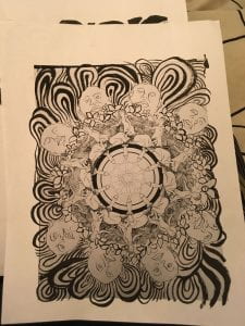
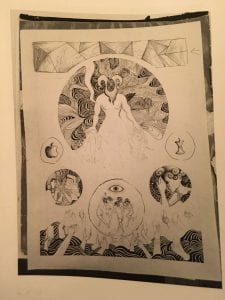
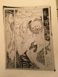
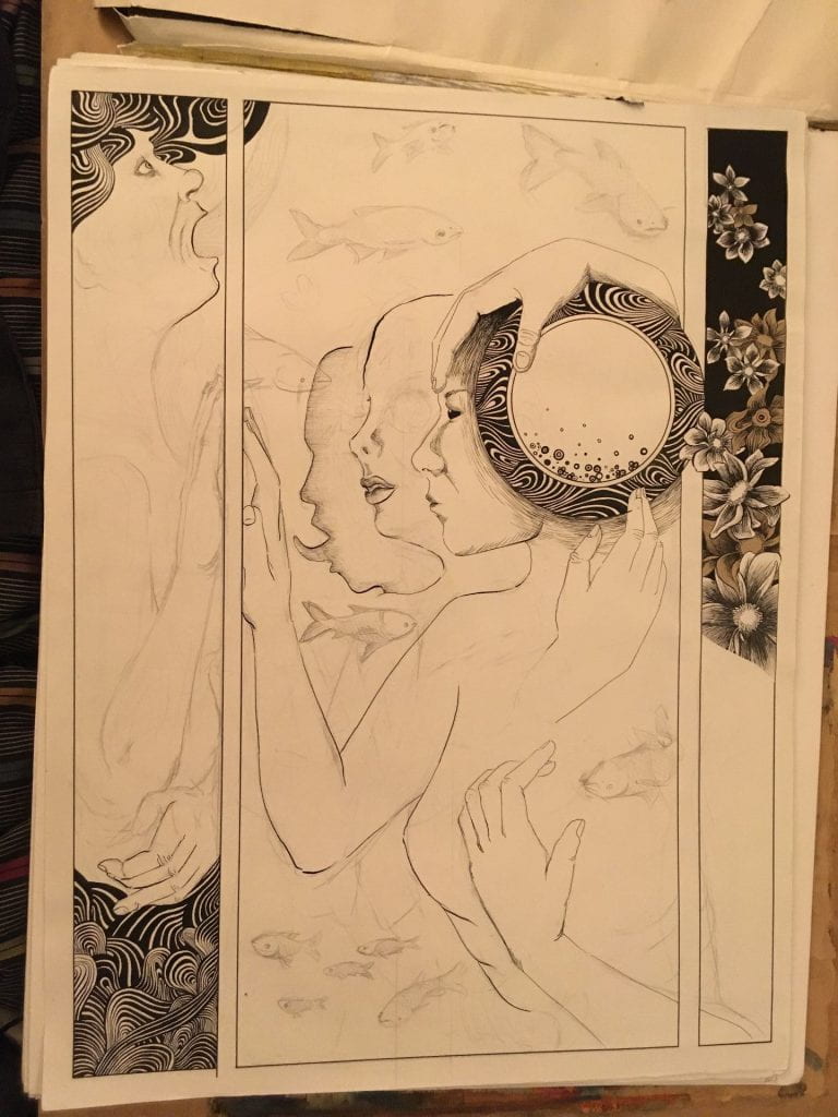
Cell Phone Mandala:
I will finish it (mostly) by next week.
Chang said:
“Sustain the integrity of the markmaking from the center, and pull the designs to the edges. Make the marks small and dense.”
I’ve worked on this all weekend, and it’s taking forever. The background is almost done. I still need to go back through to the figures in the center and refine them some more.

Xerox test

It is beginning to have a mind of it’s own.
__________________________________________
“Plastics Mandala”
Chang said:
“Be conscious of the push and pull of the different layers. Hold off on this one at the moment.”

_____________________________
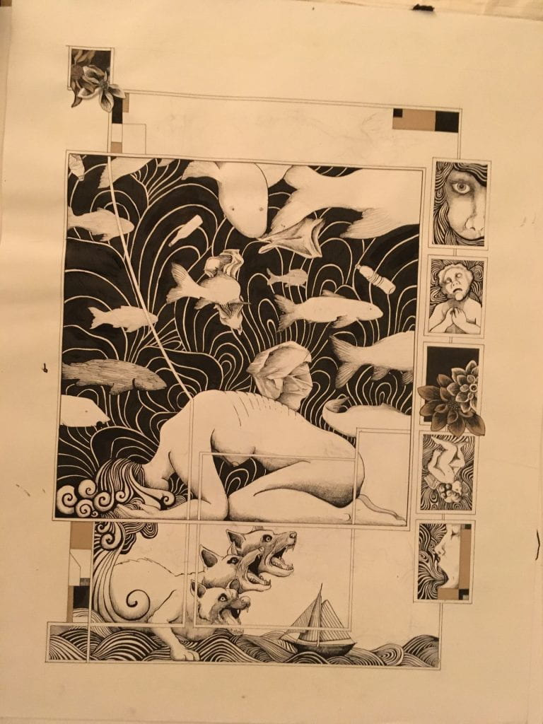
Cerberus piece:
Will have finished-ish for next week. Last week I inked in the background and cut out some areas to allow for the brown paper to show through.
Xerox test
______________________________
Chang said:
“Hold off on this one.”
I did add some Asian carp to the background, as well as adding more squiggly lines. I’m not super convinced by this piece. The anatomy is weird. I might collage it. I might set it aside. I’m creating some distance before making a decision.
Xerox test
_______________
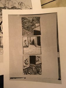
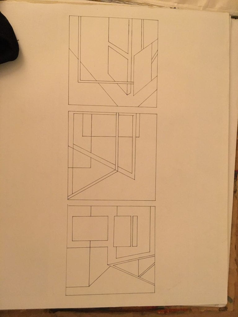
Architectural/Fragmented Reality:
Chang said:
“Refine the drawing before going into the inking. All spaces should be defined by minimal tangential relationships Ie. solid black and white, with some representational drawings. Focus less on pattern though. Each shape is an object with DENSITY. What is the edge? What is the line? Make it graphic and minimalist.”
This is just a Xerox test image. The actual drawing hasn’t changed in the last week. Chang disliked like the idea of re-introducing characters from other drawings, and I agree. In this test it feels like a collage of unconnected characters and textures. The addition of too many patterns/textures makes it chaotic. While I think that creating a little visual chaos might add to the narrative, I don’t think this is the way to do it.
I’m also holding off on this one for now. I need to make more printouts and play with the composition before committing.
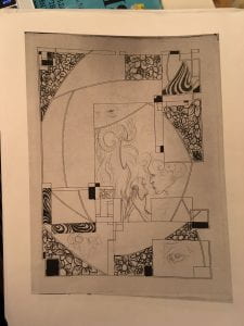
Xerox test