For the city as canvas project, we began by looking at various types of graffiti. I don’t have much experience with typography at all so this was a fun challenge for me to try. After looking through many types, I really liked the ones that looked almost bubble-like. So, I decided to give that a try to spell out my name. I didn’t think that just the name in black and white was enough, so I added a pink and purple-ish shade around it, and some paint drips to make it look more like real graffiti. 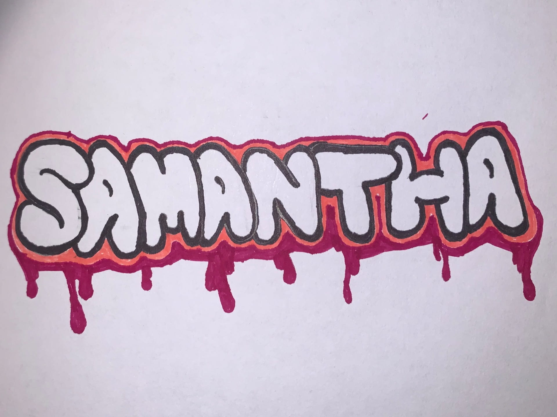
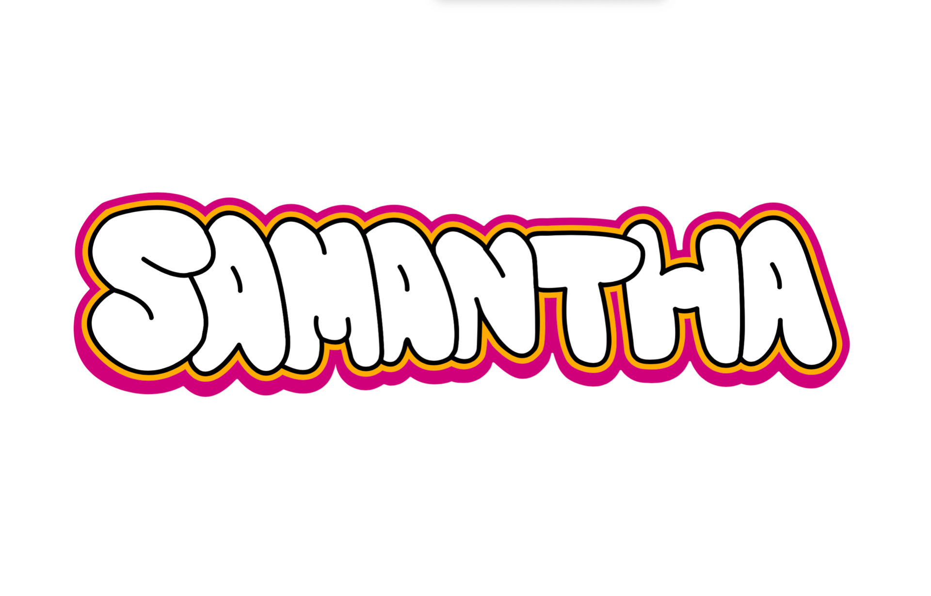
Next, I put the project into Illustrator and used the pen tool to outline the shape and recreate all the aspects of the drawing. I didn’t completely like the version with the drips at first, so I made a version with and without them to hear the class’ feedback.
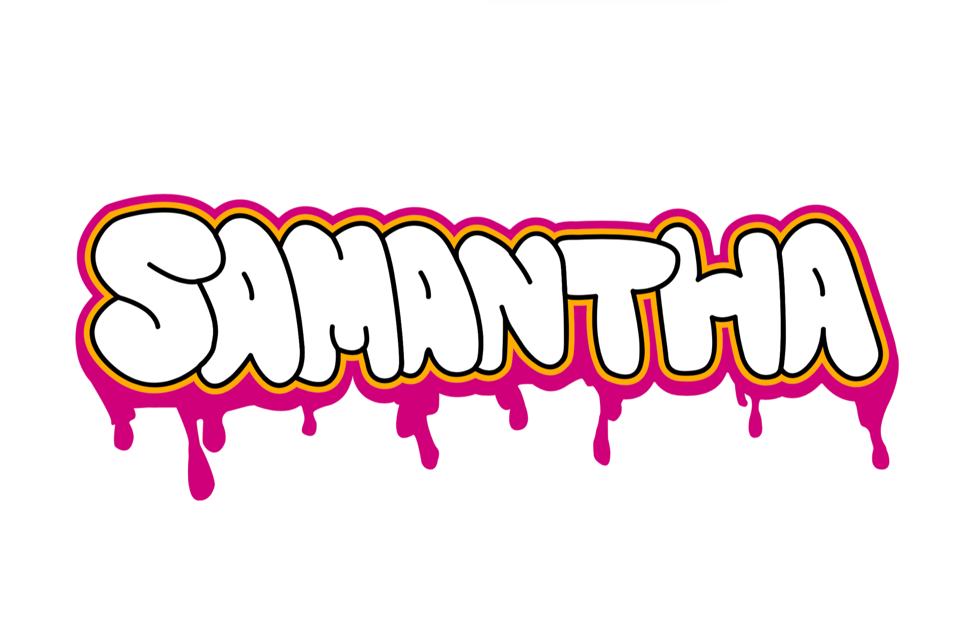
The feedback from the class helped me decide upon the second version, with the drips on it. Next, I had to pick a wall to photograph to put my “graffiti” on. I found a cool wall in Soho that was already covered in graffiti, so I figured it would mesh well with its surroundings.
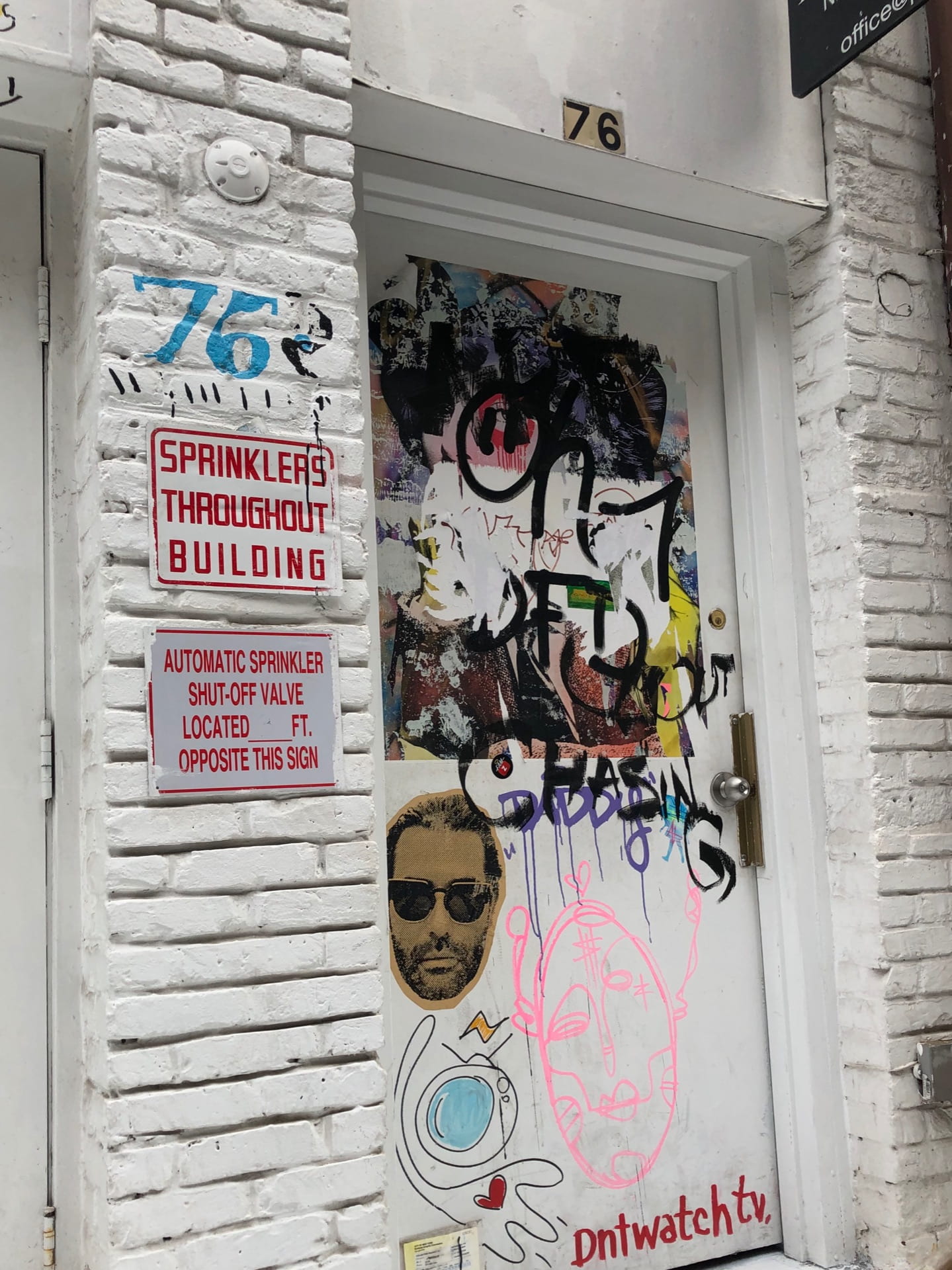
I added my graffiti to the image and played around with it in Photoshop for quite some time but it appeared to me as just a sticker that was put onto the door. 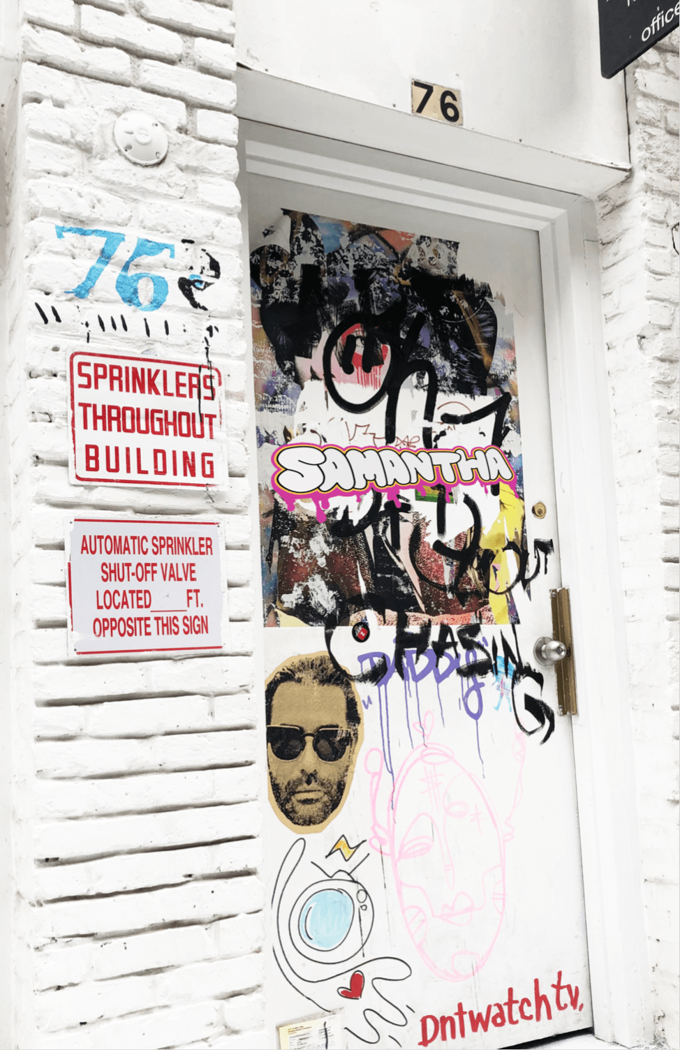
I was given the recommendation by a classmate to maybe try putting some of the actual graffiti on the door over top of it so it appeared as if it was underneath a few of the layers of the paint. I really liked the idea so I gave it a try and I feel like it was very effective in making the graffiti appear a bit more realistic on the door.
 Finally, I think that the graffiti on the door looks believable and meshes in well with its surrounding environment. This project was fun, yet seemed to challenge both my Illustrator and Photoshop skills. I overall enjoyed it and it helped me become more confident in my skills with the pen tool on Illustrator.