For this project we used ideas about negative and positive spaces along with the creation of a new work through other works. I found this project very enjoyable not only because I appreciated the physical and the digital components but I felt as though it granted lots of freedom to exactly how you wanted your work to be seen.
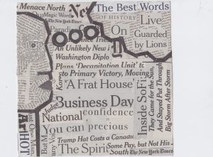 We started with our newspaper collages, I’m not the most artistically talented person so I found this step of the process a little difficult. Mostly with just getting started… I have of course done collaging before but it was always with different textures and colors with this one you had to learn how to work with just the grey of the words and the occasional more bold black titles. I think if I were to re do this project I would have given myself more shapes to work with for the future steps, of course I wasn’t aware what we’d be doing with the collage so it wasn’t a fault in myself but still the same.
White on Black
I’m going to begin with my challenges. Which specifically came out when creating my white on black piece. I found this one the most difficult because the shapes I had to work with didn’t create a great background of black to then develop a white space from. Along with that we had to use the same shapes in each one so I couldn’t add to this just to make it easier because I risked ruining the ones that I felt were stronger. I spent five times trying to rearrange the shapes and each time was left frustrated and instead putting it off for another day. I eventually stopped looking at it like something that had to be entirely black with a white shape centered and instead thought of what the black shapes did with the spaces of white. You can see the triangles in between the edges on the bottom right and the squares all embedded by the left face. This made it slightly easier and gave me more options.
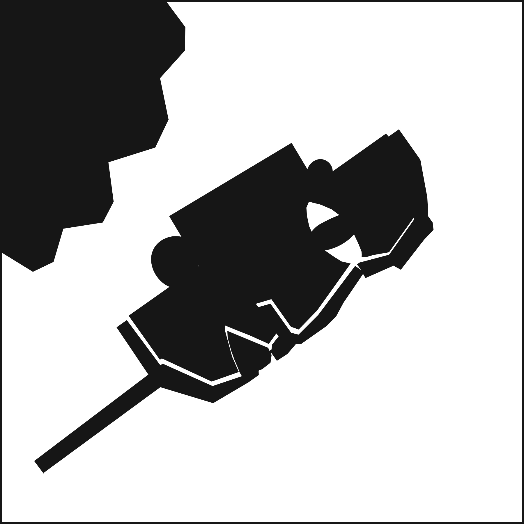
Black on White
Out of all the options I think black on white was the easiest. It was hard to mess up on this one because all the shapes you were working with were already black so it was just a matter of arranging them into an order you found visually appealing on the already white background. Black on white was the first one of the three I completed so I really thought the rest were going to present no challenges, then quickly learned that was not the case. The shapes I used originally to create this were the shapes I decided to continue to use only adding in a rectangle and small circle.
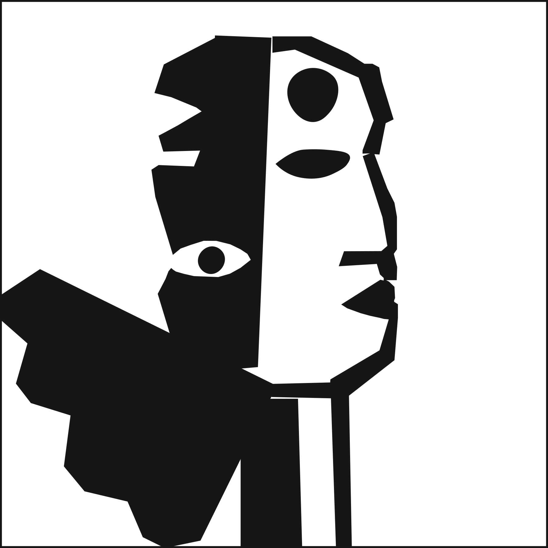
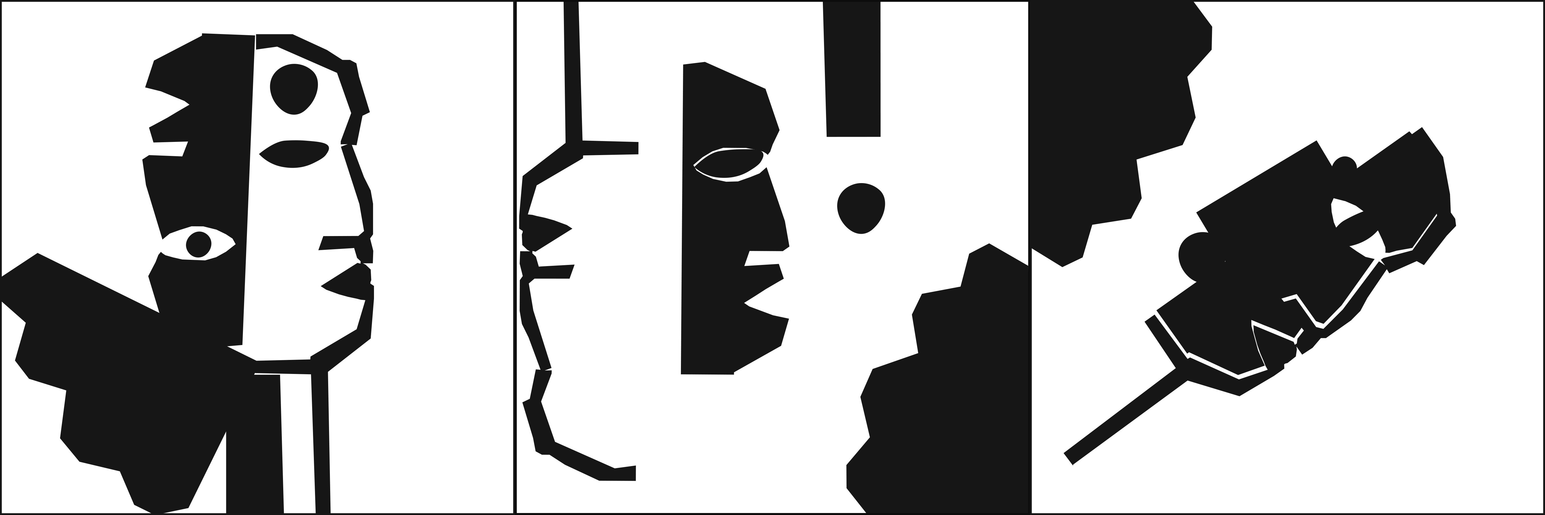
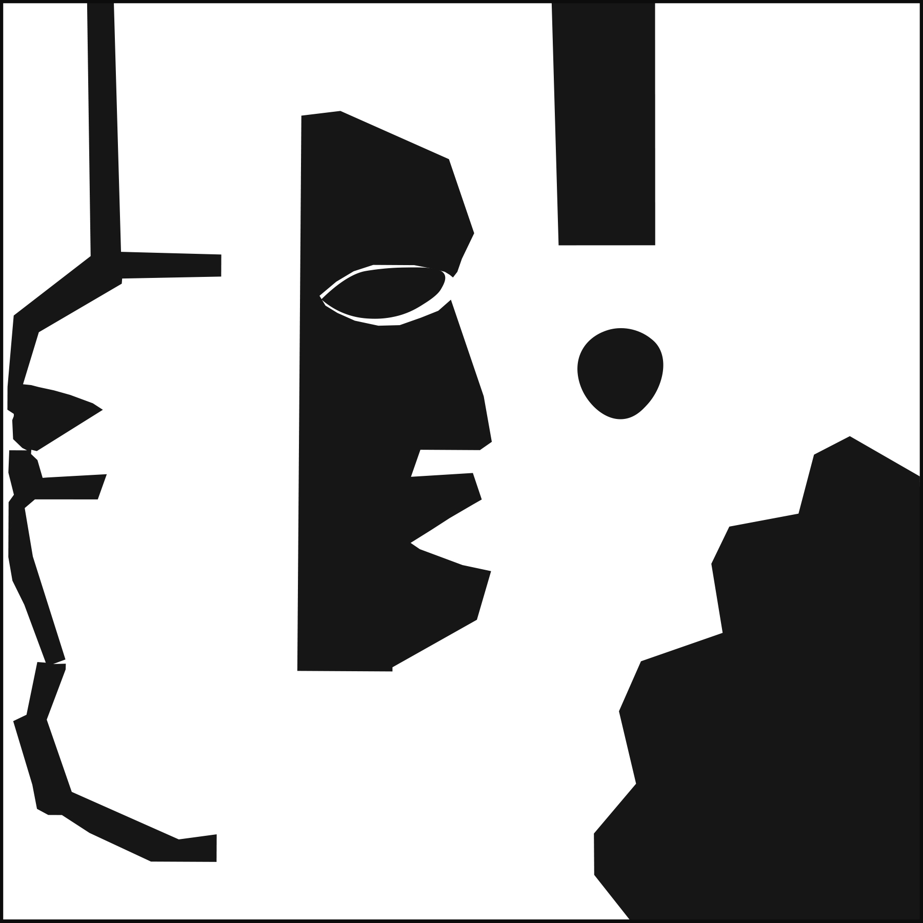
Ambiguous
Lastly we have Ambiguous which personally is my favorite of all the works. I think it is very clear what I was trying to represent and I liked the crisp balance of the faces. For the white side eye there is a black eye and for the black side a white eye.
All my images looked very similar but I think that was unavoidable when you see what I had to work with. I do think I was able to create very different images within themselves even if they all looked very much related.