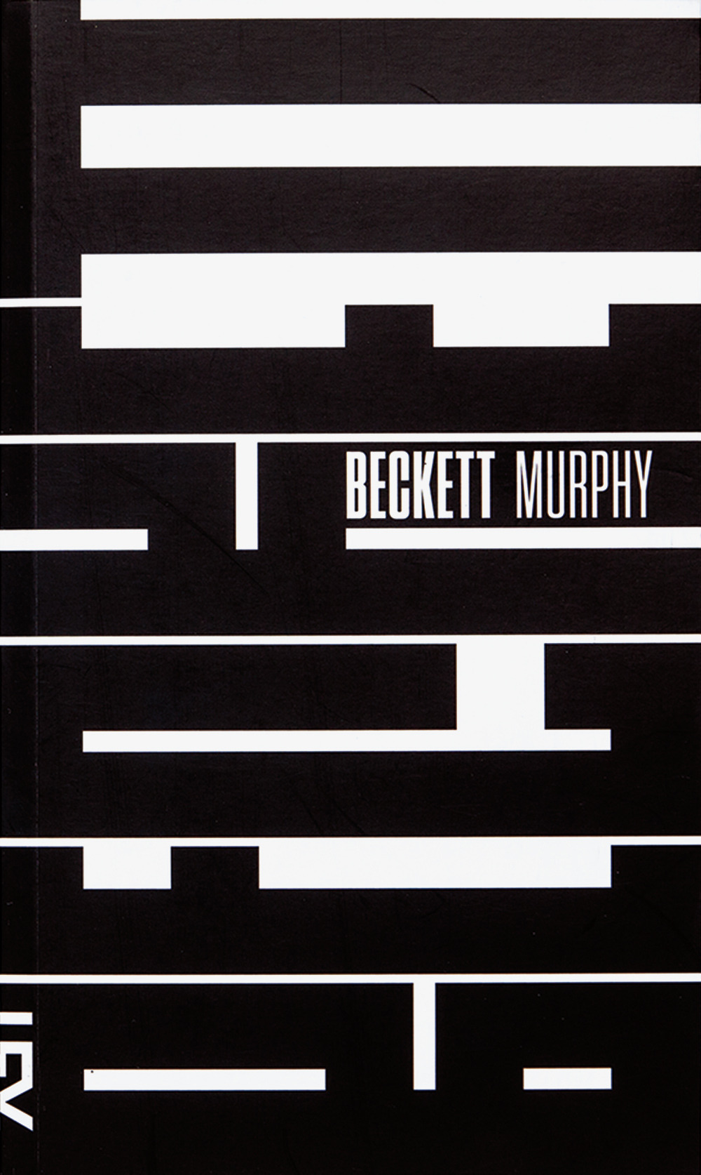
Designer: Paulo André Chagas
Year: 2013
Source: http://typeonly.tumblr.com/
Explanation: This is easily my favorite among the type designs I saw. First off, I love its simplicity. Using only black and white, and what seems initially to be just abstract black shapes in the background, it manages to convey a sense of prominence and solidity. Then, upon closer inspection, the abstract black shapes in the background slowly reveal themselves as letters in the name Beckett. The clean lines and sharp shapes demand the viewer’s attention, conveying not “Hey, if you feel like it, maybe you could check out this book some time,” as a softer design may, but “Look at this book NOW.” And because the meaning or significance of the black shapes in the background is not apparent immediately, it encourages the viewer to keep looking at and contemplating this design until they fully figure it out, as I did.