What aspect of puppetry, or performing objects, resonates with you? How can it help clarify the work that you do? Would you consider creating a piece that involved puppetry?

2. I followed the steps in tutorial to reduce the face count of this armchair.
Select – Add modifier – Decimate
(The total face count is under 500)
3. I exported it as obj. file.
4. The next step is importing this file into Pepakura. But this app doesn’t have Mac version. Therefore, I found a substitutional app called Unfolder. (https://www.unfolder.app/download.html)
5. I opened my file in the Unfolder. I adjusted the paper size (A2), rearranged each part on the paper.
This is what I got finally.
I chose this project because I think it is much easier and faster for computer to calculate how many surfaces and joining parts you need to make when you are preparing a paper model. As long as you have the 2D version of your model, you can just print it, cut it out, and finally glue it into a 3D model.
Final Product Photo:
The process:
1. I set up a seamless backdrop by sticking a piece of paper on the wall. The bottom part of paper is dropped on a table. I fix the paper background with tapes.
2. I set up the light.
3. I placed the object- a jewel case.
4. I added a bounce card on the other side.
5. I started taking photos. Because I don’t have tripod, so I held my phone and put my arms straight on a chair to prevent camera moving. I took lots of photos, here are some of them.
6. Then I put the first one in Photoshop, starting to edit it.
7. I cropped the image into a proper size.
8. I cleaned the background by using the tools: clone stamp\patch. Then I adjusted the levels of color.
9.I made a mask on the background because I want to make the background more flat and white. I adjusted the opacity of the mask to make the image look nature.
10. I adjusted the color level, hue and saturation again. I think this step made the photo look much better.
A successful website:
Pinterest is an American image sharing and social media designed to enable saving
and discovery of ideas on the World Wide Web using images and, on a smaller
scale, animated GIFs and videos, in the form of pinboards.
It is appropriate for publishing daily photos and visual artworks. The users can share their images or getting inspiration from this website. The pages are mainly based on images, surrounding with plenty of blank space. The titles are clear and easy to read. Once the users type keywords in search area, they will pinpoint the related images. When the users click on the search button, some ideas related to their previous research will be recommended automatically. I will rate the memorability of this website highly due to this function. It is quite simple and efficient for users to browse ideas. However, if you want to get fully accessed, you have to sign up for an account and remain logged in. It decreases the efficiency to some extent.
If you click on the user button, you will go to the Boards/Pins page. It allows you to view the pins you saved and posted. It is clear and well categorized.
Pinterest has very clear and tidy layout. It does not have pop up ads, therefore the users will not have mis-click errors. I personally enjoy using Pinterest to search design ideas. Most of resources seem to have high qualities. It gives me high satisfaction.
This is the mobile version of Pinterest.
URL: www.pinterest.com
A less successful website:
I choose a Chinese website named QianTu. First, the layout is a bit more crowded than Pinterest. There seem to have several navigation sites. The posters in the middle are changing and taking turns all the time. It gives a feeling of too much information. It decreases the learnability of a web.
If you click on Illustration bar, you can see a more categorized navigation site, which helps you to filtrate information. It increases the efficiency to some extent.
If you want to download an image, you can just click on that. Then you need to sign up before you download, which is similar to Pinterest. There’s an ad bar appears on the bottom of the page, which decreases the satisfaction. Besides, all the resources in QianTu seem to be finished artworks or template. Most of the free downloading resources have low qualities. I will only use them for inspiration, but not materials.
URL: https://www.58pic.com
Three, for me, is not only a number. It can also represent shapes, rules and groups. Number 3 was written as “三” in Chinese character. It is made of three parallel lines in different lengths. Three started to have a shape when I learnt how to write it in Chinese.
I got to know another shape of three when I was taught to draw a triangle. My math teacher told me triangle is the most stable structure among all the geometric shapes. That’s why triangular structures are used frequently in architecture. Then, three started to have its personality, stable.
I learn more about three when I grow up. In my first sketching class, I was taught to draw a cube. That’s my first impression of 3D. When I was observing the real cube, I could only see three sides. And I drew what I saw on the paper. My teacher said, this is three dimension.
The first 3D movie I watched was Avatar. I can never forget the feeling when I watched it. When I put on 3D glasses, the blur image on screen suddenly became clear and real. It seemed like the characters were right there in front of me and talking to me. The characters were no longer just plane images but touchable real creatures.
Three as a rule was known for the rule of thirds. It is widely used in photography. It is the process of dividing an image into thirds, using two horizontal and two vertical lines. When I position the most important element at these intersection points, I feel it is such a magic rule that assist me to produce a more natural image. I used it in the compositions of my drawings, paintings and photos.
Three often appears as a group in many movies, novels and artworks. Many of them have three main characters. For example, my favorite comedy movie, 3 idiots.
But it also generates a new thinking for me. Although ‘three’ can create a stable structure in architecture, what about ‘three’ in human relationships?
Will the relationship, or friendship become stable or vulnerable when three people come together?
Both of my studio and seminar project are about the combination of Chinese and greek culture. According to the history evidence, there are a group of sculptors who came to china even earlier than Macro Polo. They influenced the Chinese sculptors who built the Terra-cotta Army.
My inspirations are from an exhibition called THE EPIC ABSTRACTION which took place in the Met.
I was inspired by the technique of splitting paints on the canvas from Autumn Rhythm.
I was also inspired by the the silhouettes of two continents in the Night Journey. I would like to incorporate it in my paintings.
So I made my first final outcome.
The red part represents Chinese culture and the blue part represents greek culture. The middle part of splitting effects represents the collision of these two cultures.
I made the second one after my class visiting the three artists’ studio.
I was inspired by the use of color and lines of the first artist.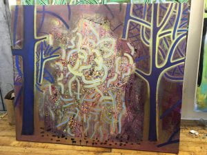
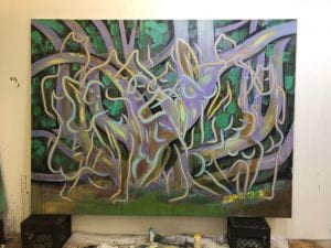
Then I made the second final outcome:
The upper part also represents the merging of two cultures and the dots below represents the Terra-cotta Army.
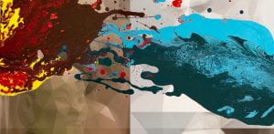
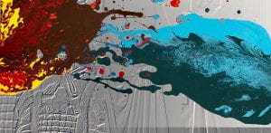
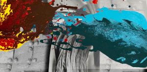
I also would like to incorporate some photoshop work into my piece. Therefore, I took some screen garbs of the representative parts of Terra-cotta Army (patterns on armour) and greek sculptures (furbelow) to make some backgrounds.
Then I added them onto the first piece: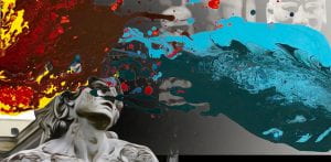
Me and my partner Lexie went to a park in Brooklyn called MARIA HERNANDEZ PARK to do voluntary work with It’s My Park in April 2019. We basically picked up trash and collected bottles which can be reused.
Thousands of New Yorkers come together each year to volunteer and celebrate their neighborhood parks and public spaces through It’s My Park. The It’s My Park projects are open to the public and walk-ons are welcome. It’s My Park is presented by Partnerships for Parks , a joint program of NYC Parks and the City Parks Foundation.
Here are some photos we took in the park:
We analyzed the trash we picked:
Our designs for the organization: